



Project: Hyperion — Brand Guidelines
Brand Guidelines · Logo System · Colour & Type
Patronus Pixels is a graphic design & social media marketing agency that crafts bold identities and digital experiences that actually mean something.
A creative agency building what matters.
Scroll to exploreBuilding brands
that last
02Our Process
We take ideas from everywhere and turn them into brands that stand for something.
Every business begins with an idea.
Ideas without direction get lost in the noise.
We bring strategy, structure and focus.
A strong identity makes you unforgettable.
From visuals to voice, we build everything.
A brand that stands out and stands the test of time.
We don’t just design
we build legacies
What we build
Two core pillars. Countless possibilities.
Explore 300+ branding projects, graphics, campaigns and digital identities.
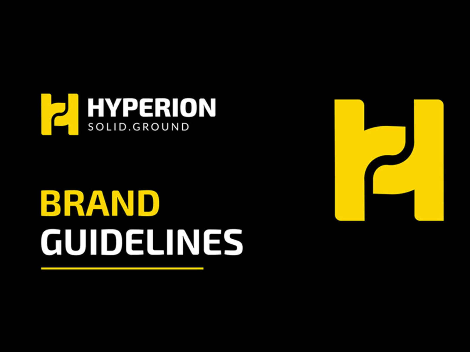
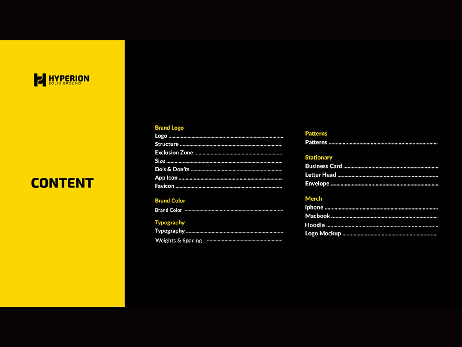
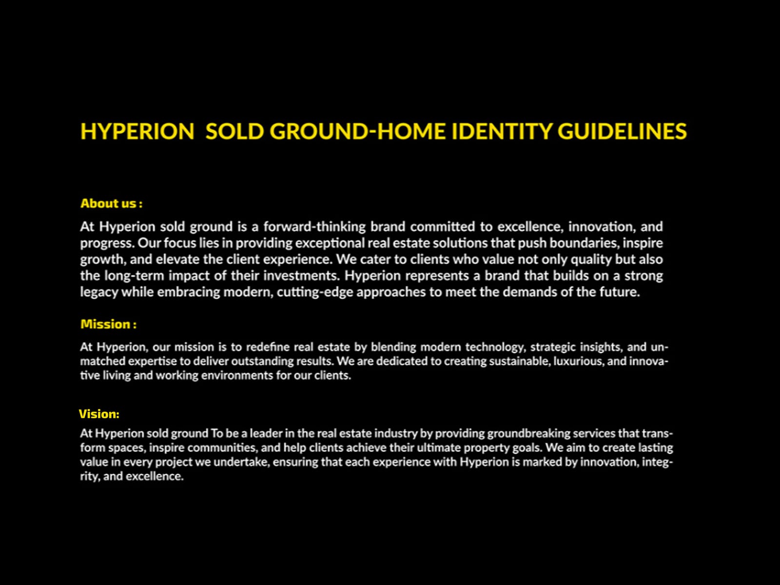
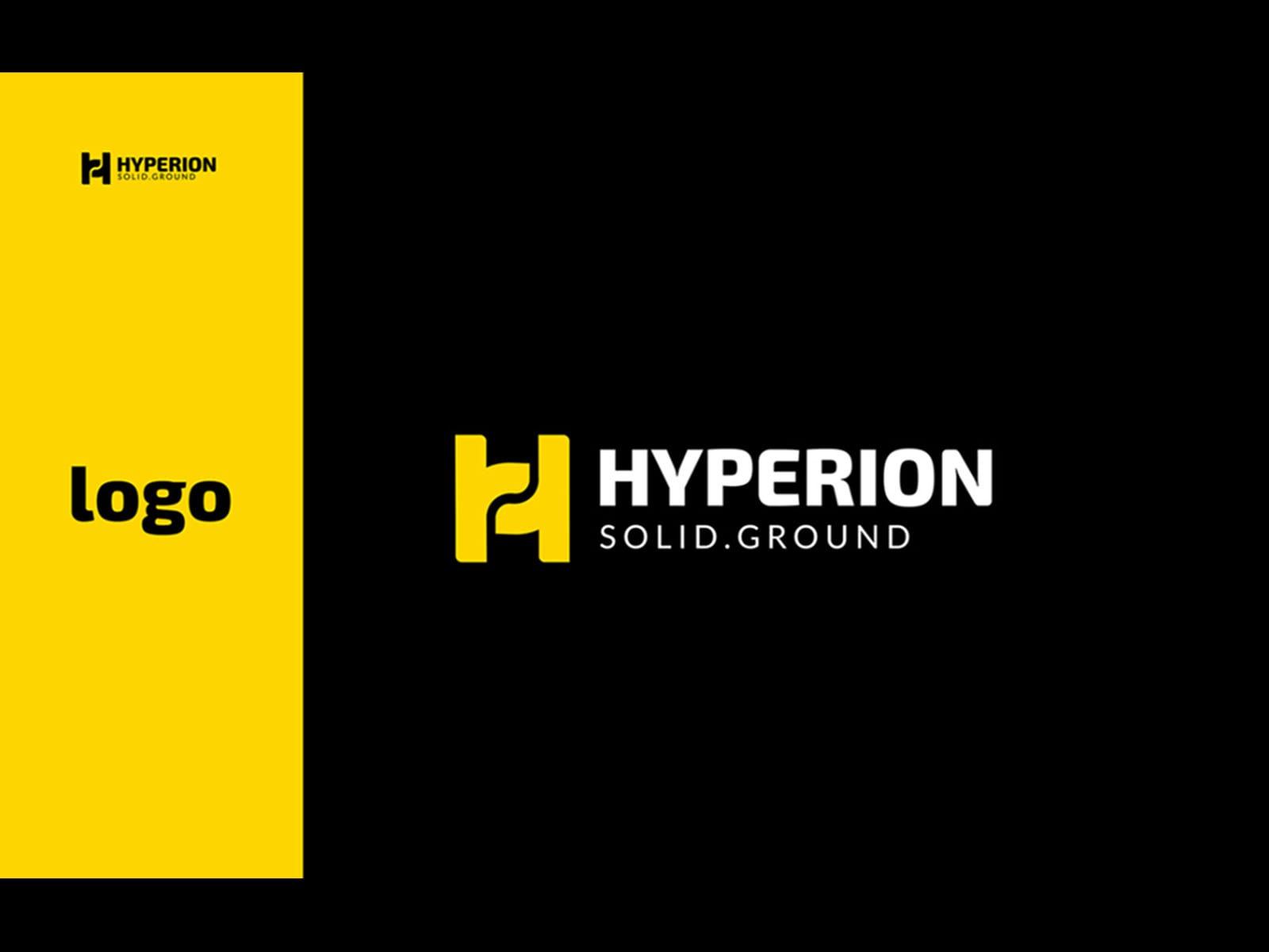
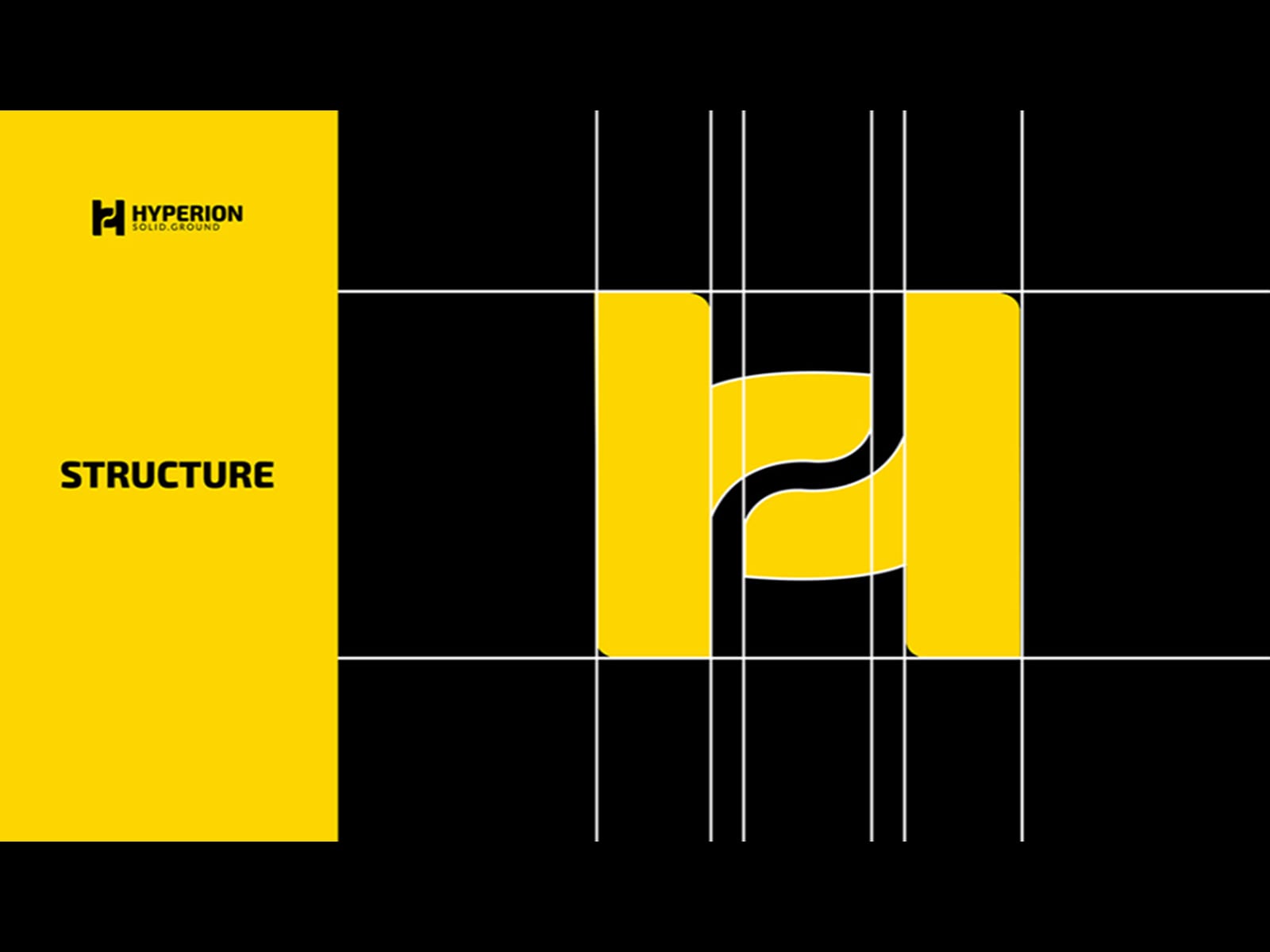
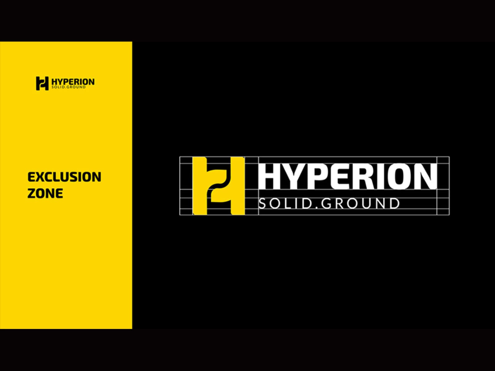
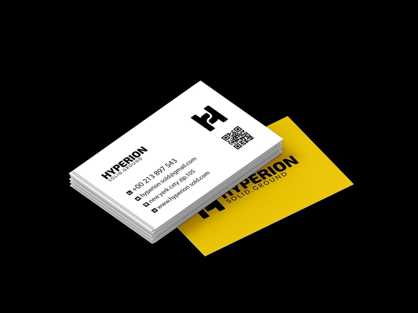
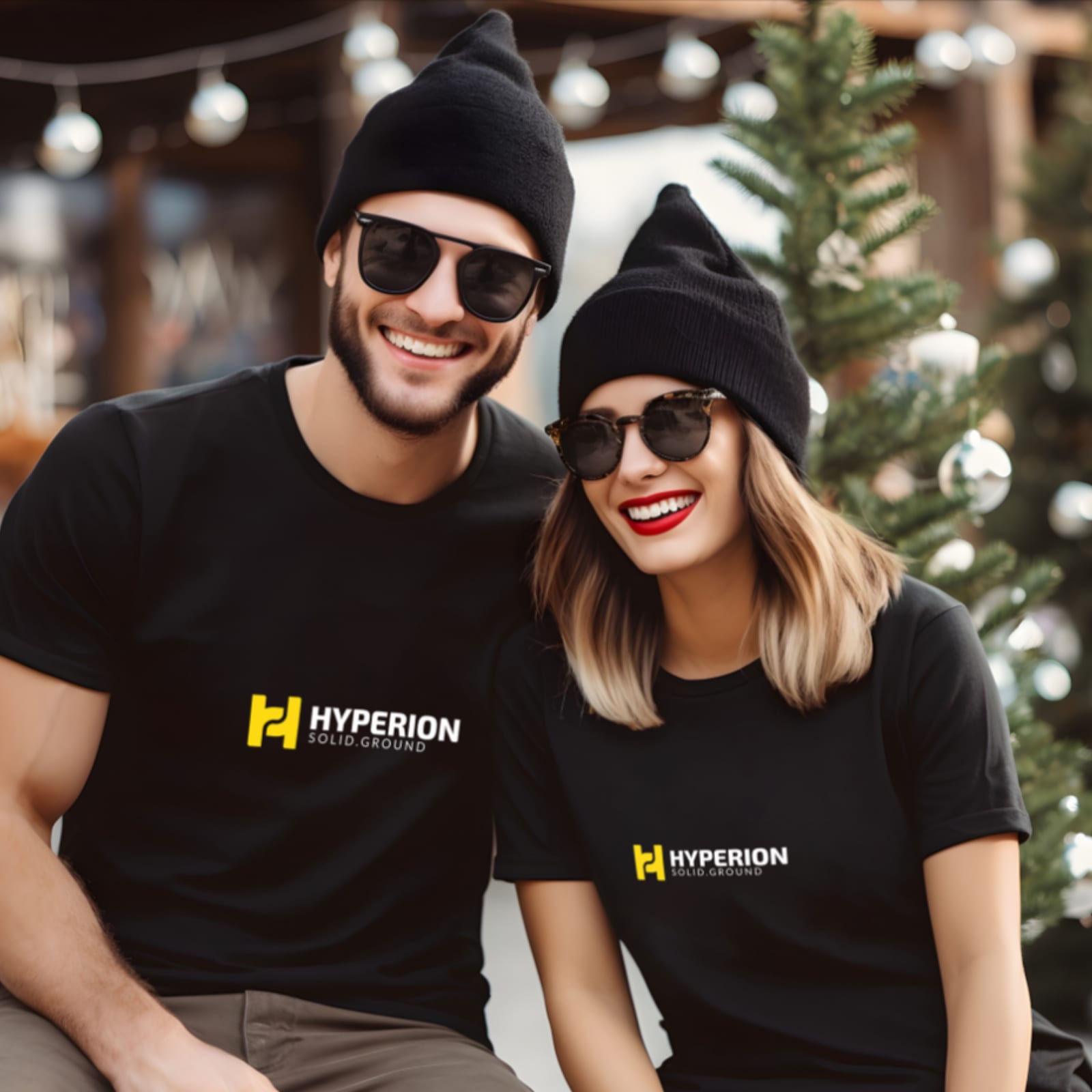
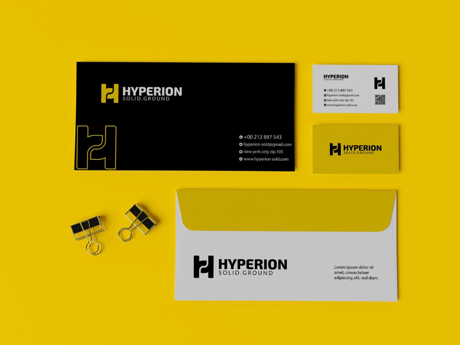
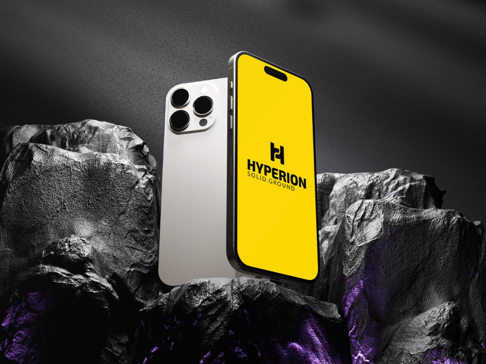
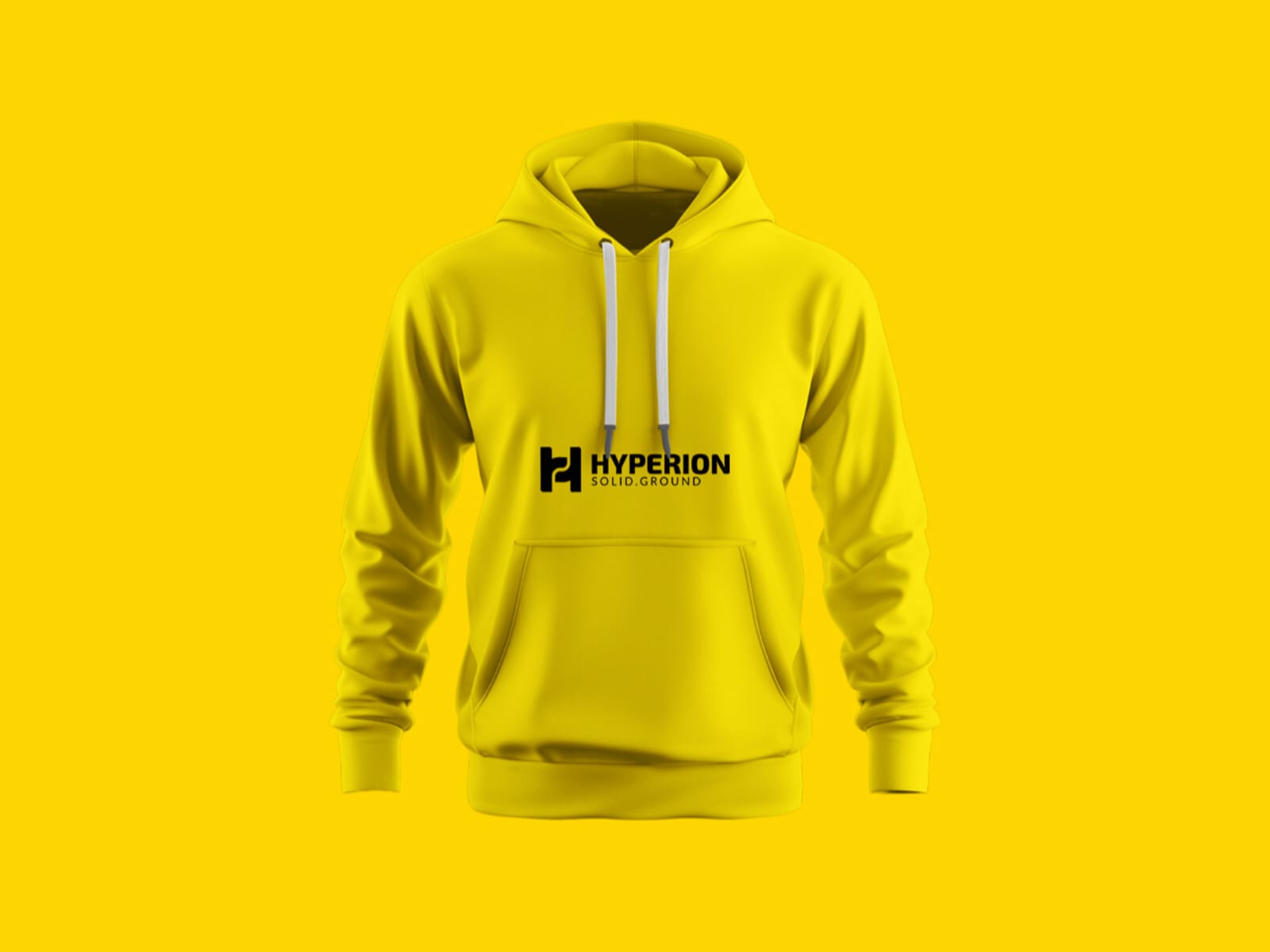
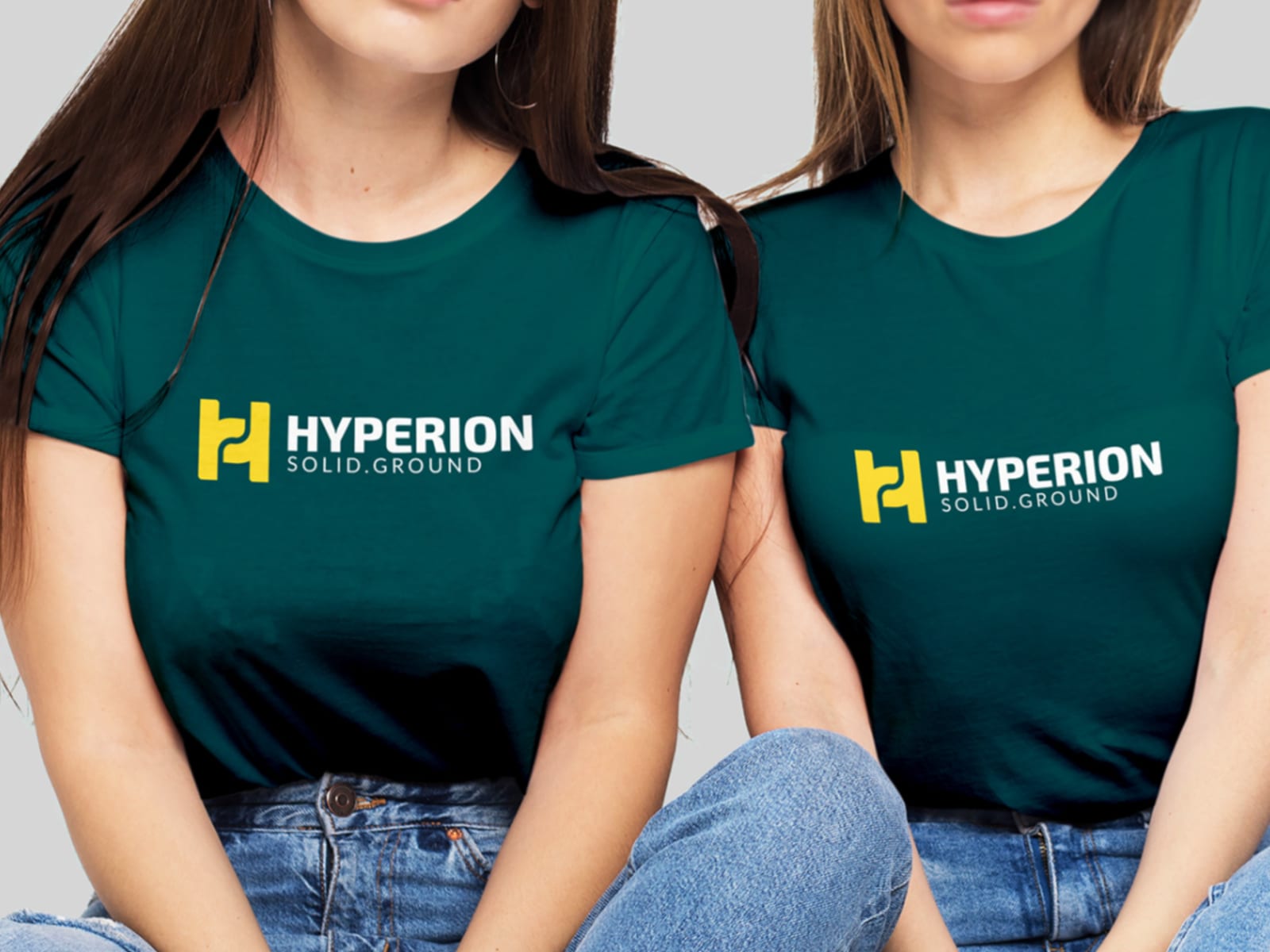
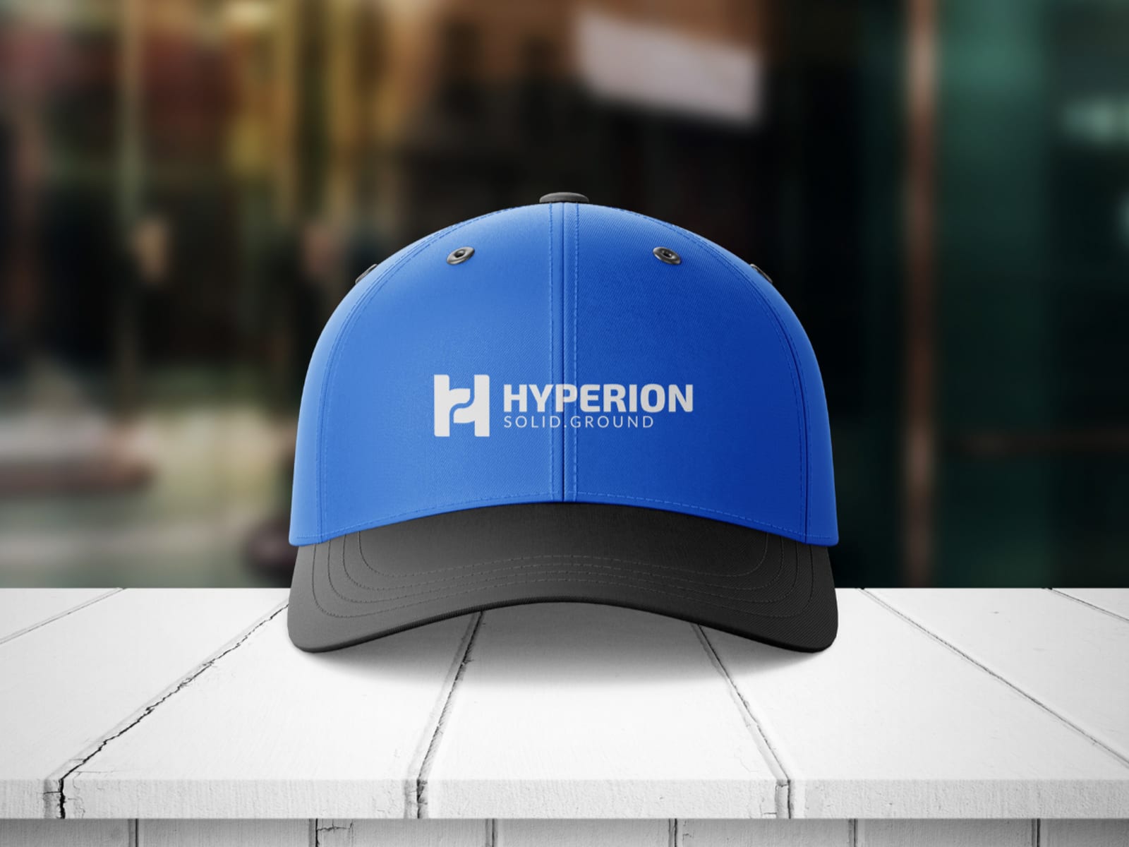
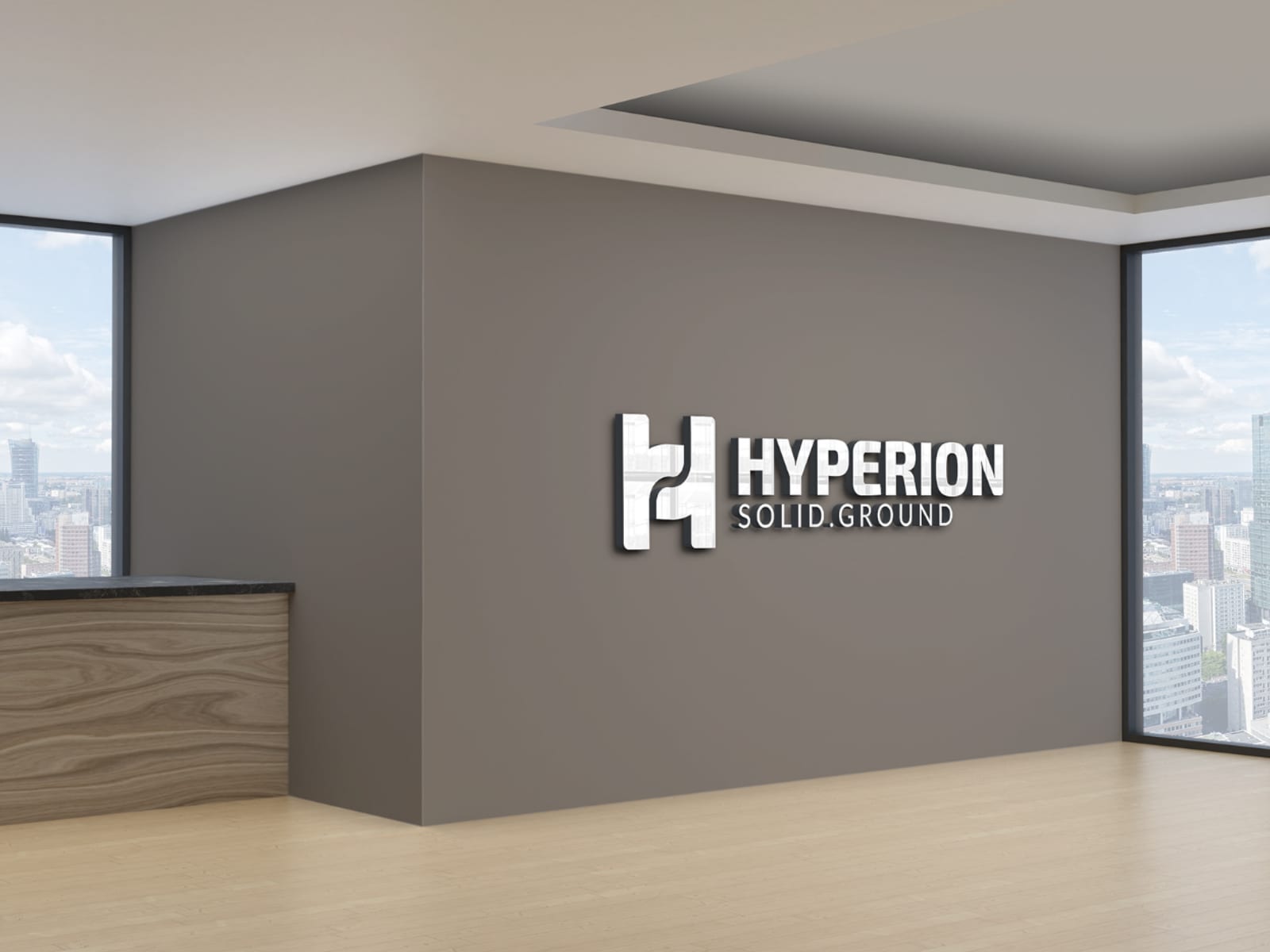
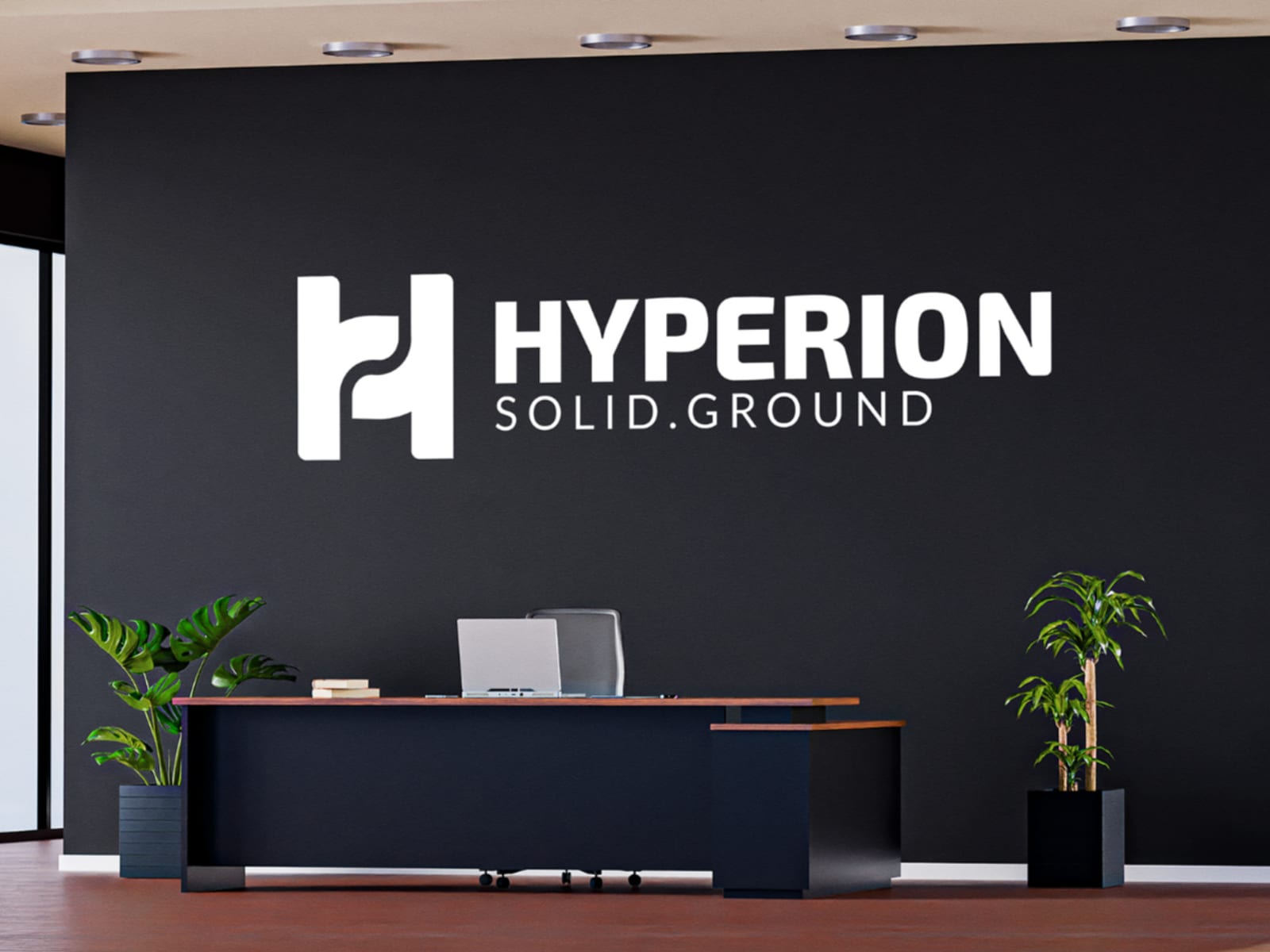
Hyperion 2021–2025
The document Hyperion was handed when we left: mark construction, clear space, palette, typography and the rules that keep all of it intact once someone else is applying it.
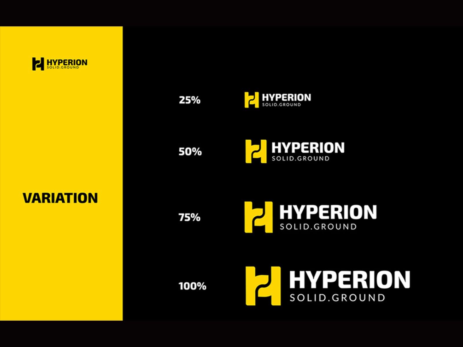
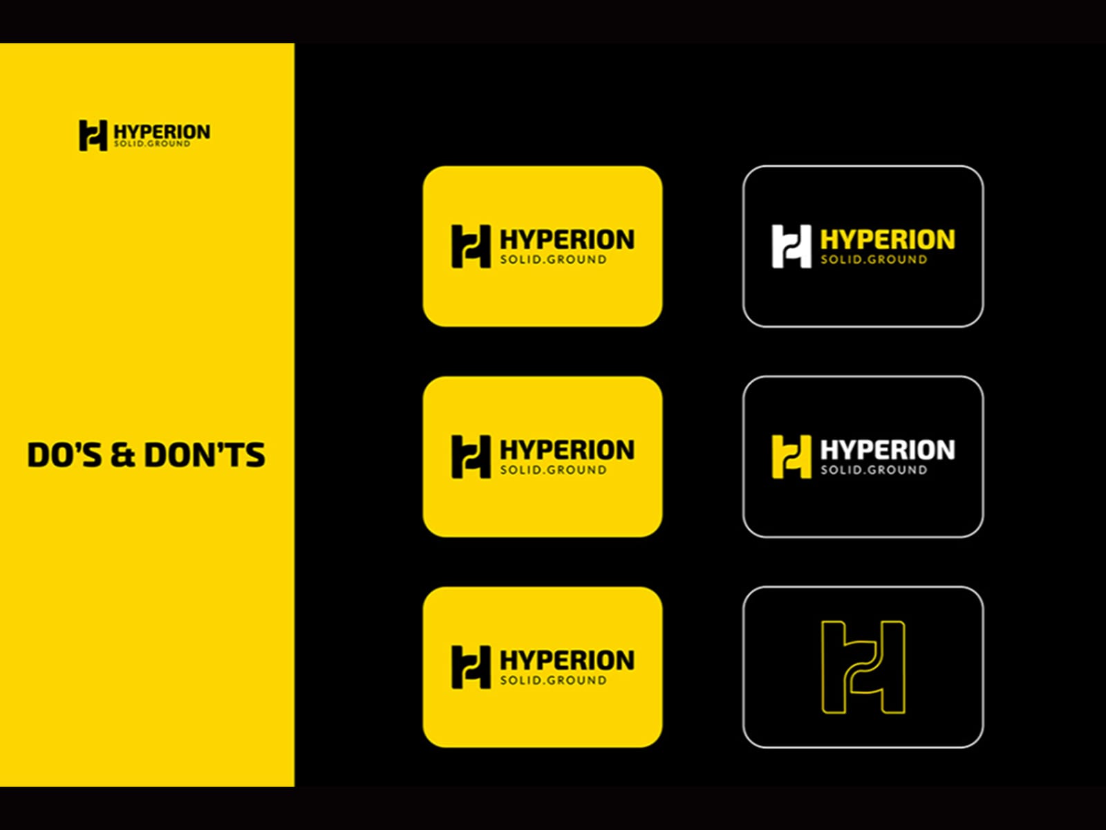
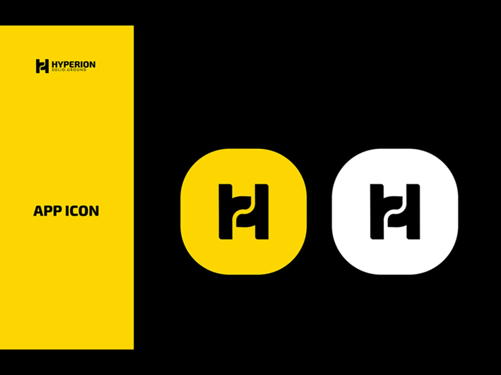
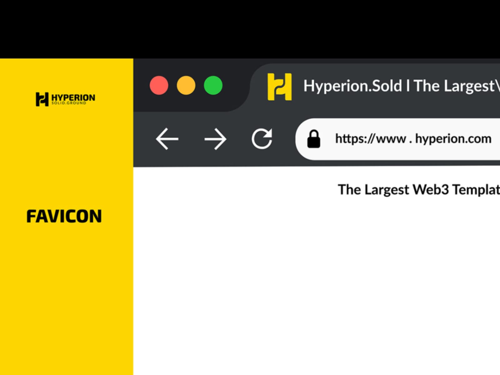
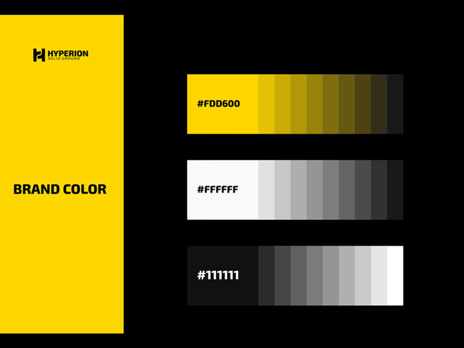
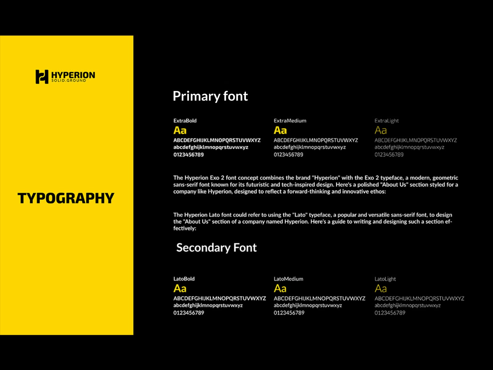
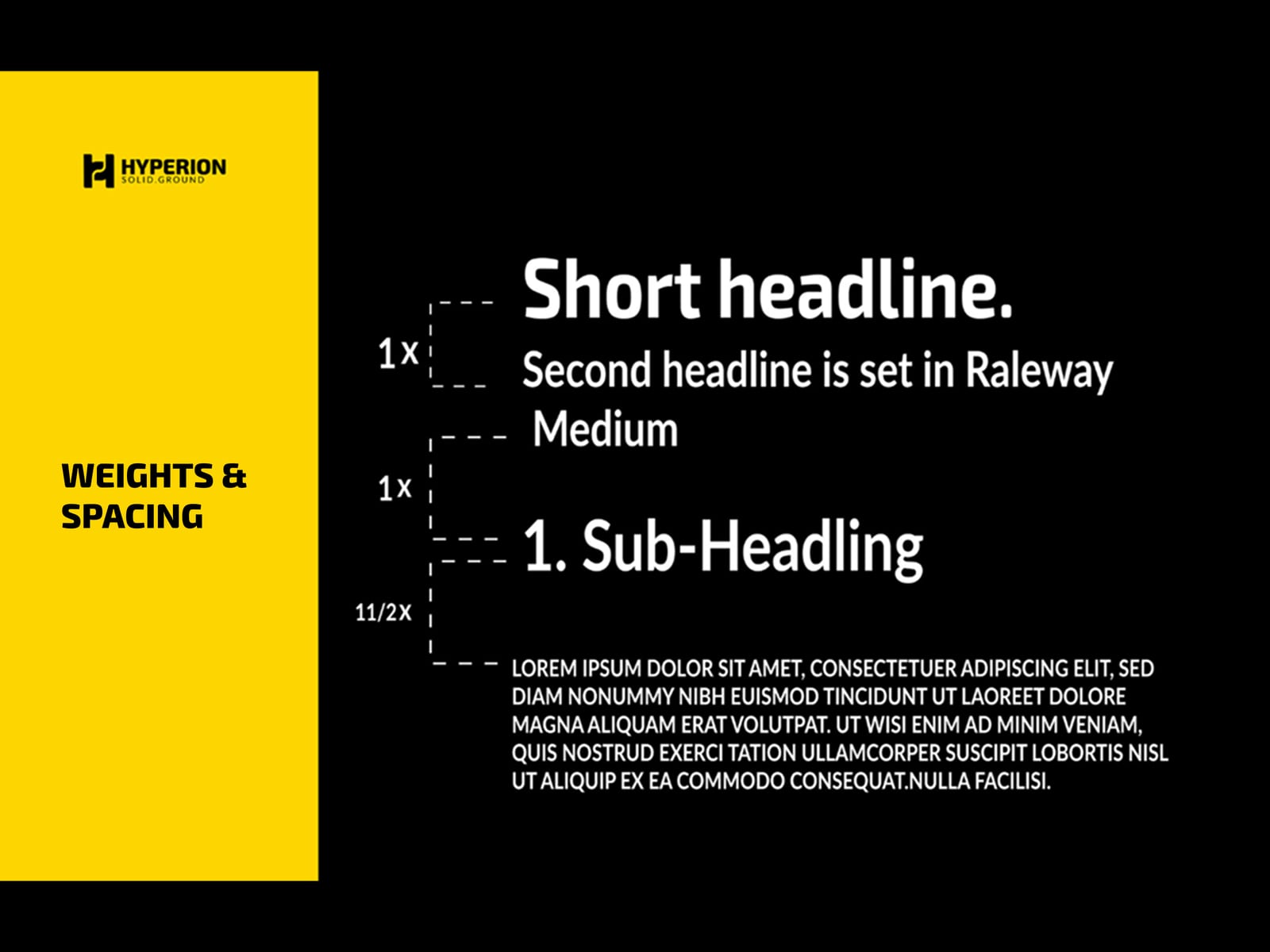
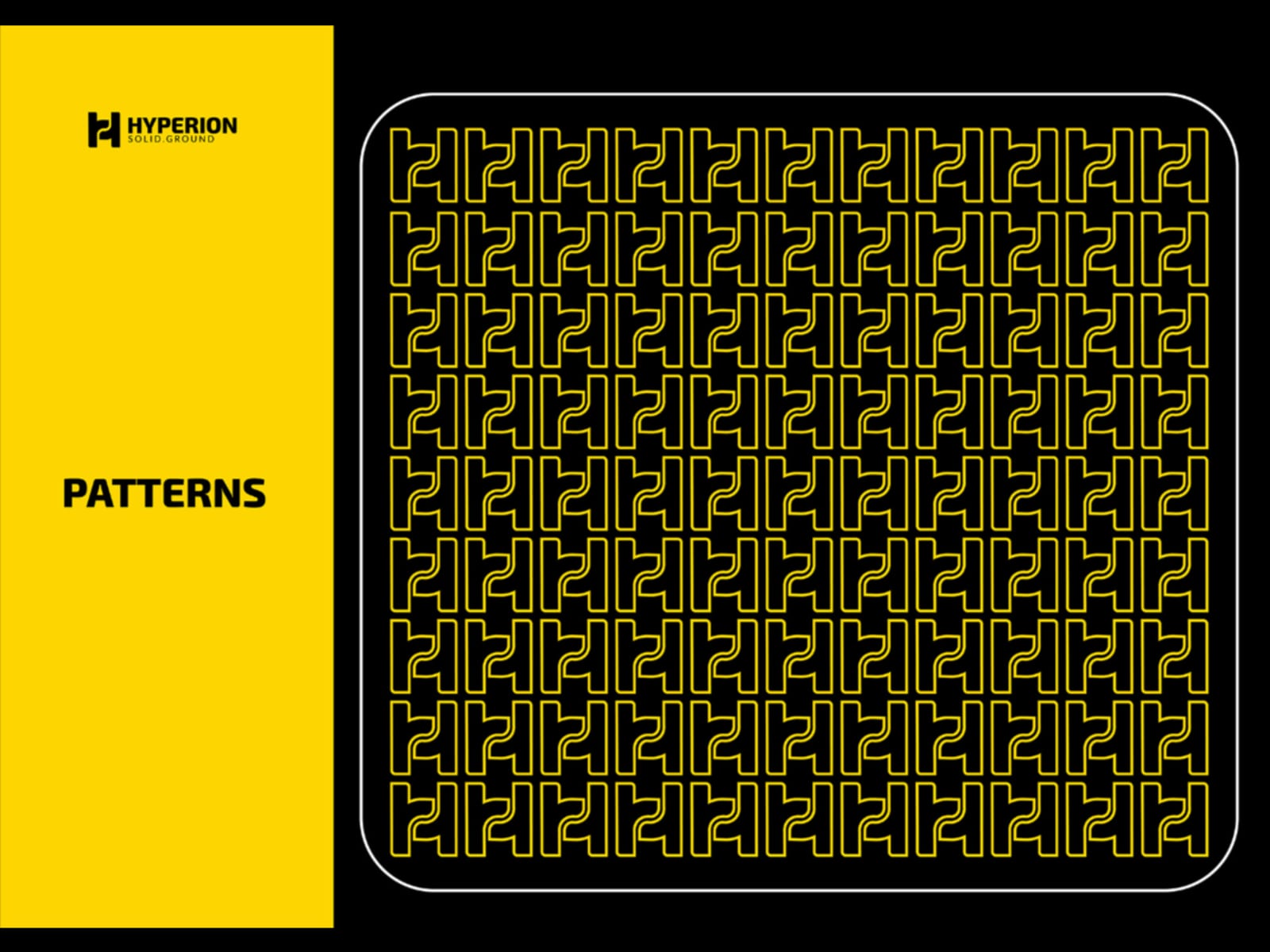
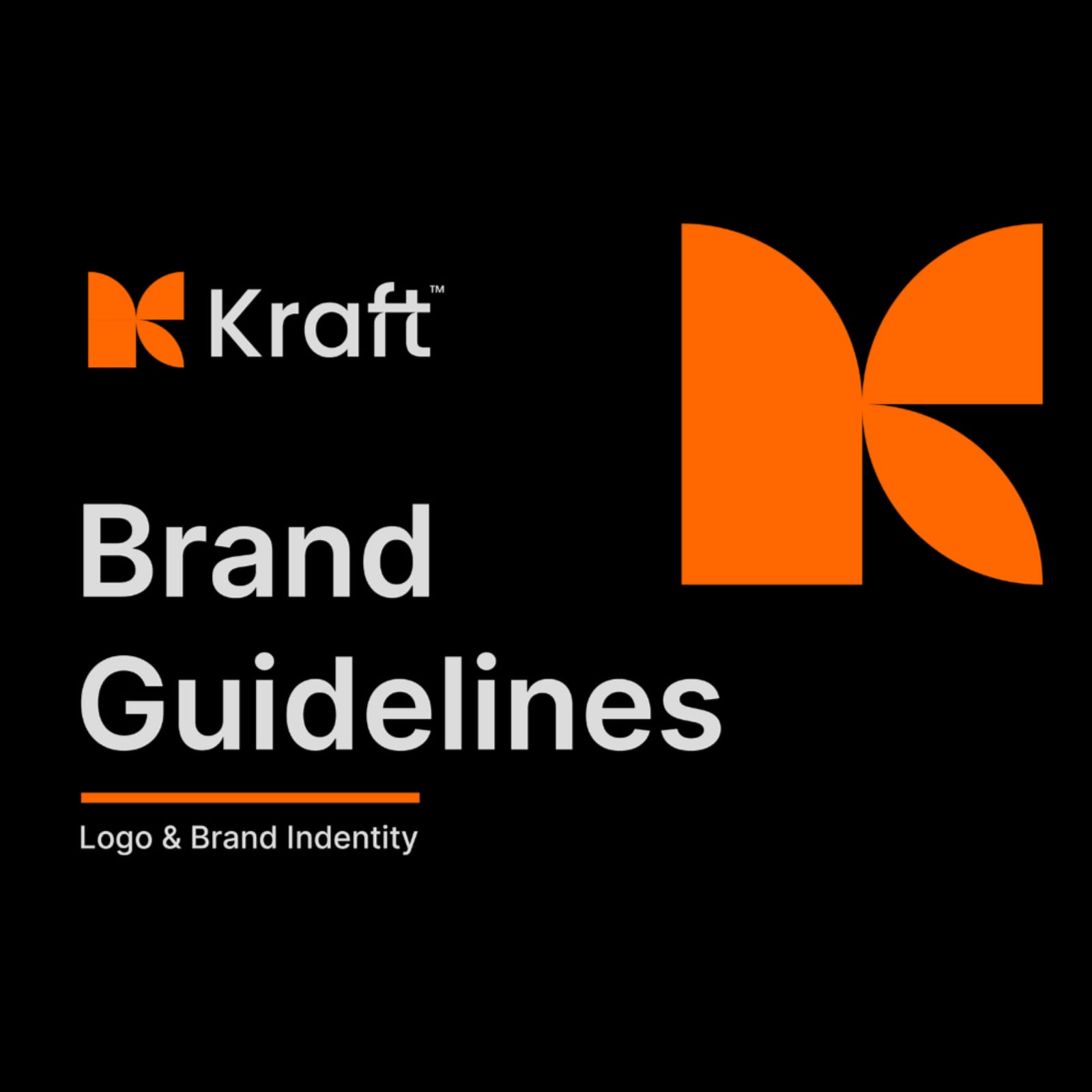
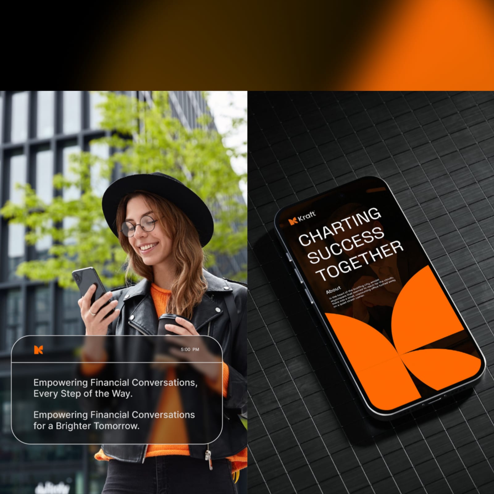
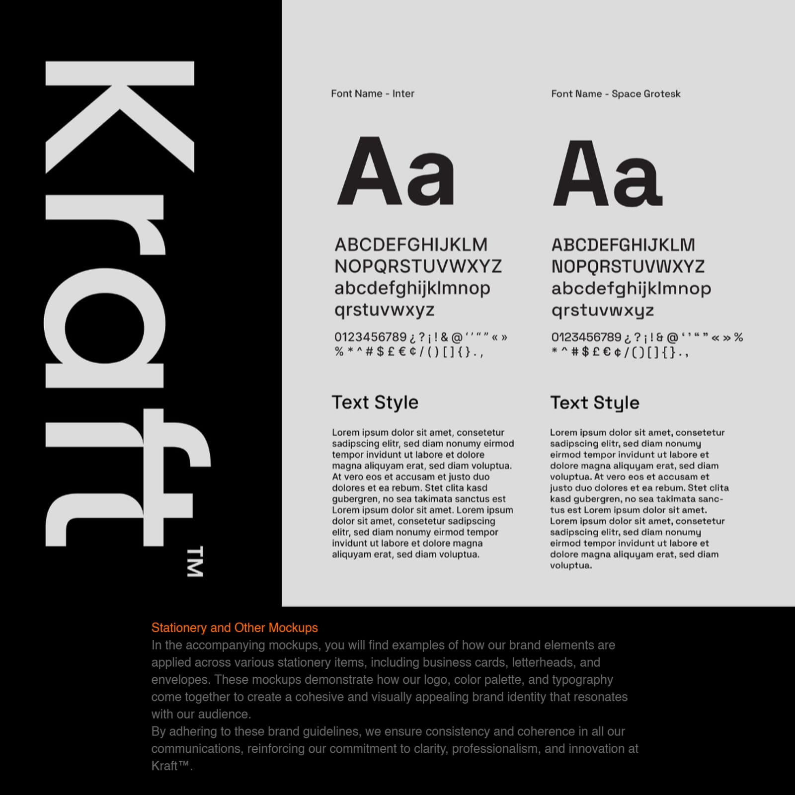
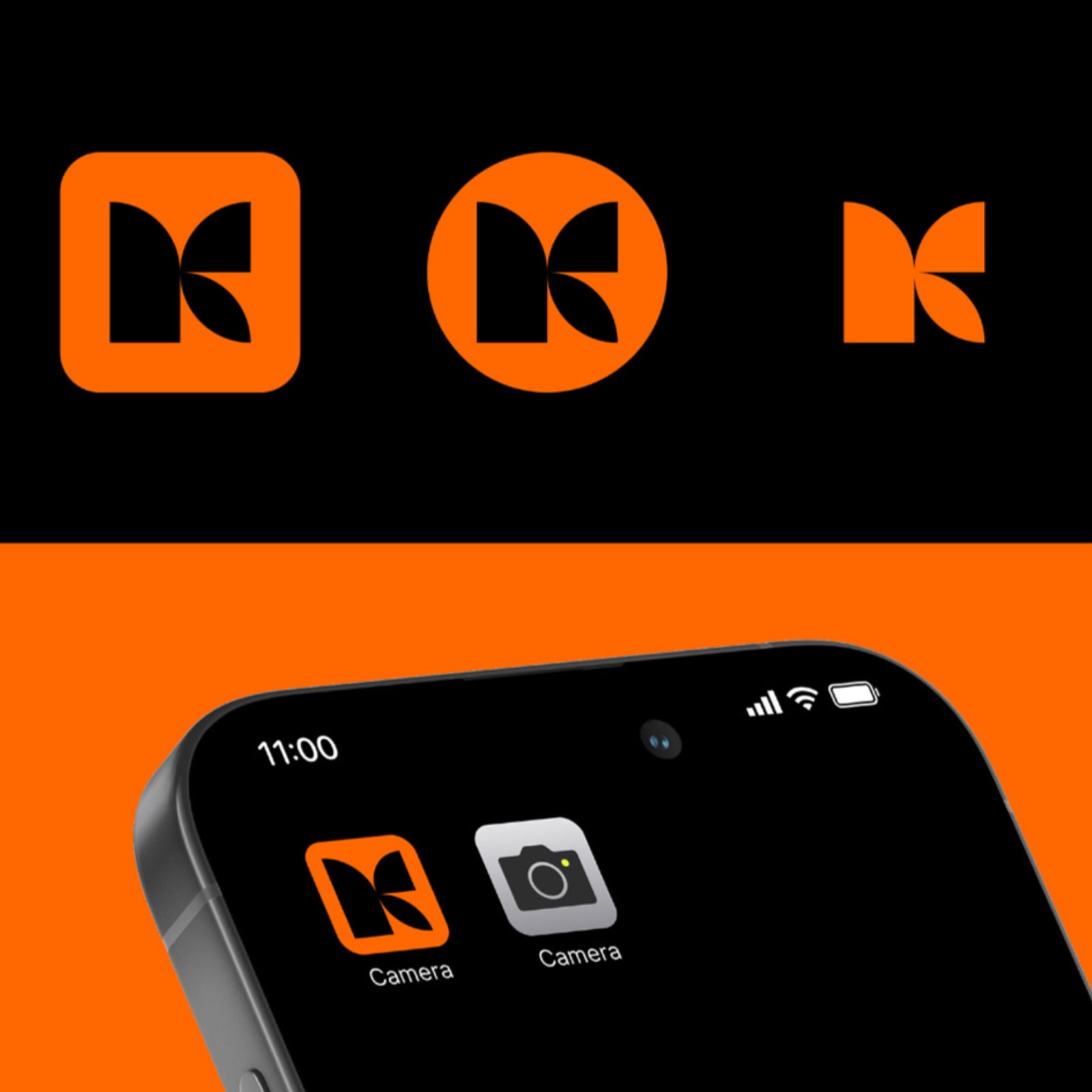
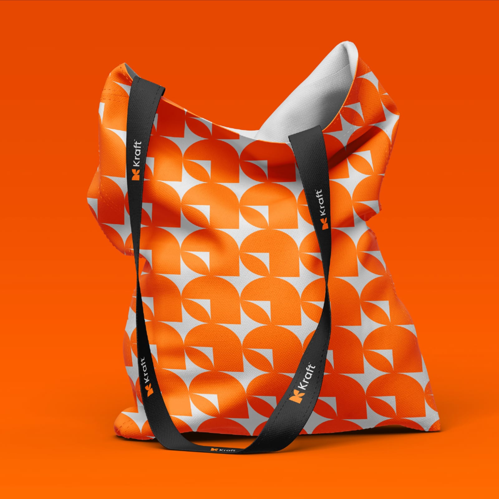
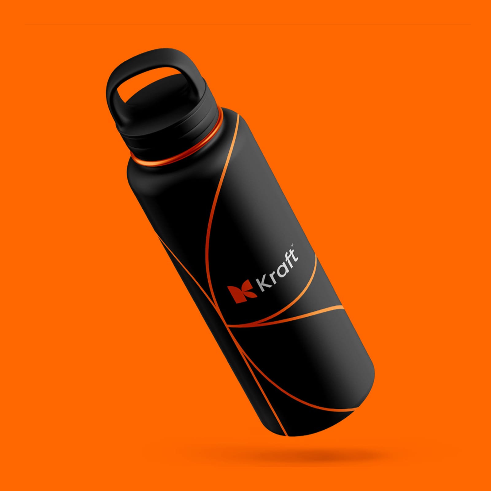
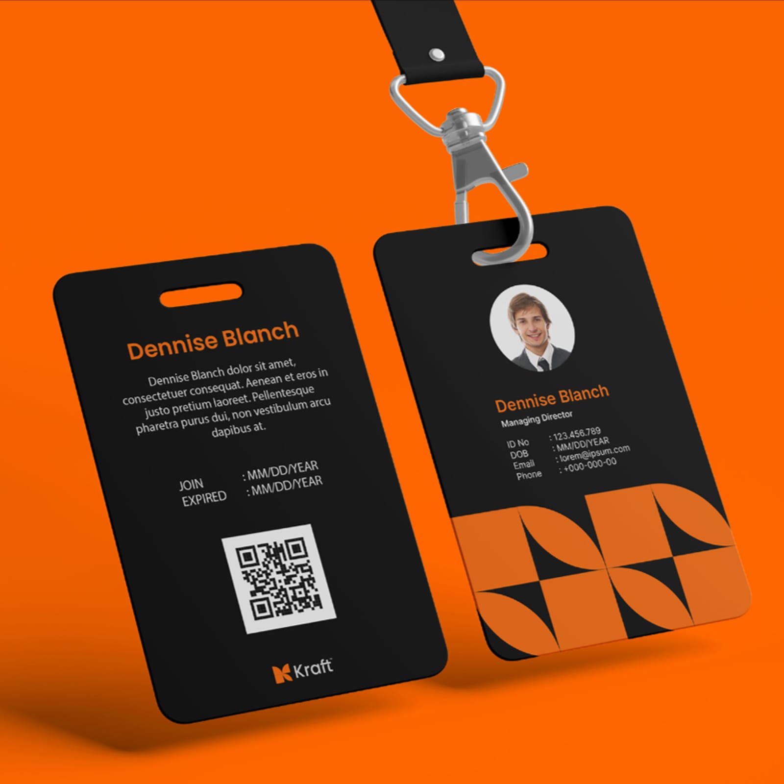
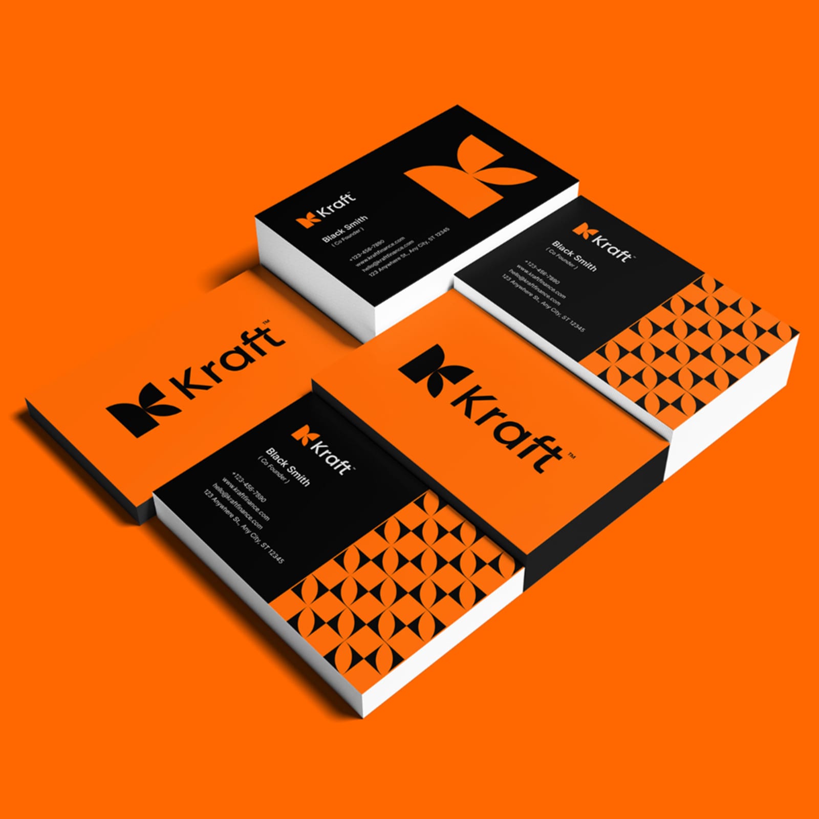
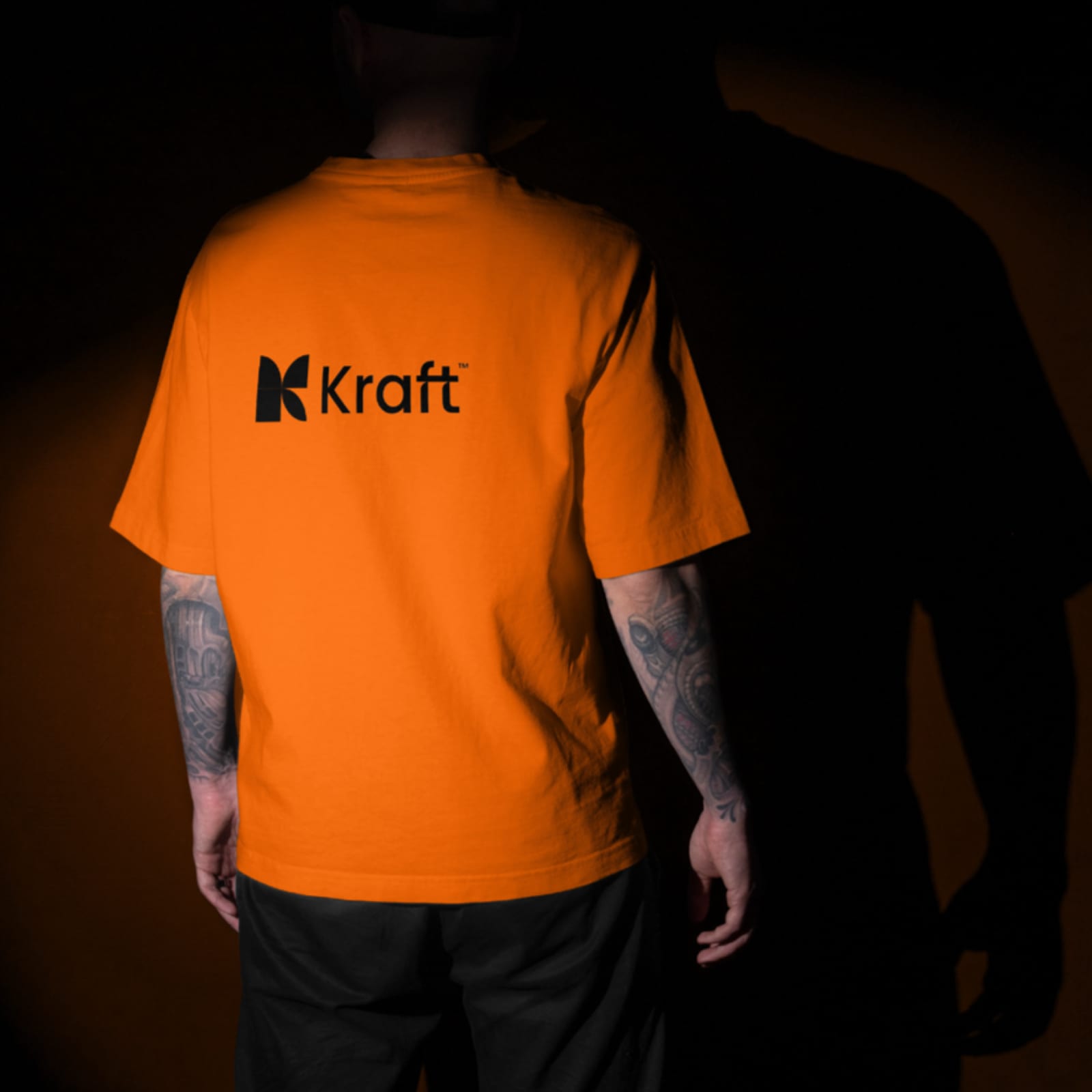
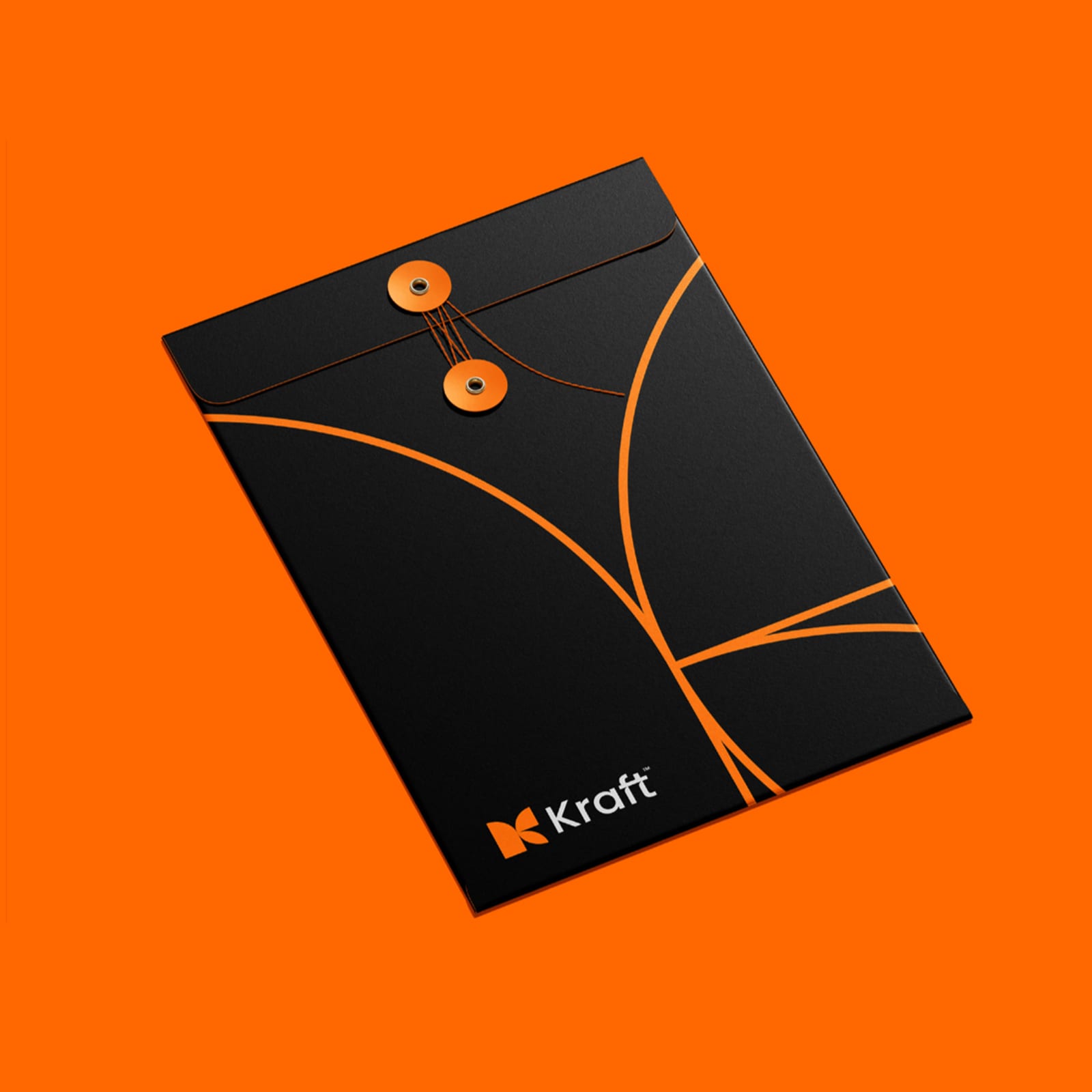
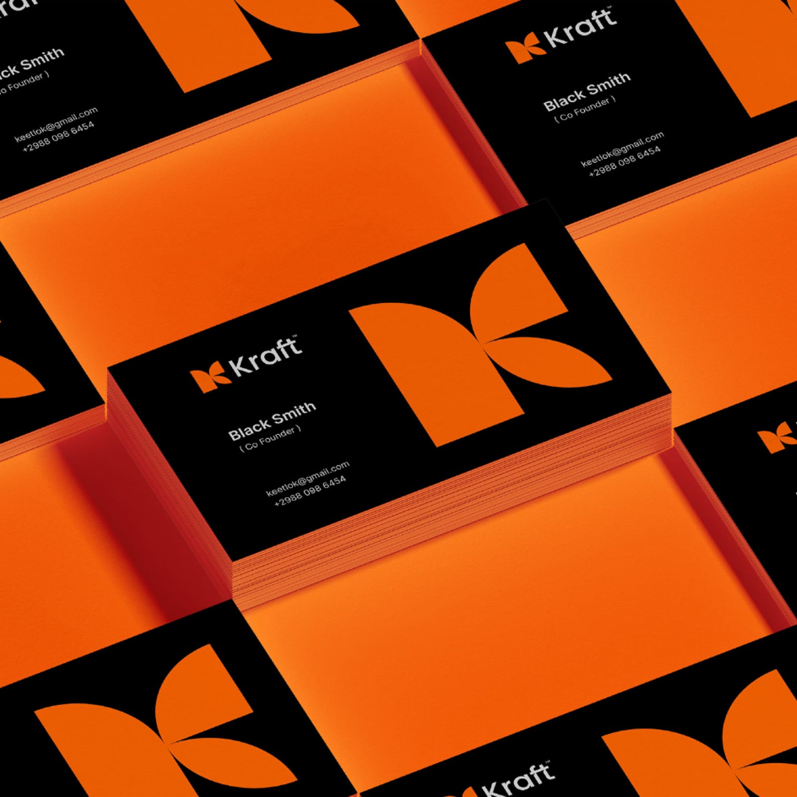
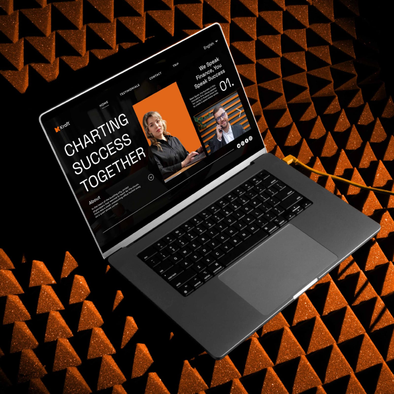
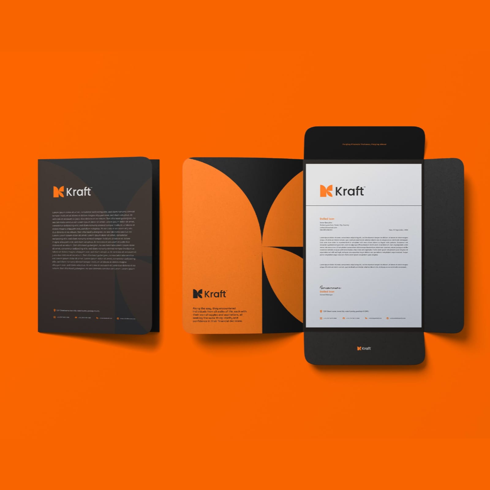
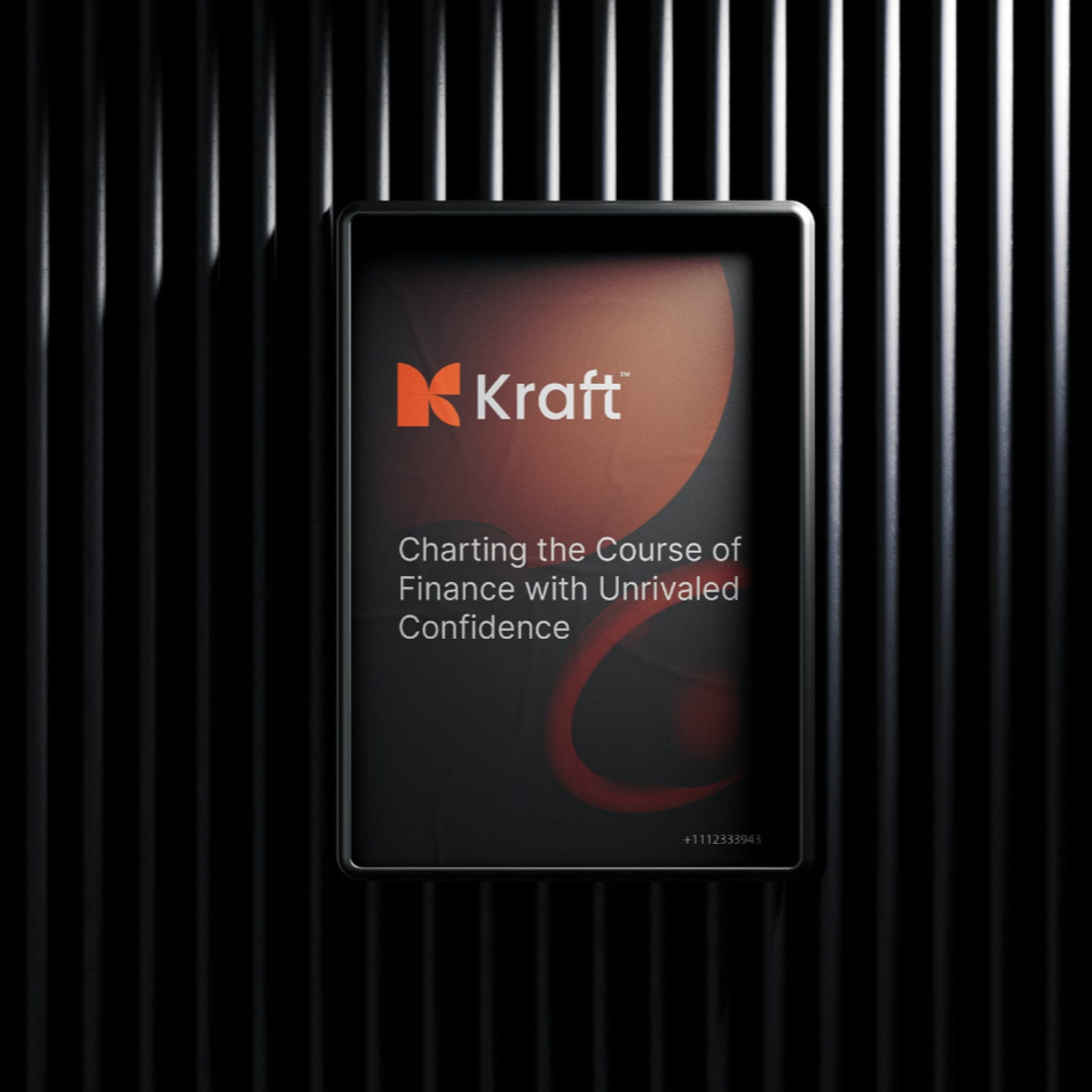
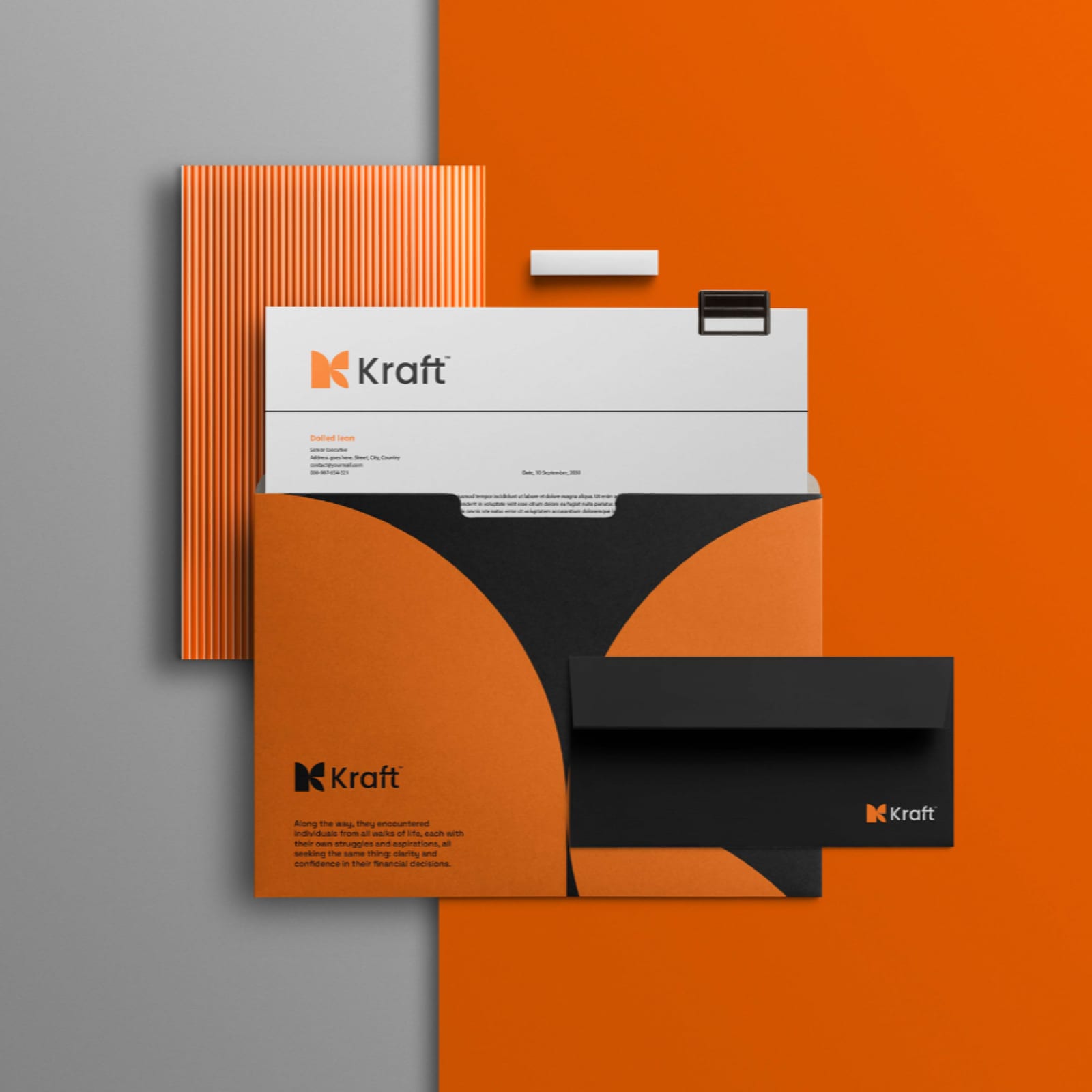
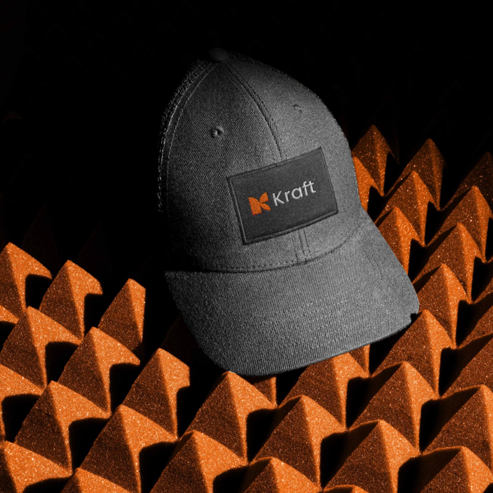
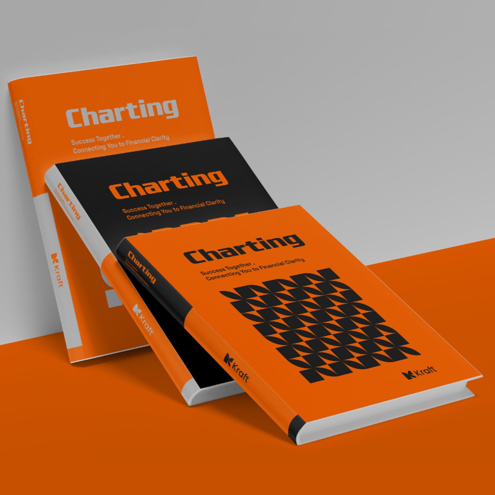
Kraft 2021–2025
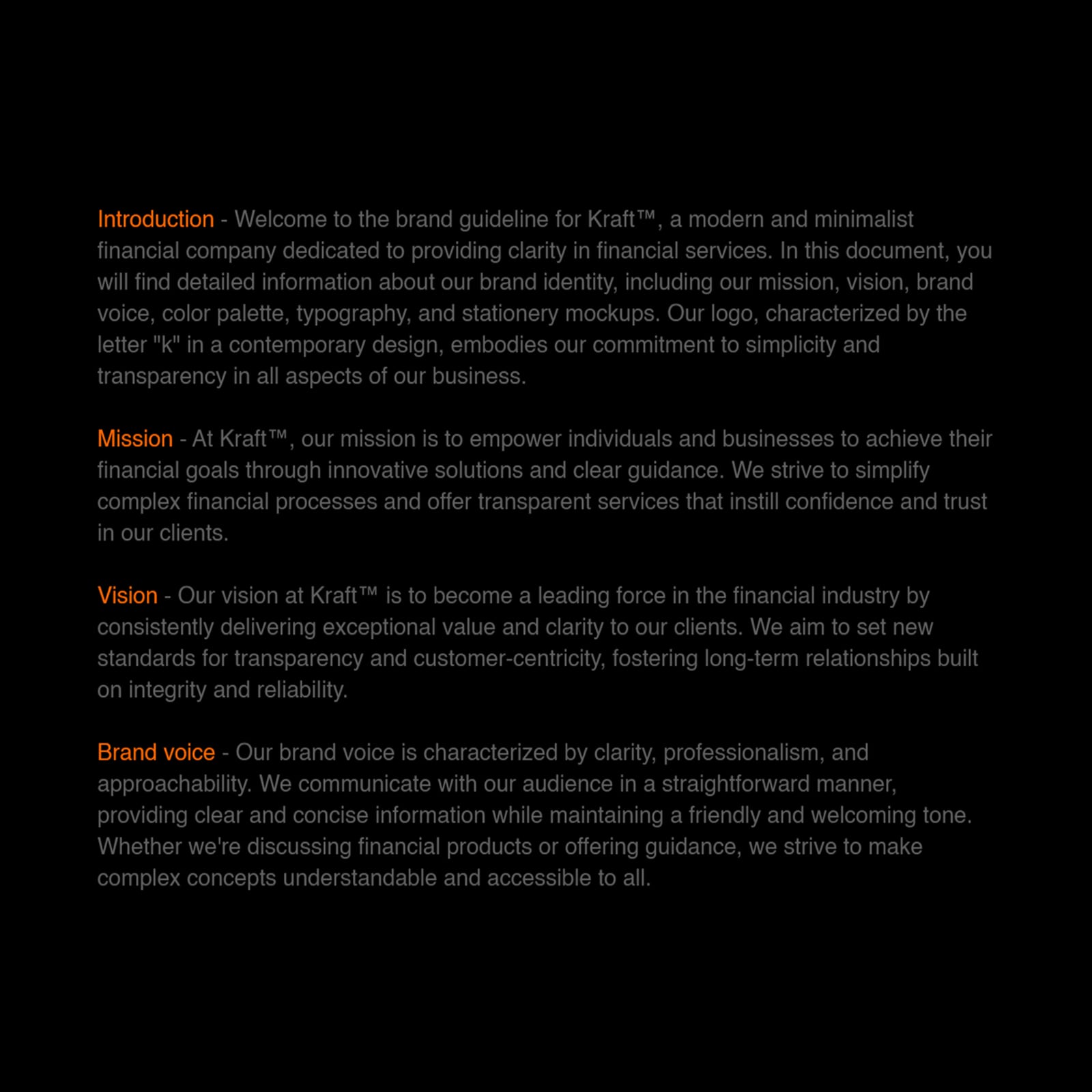
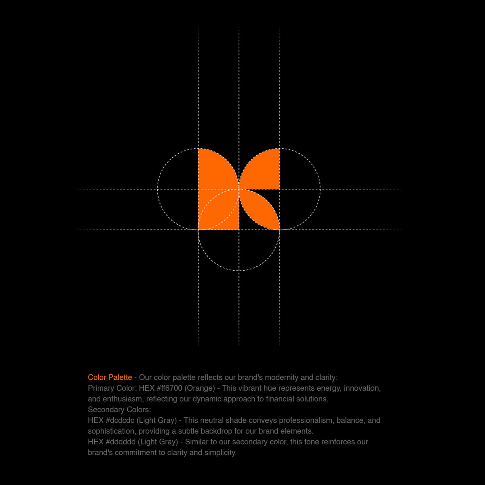
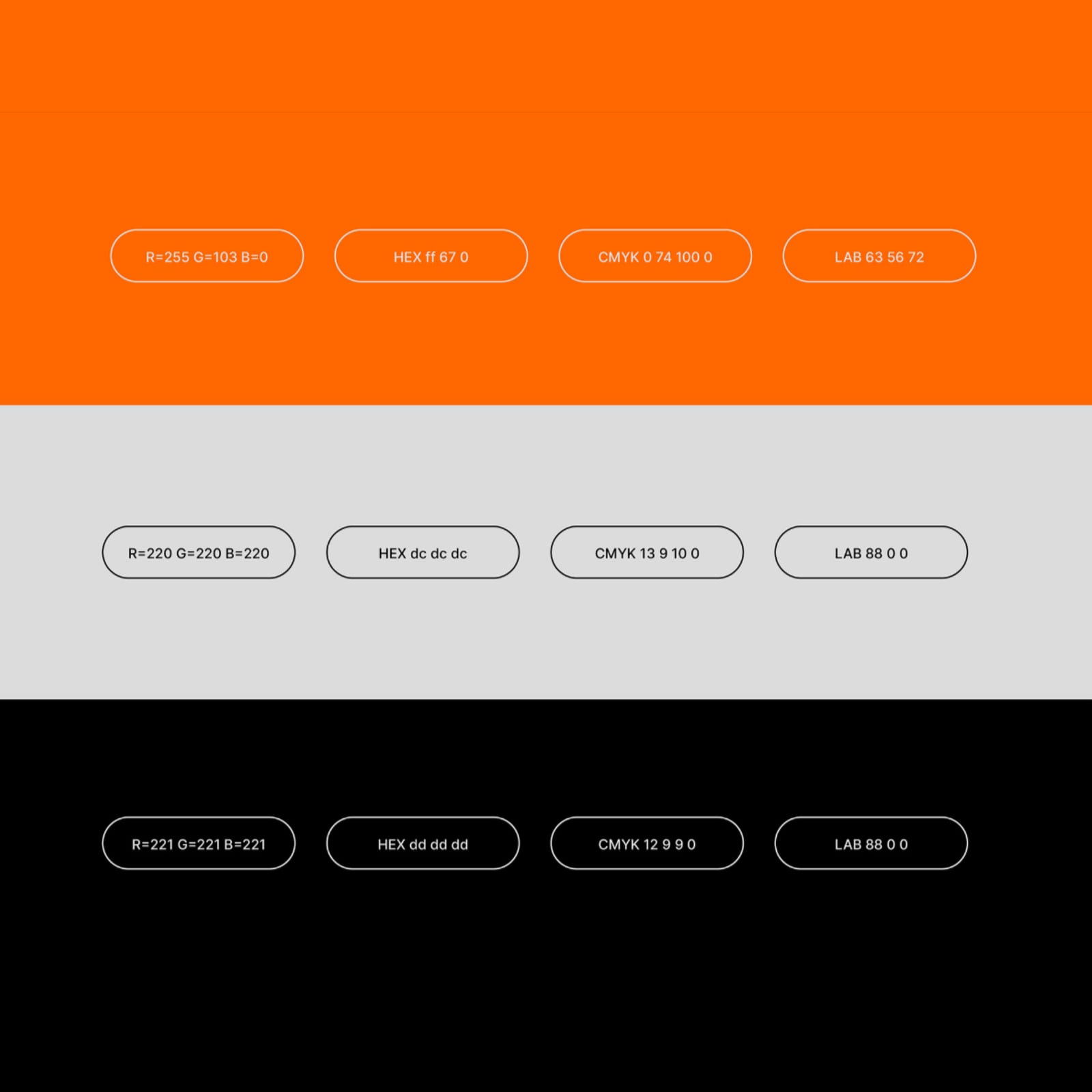
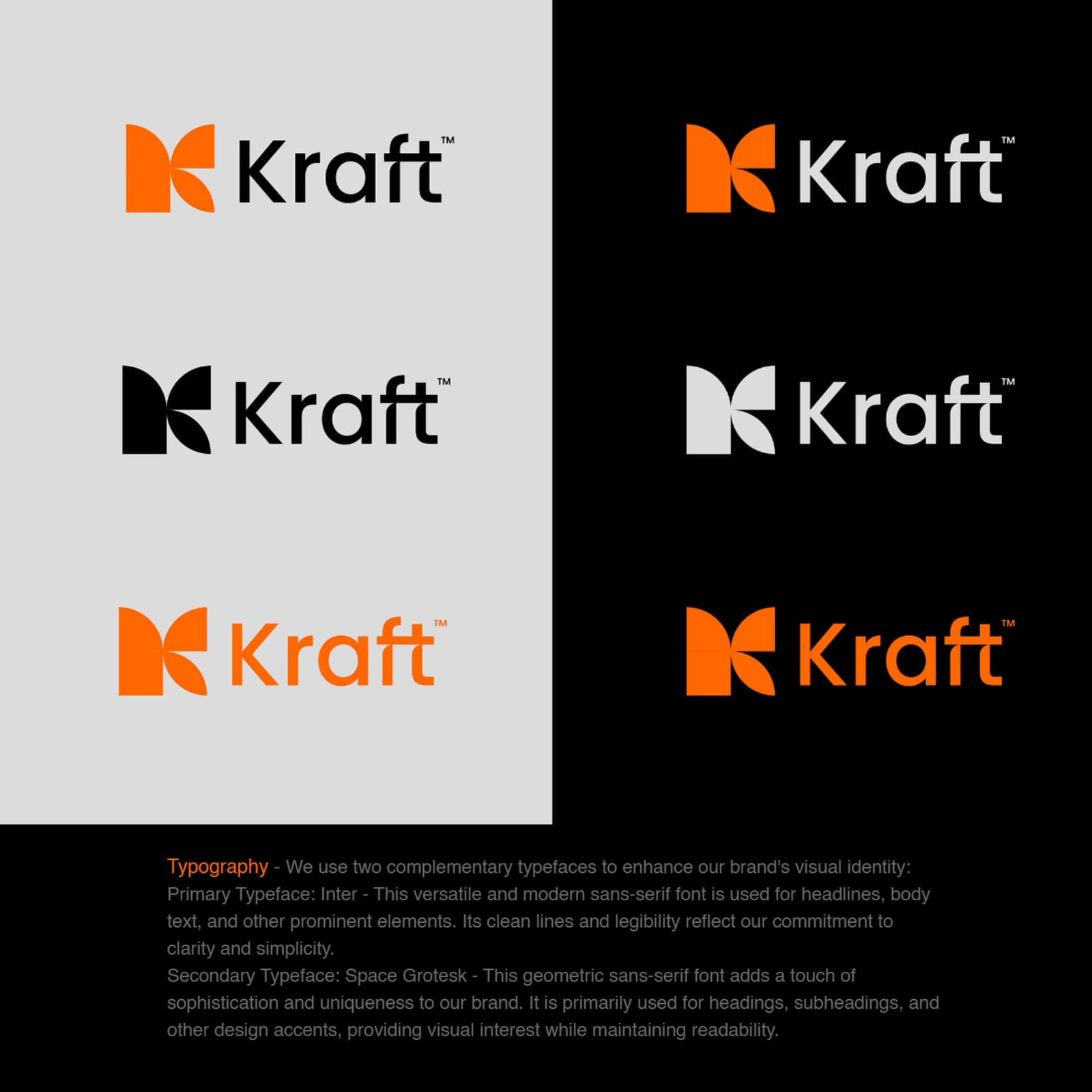
A full identity manual for Kraft — the mark, its permitted variations, the palette and the applications, written so a third party can extend the brand without asking us first.
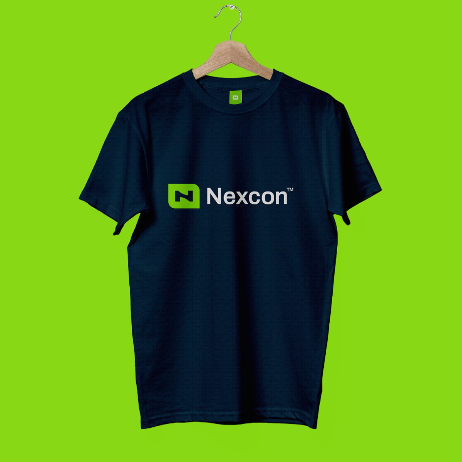
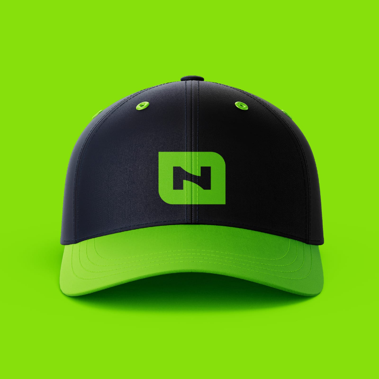
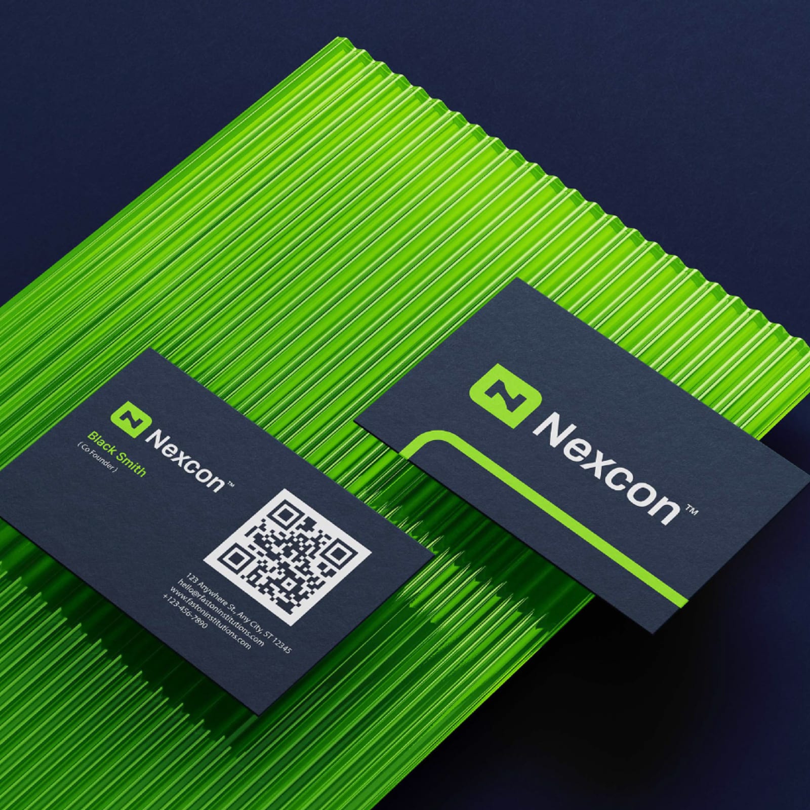
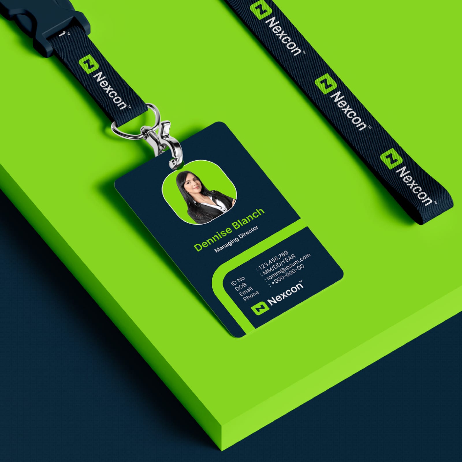
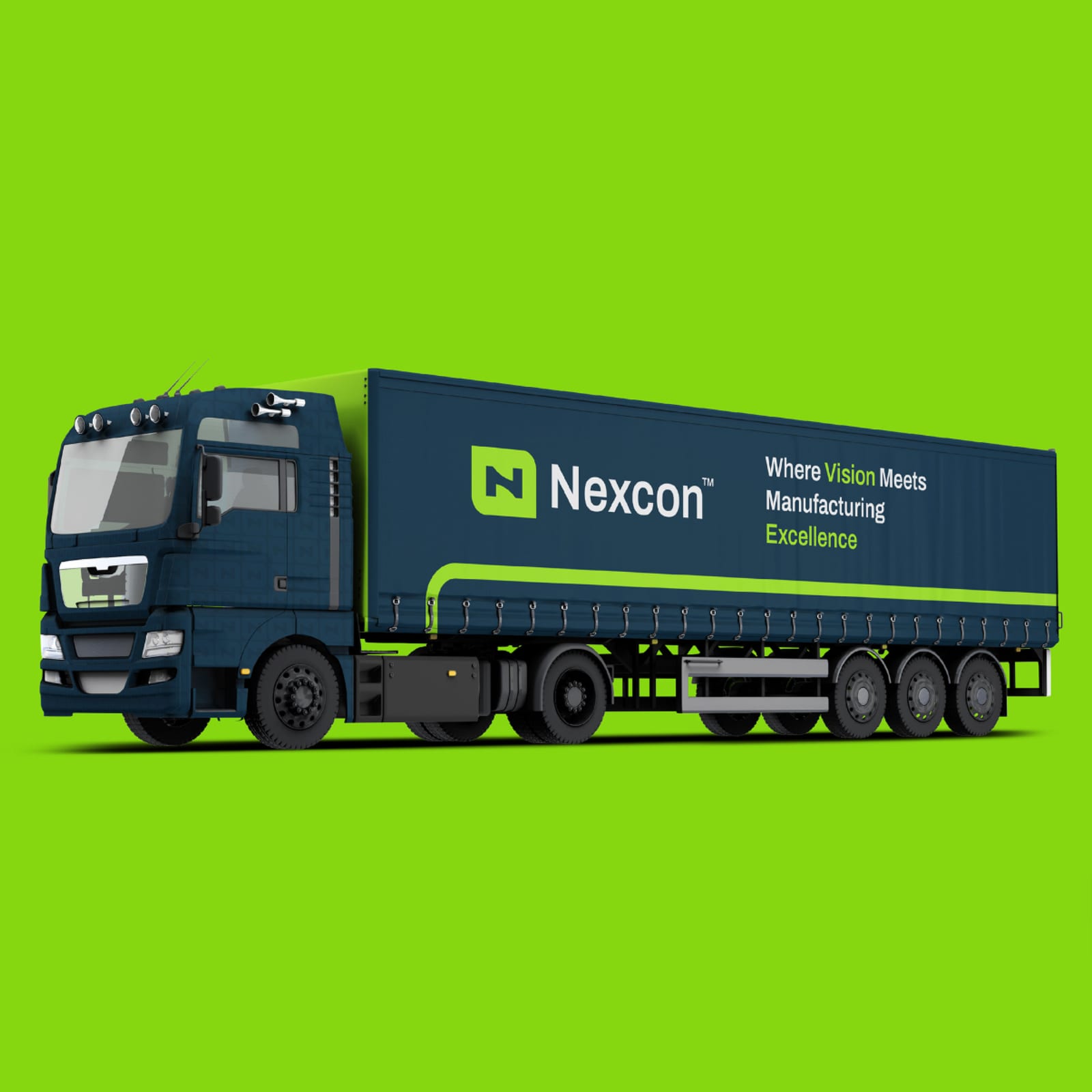
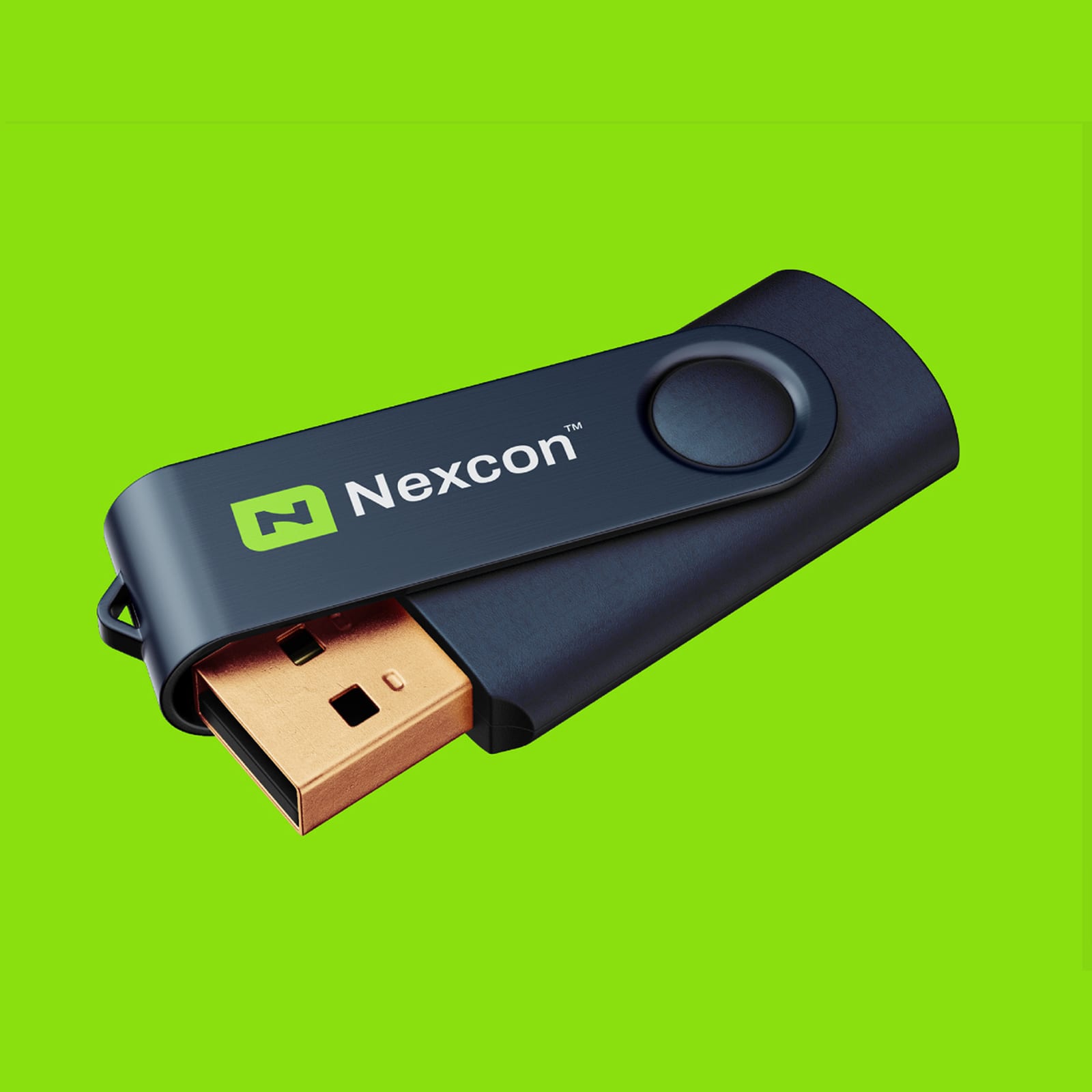
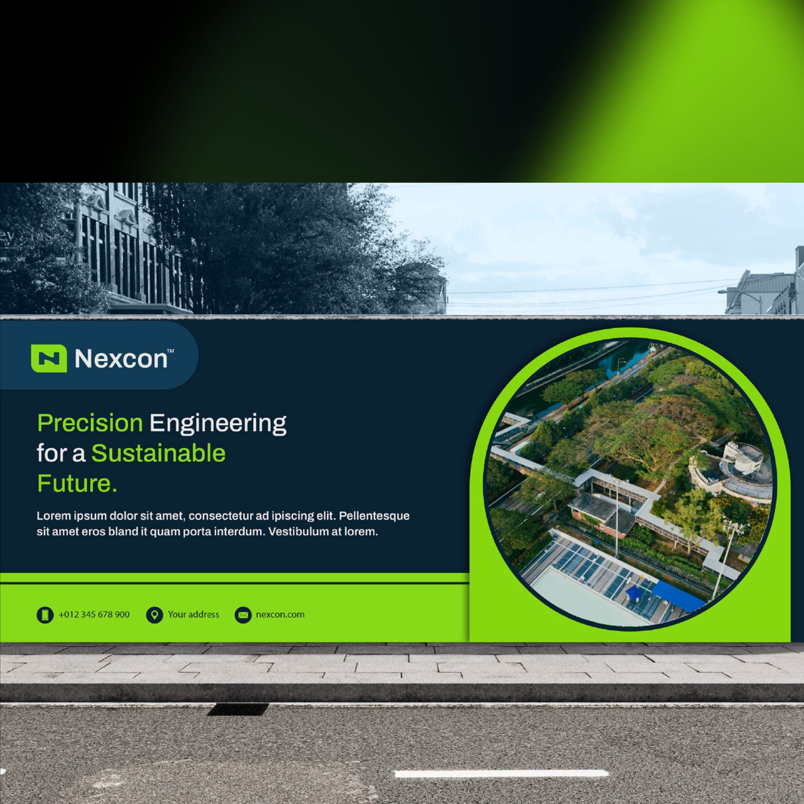
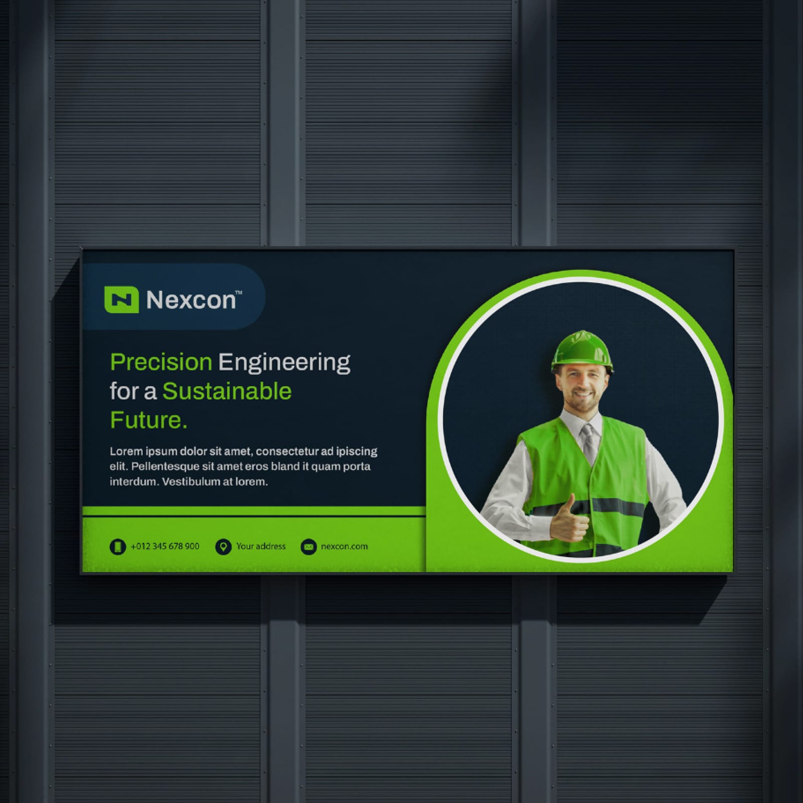
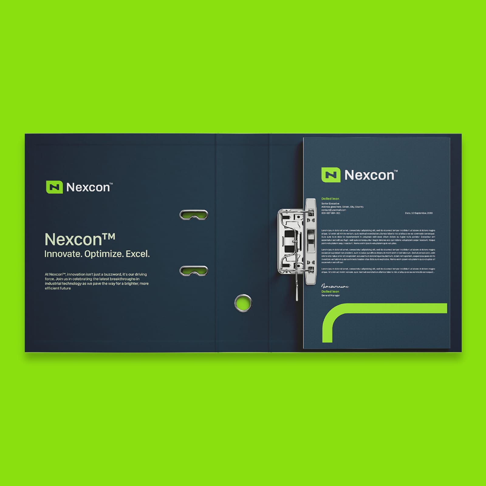
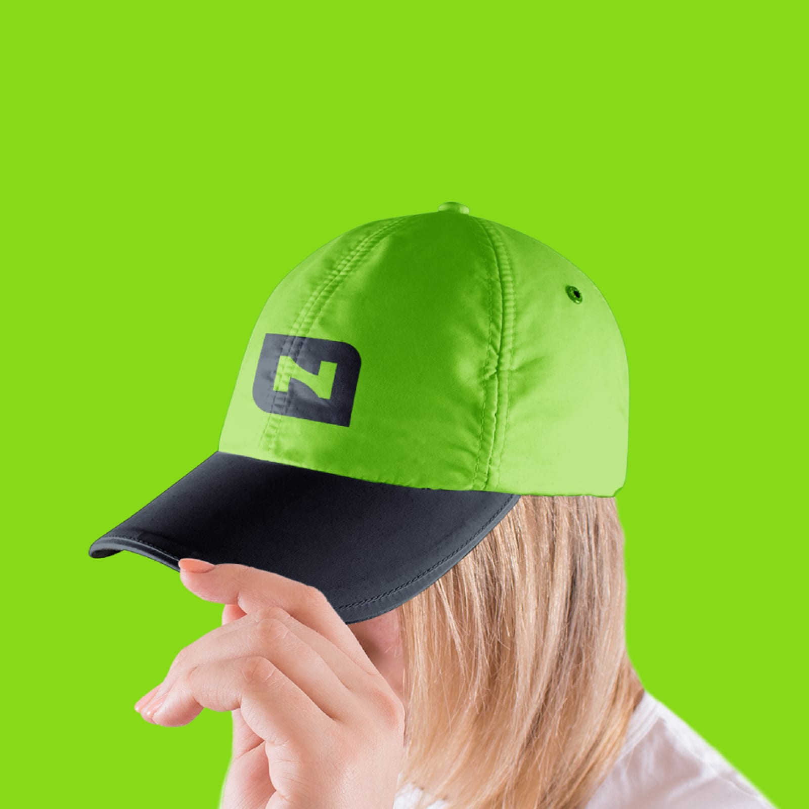
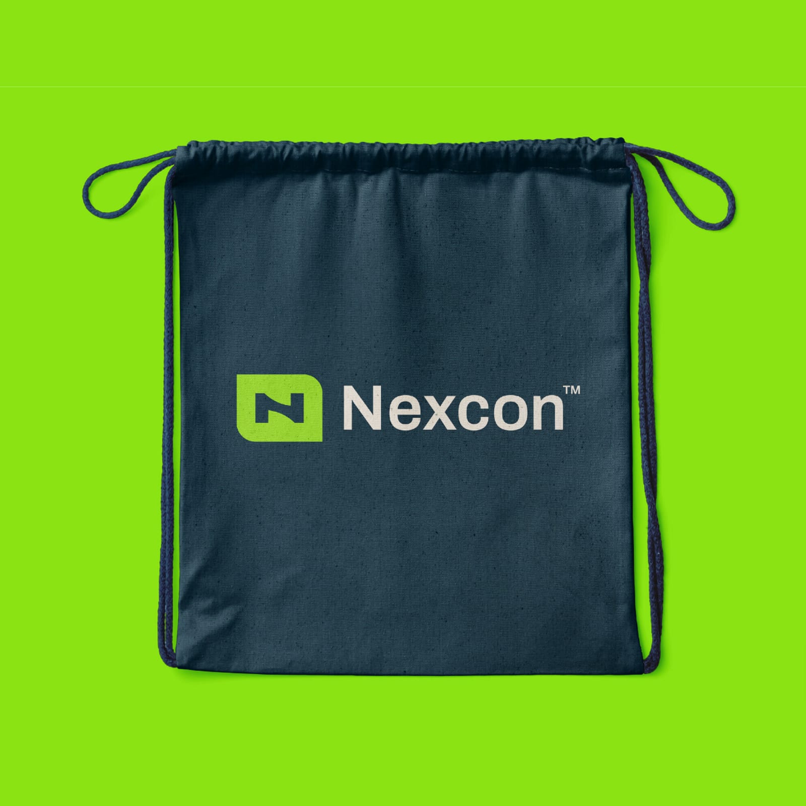
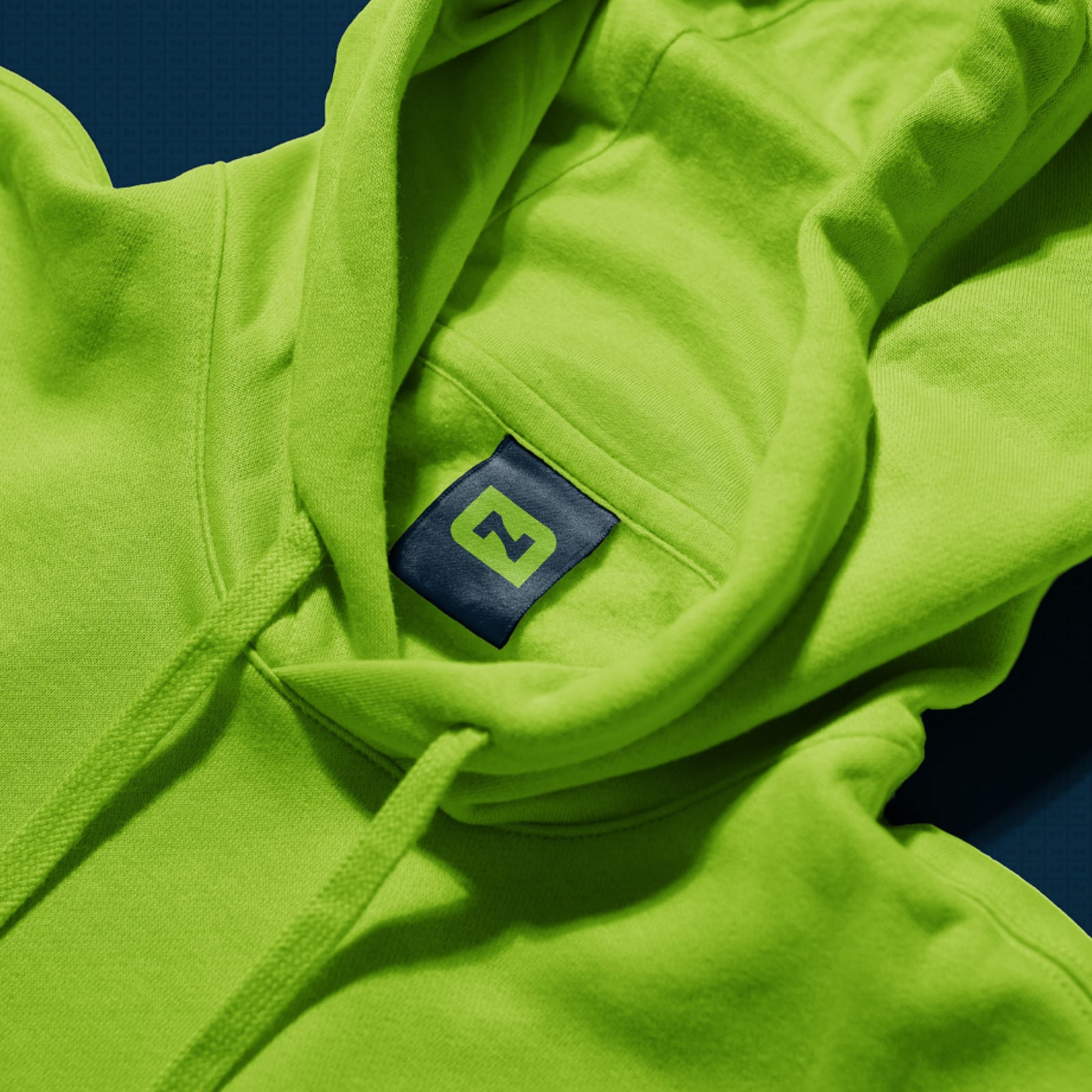
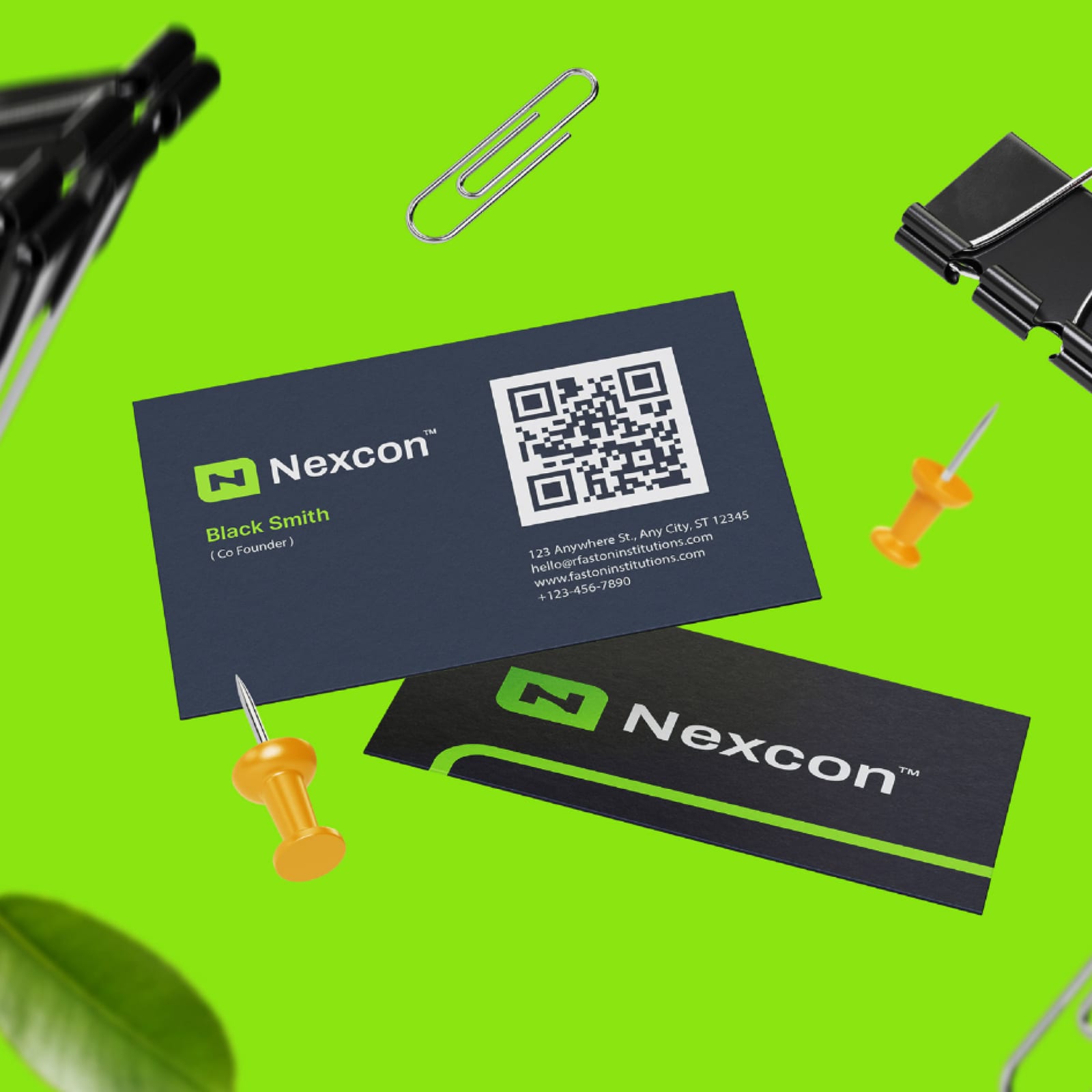
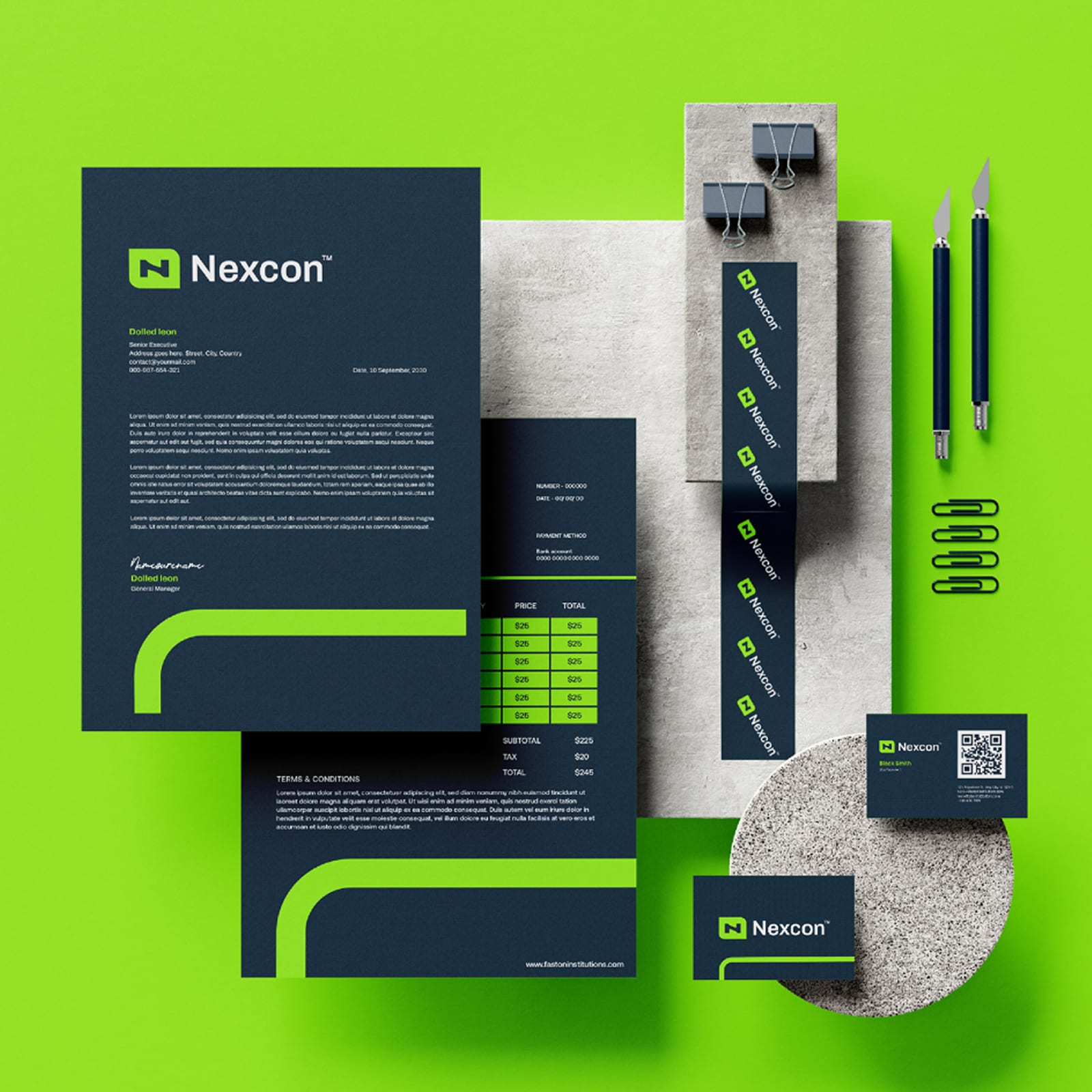
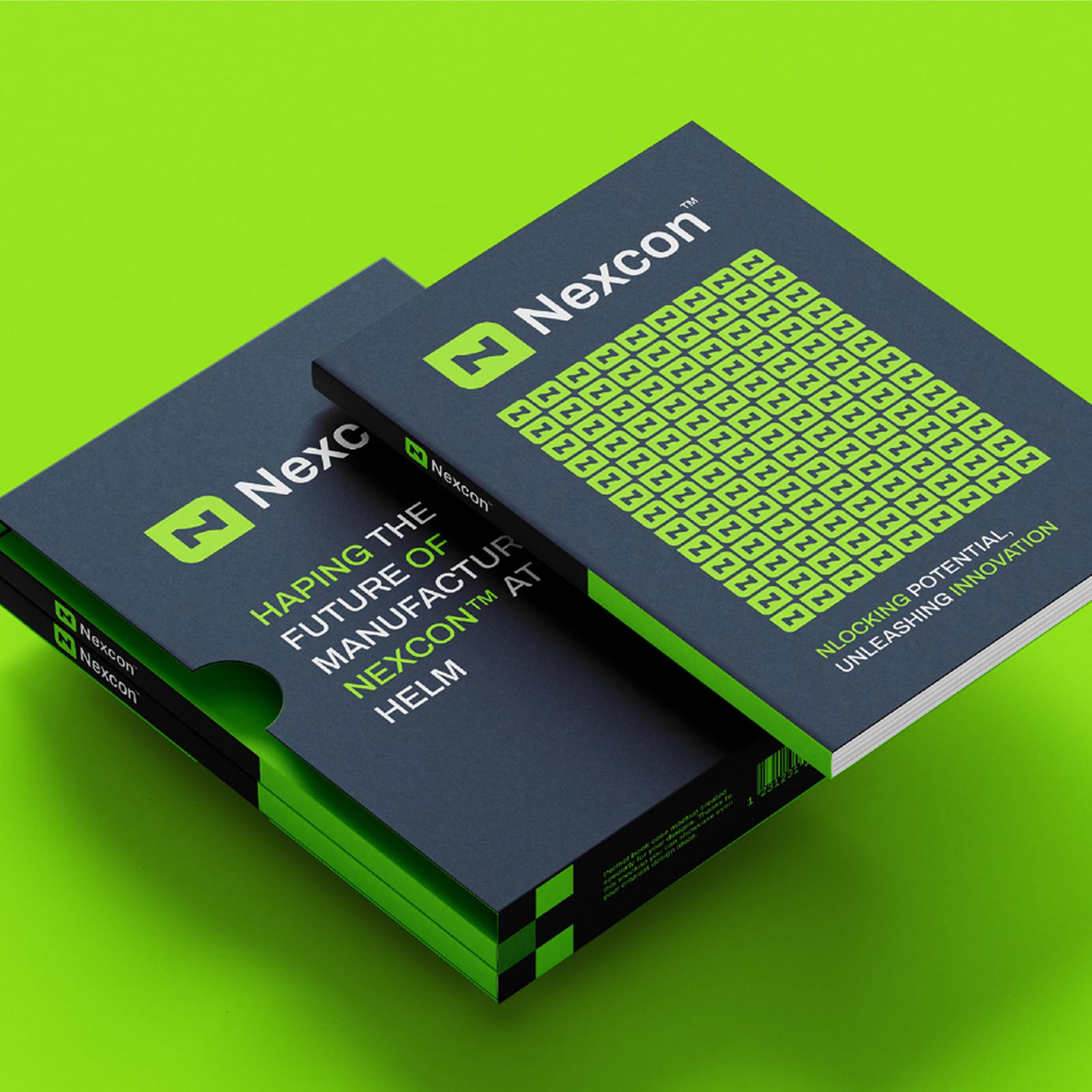
Nexcon 2021–2025
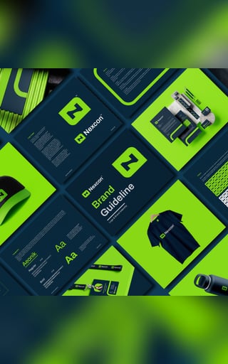
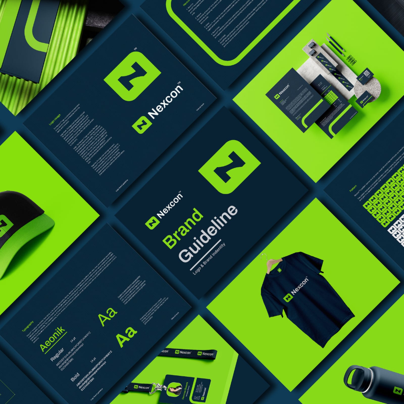
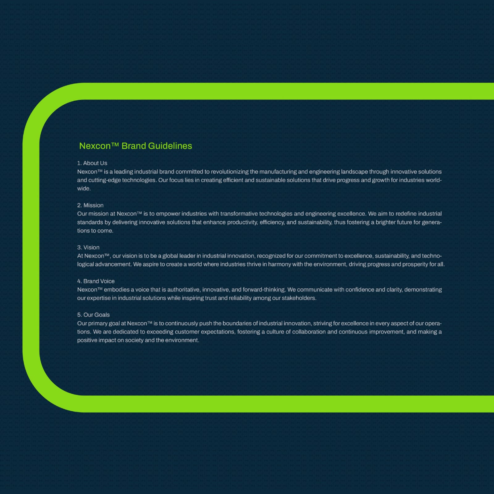
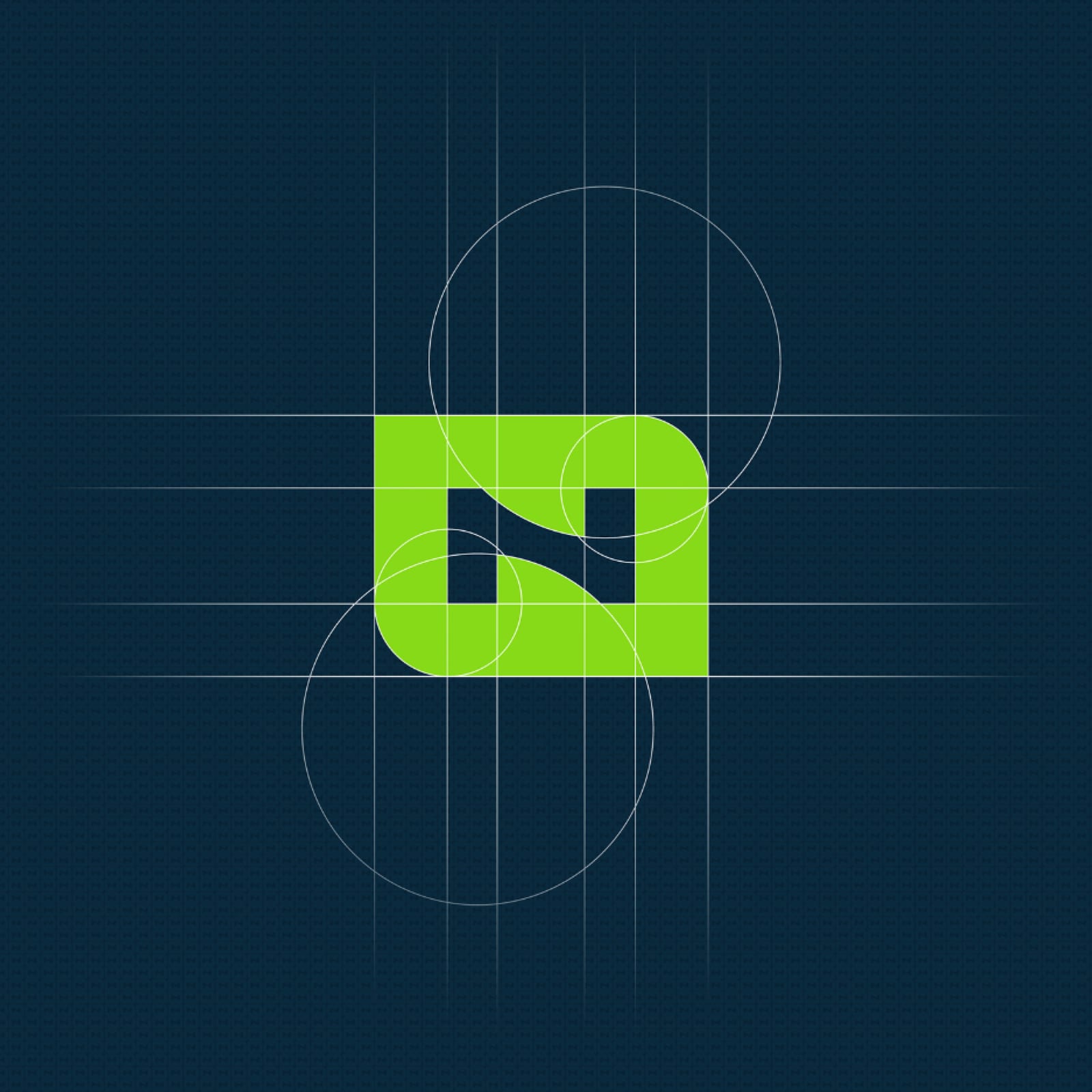
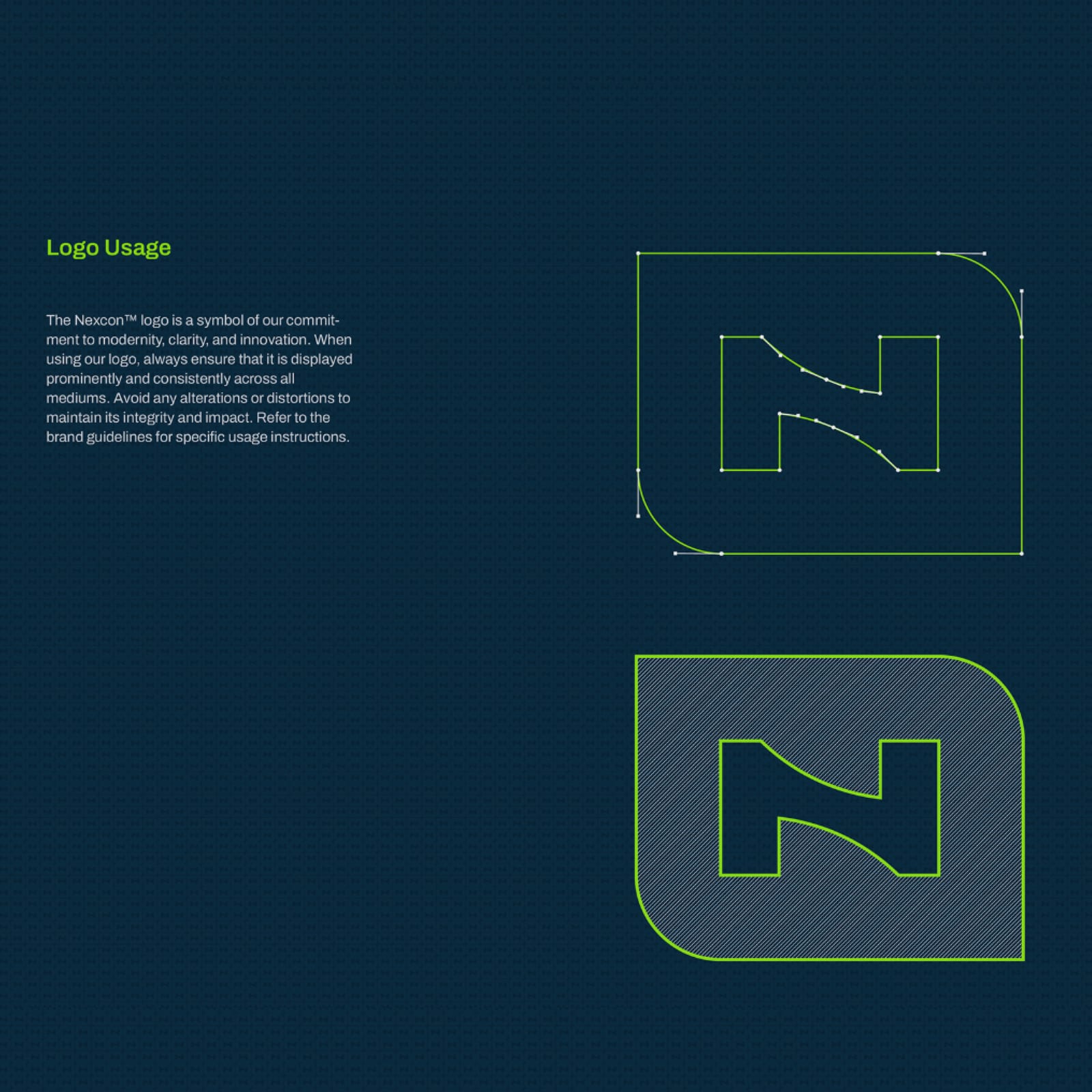
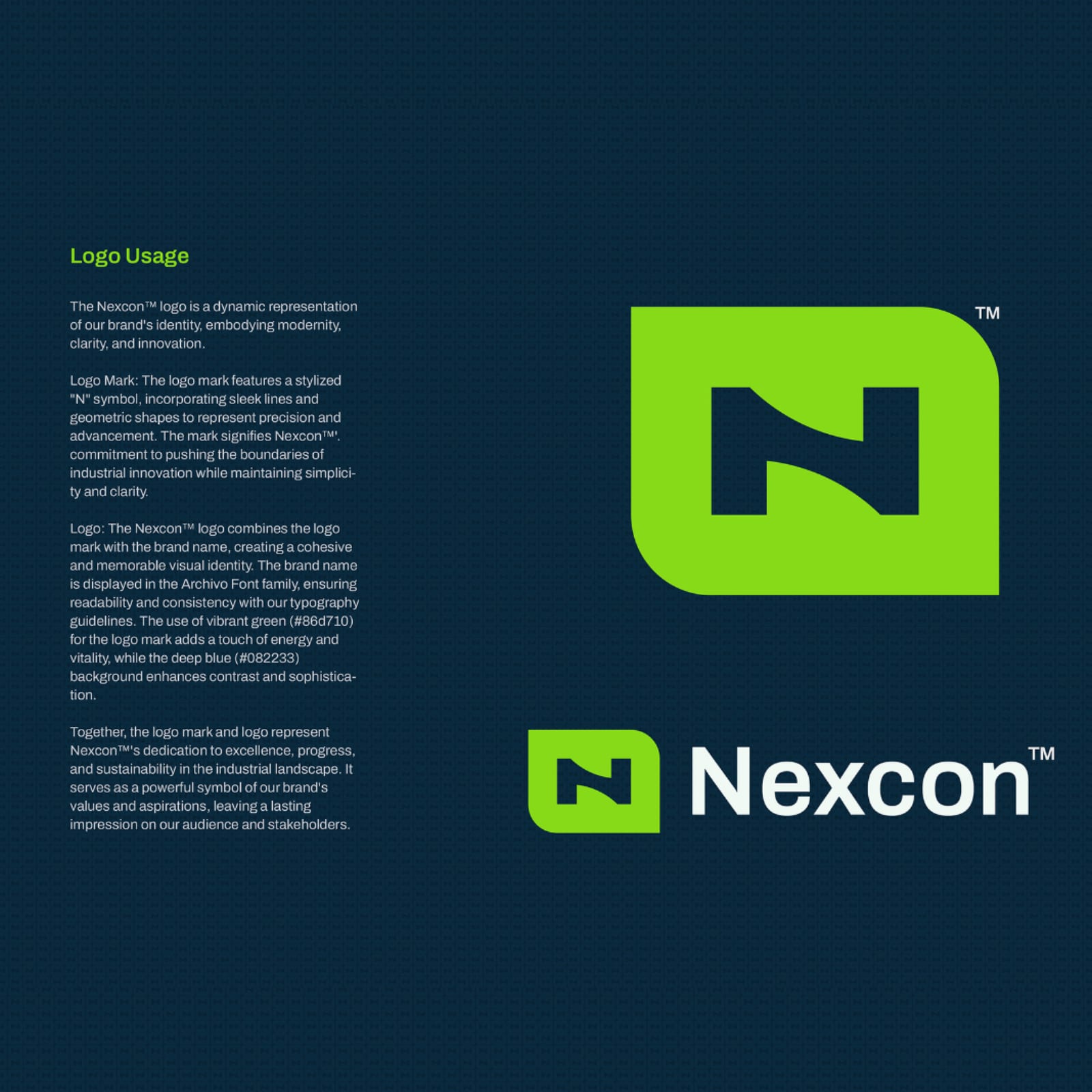
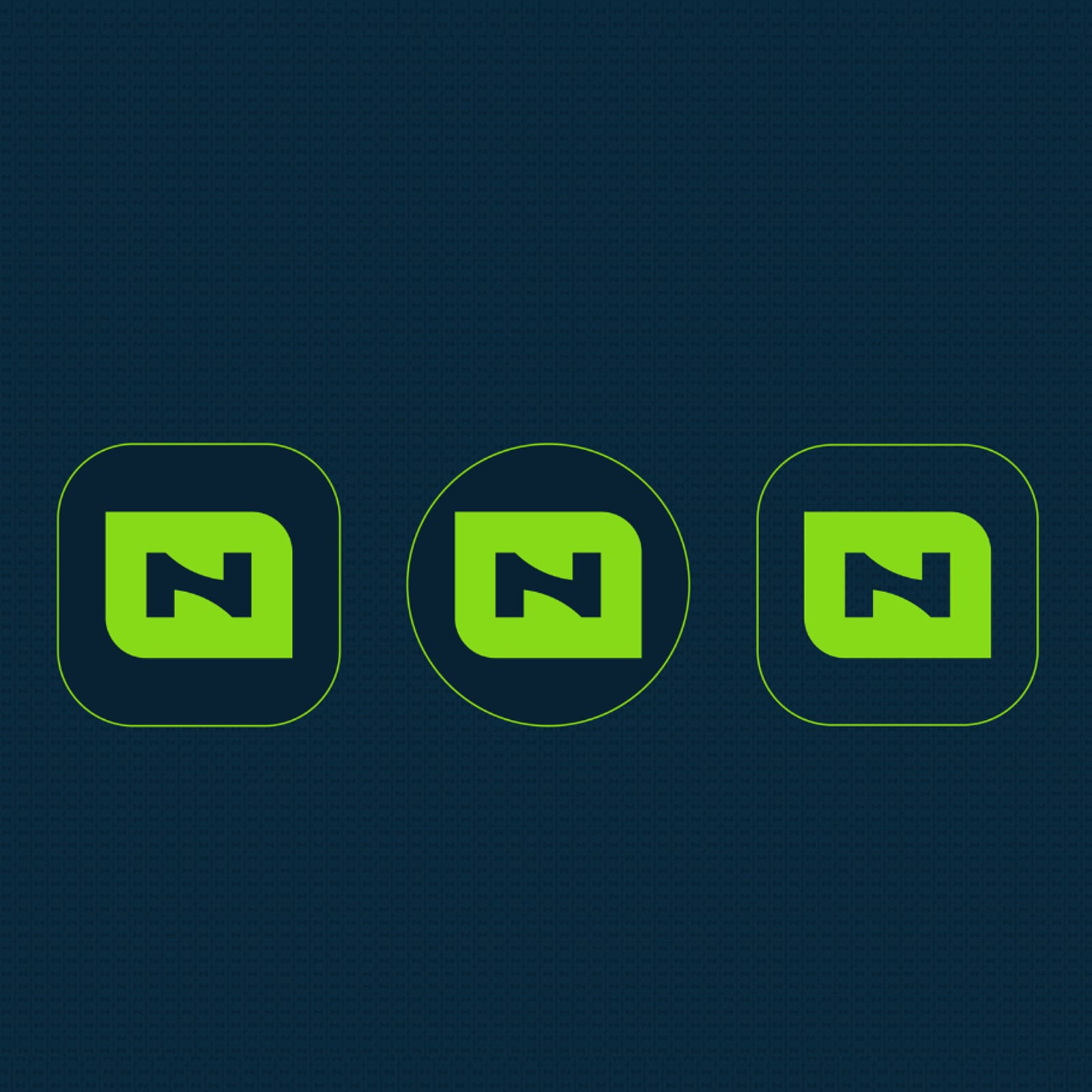
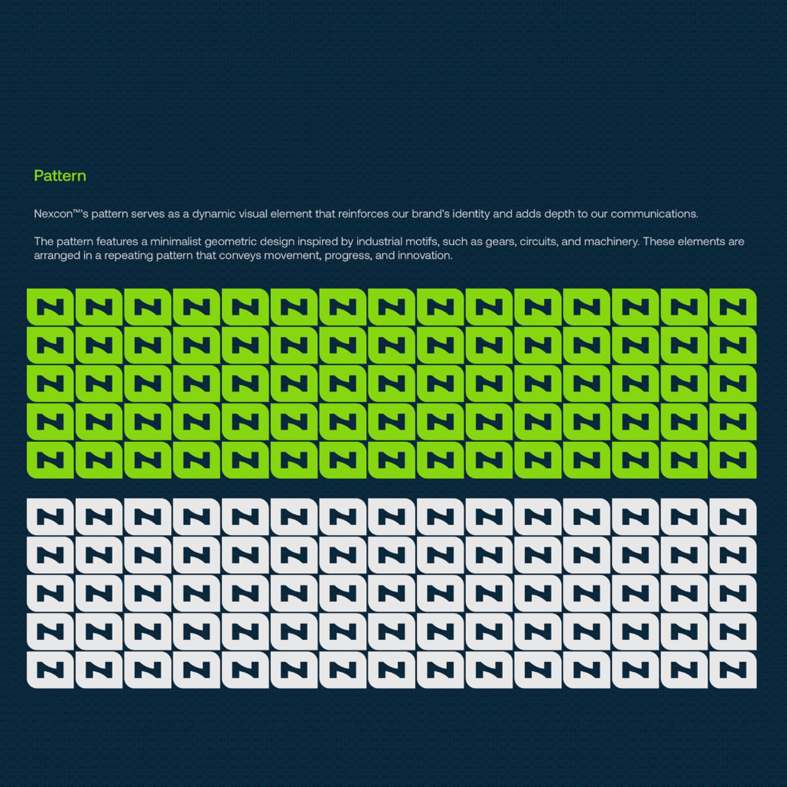
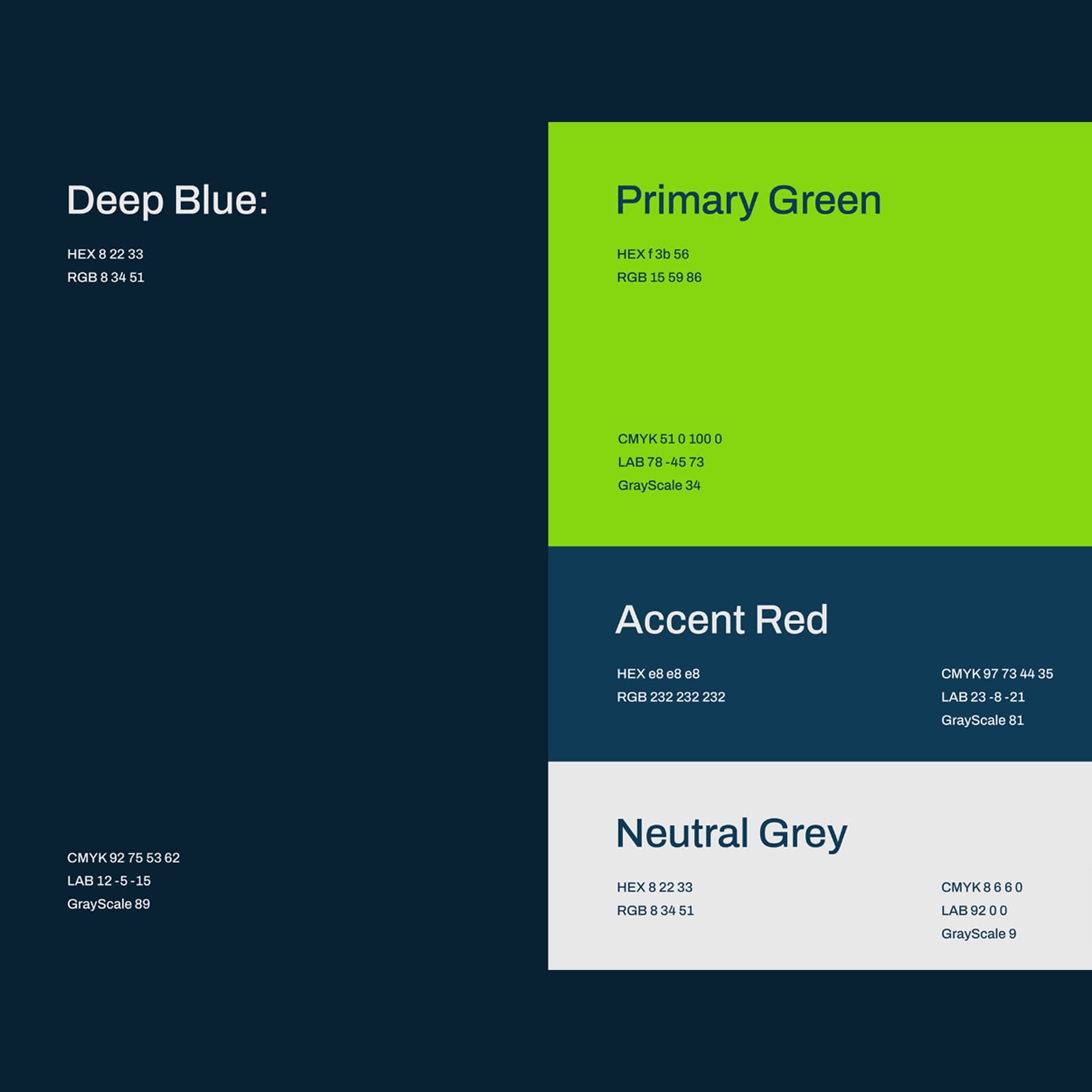
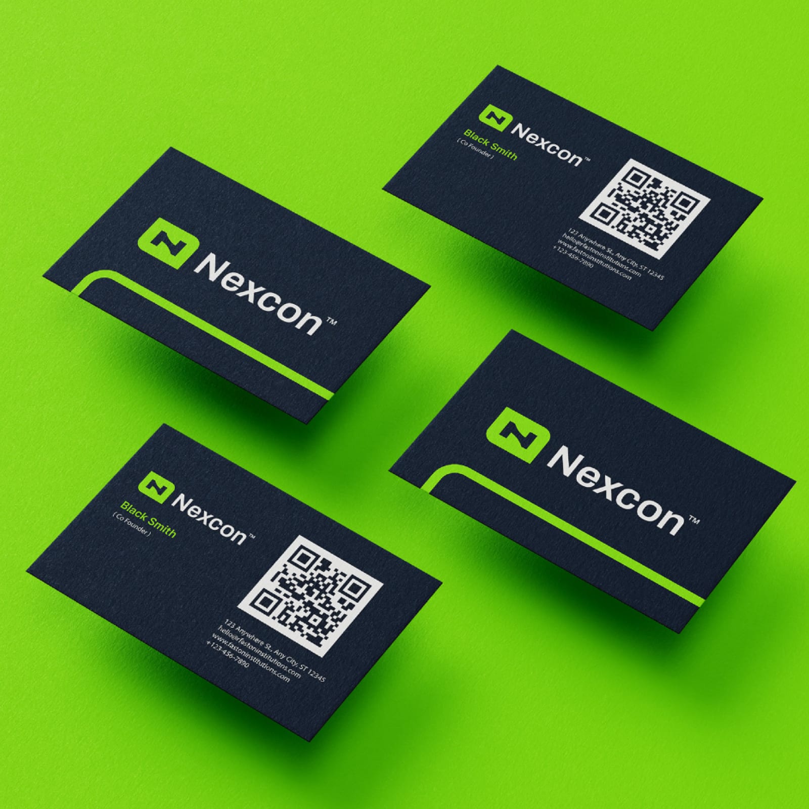
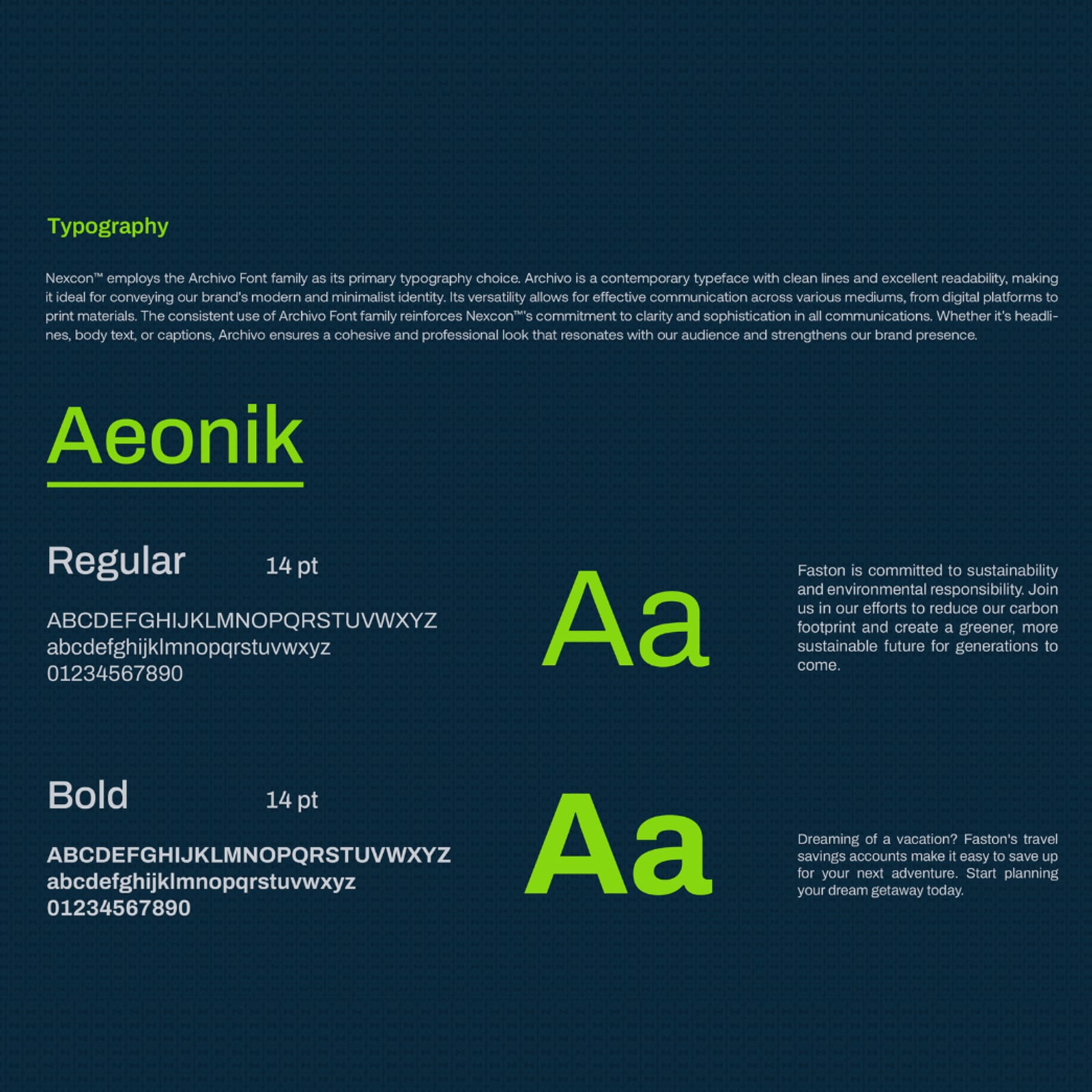
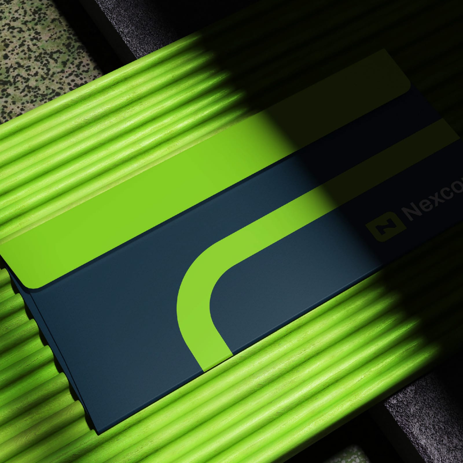
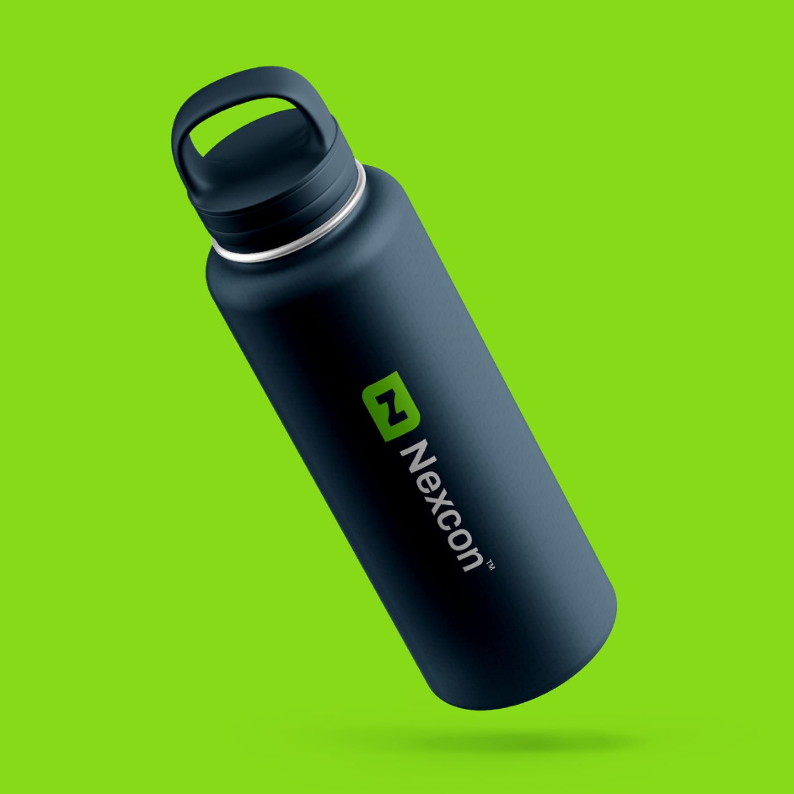
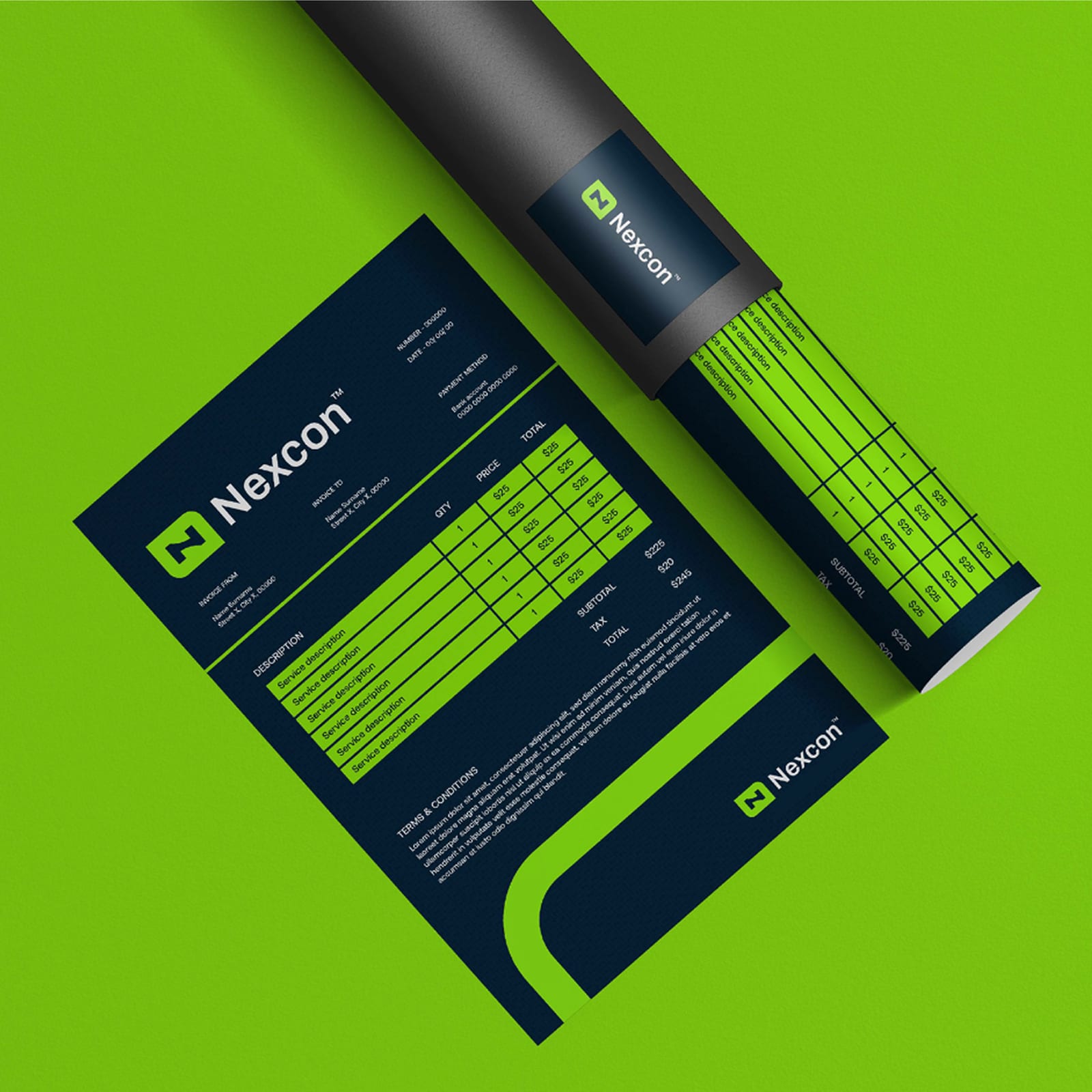
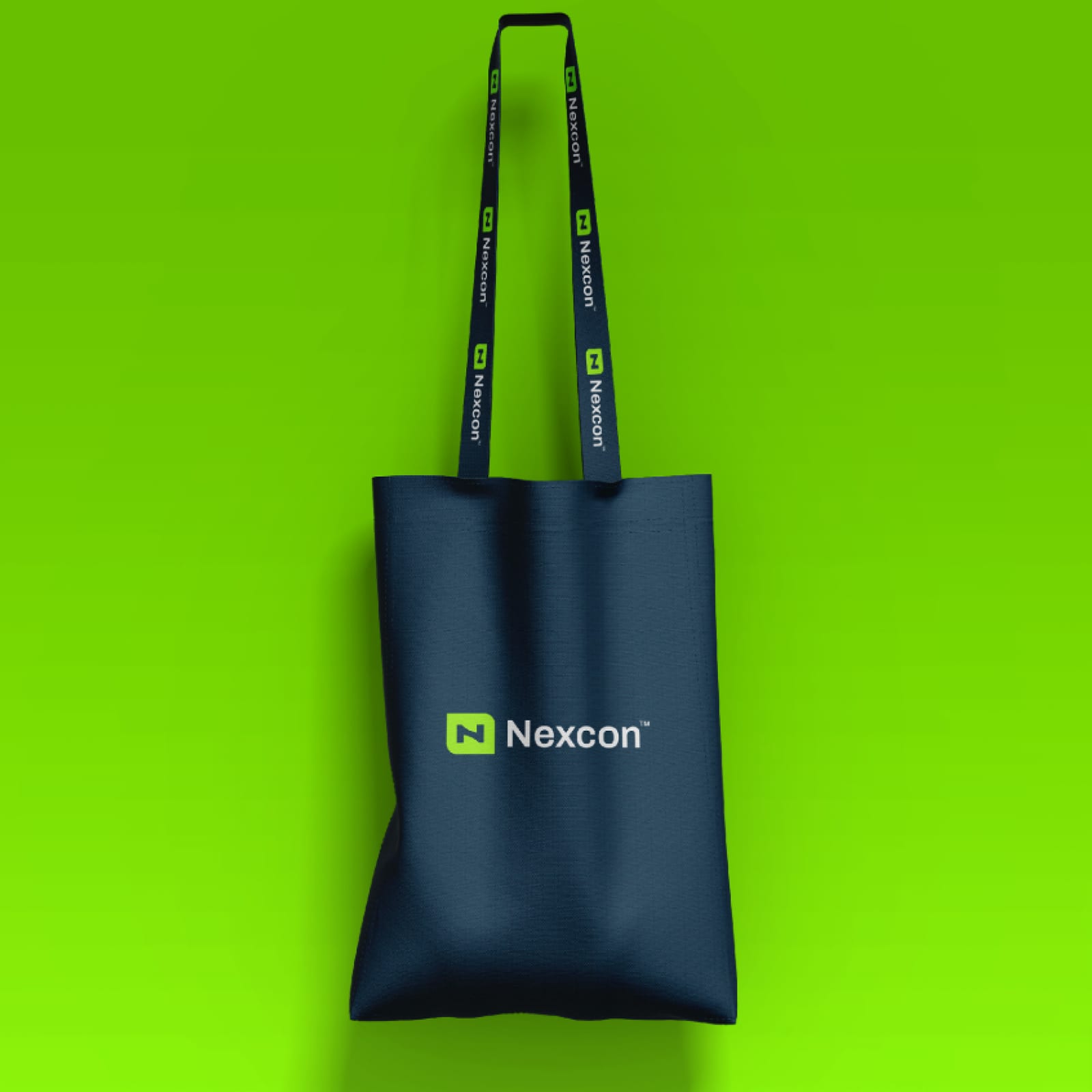
Nexcon's identity set down in full: construction geometry, misuse cases, colour breakdowns and the typographic hierarchy the brand runs on.
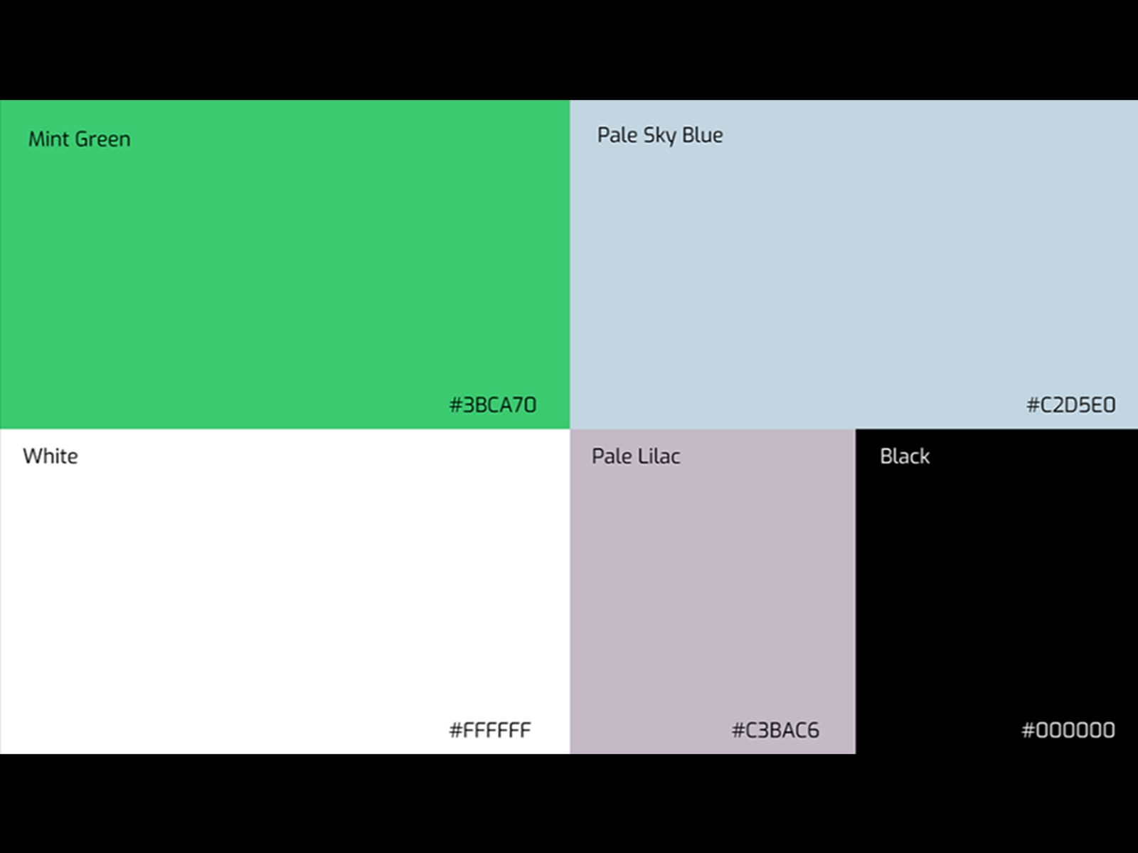
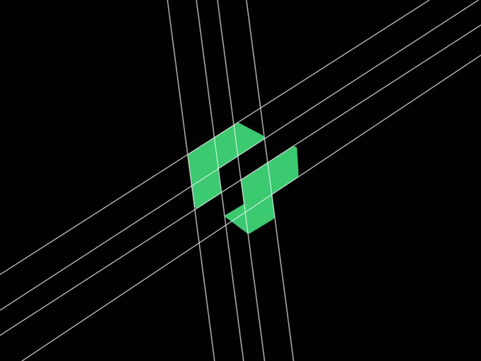
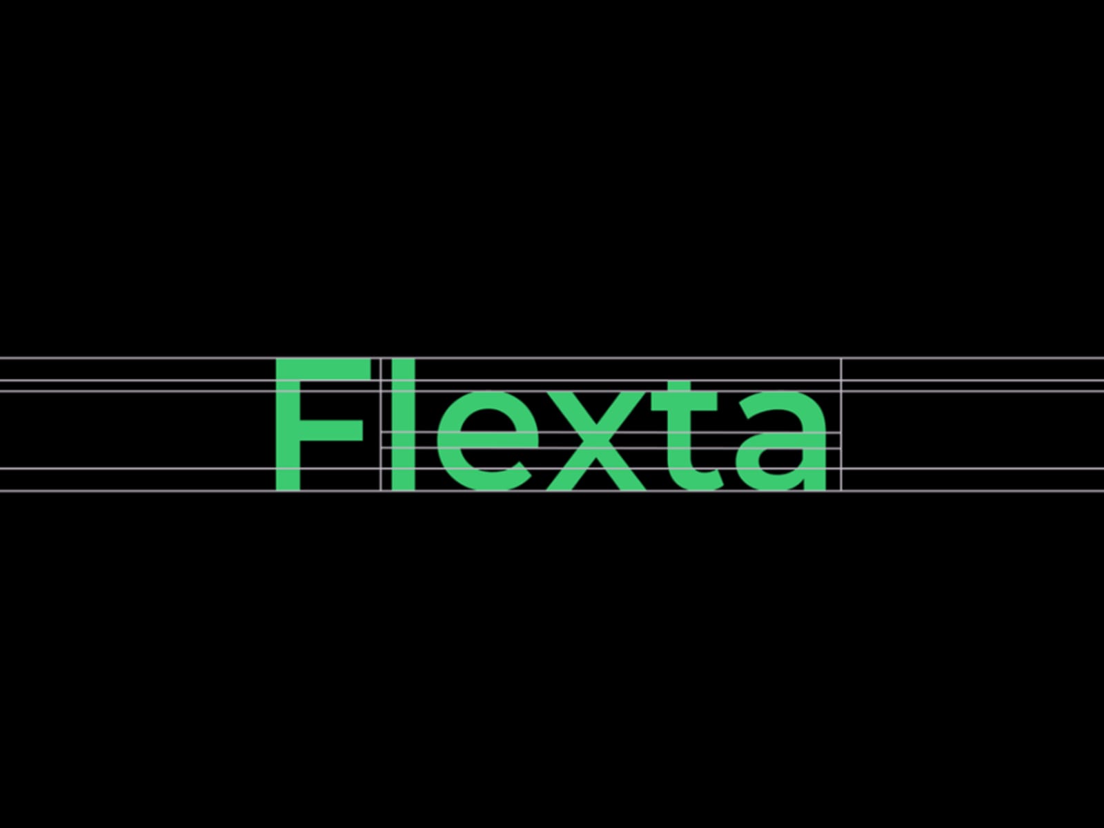
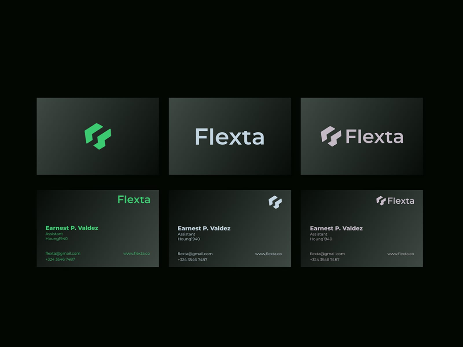
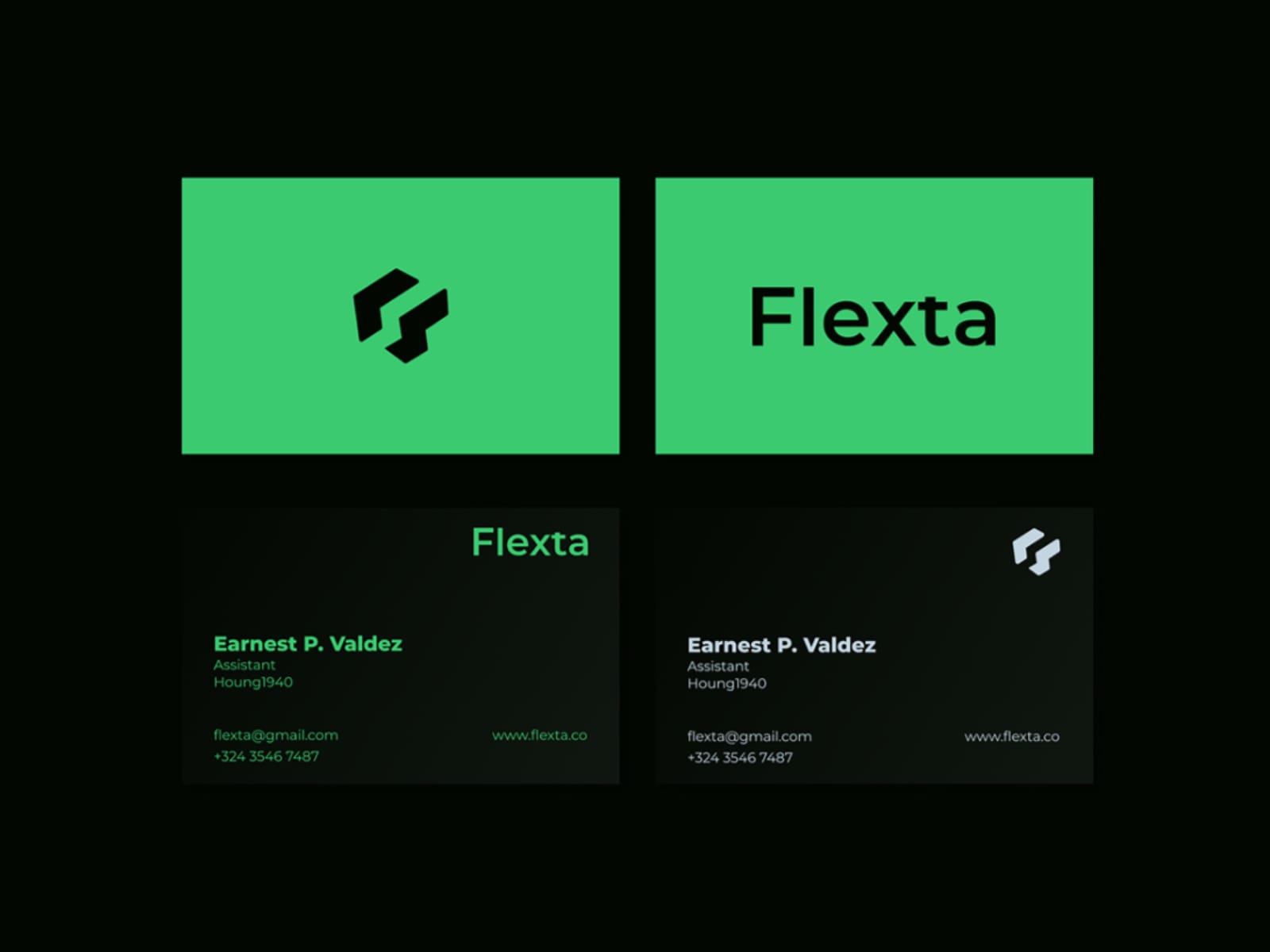
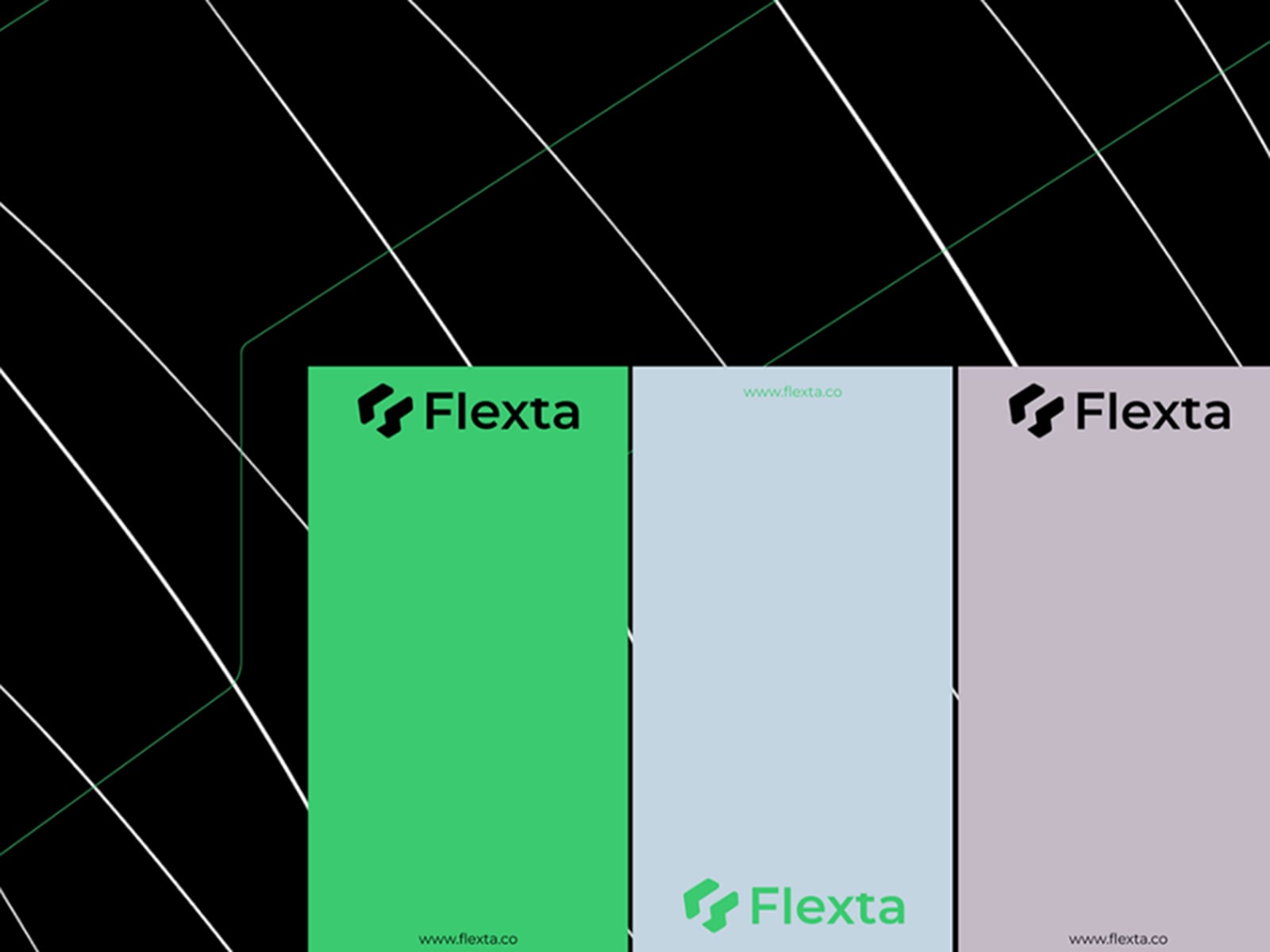
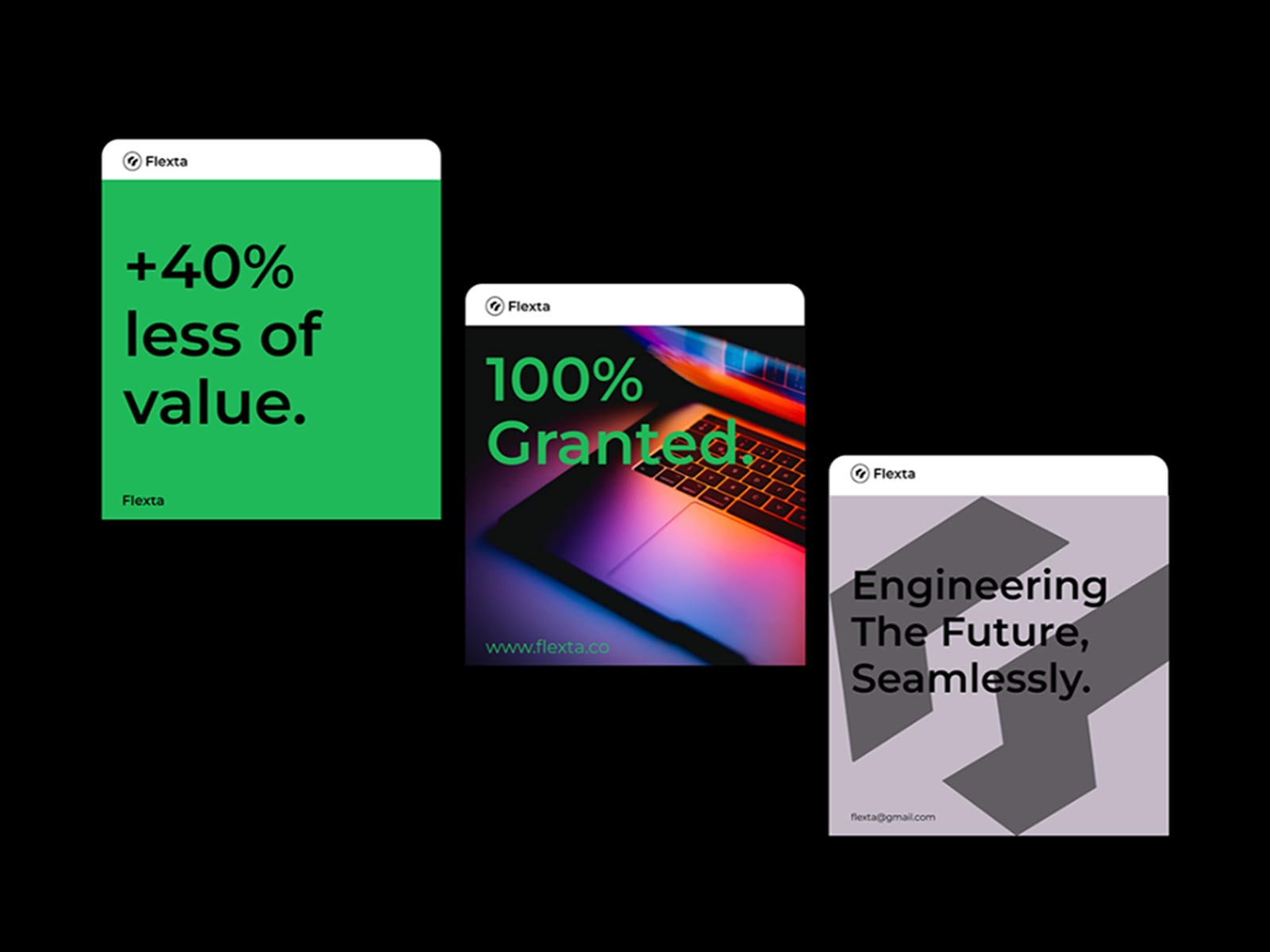
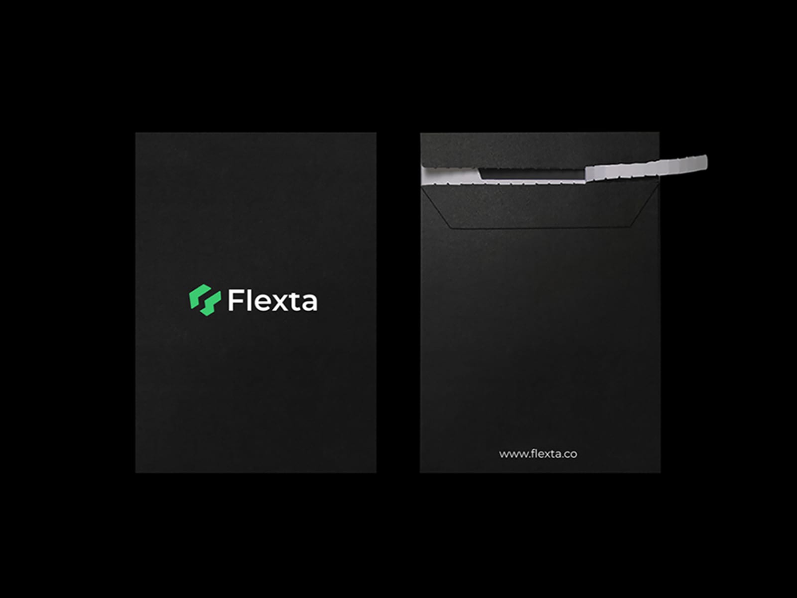
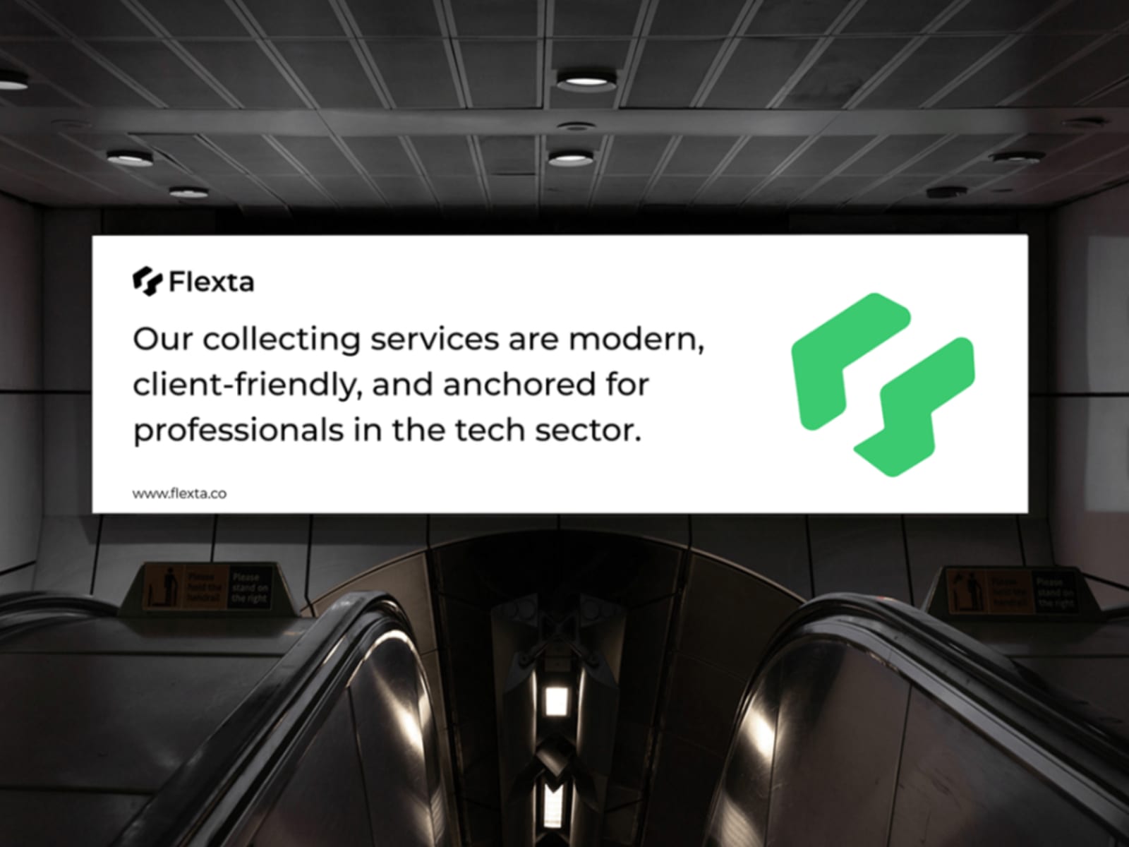
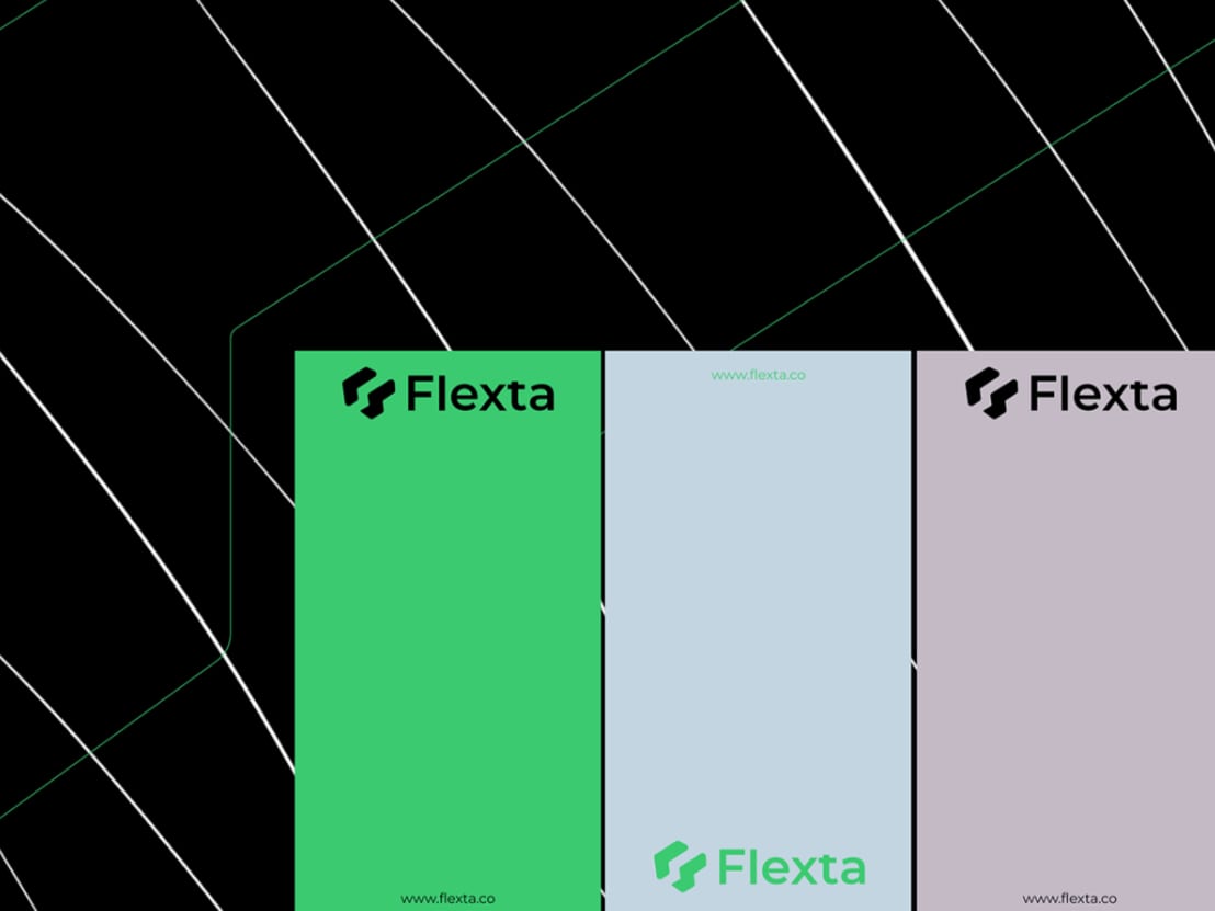
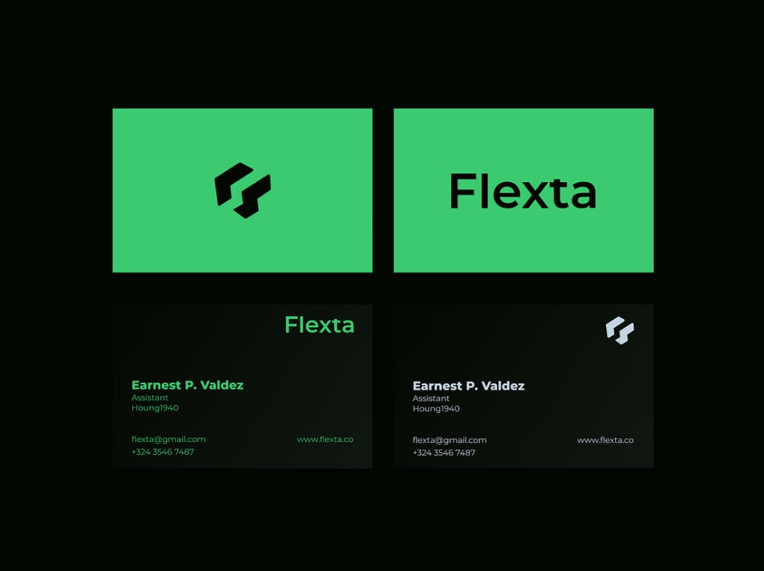
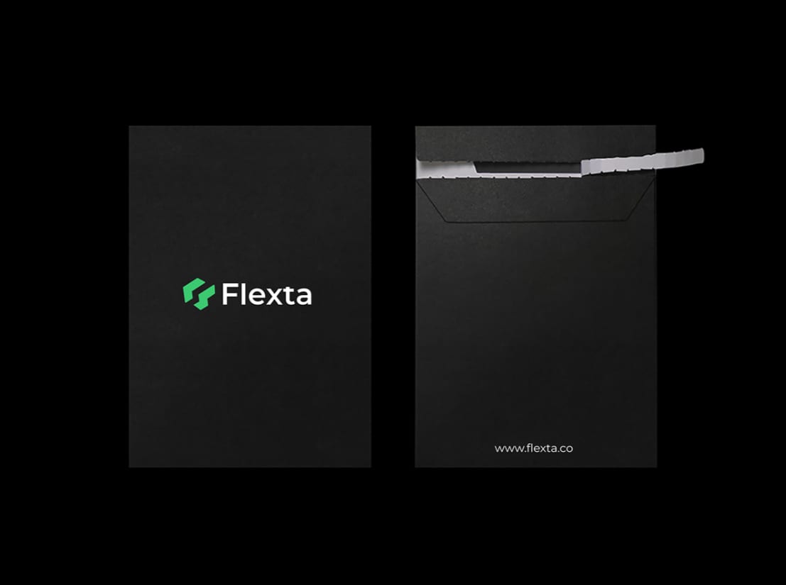
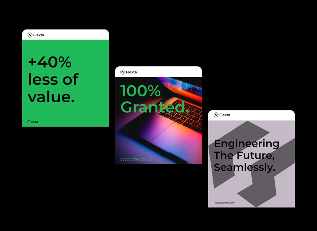
Flexta 2021–2025
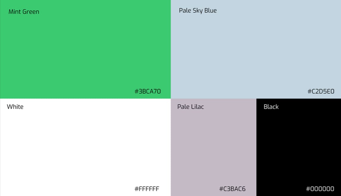
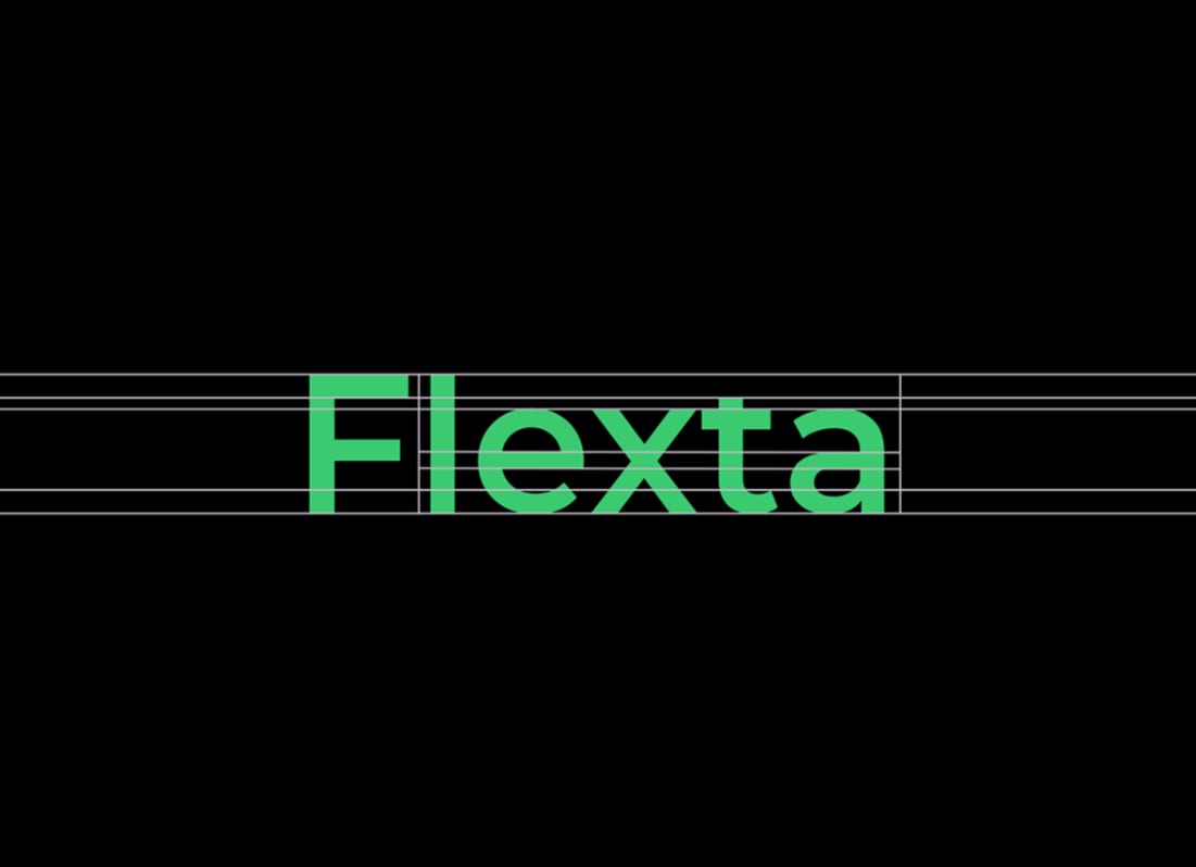
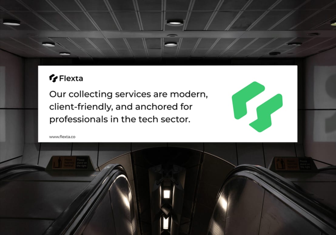
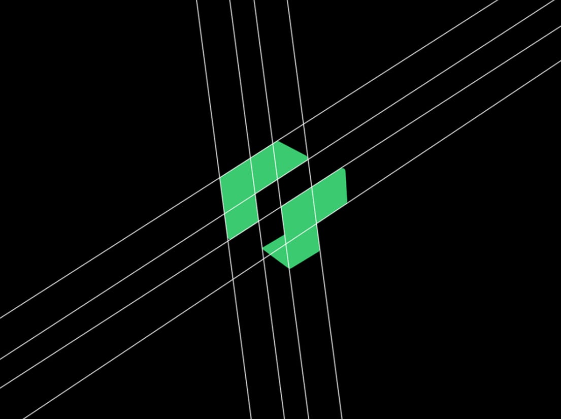
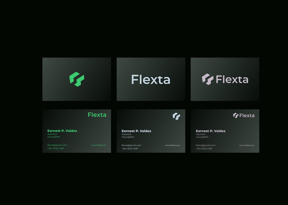
A complete identity for Flexta, from the constructed mark through to the collateral that carries it. The wordmark is drawn on the same geometry as the symbol, so the lockup holds together at any size.
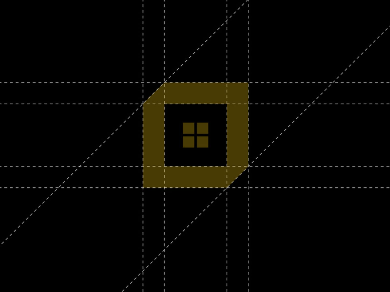
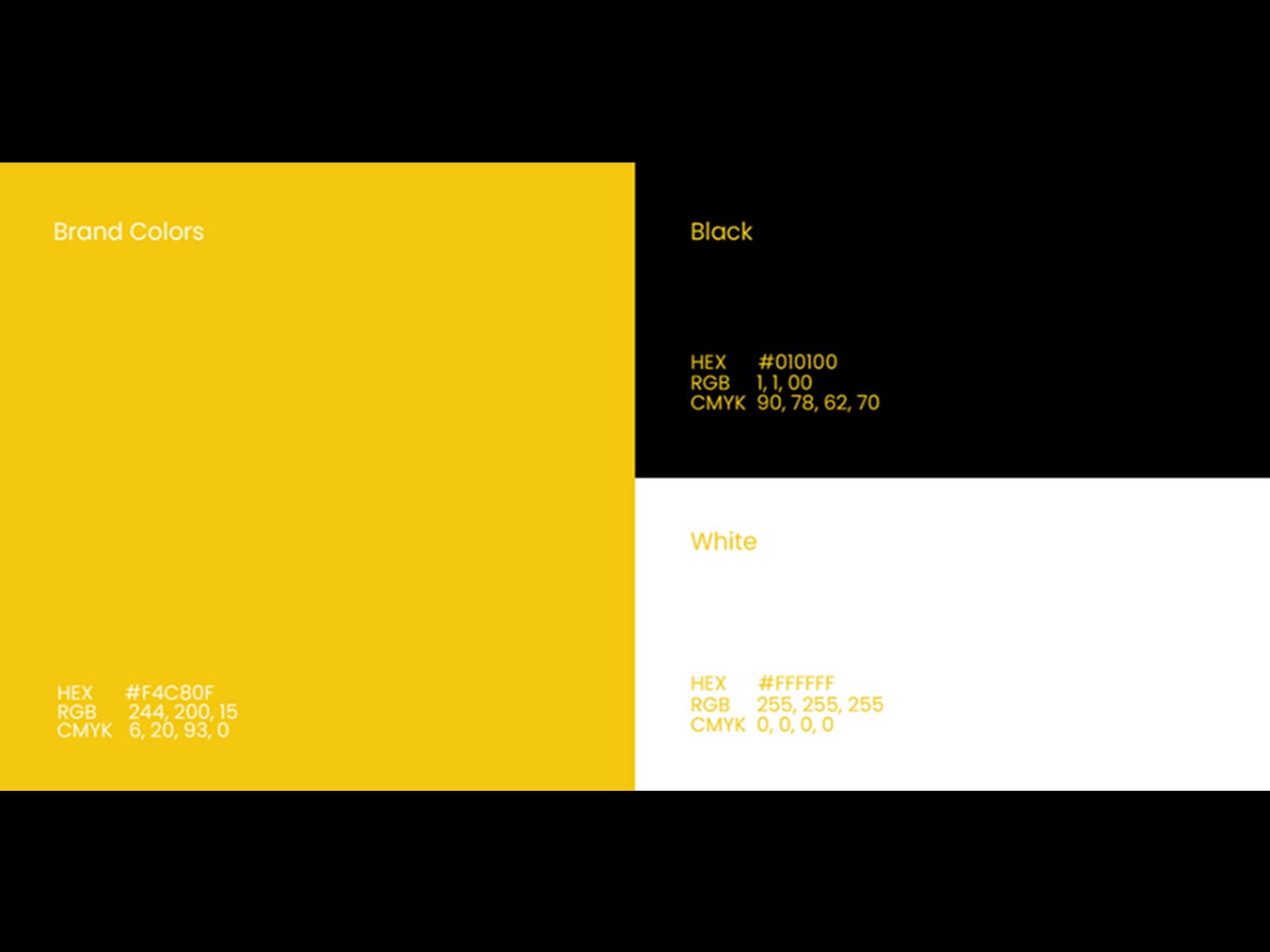
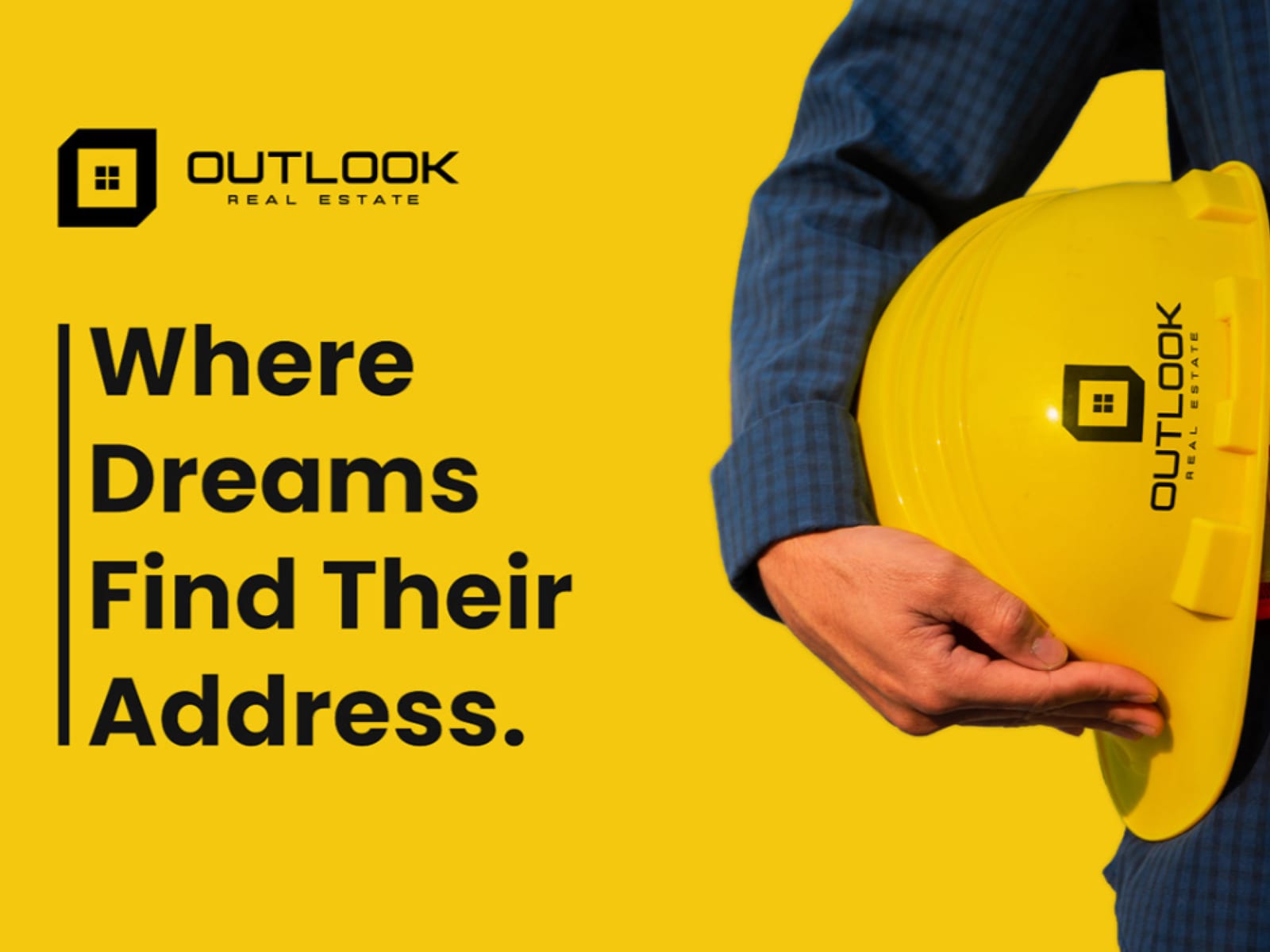
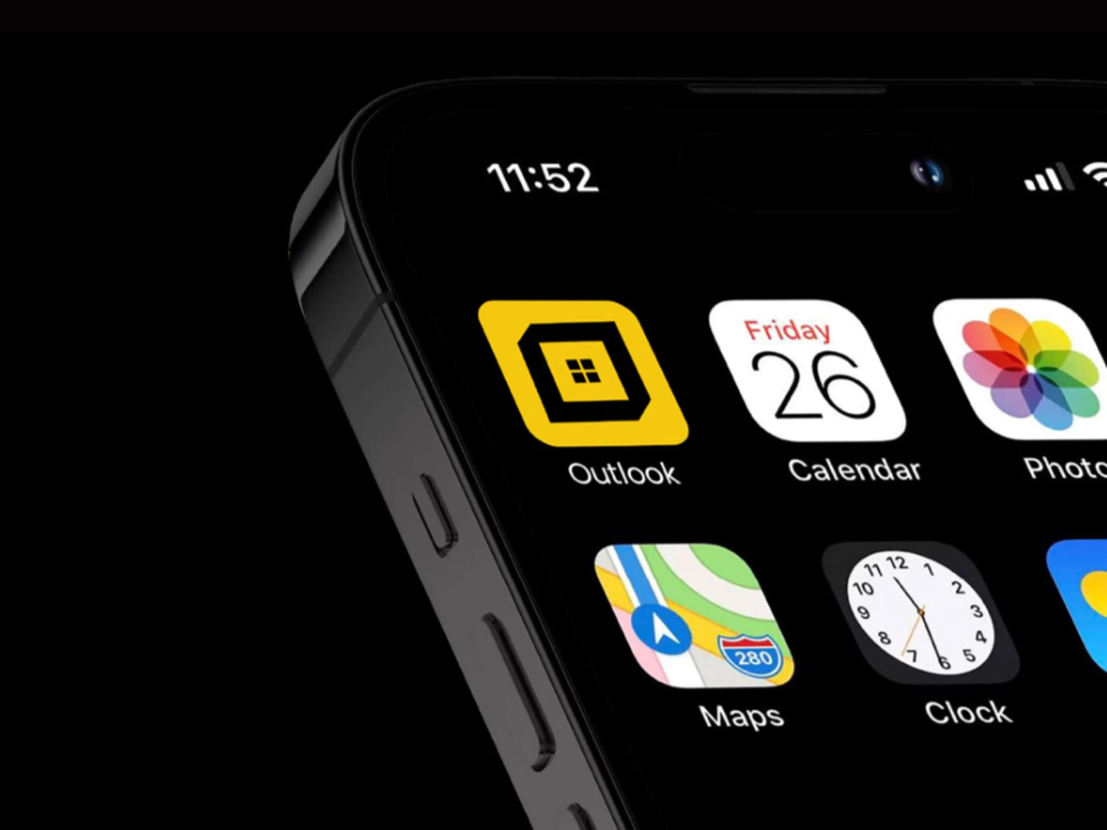
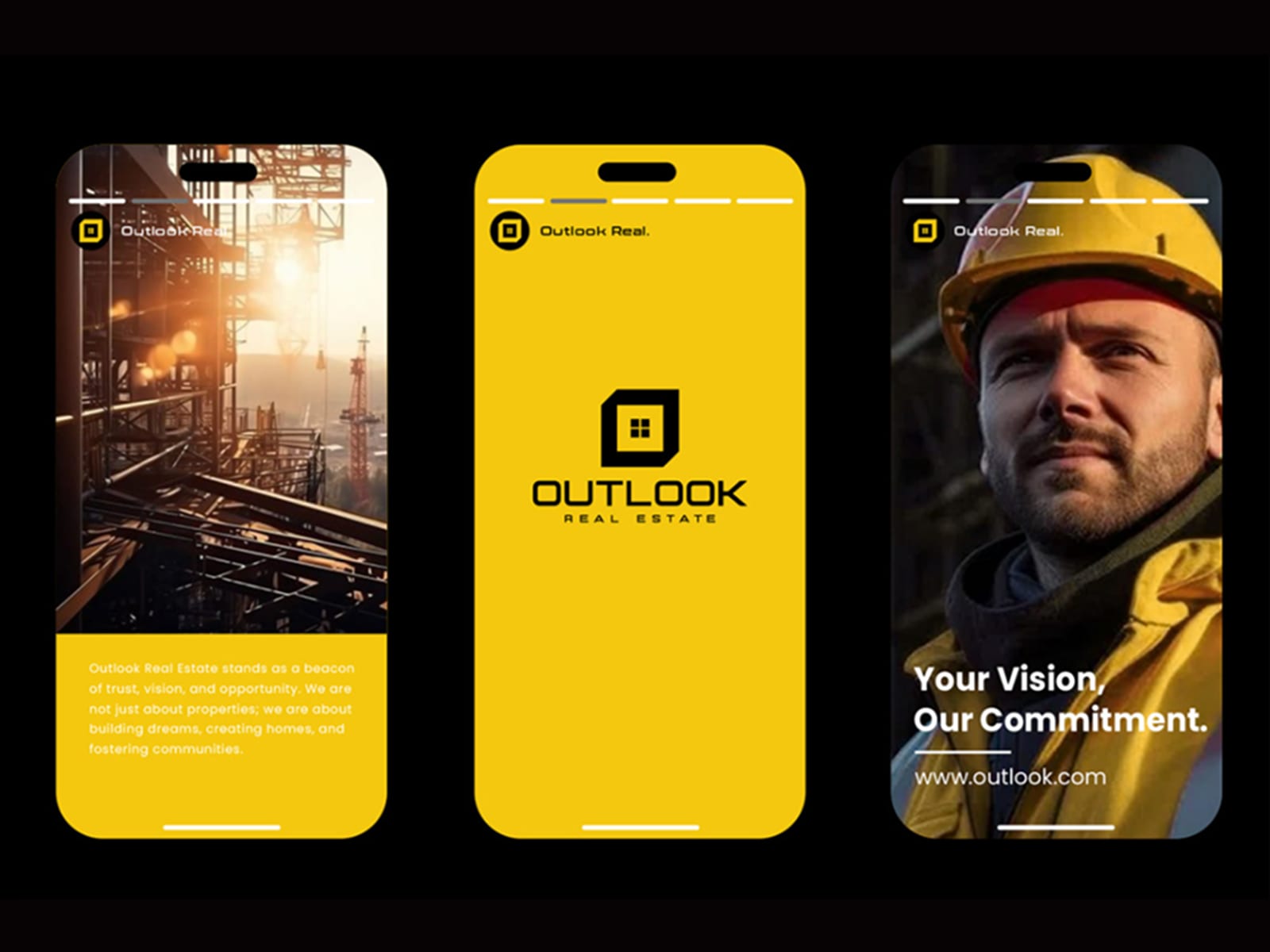
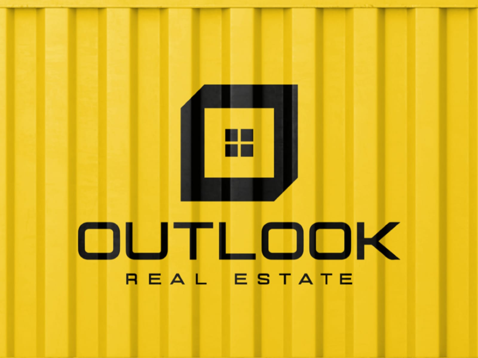
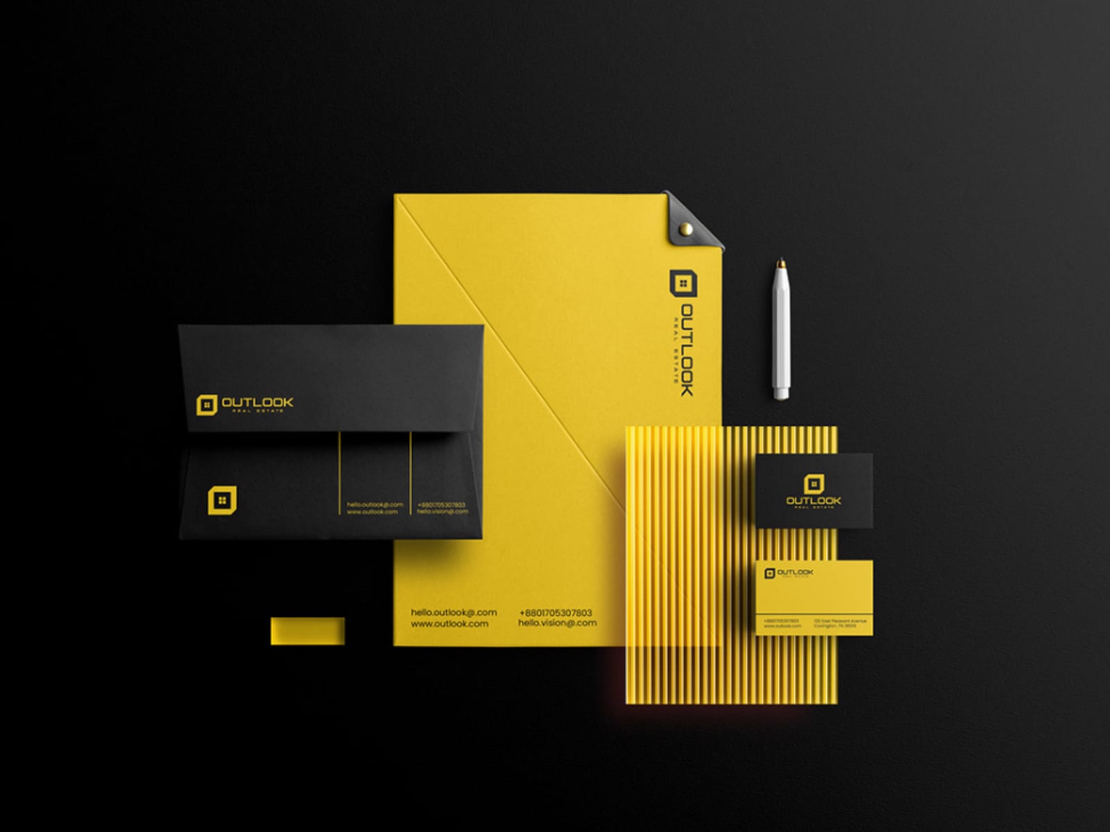
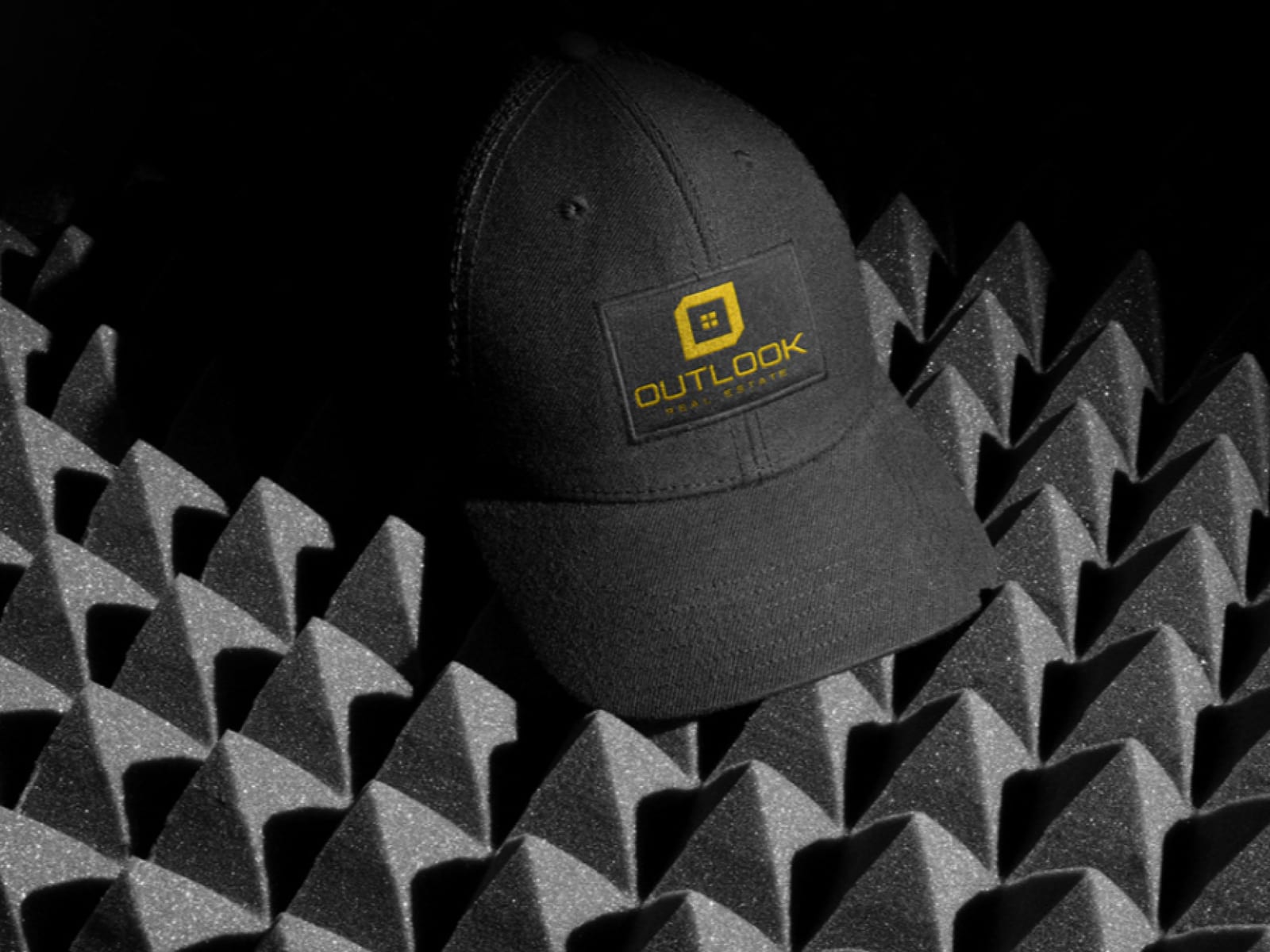
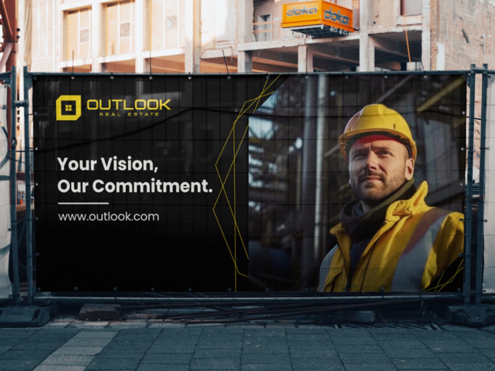
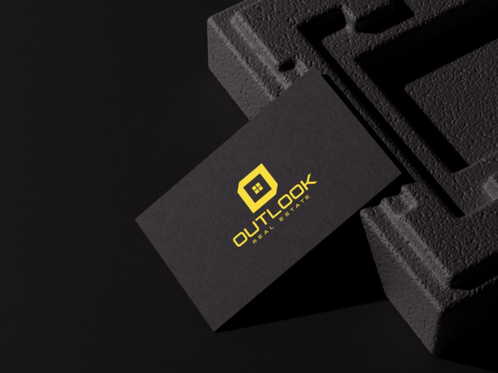
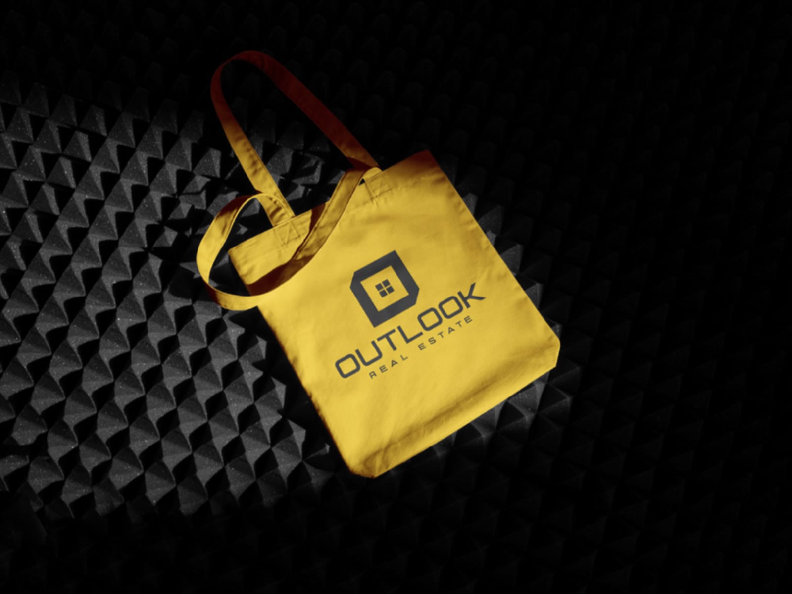
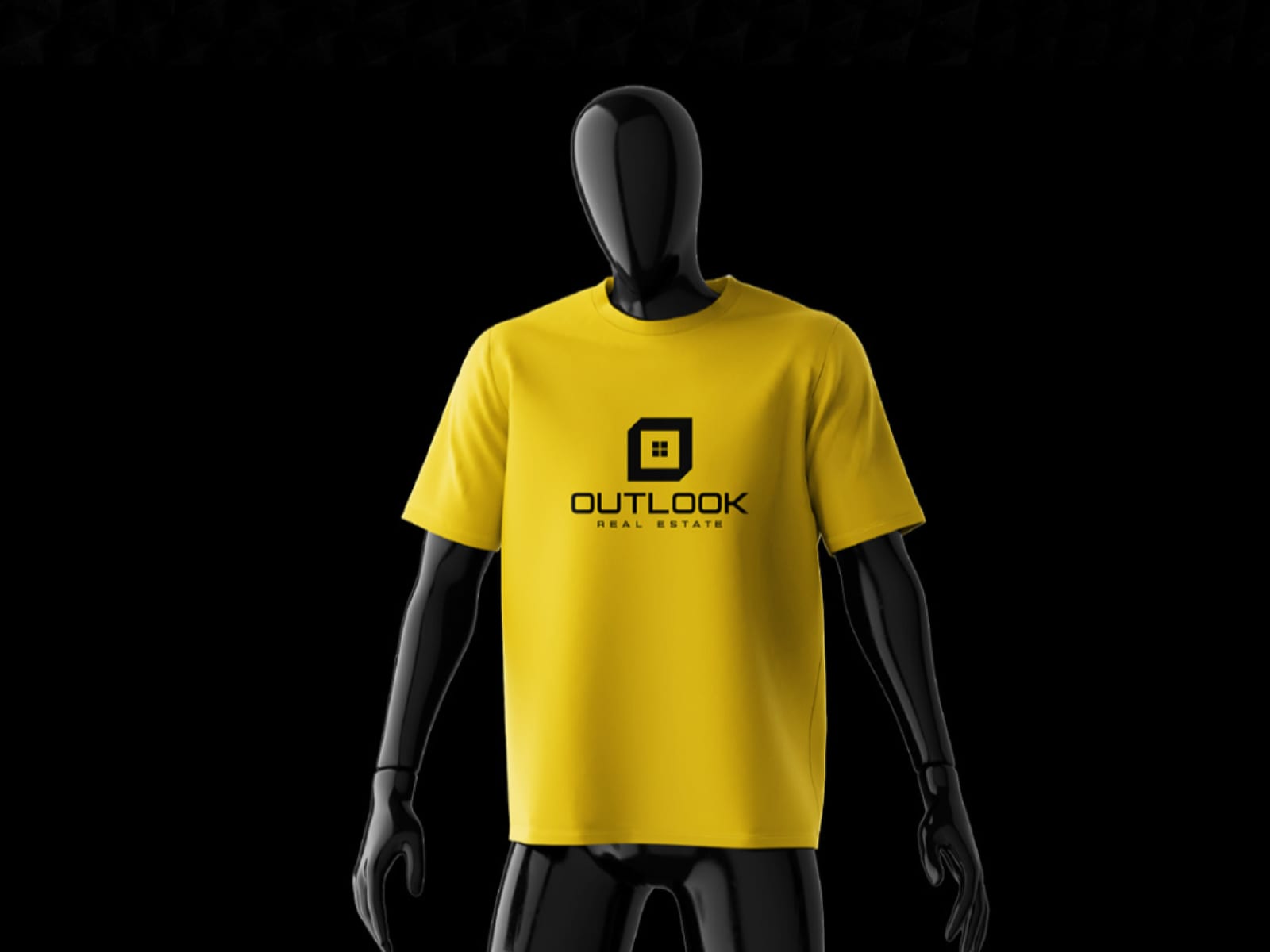
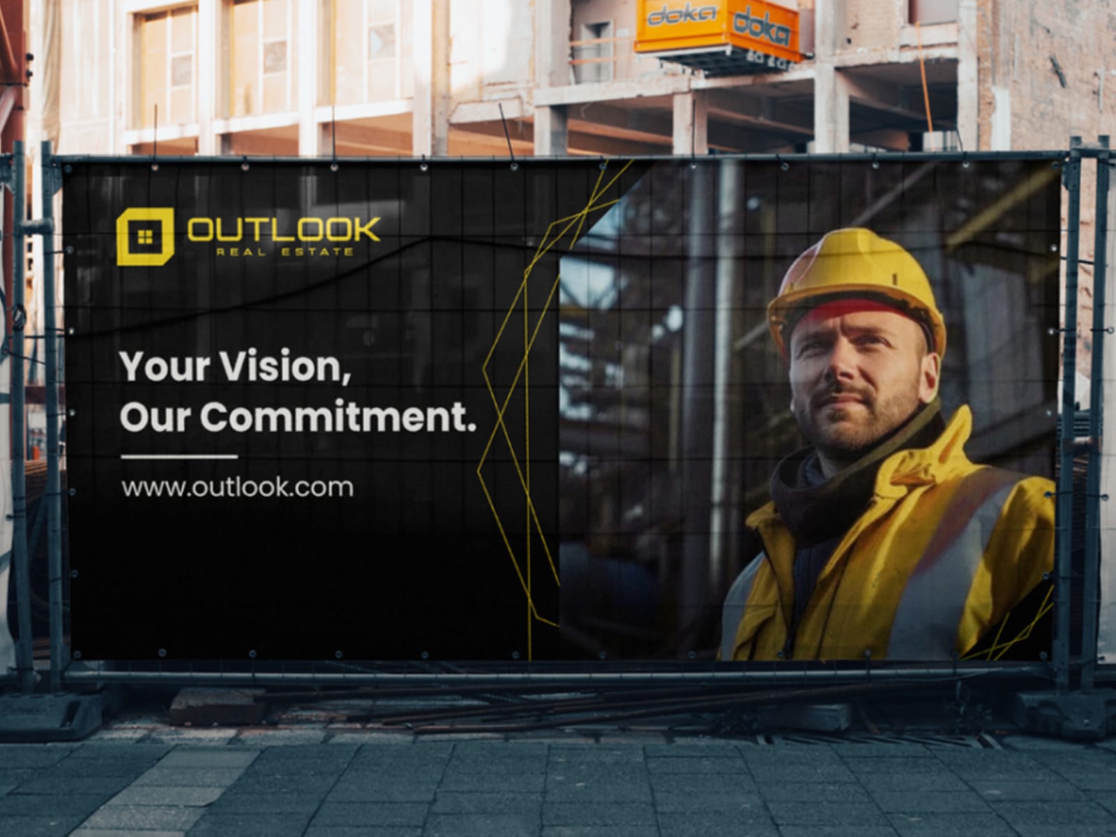
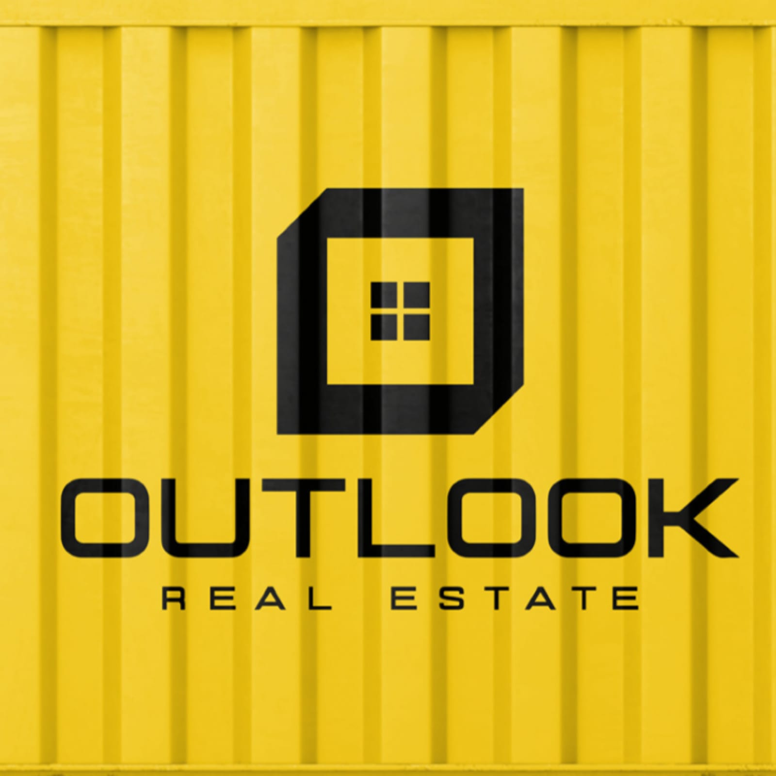
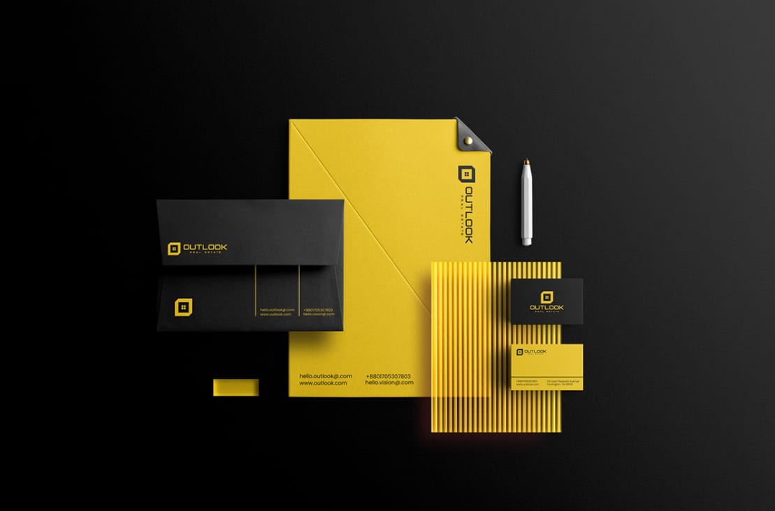
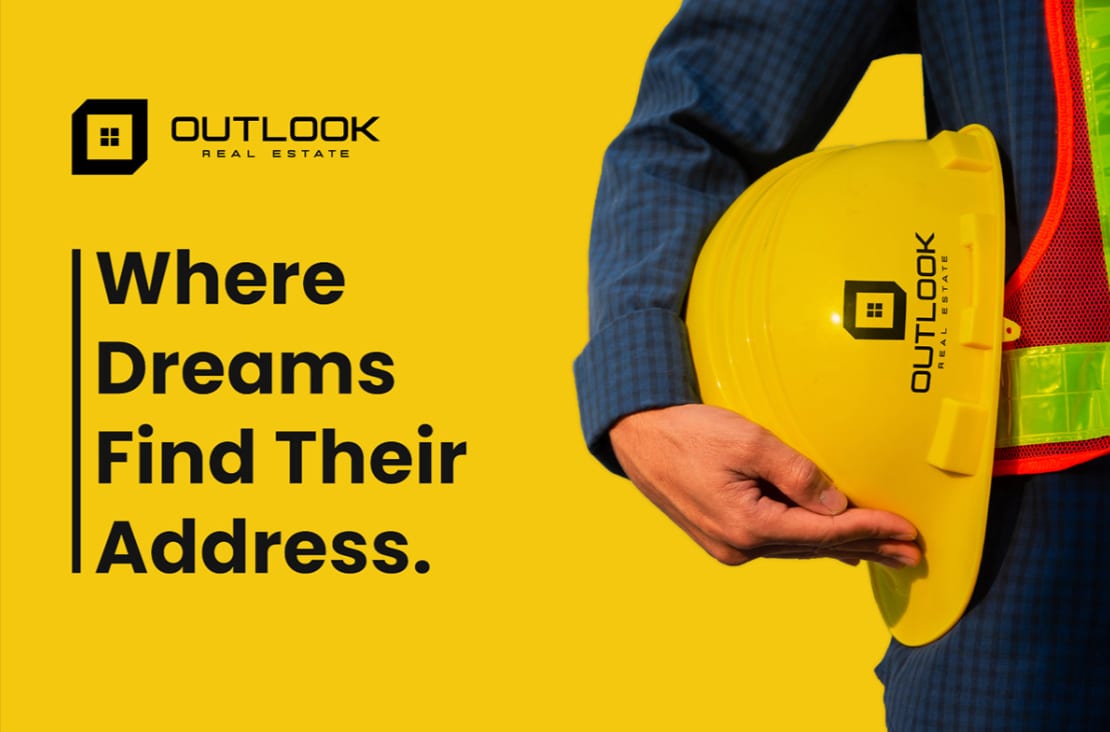
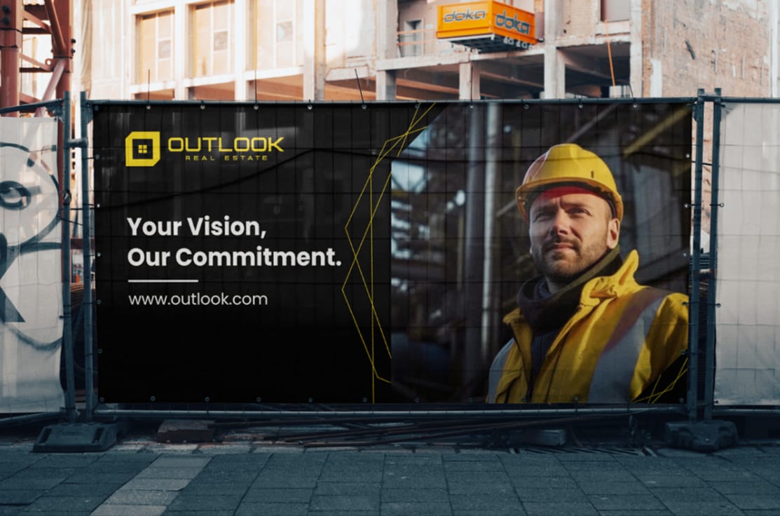
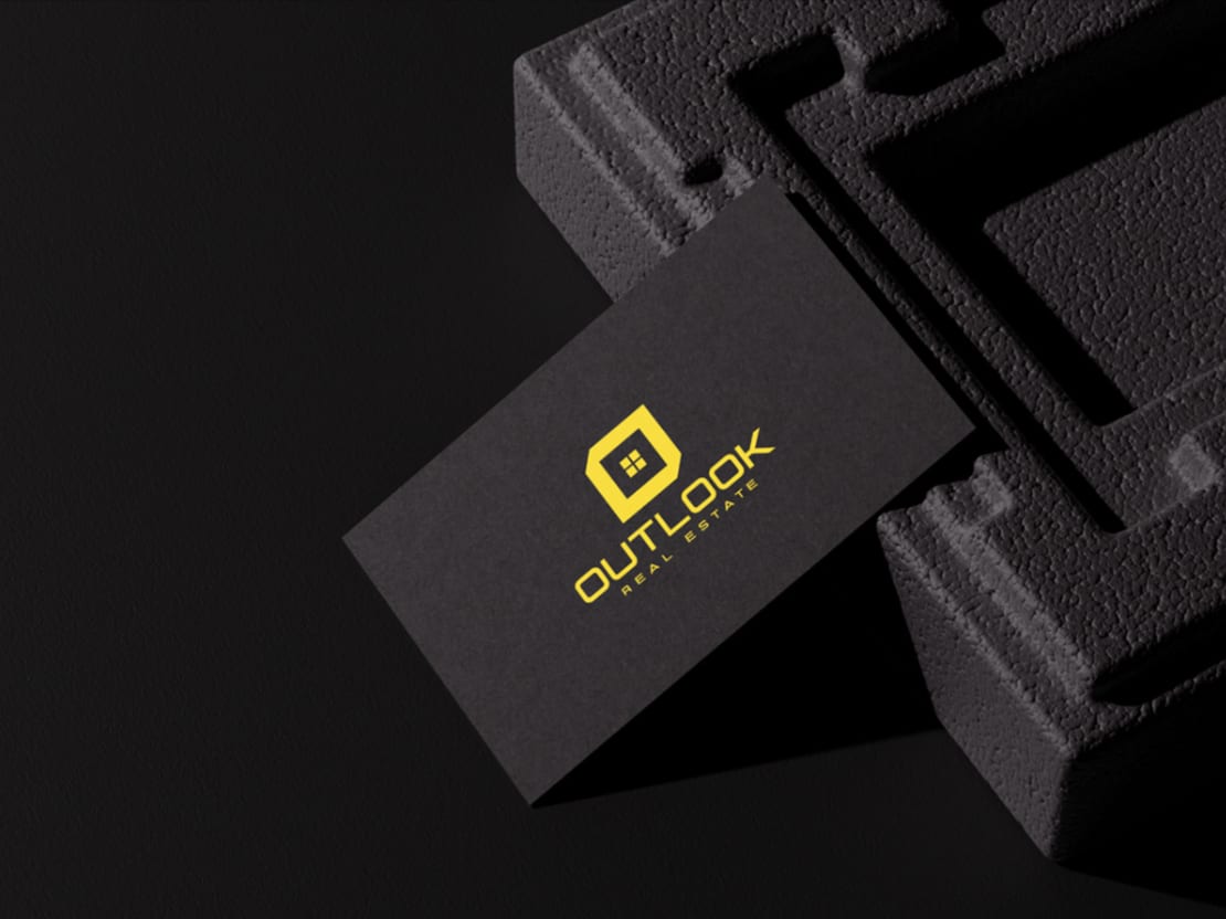
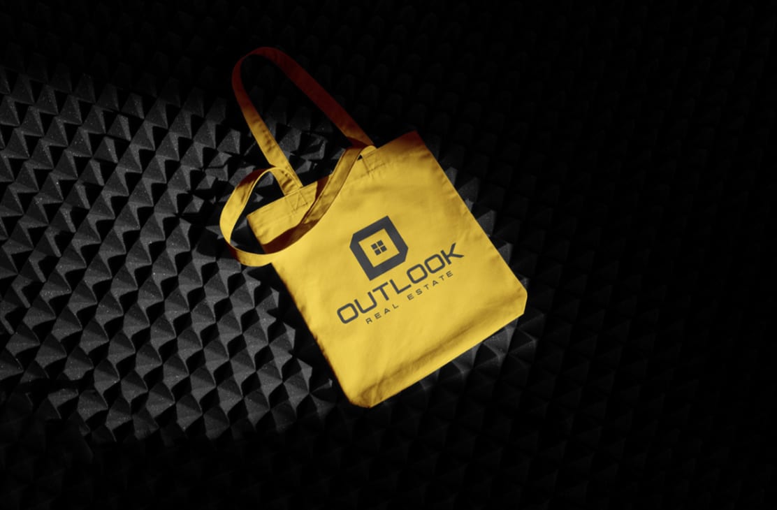
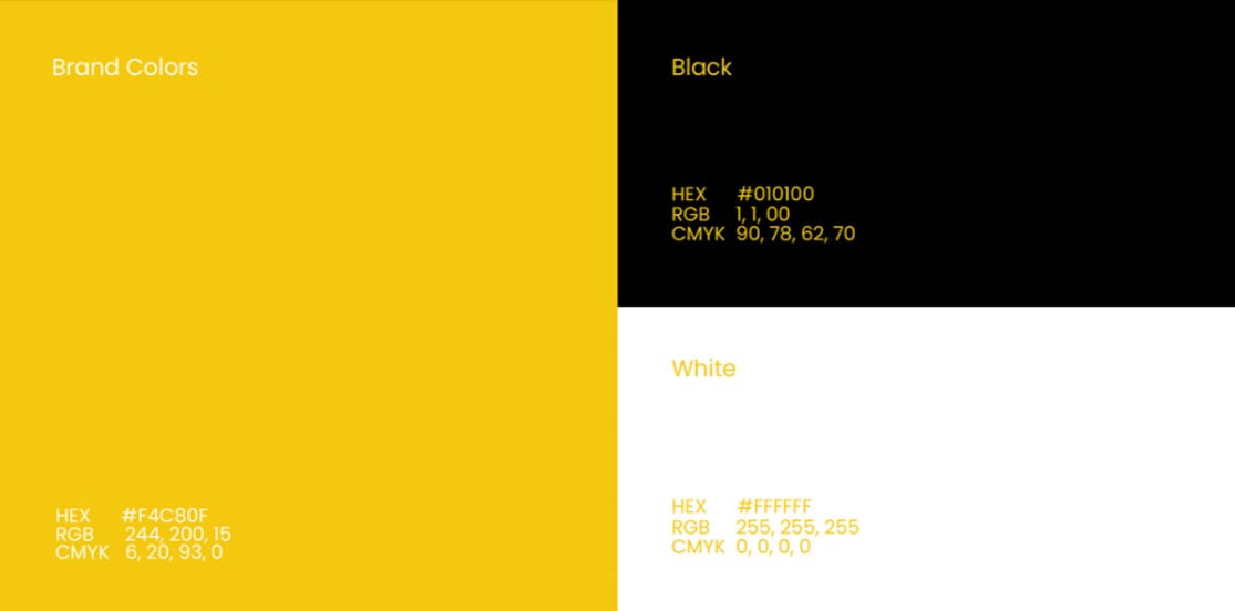
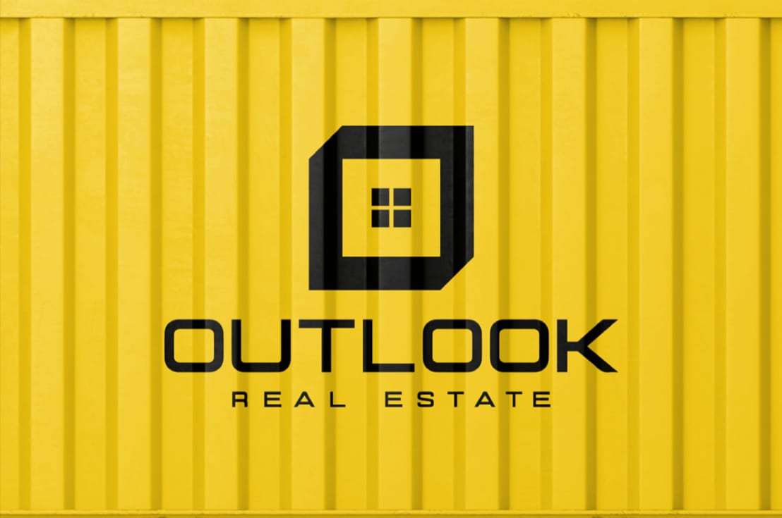
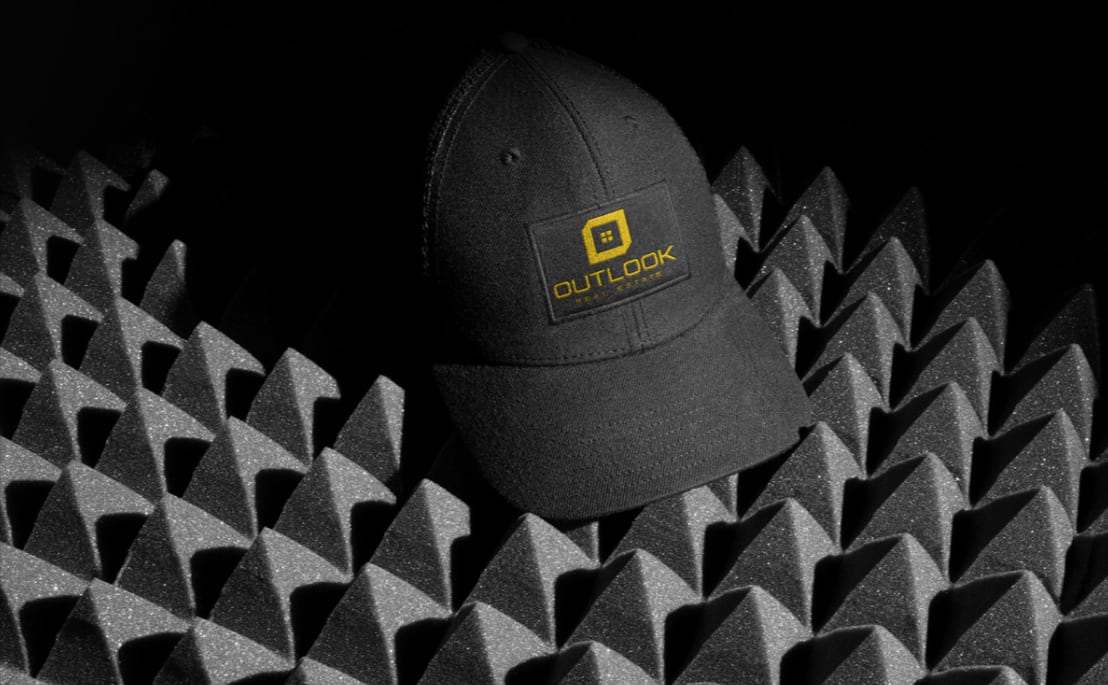
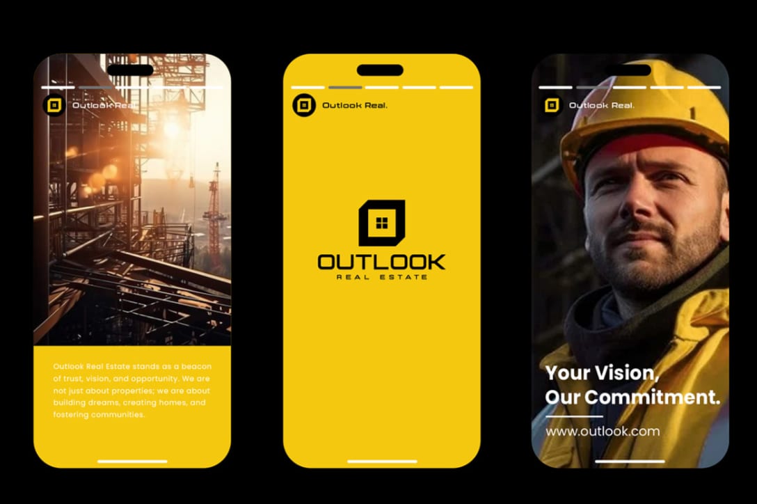
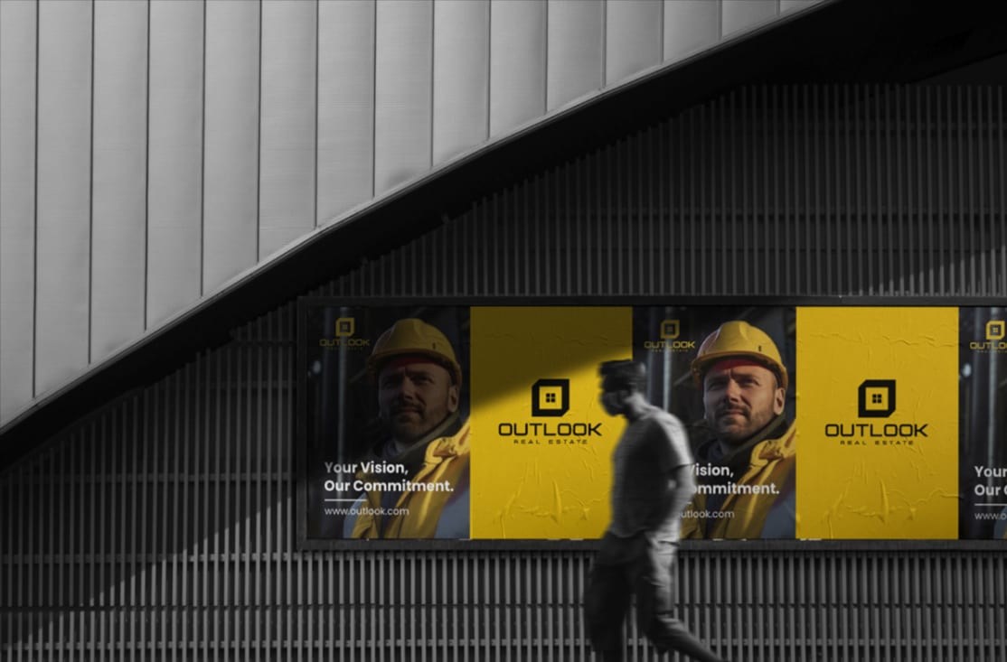
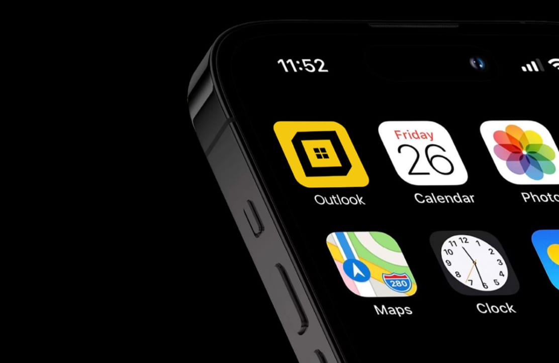
Outlook Real Estate 2021–2025
An identity for a property business that had to read as established on day one — restrained, architectural, and legible on everything from a hoarding to a listing thumbnail.

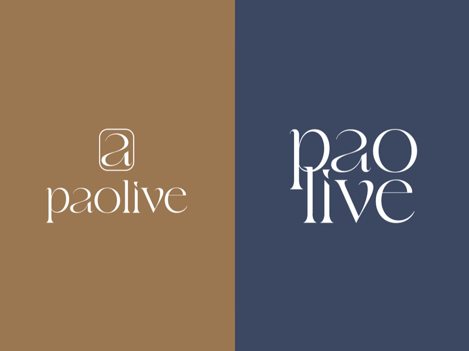
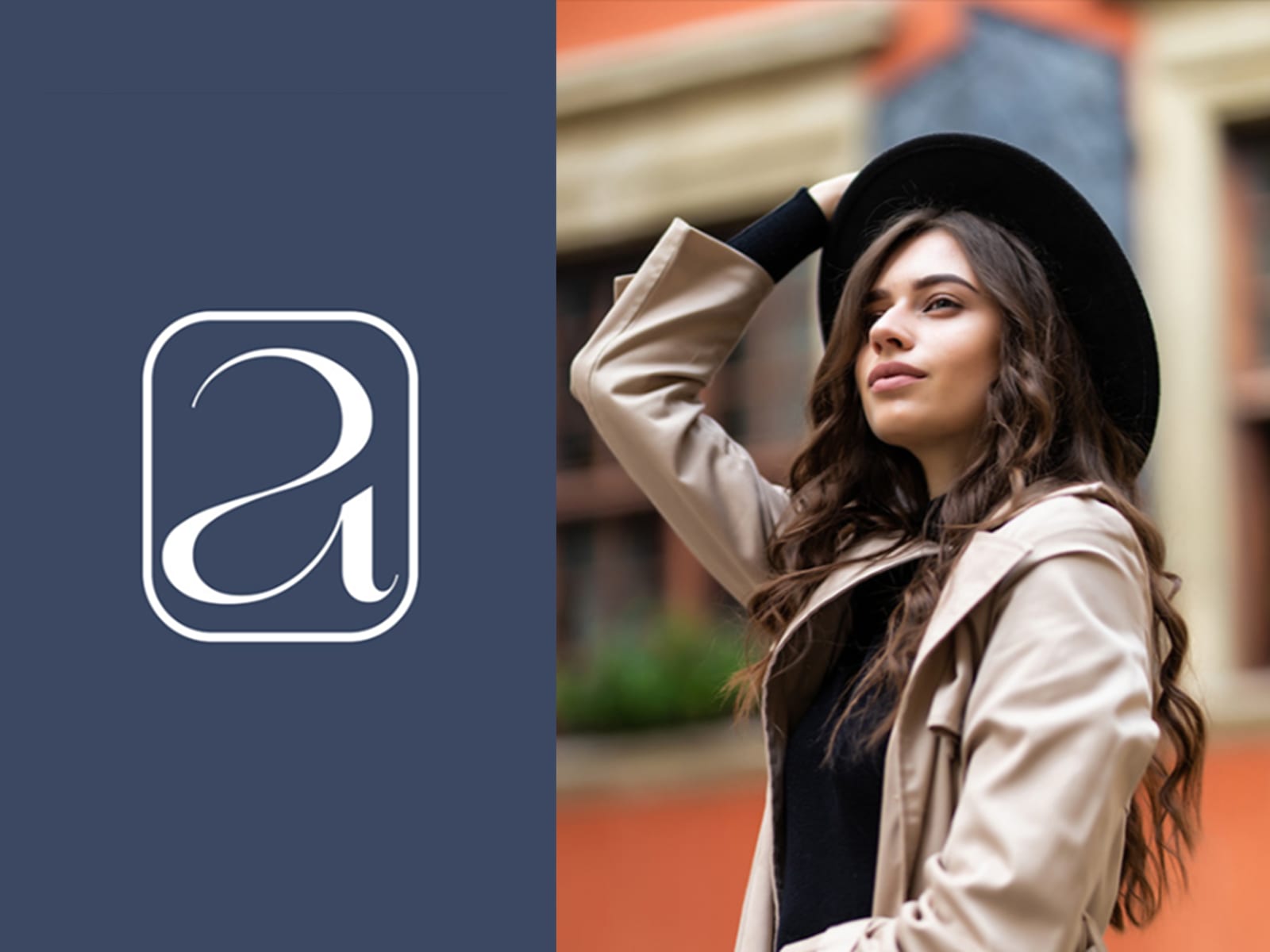
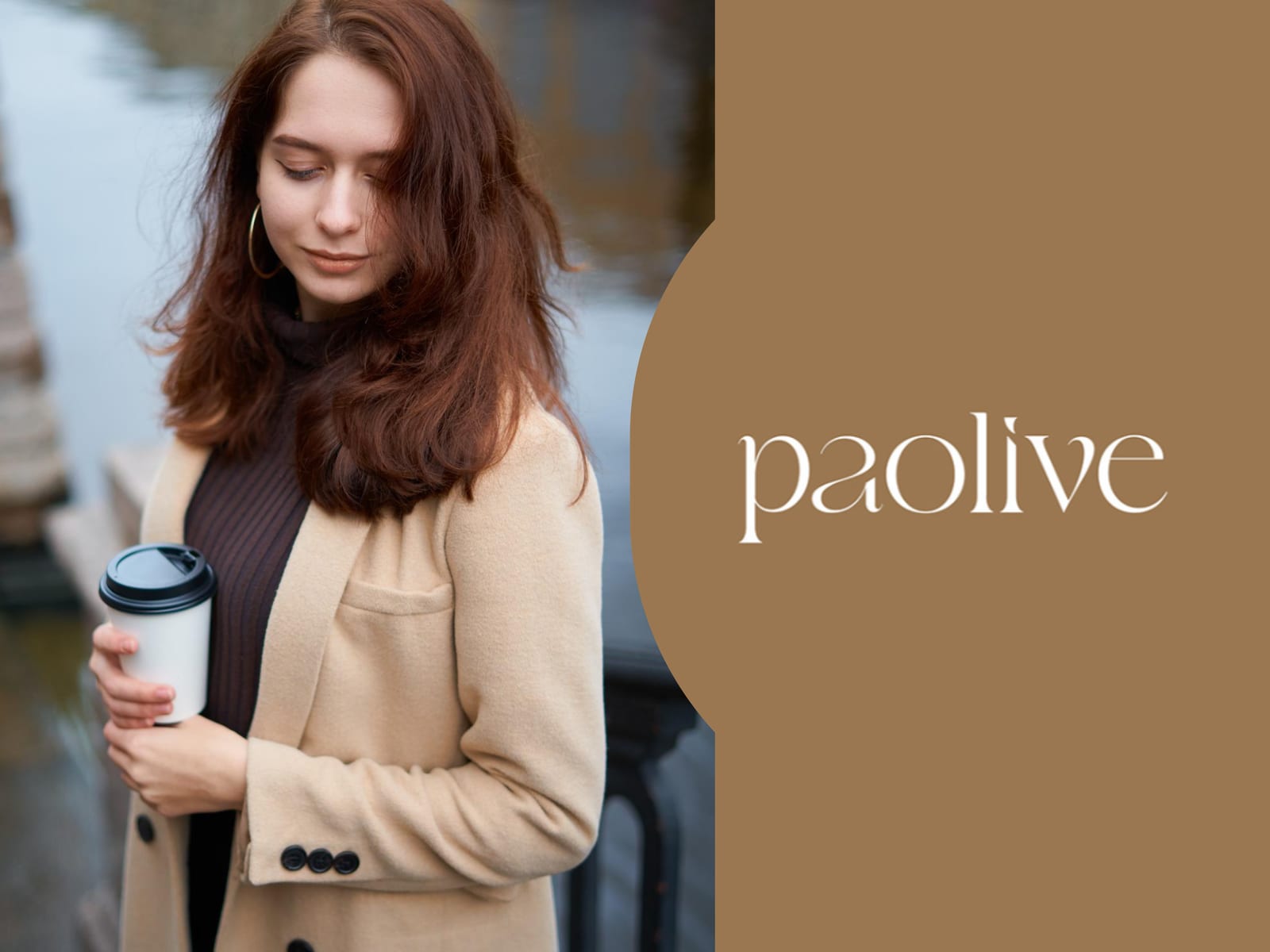
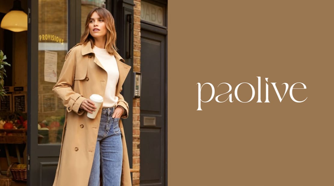
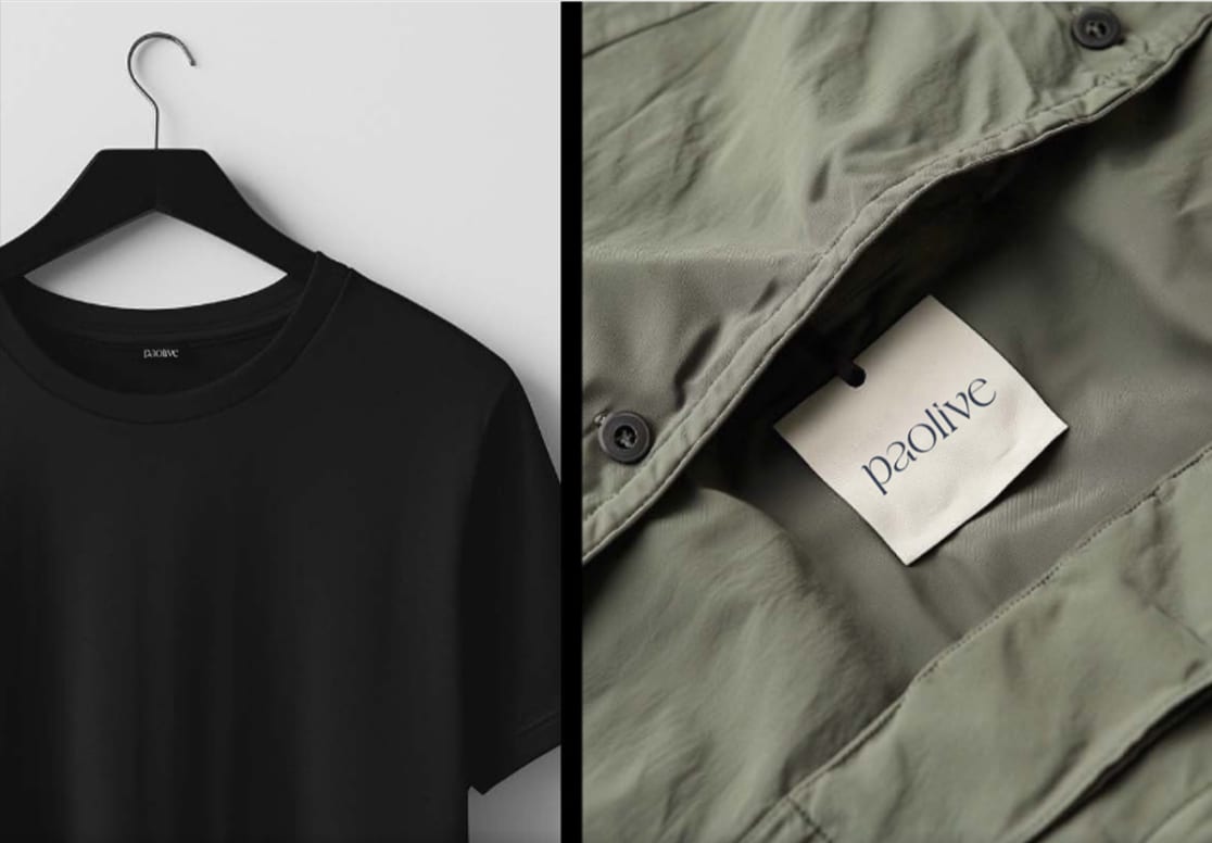
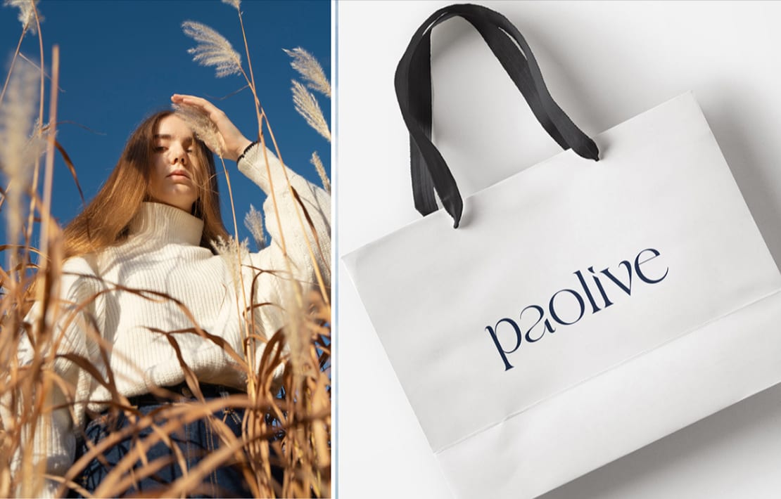
PaoLive 2021–2025
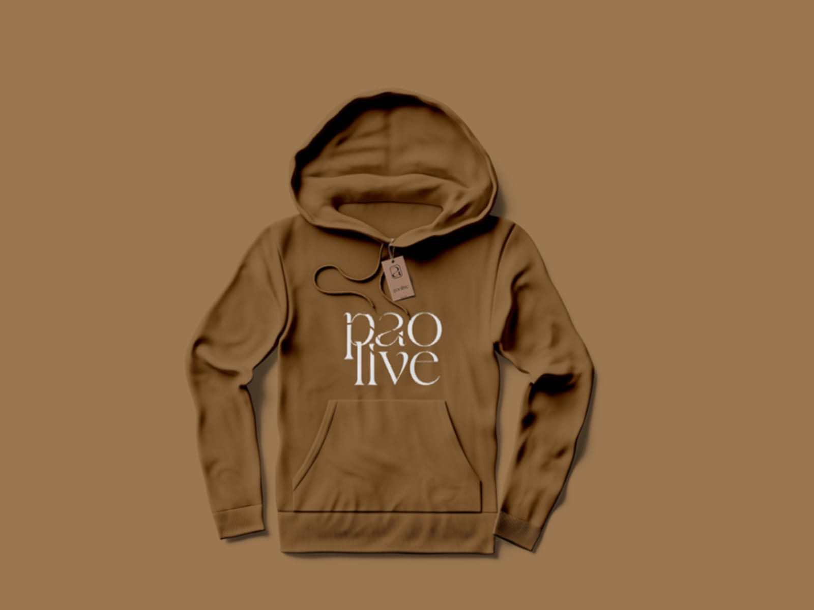
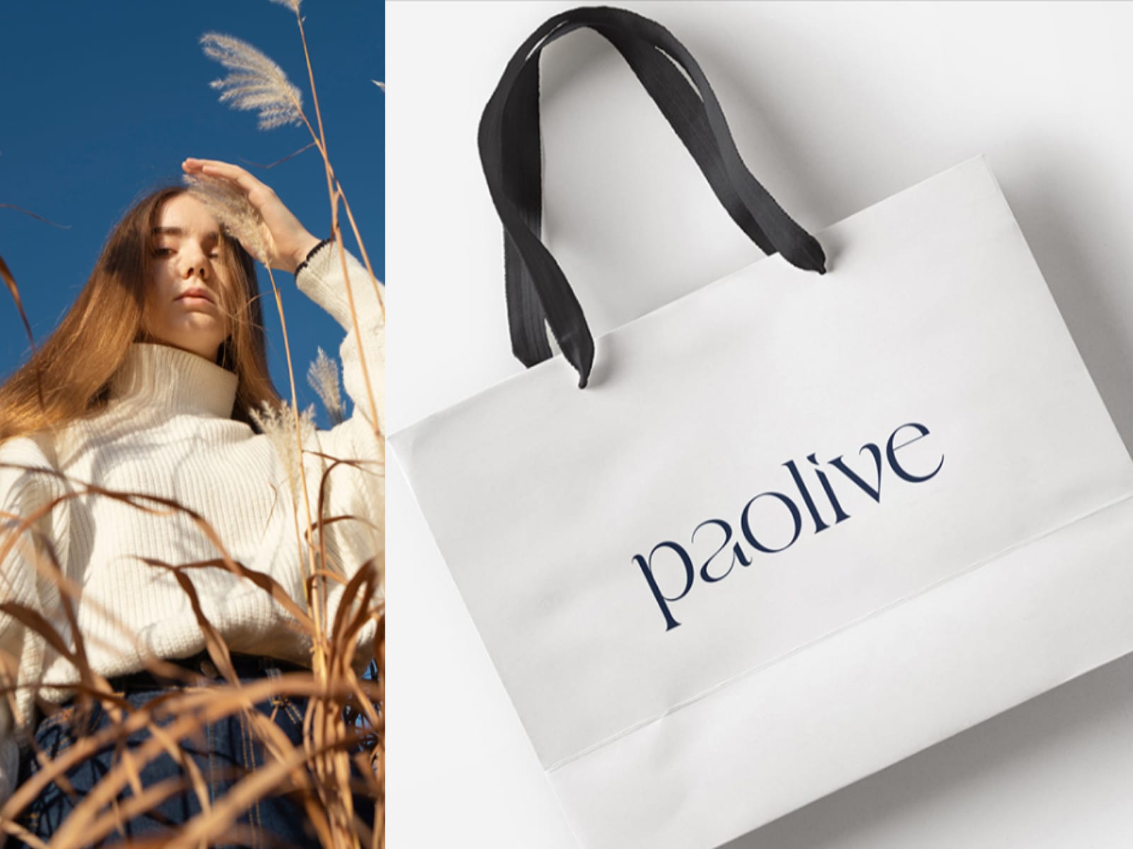
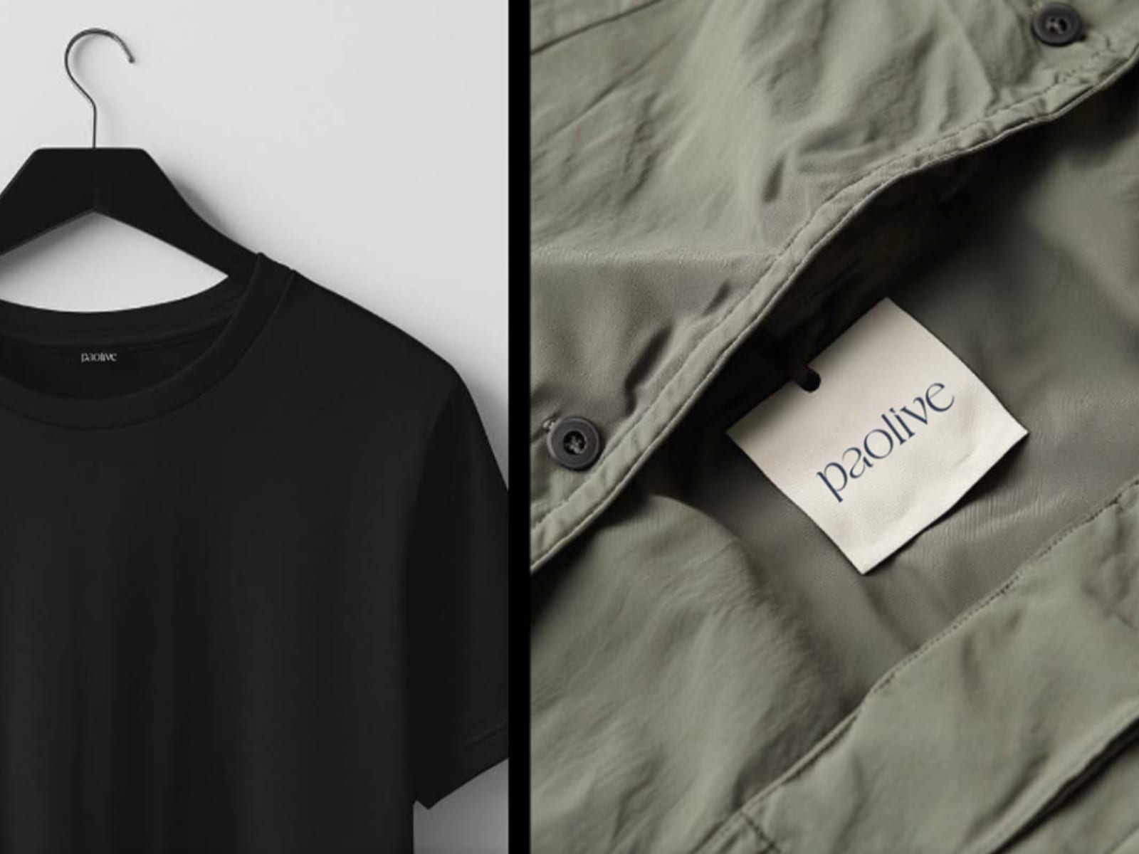
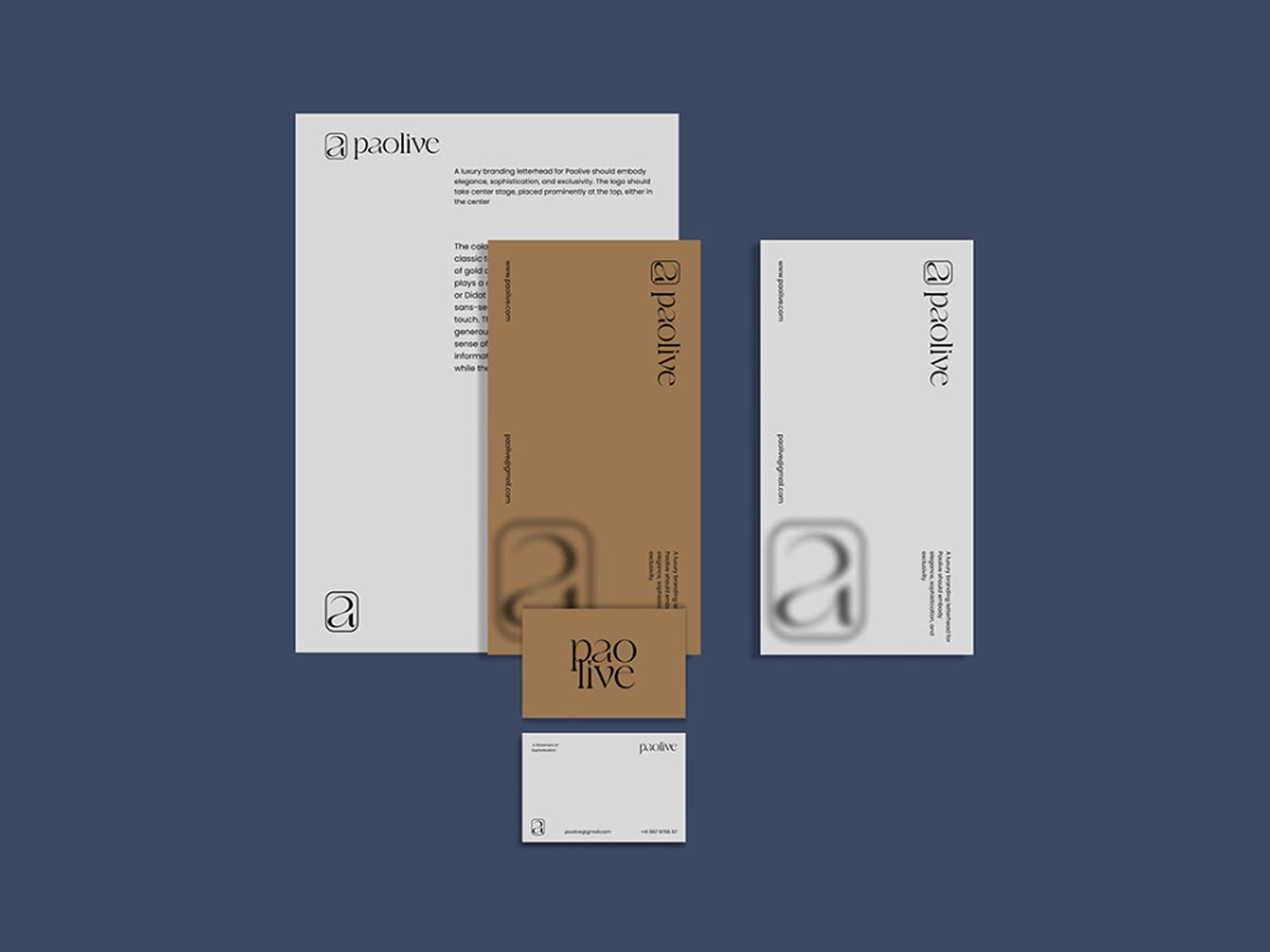
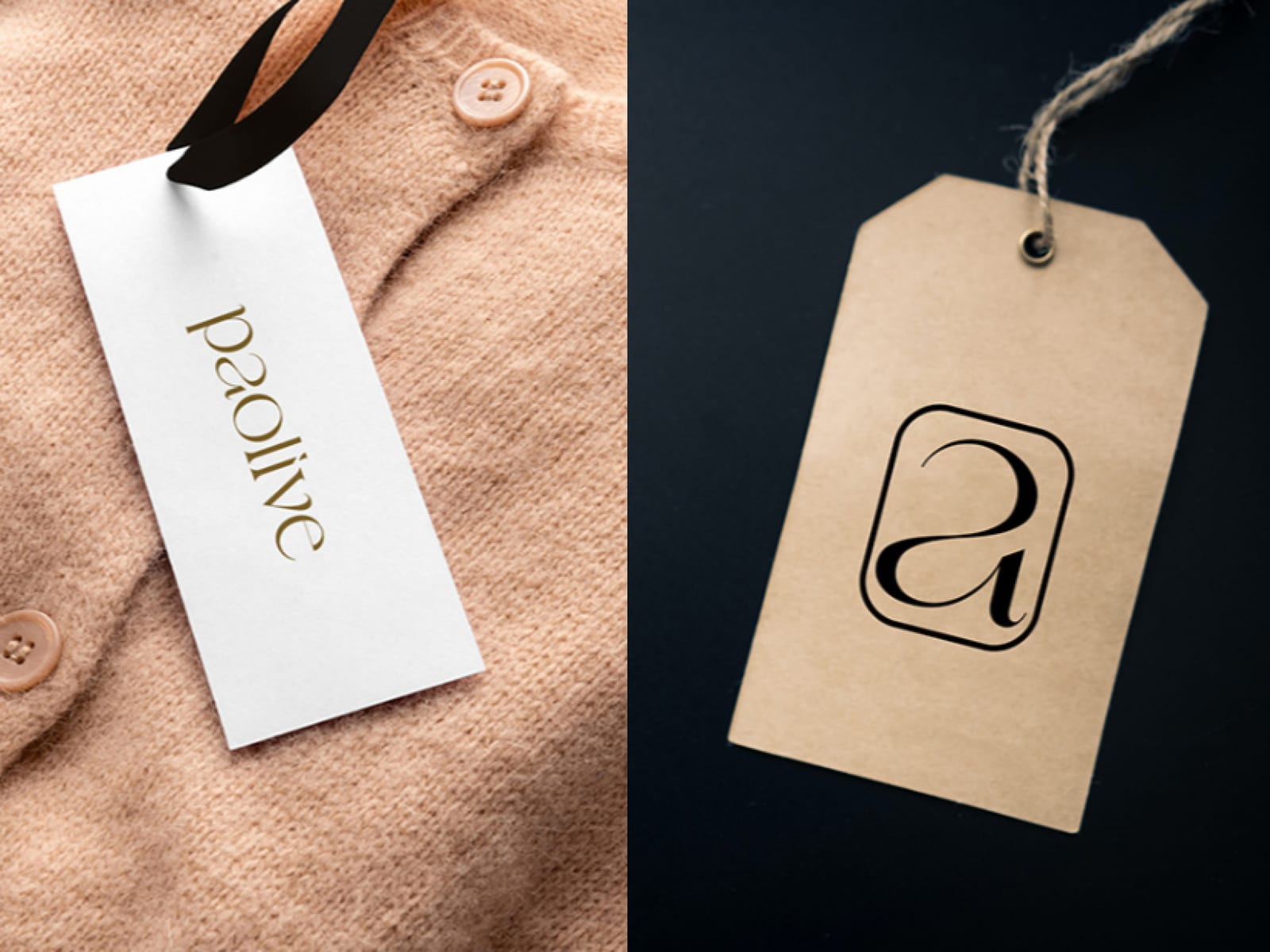
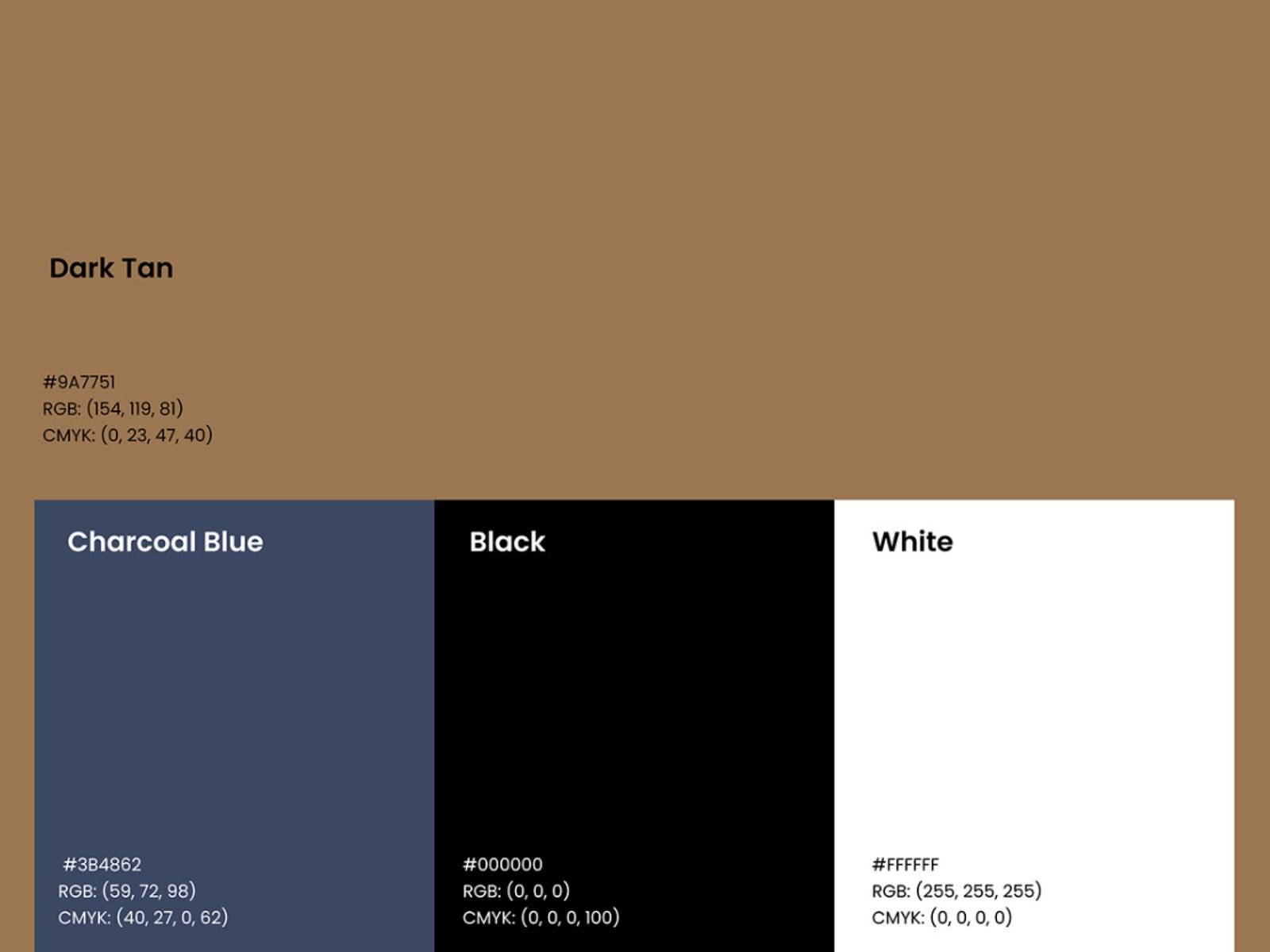
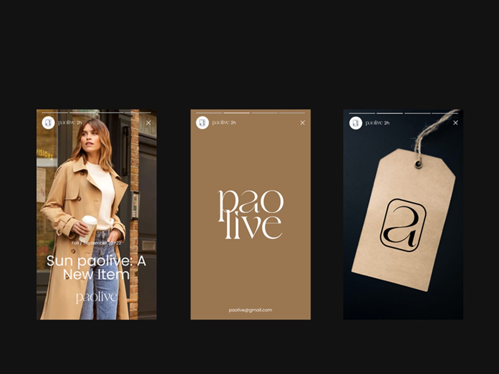
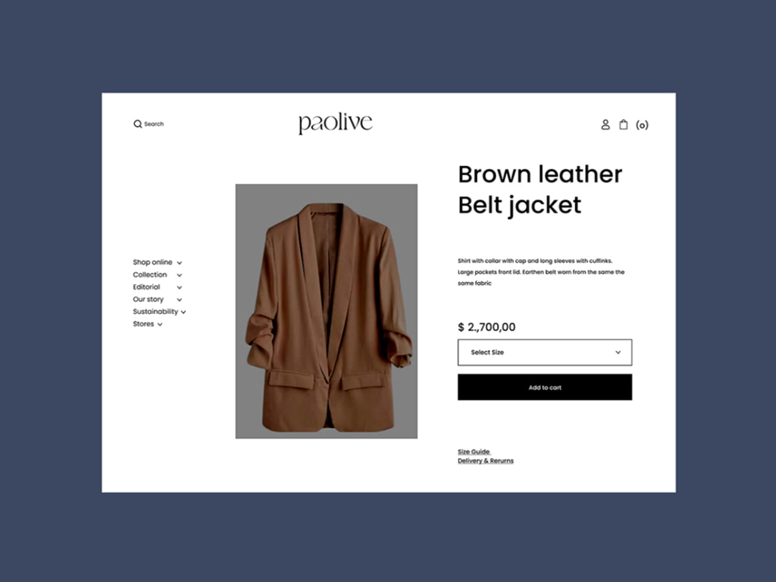
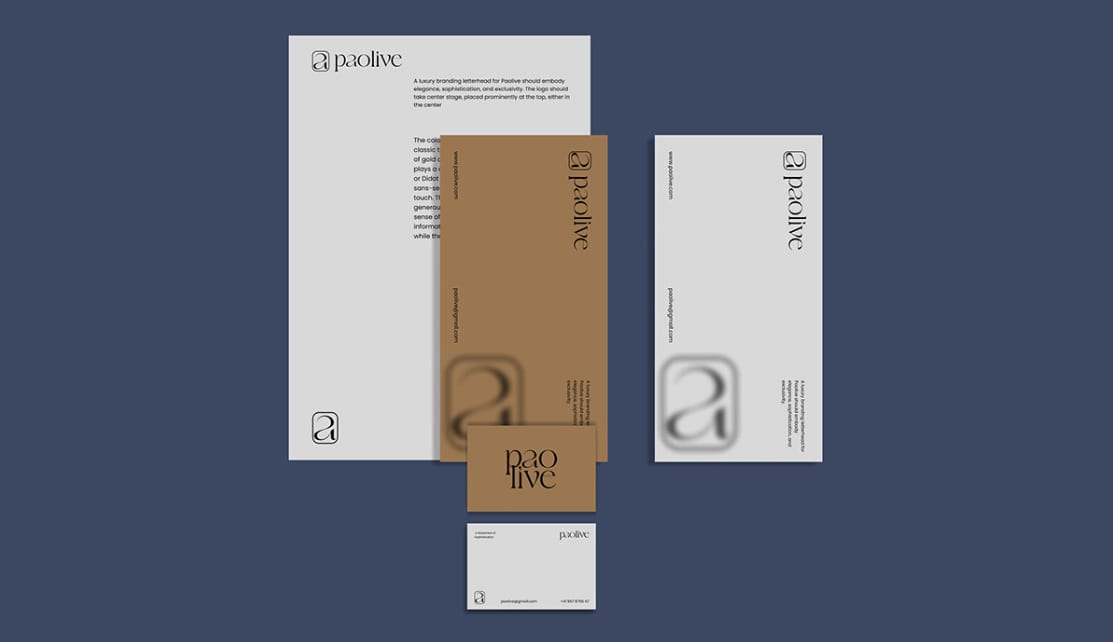
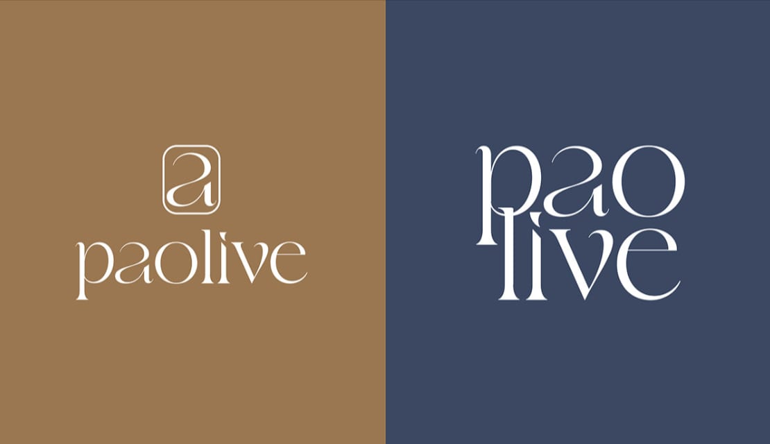
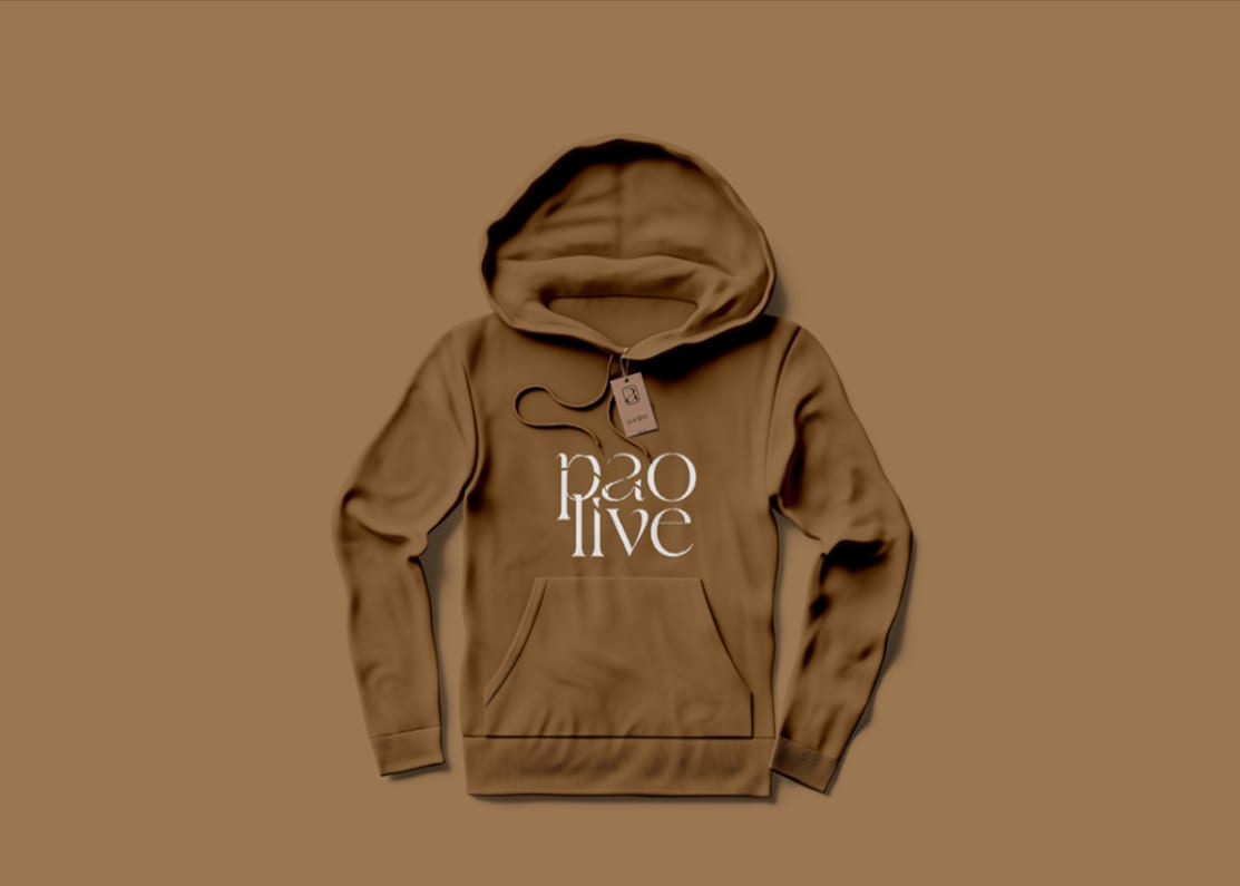
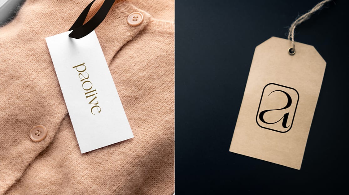
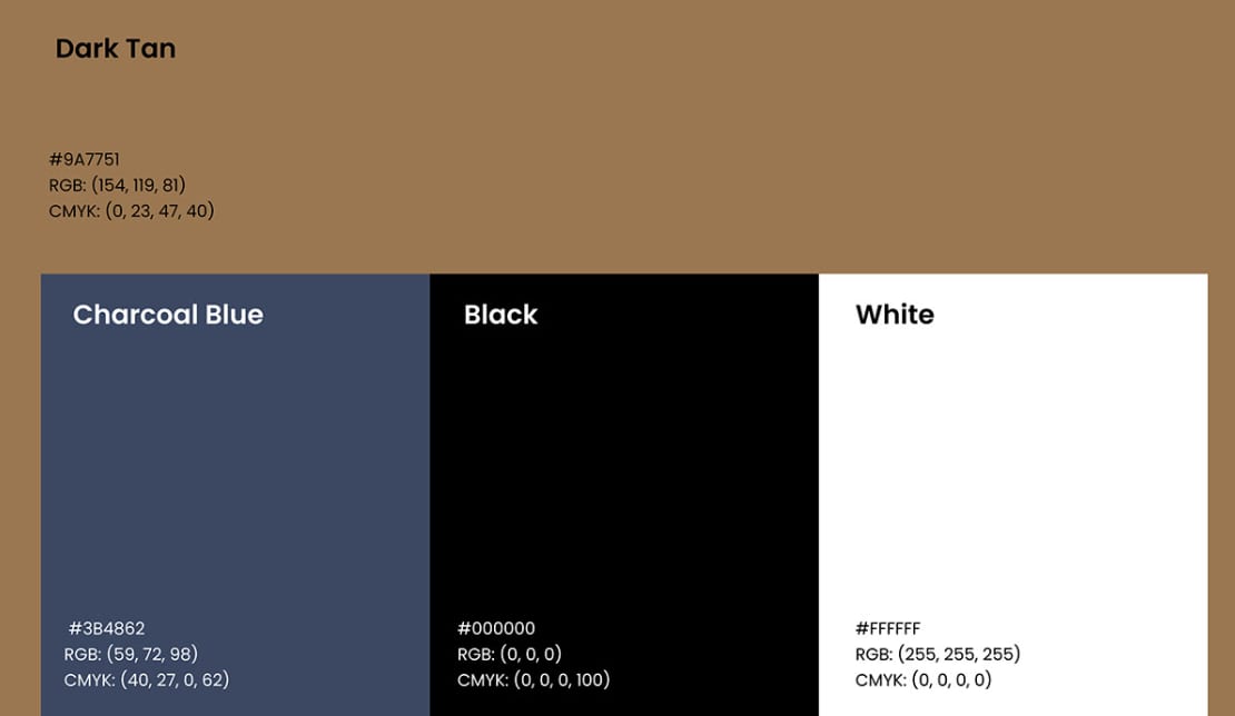
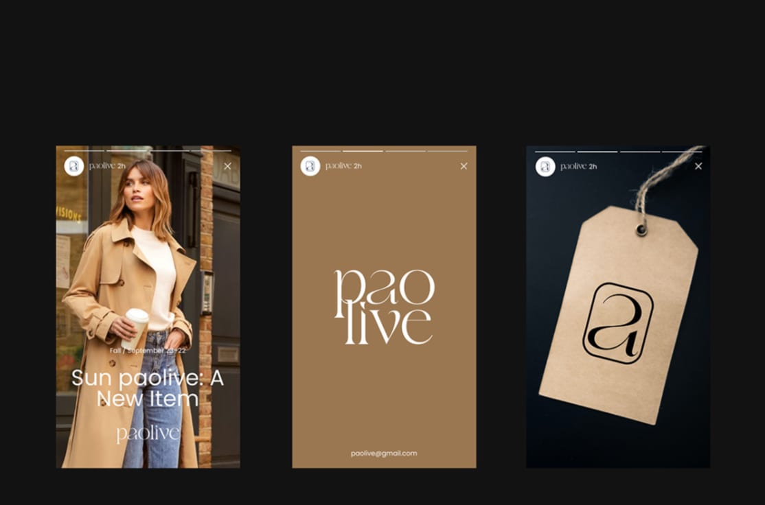
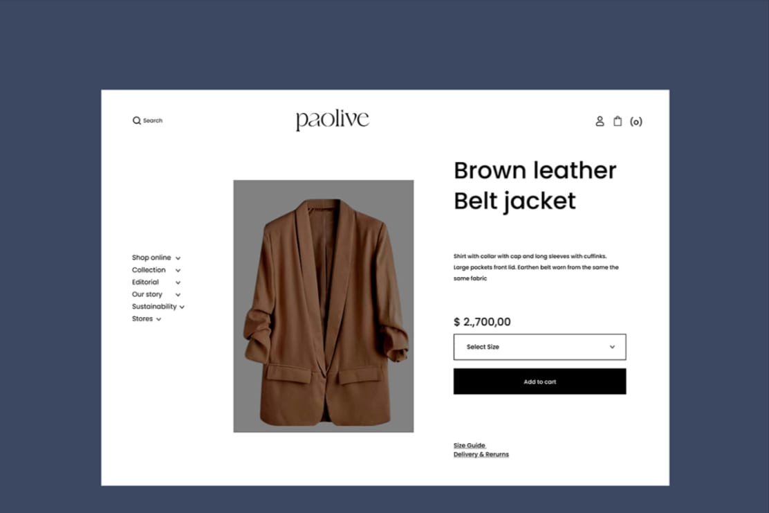
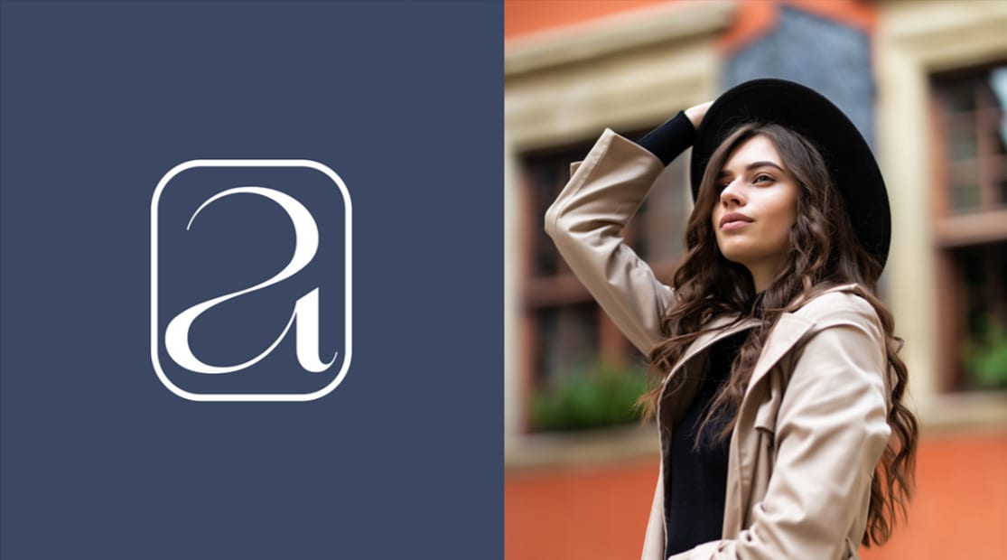
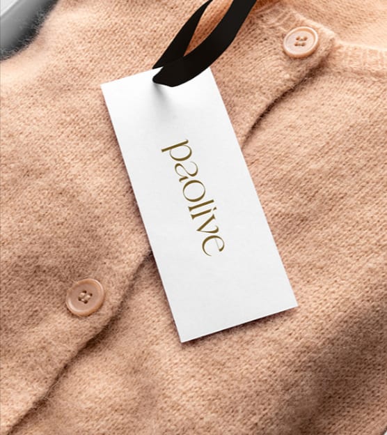
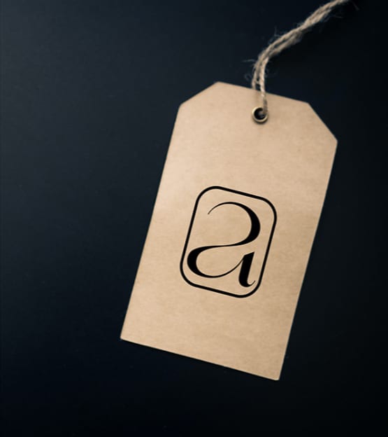
A digital-first identity for PaoLive: a mark built to survive an app icon, a favicon and a profile circle without a second version being drawn for each.
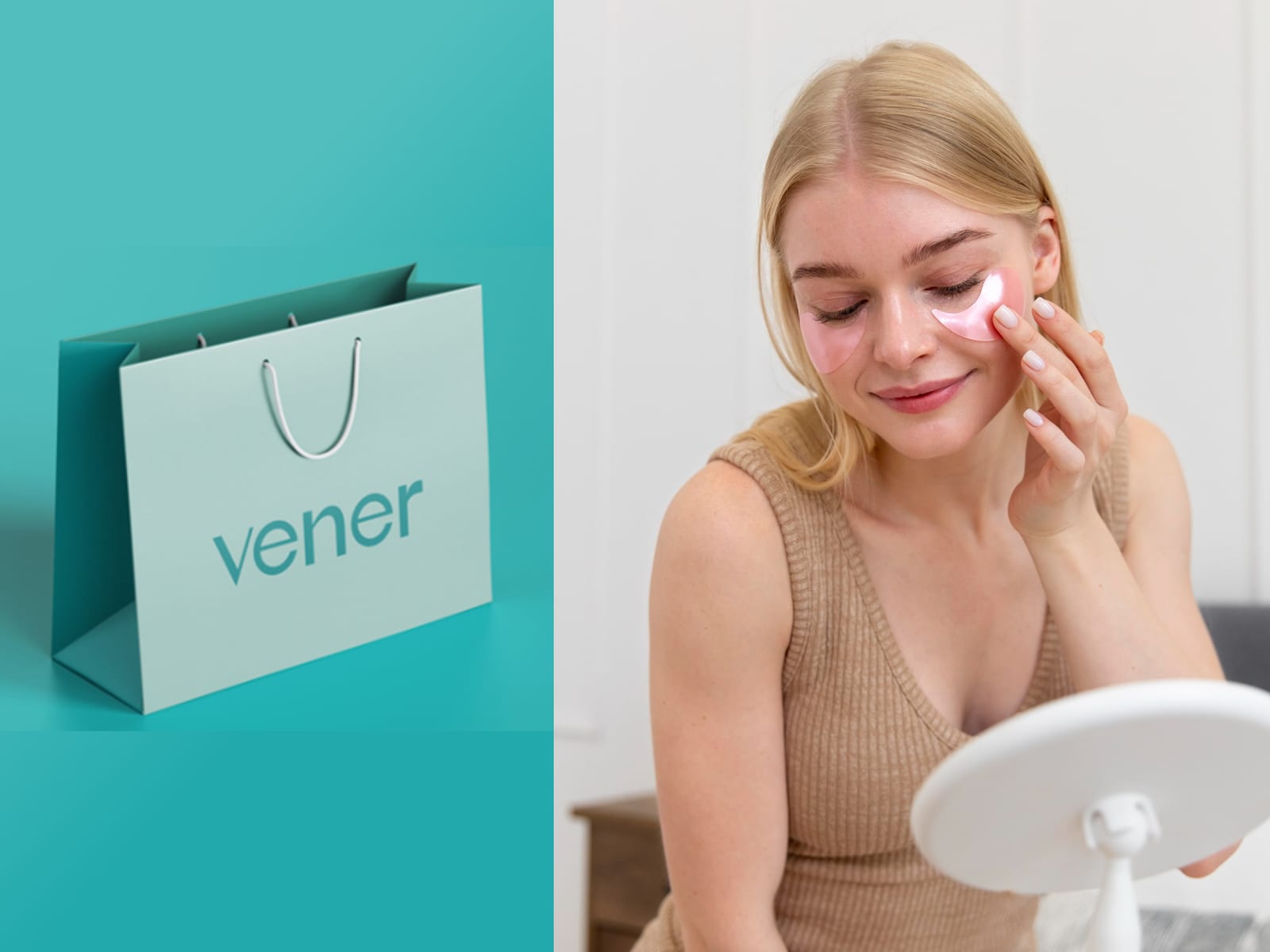
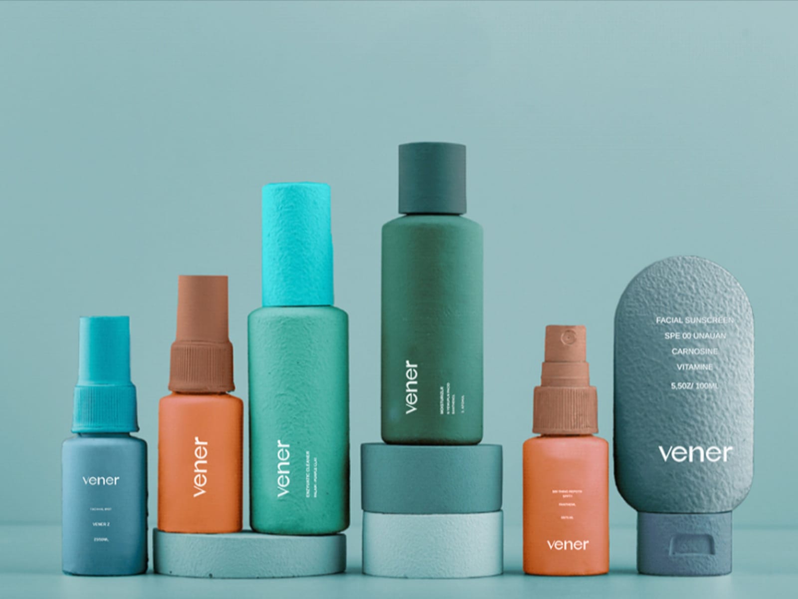
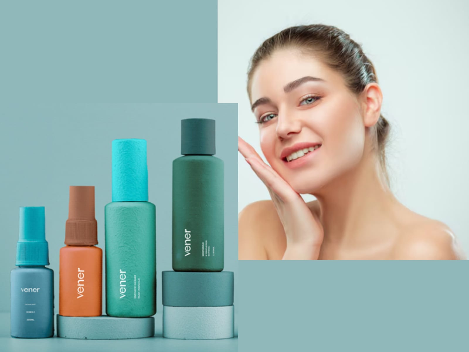
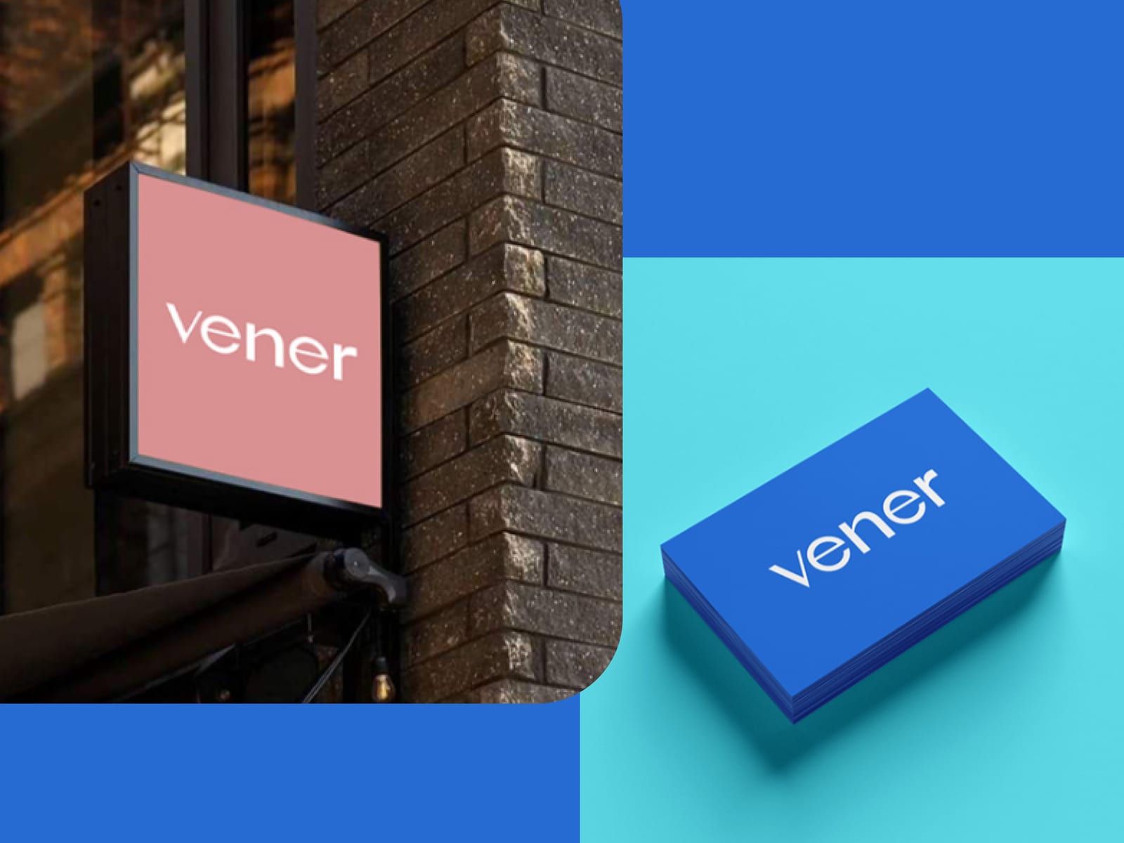
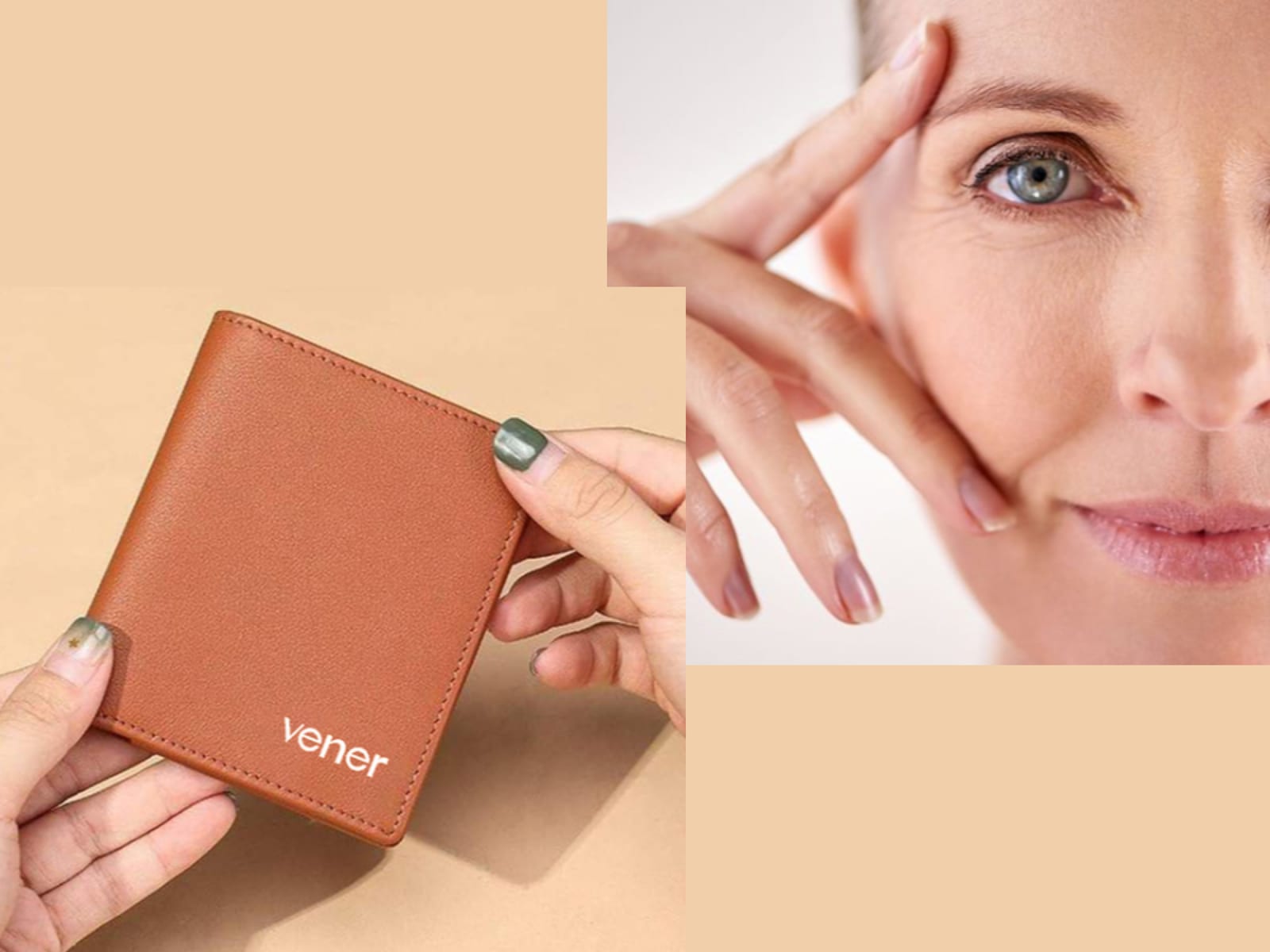
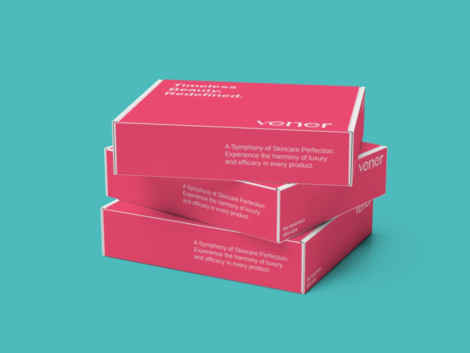
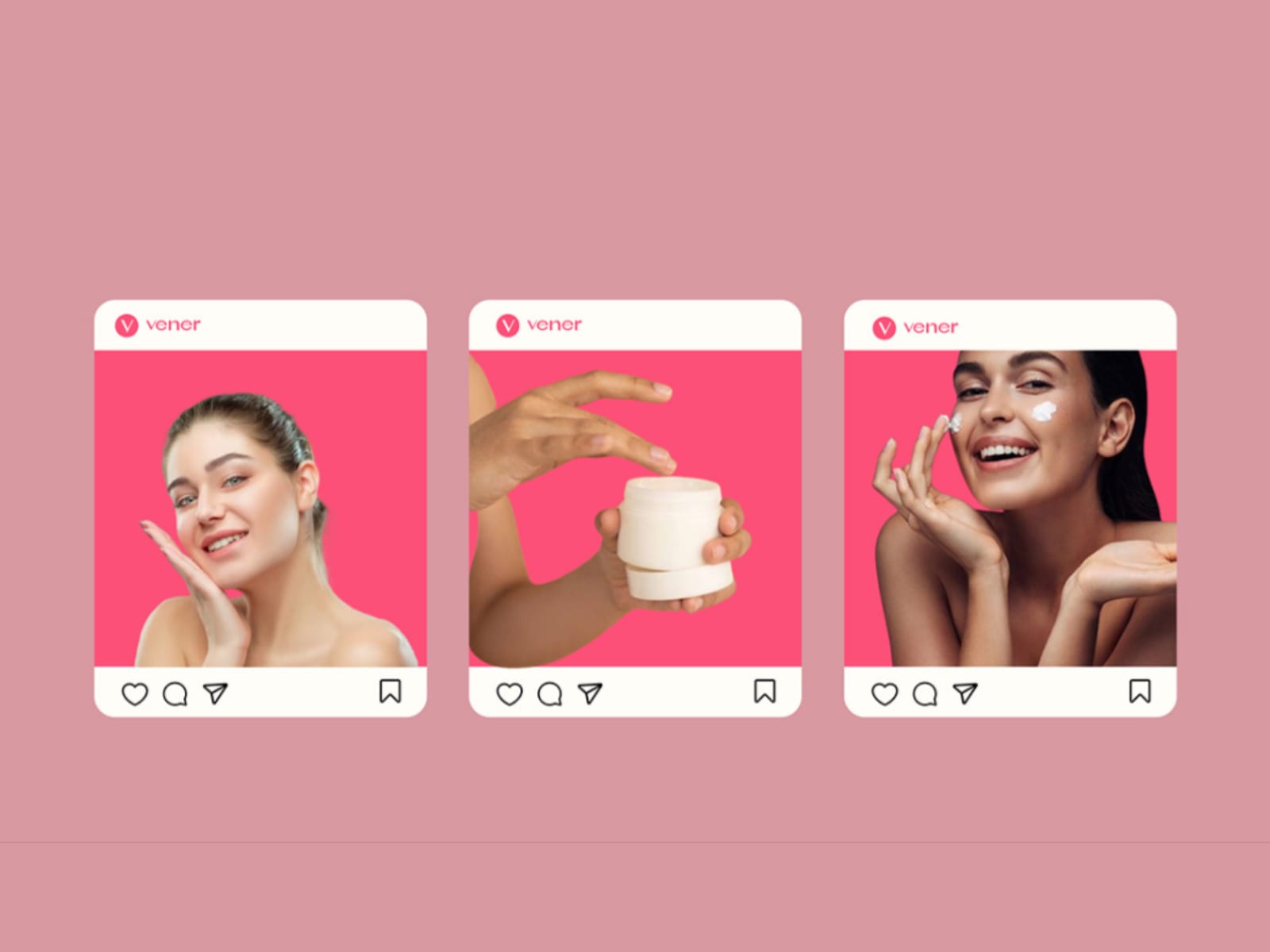
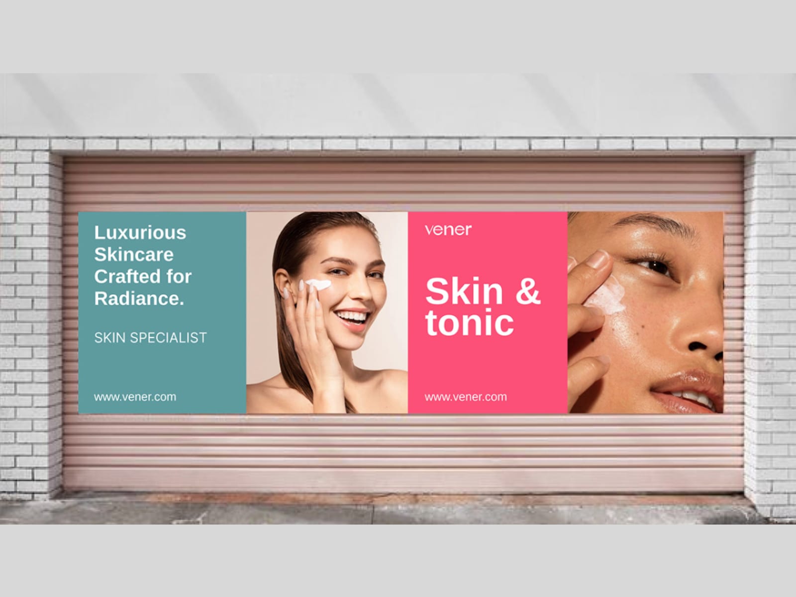
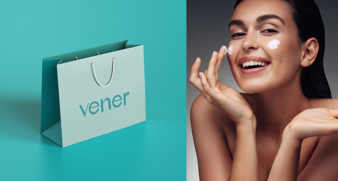
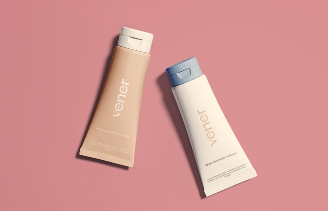
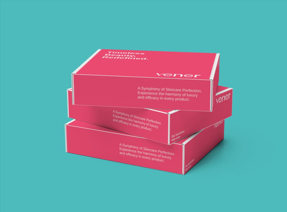
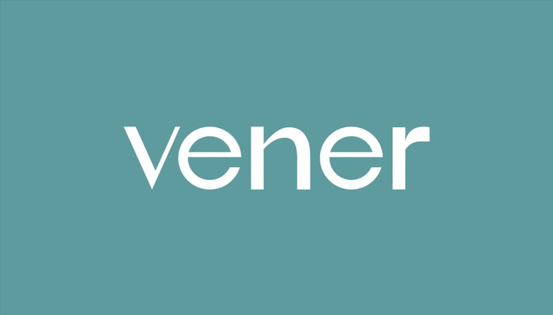
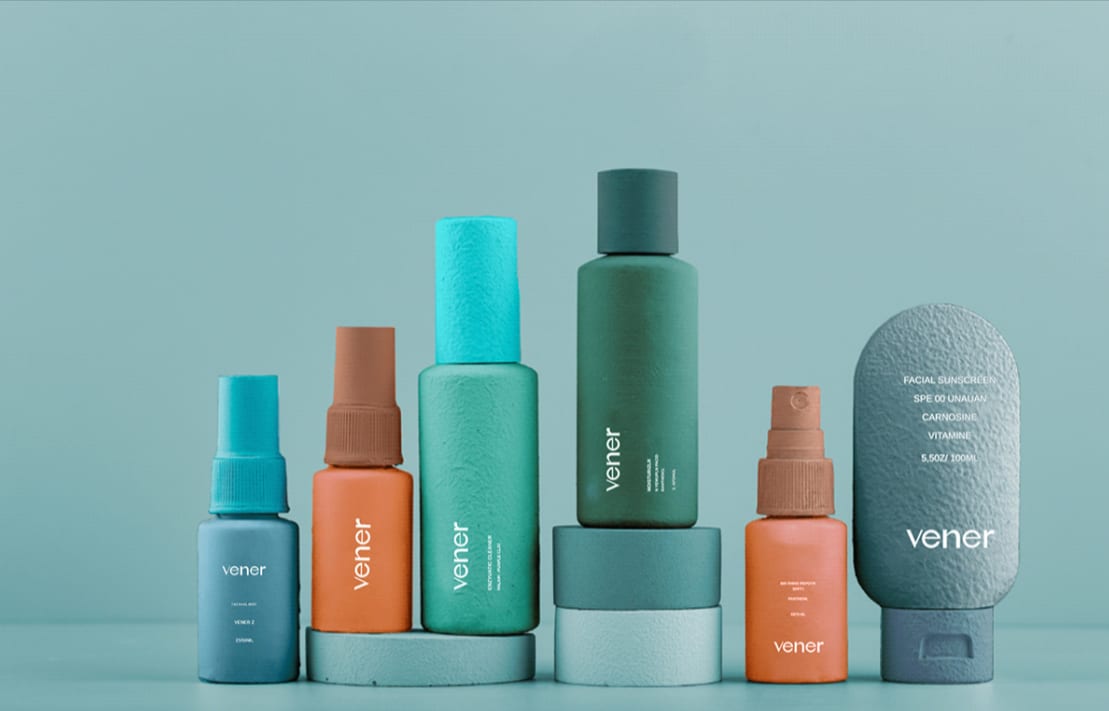
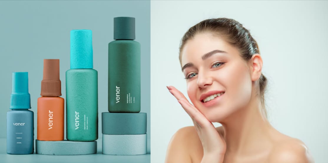
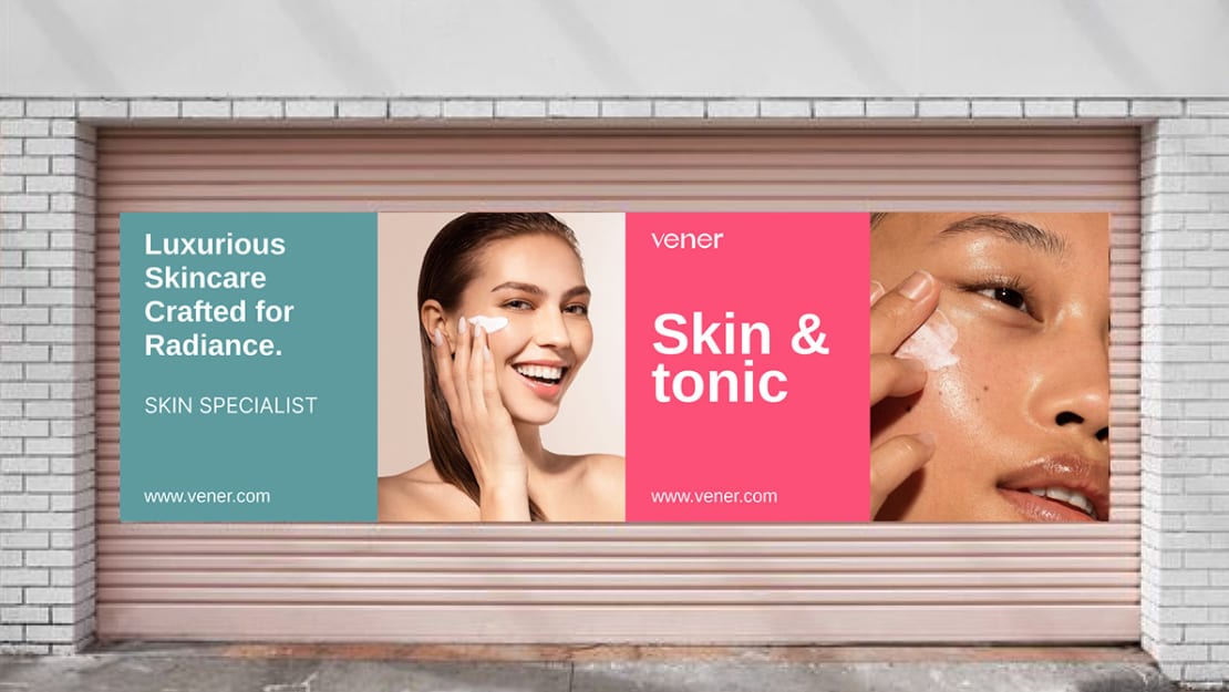
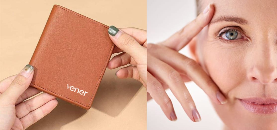
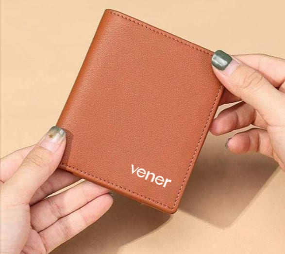
Vener 2021–2025
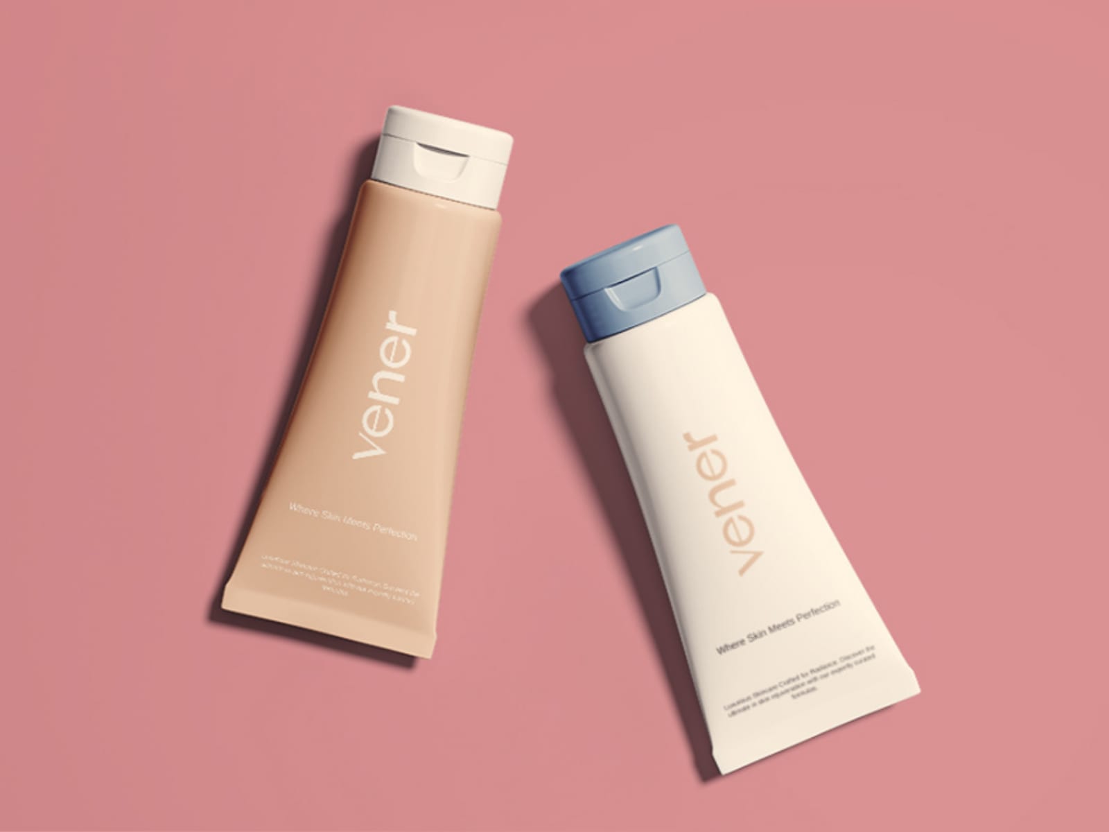
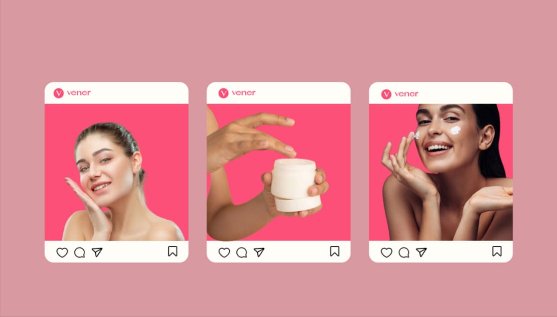
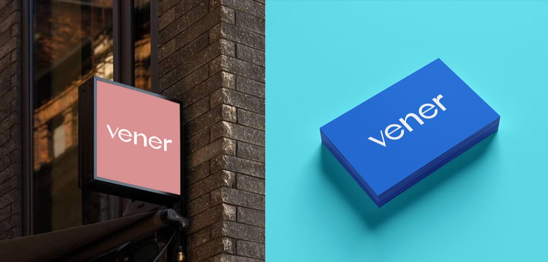
The Vener identity, developed from mark to full system — construction, palette and the applications that prove it works off the artboard.



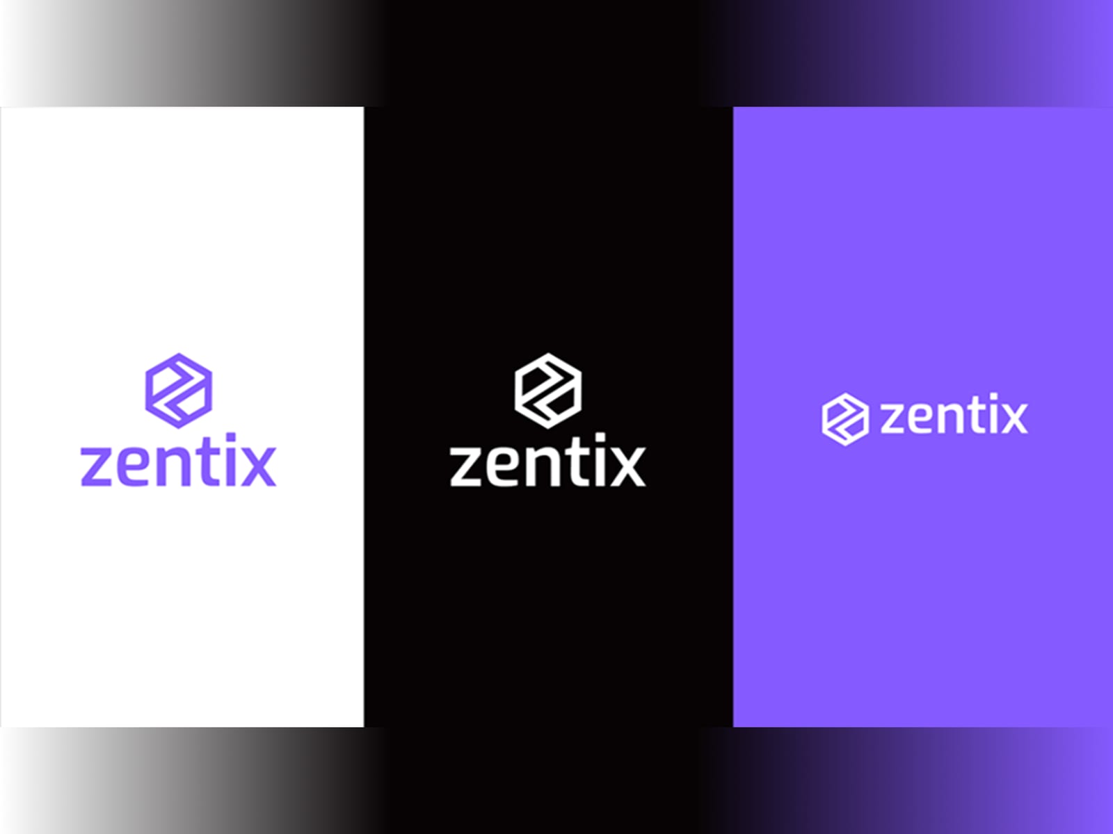
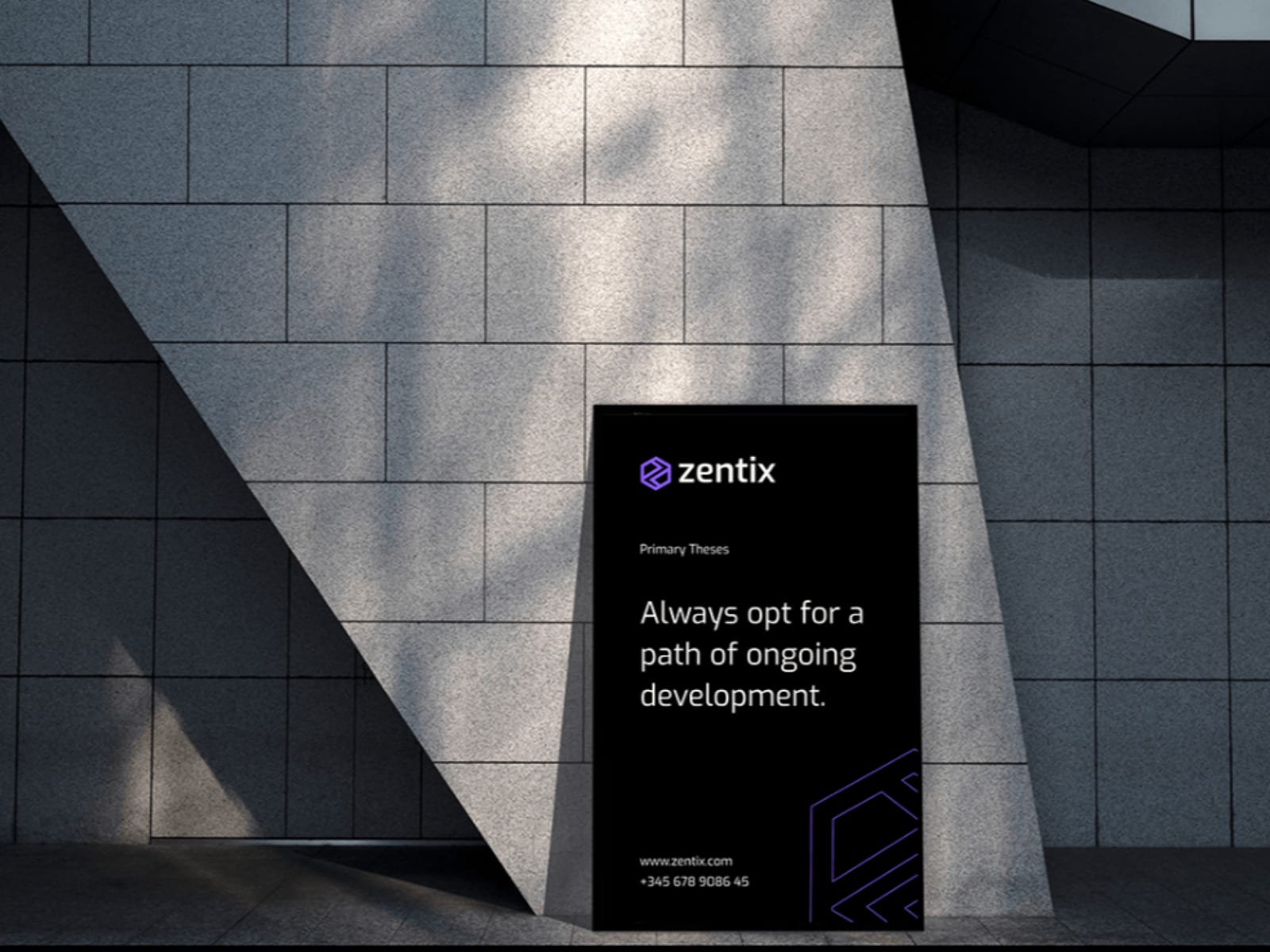
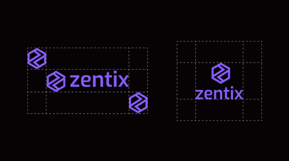
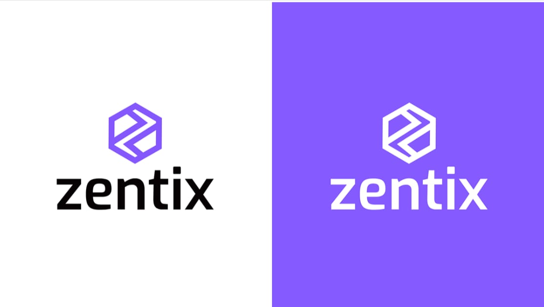
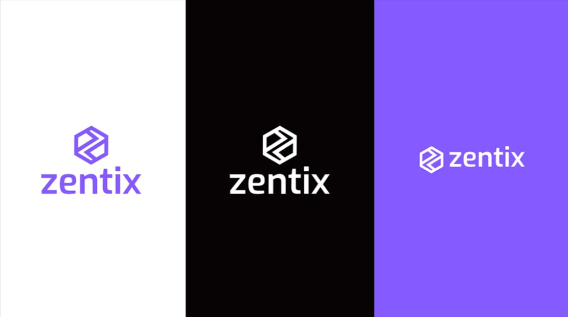
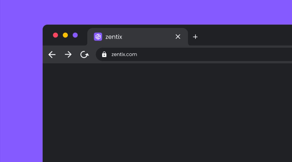
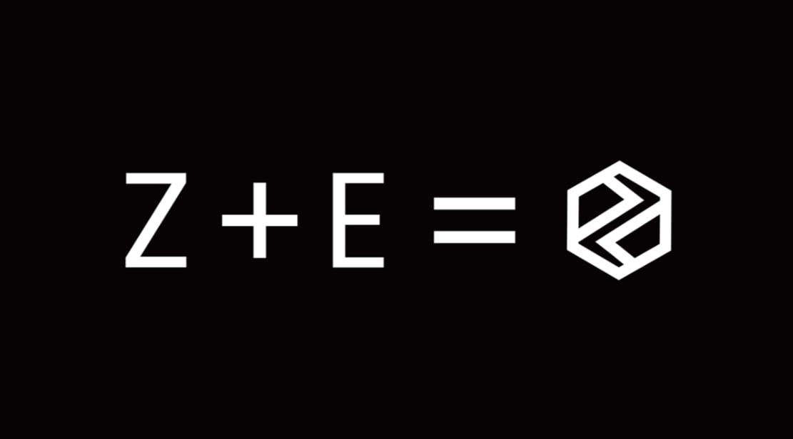
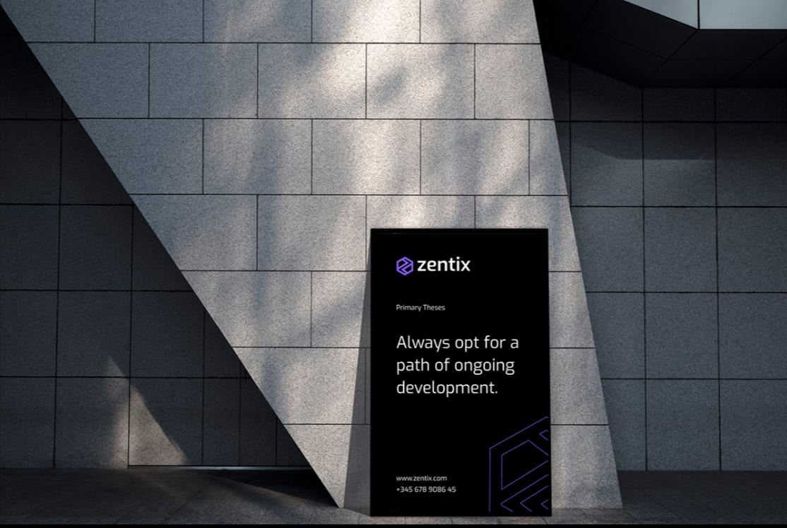
Zentix 2021–2025
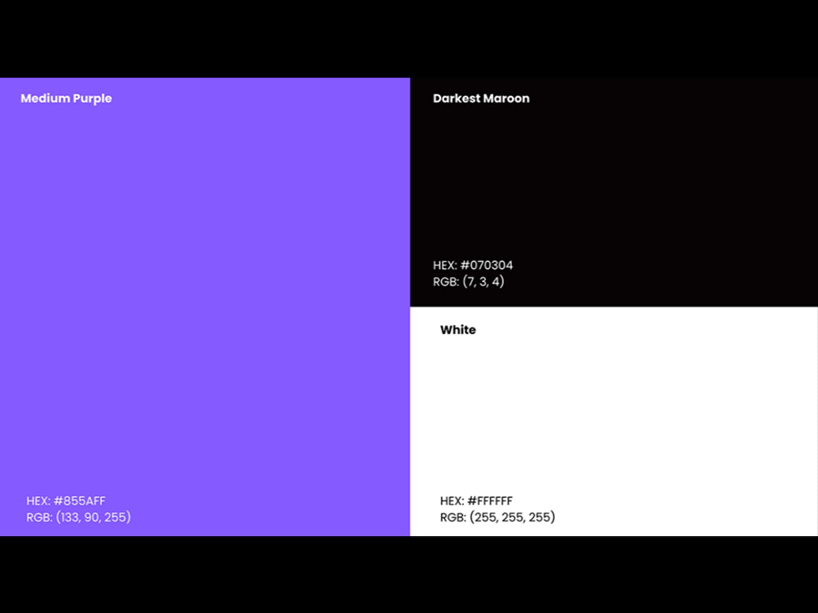
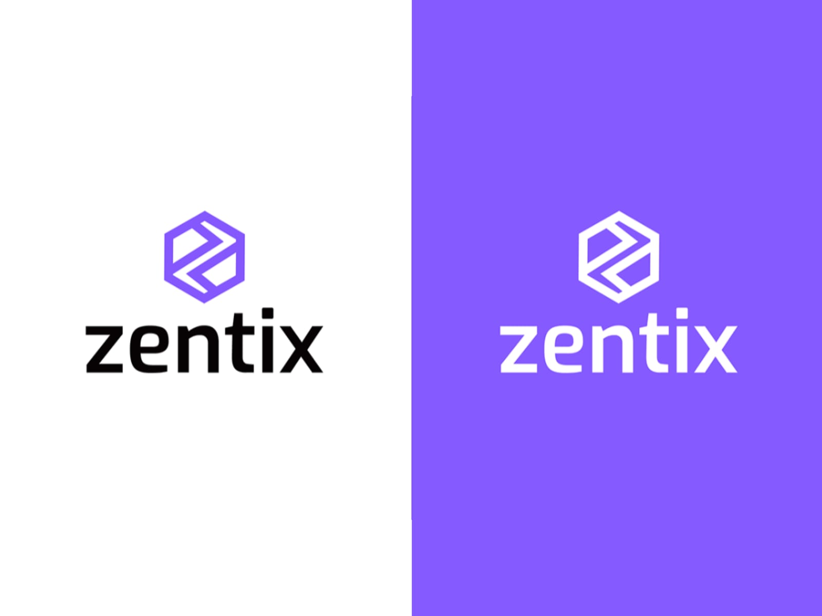
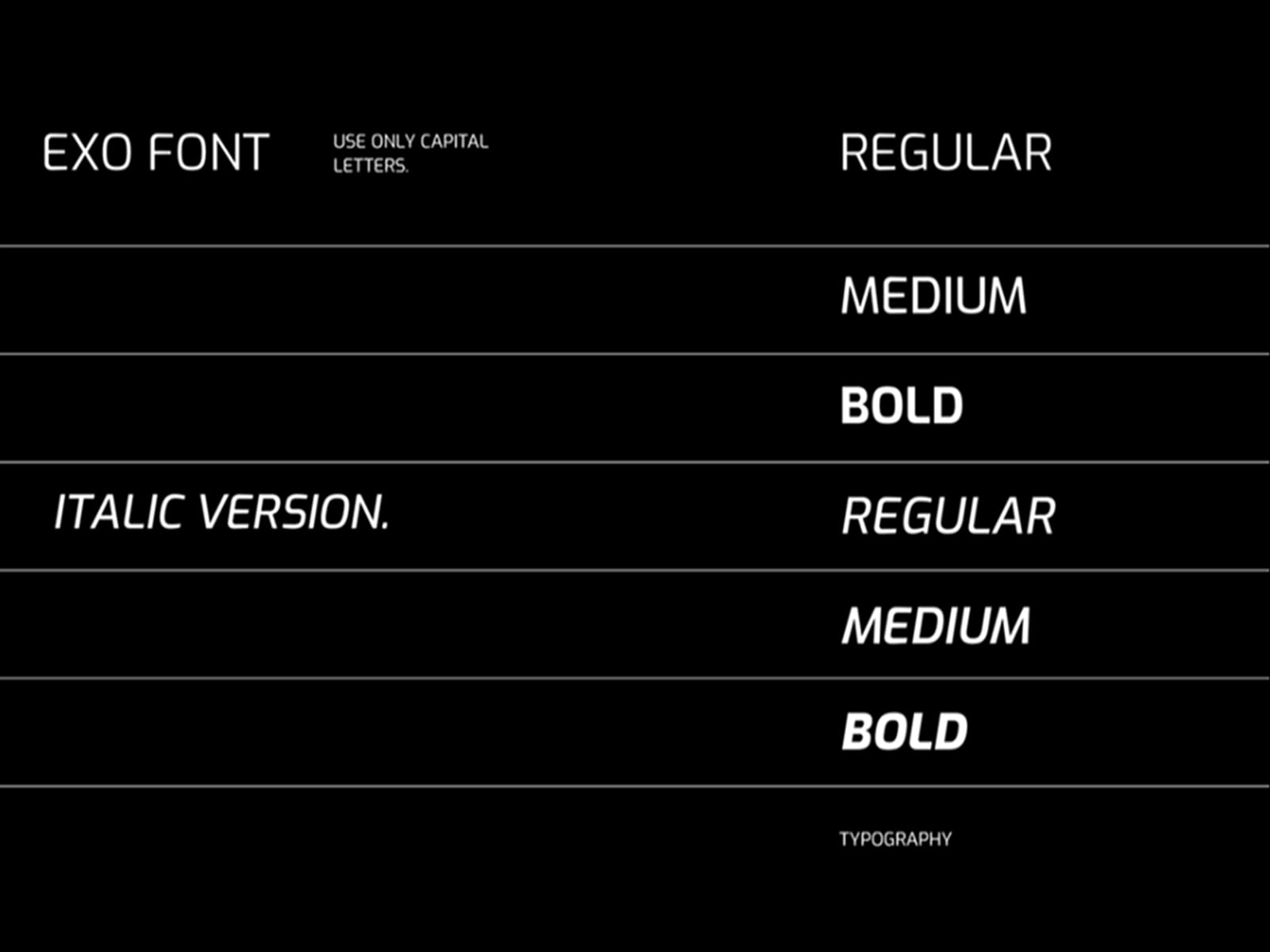
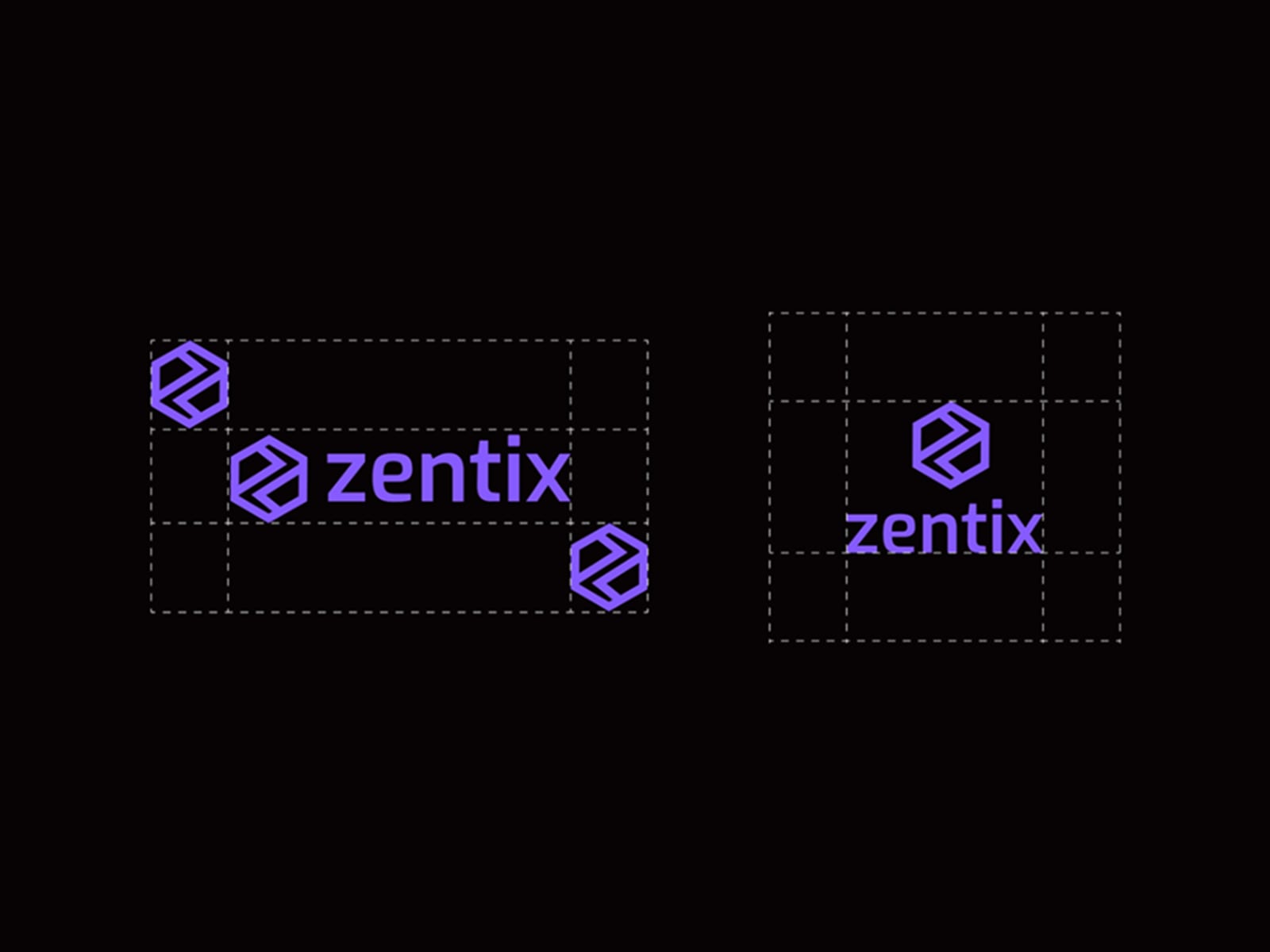
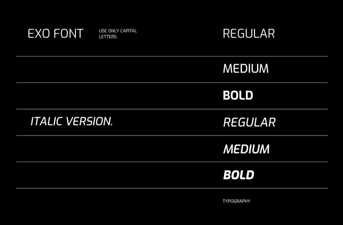
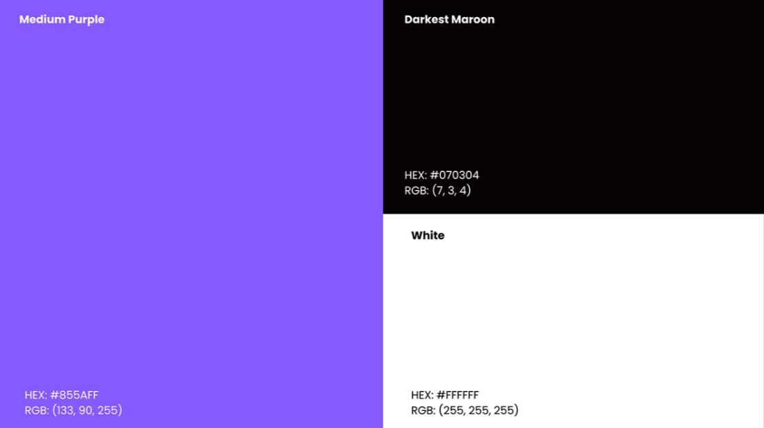
A precise, technical identity for Zentix. The mark is geometric by construction rather than by styling, which is what lets it scale from signage down to a stitched label.


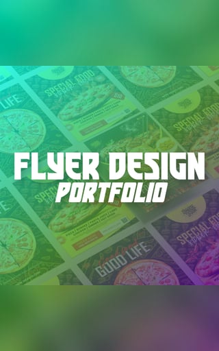
Selected Clients 2021–2025
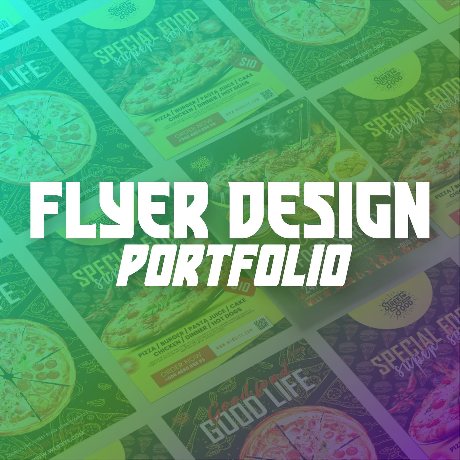
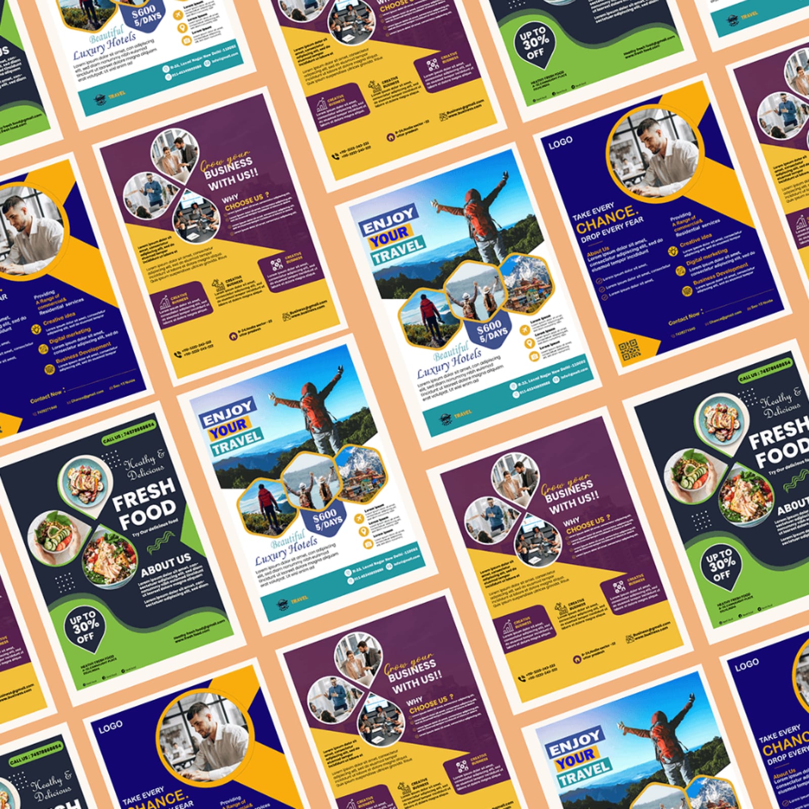
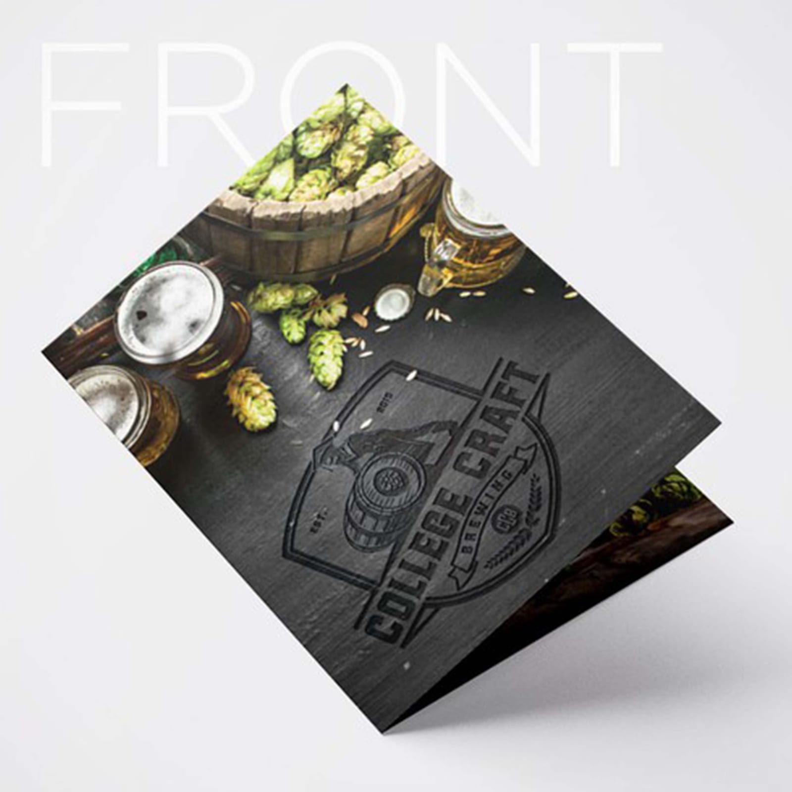
Flyers built to survive the press and the shelf — bold enough to stop someone mid-aisle, structured enough that the client can reprint with new copy and nothing breaks.
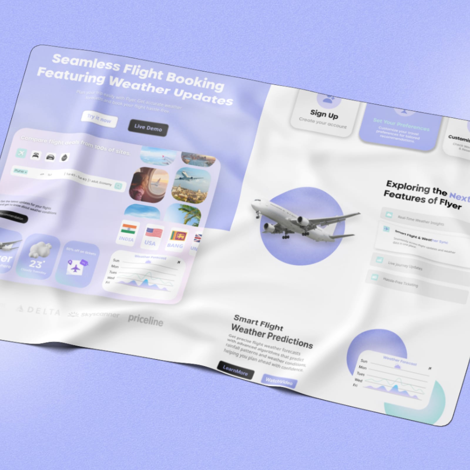
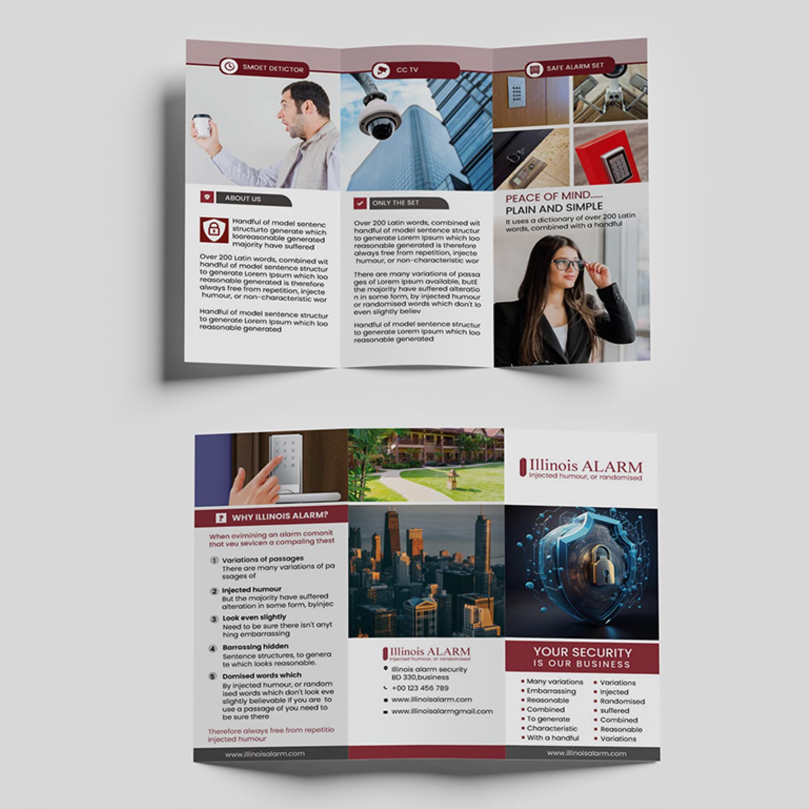
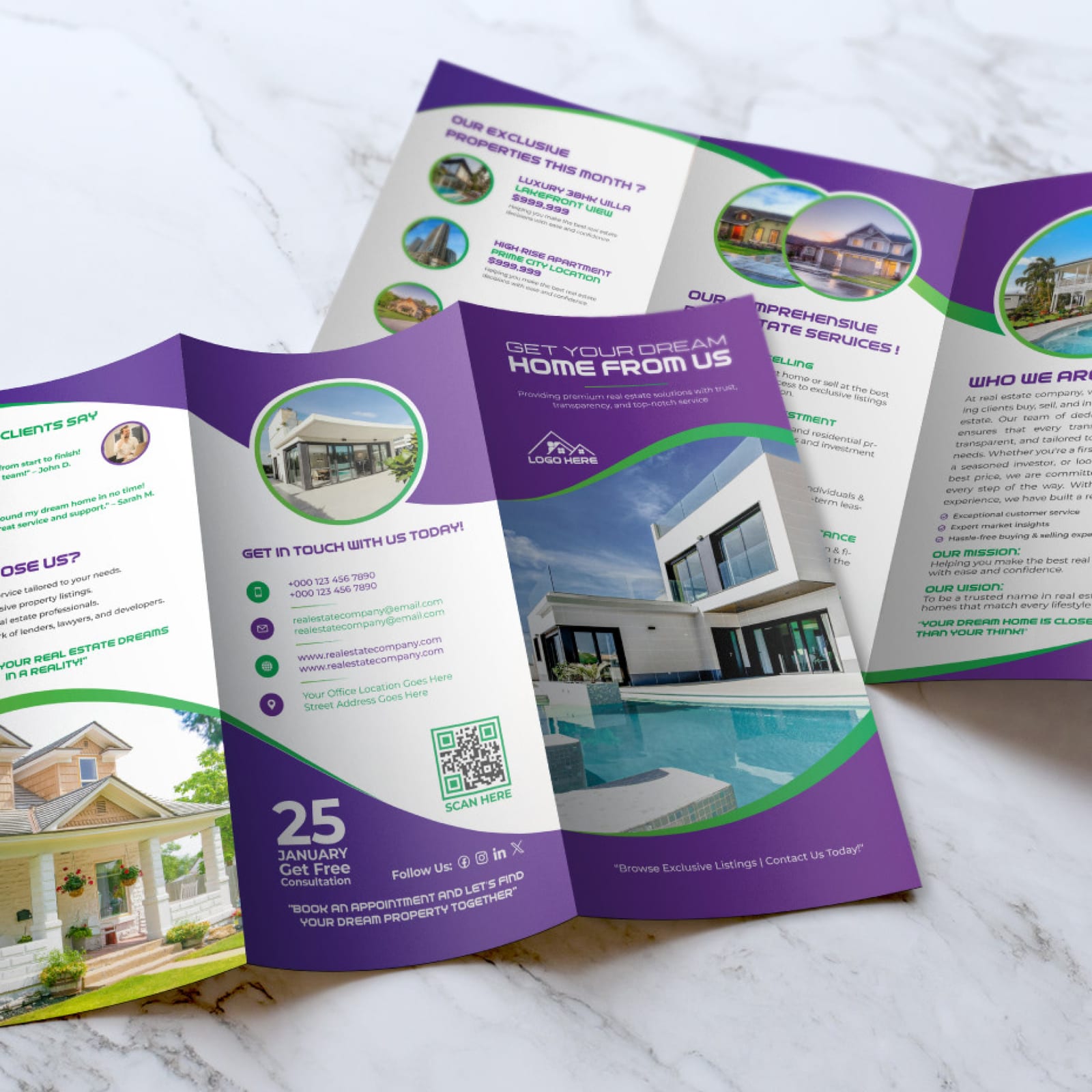
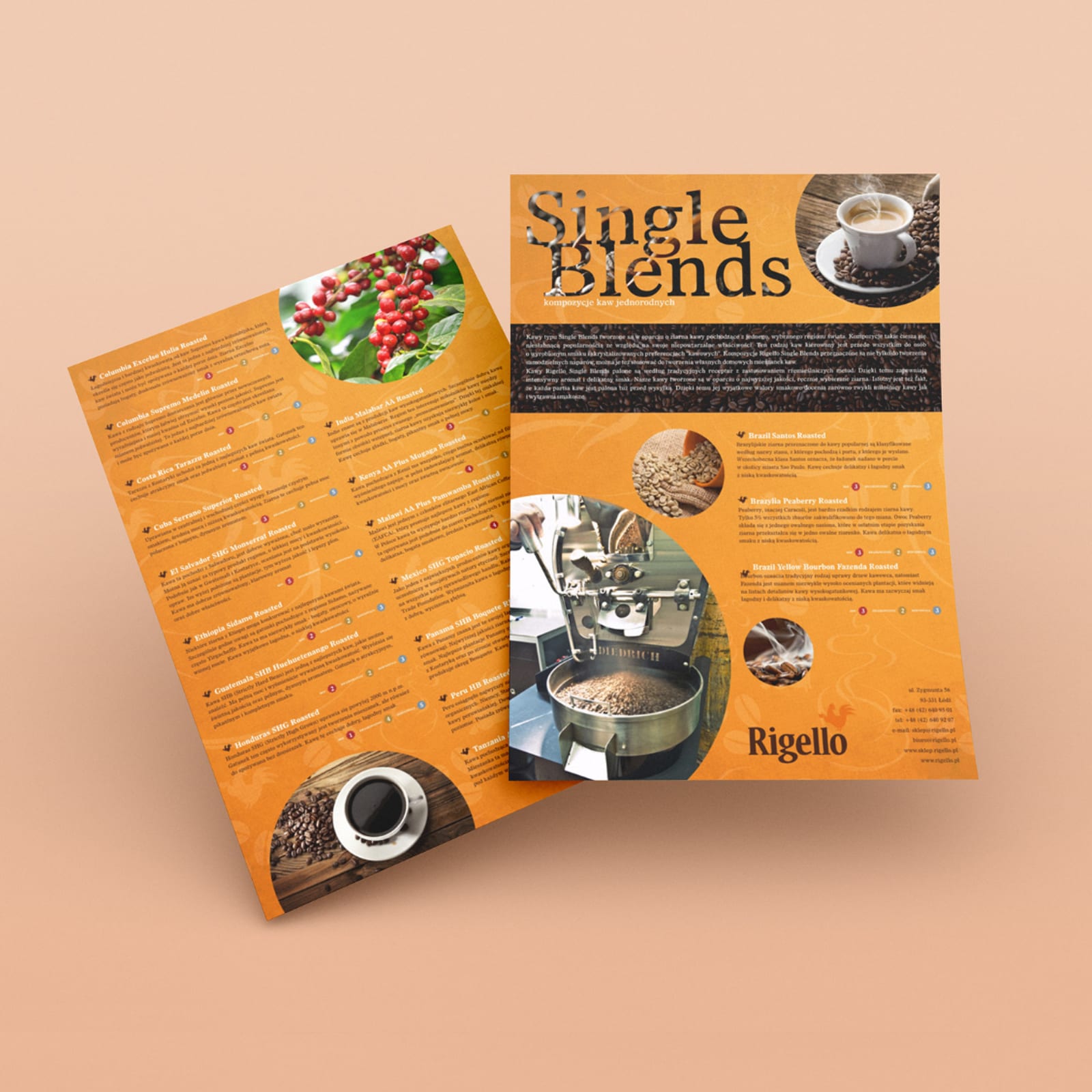
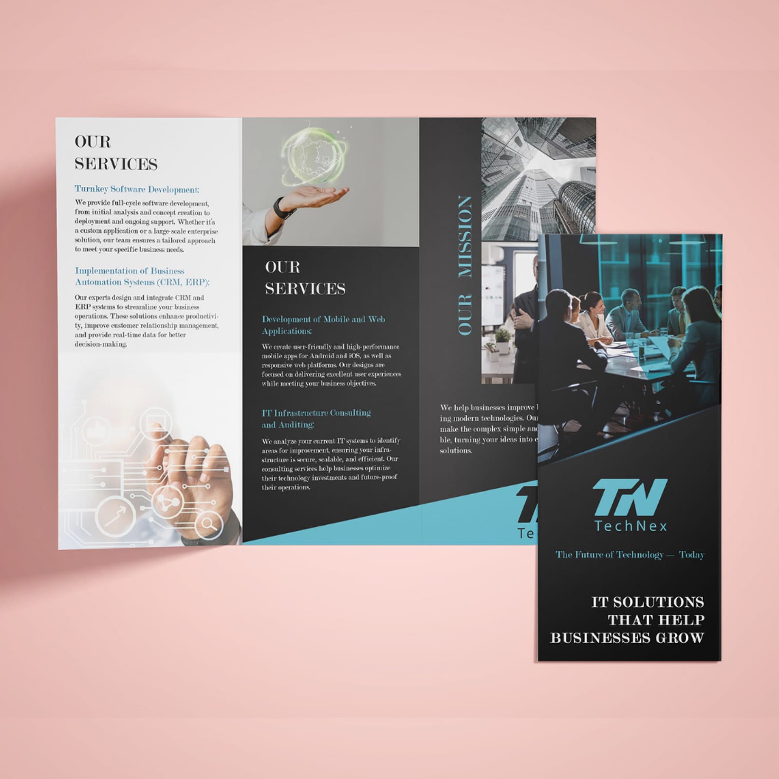
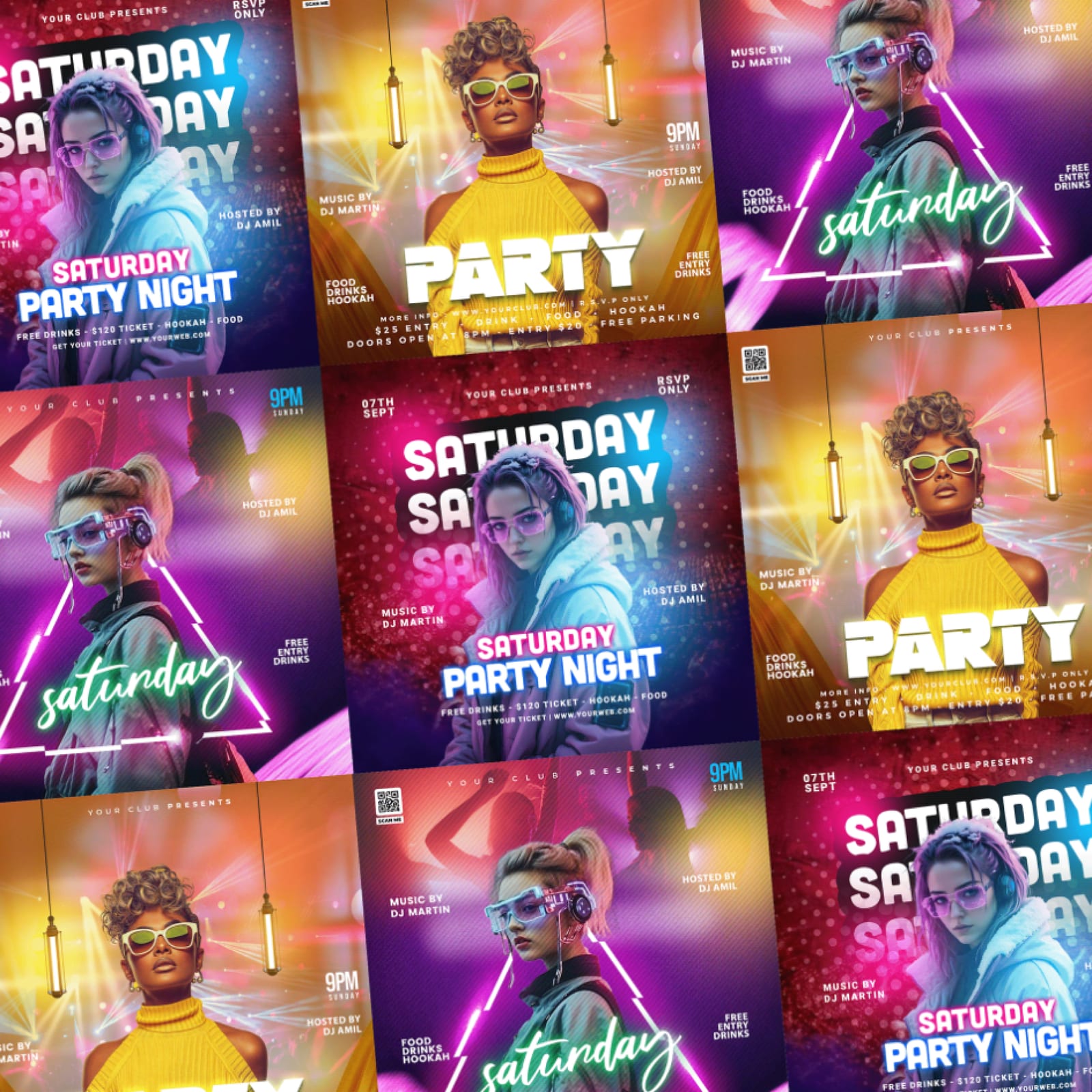
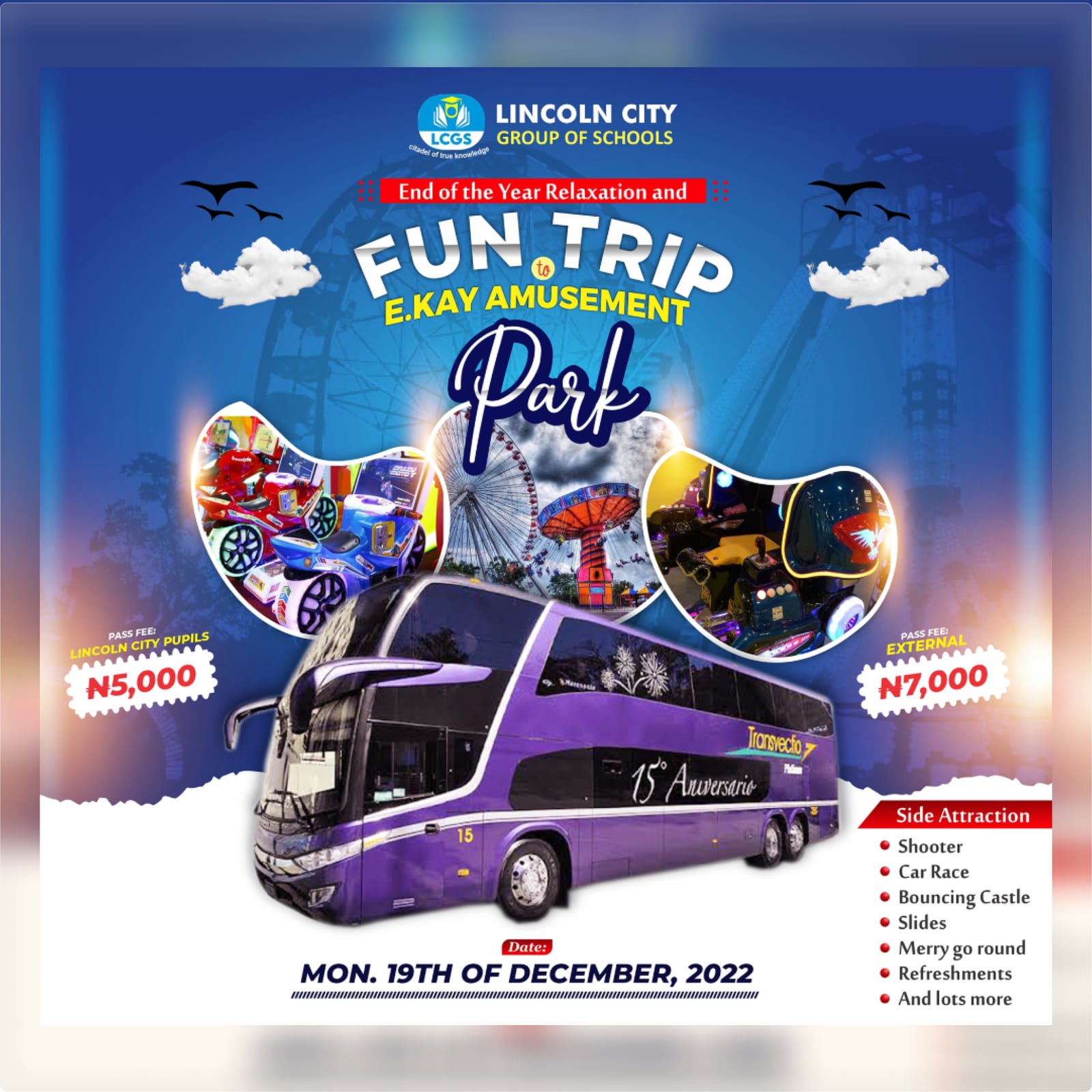
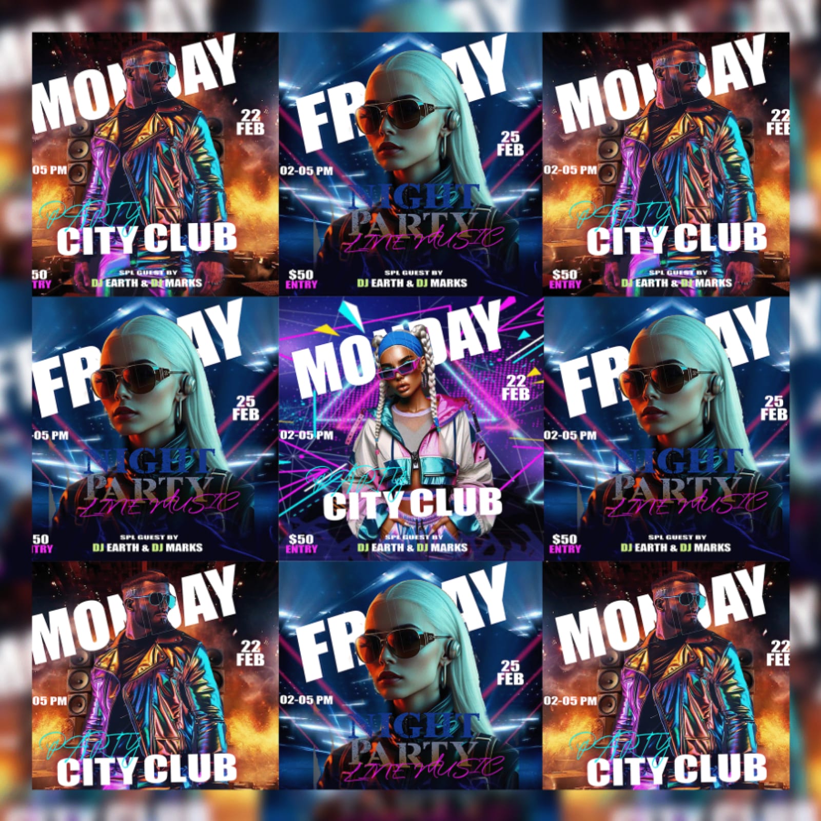
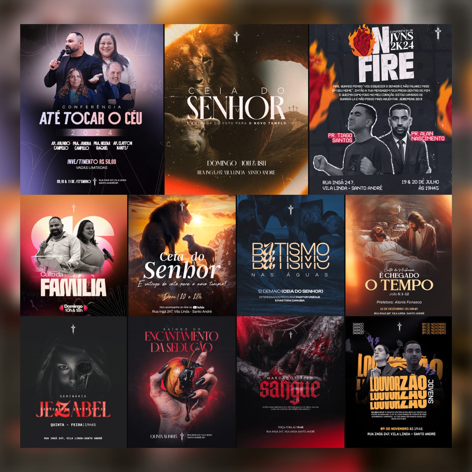
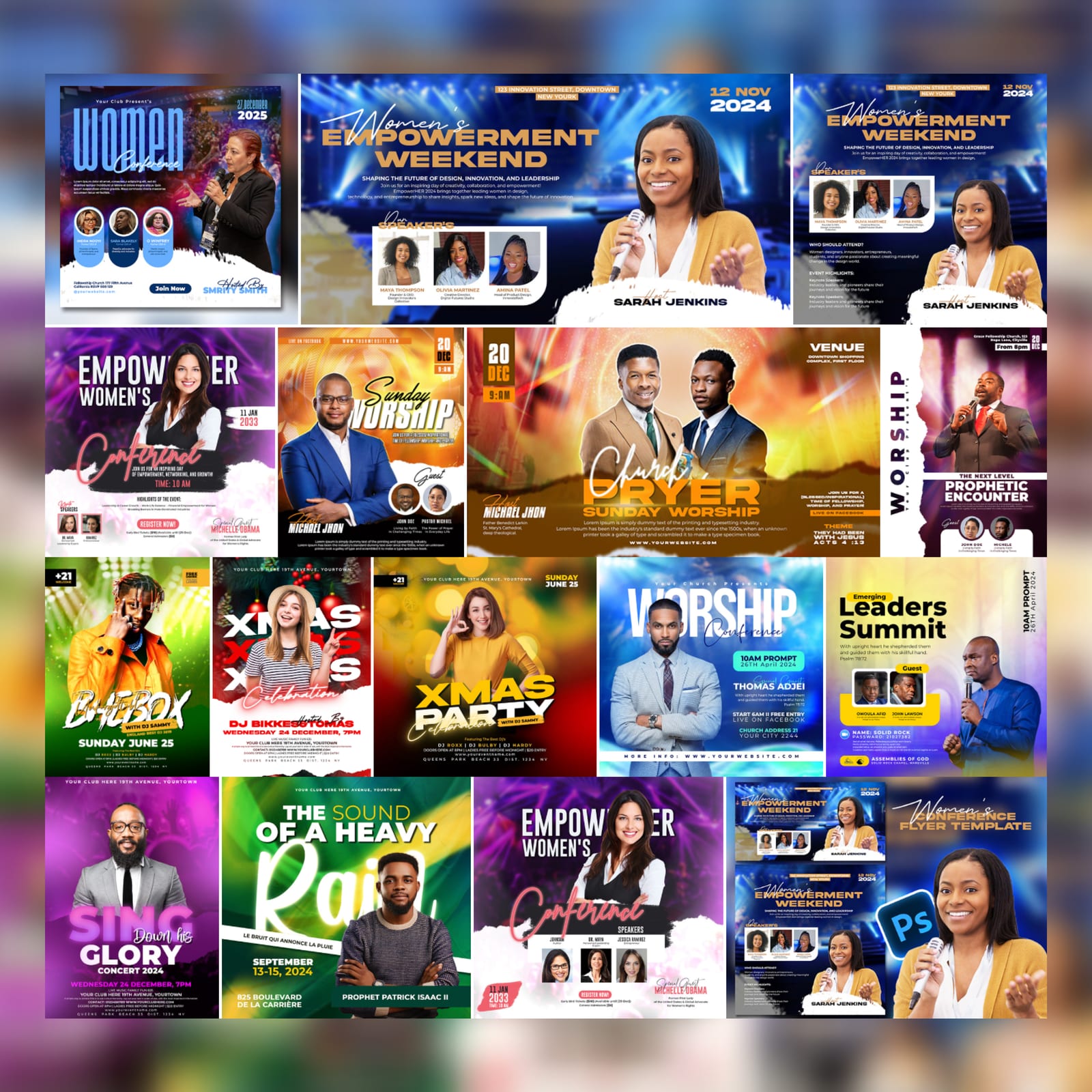
Selected Clients 2021–2025
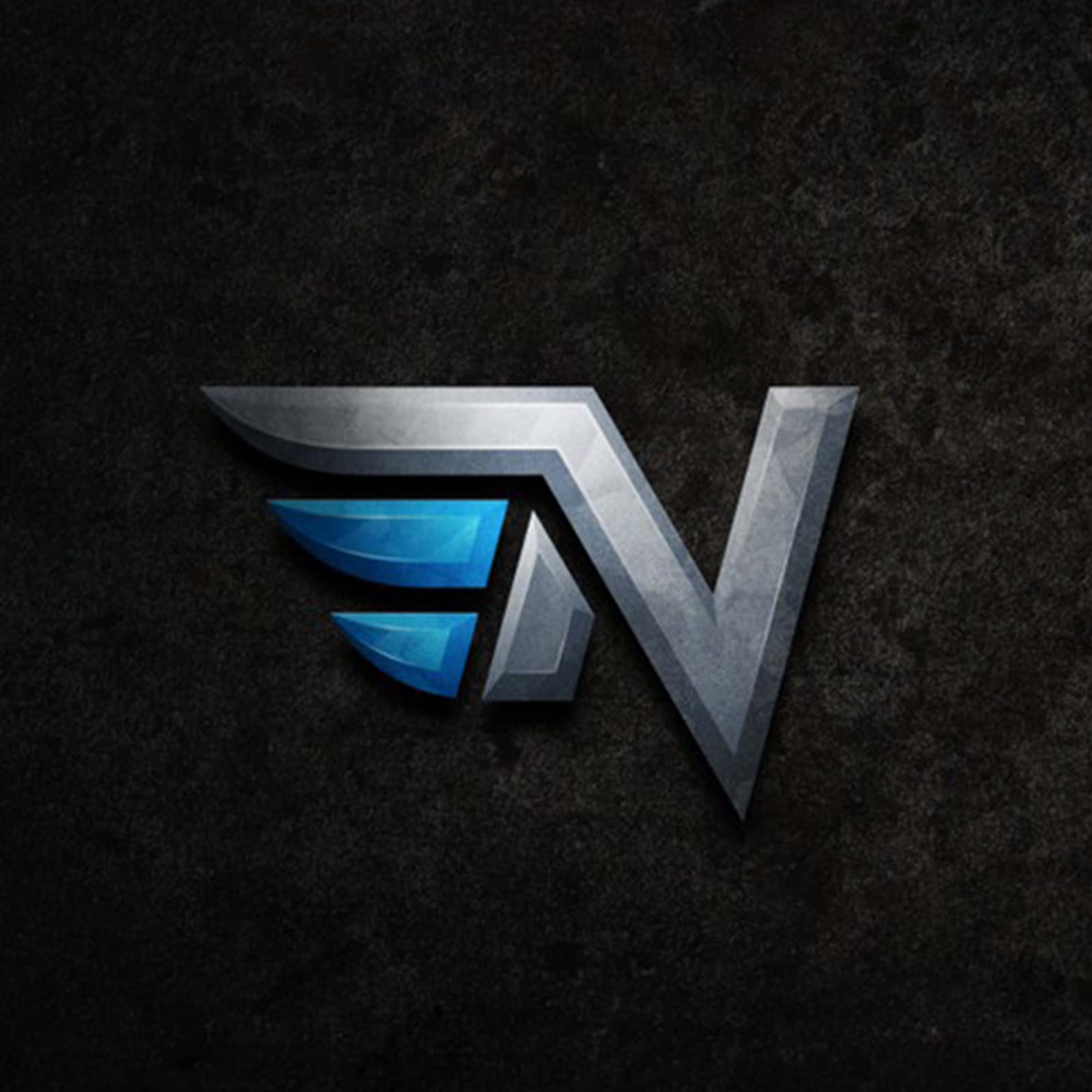
Marks taken off the flat artboard and given real material, light and depth — rendered so the form still reads when it is flattened back to one colour.
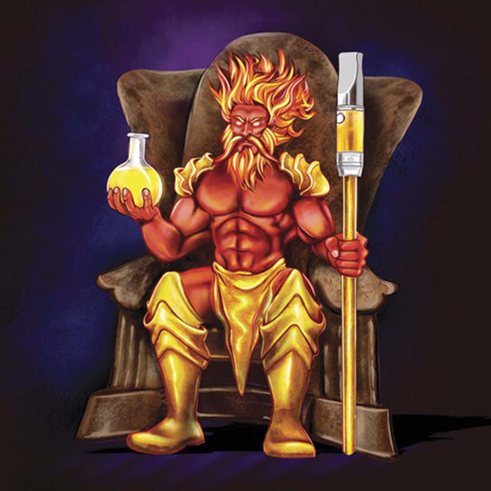
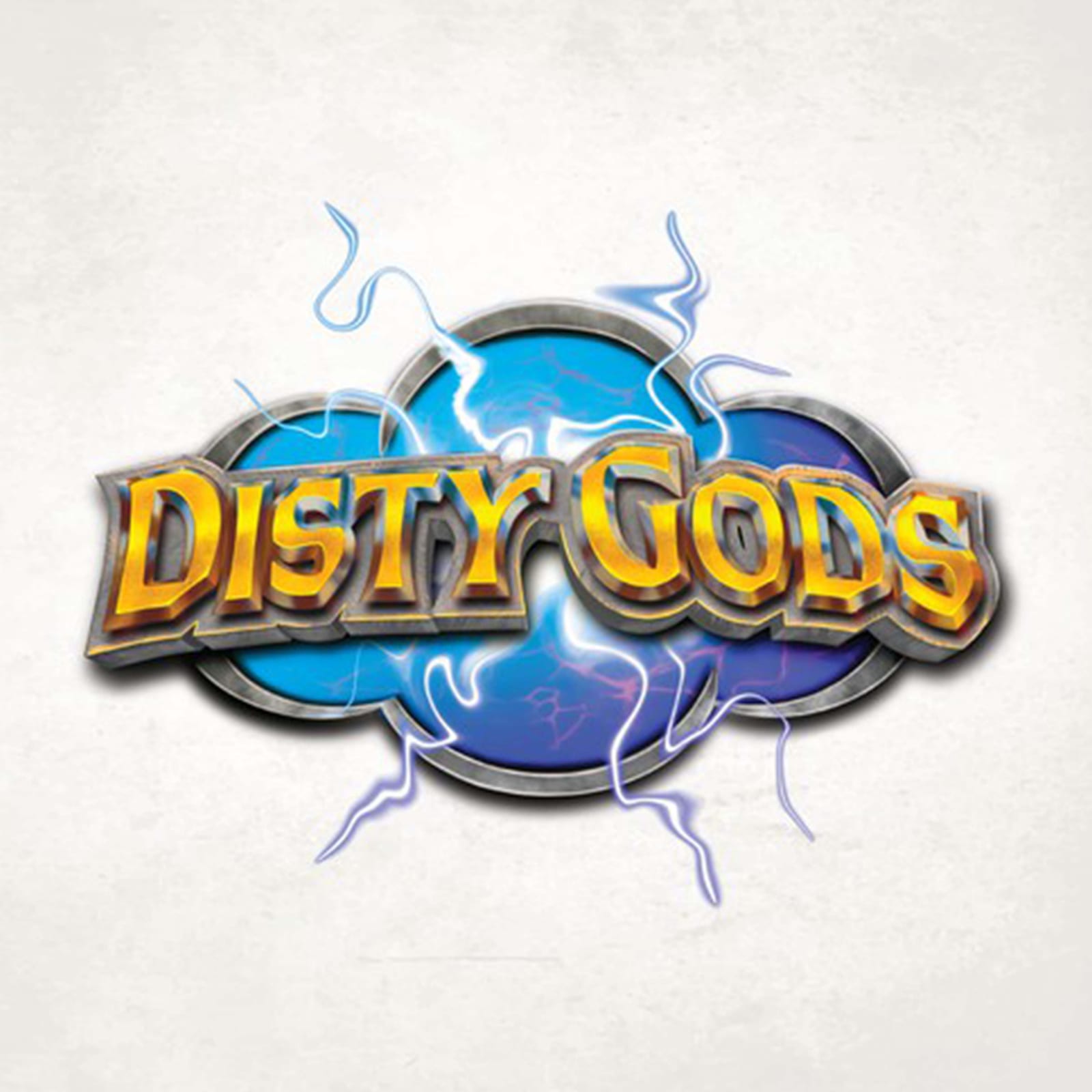
Selected Clients 2021–2025
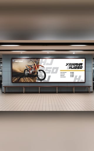
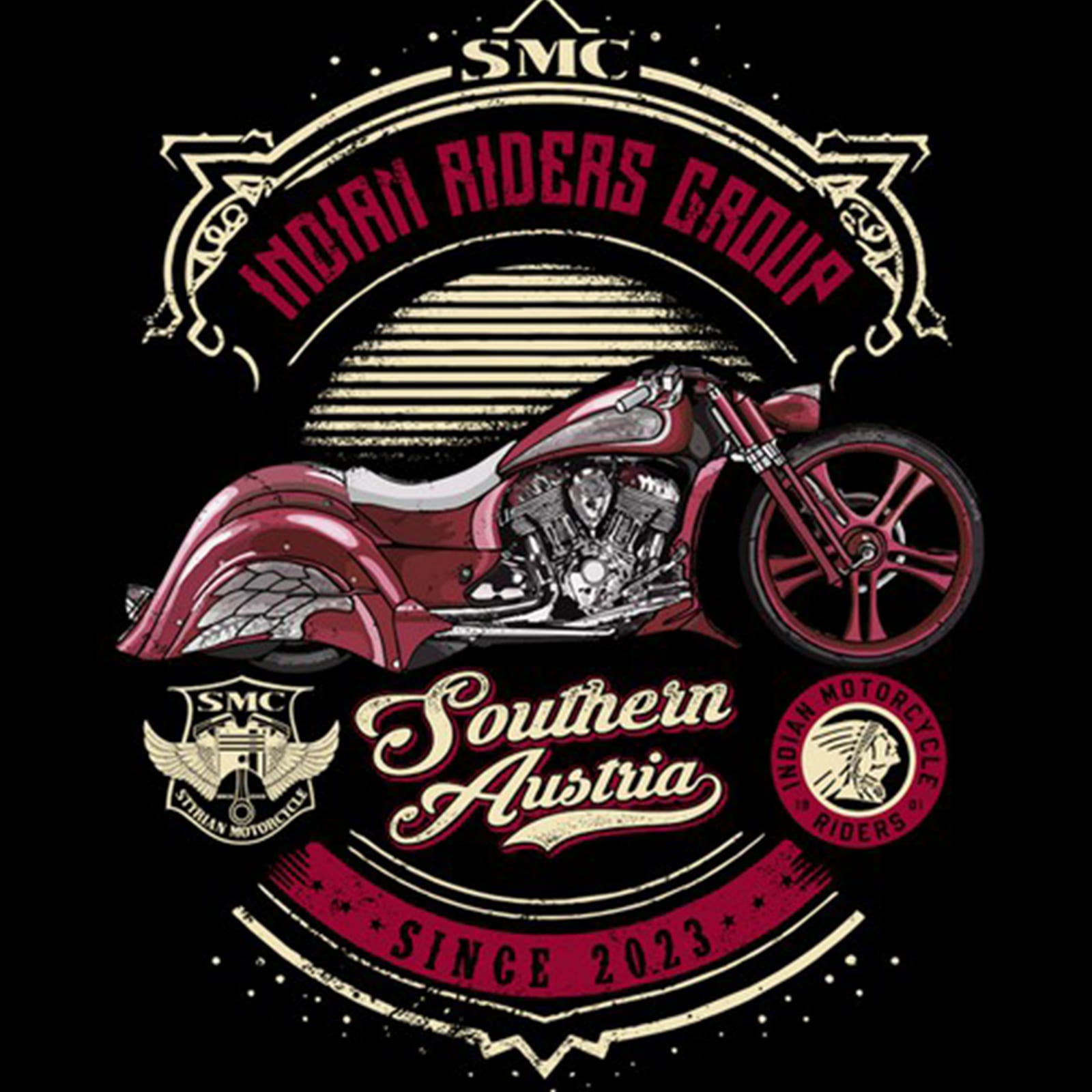
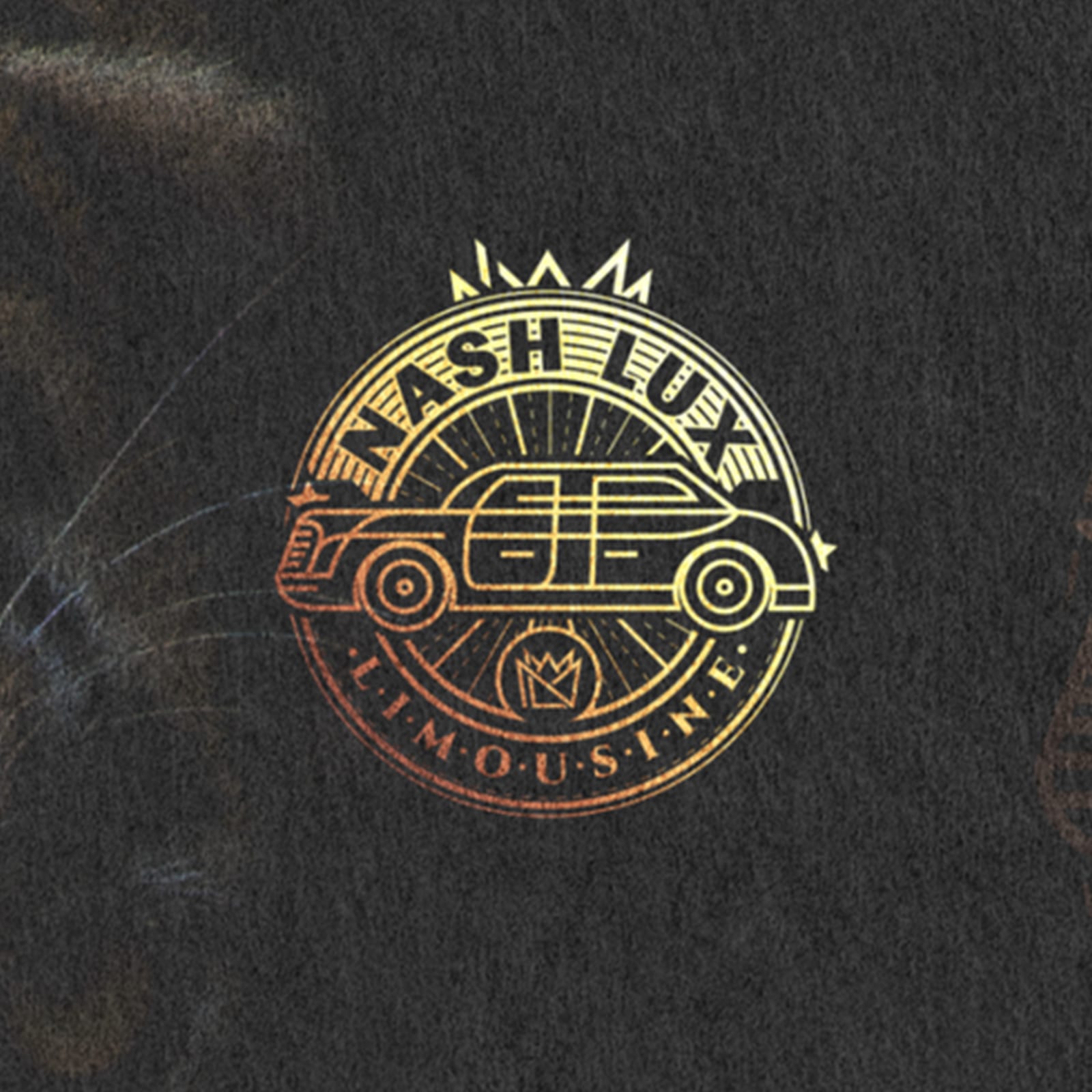
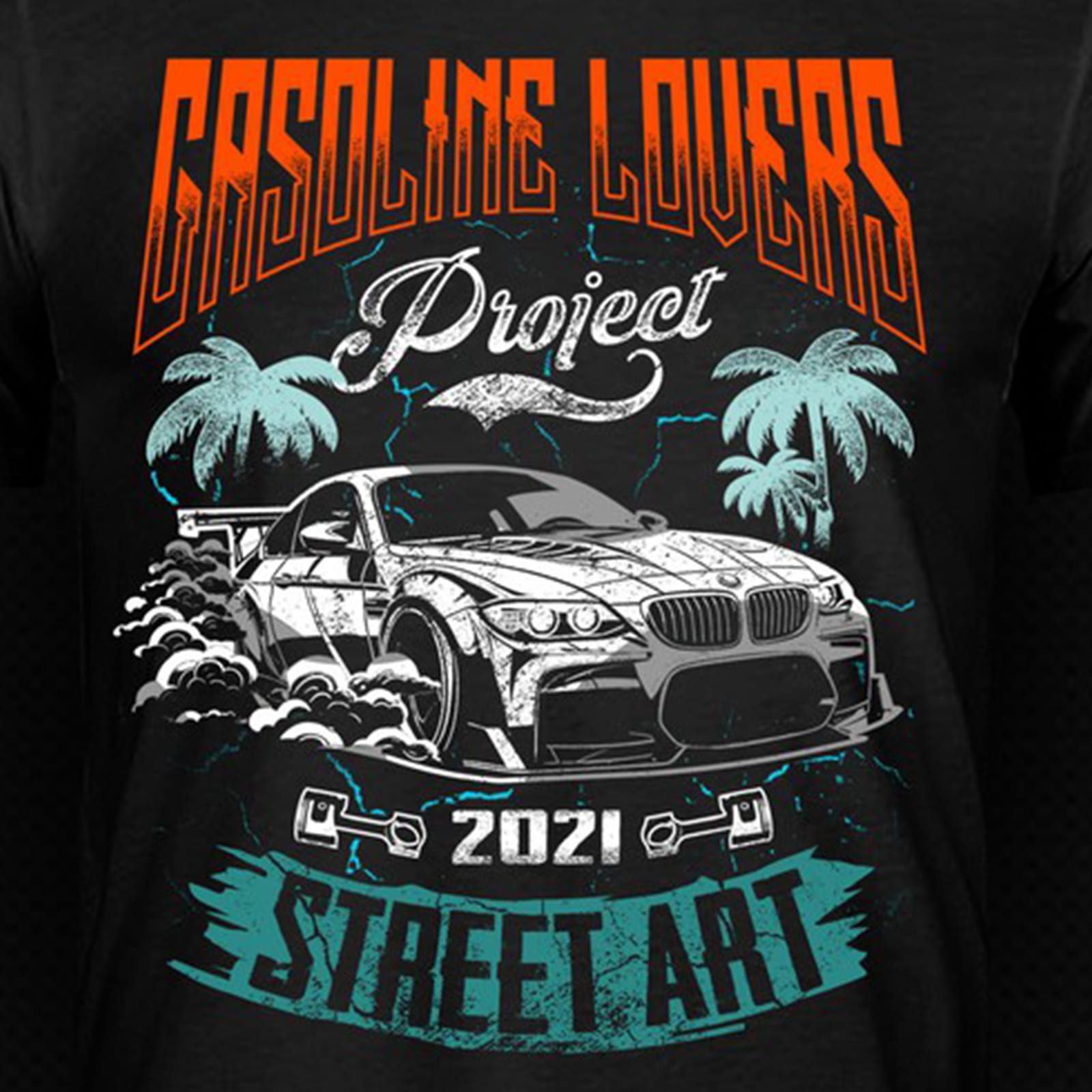
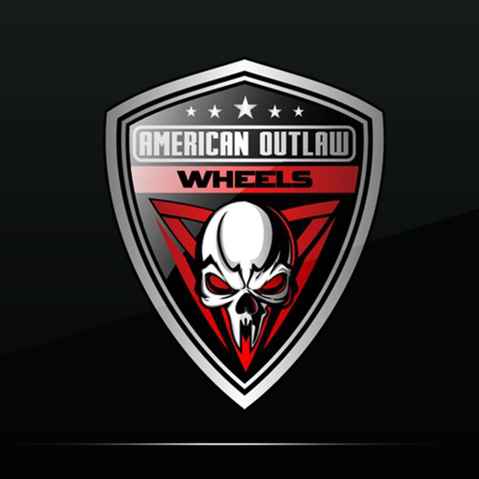
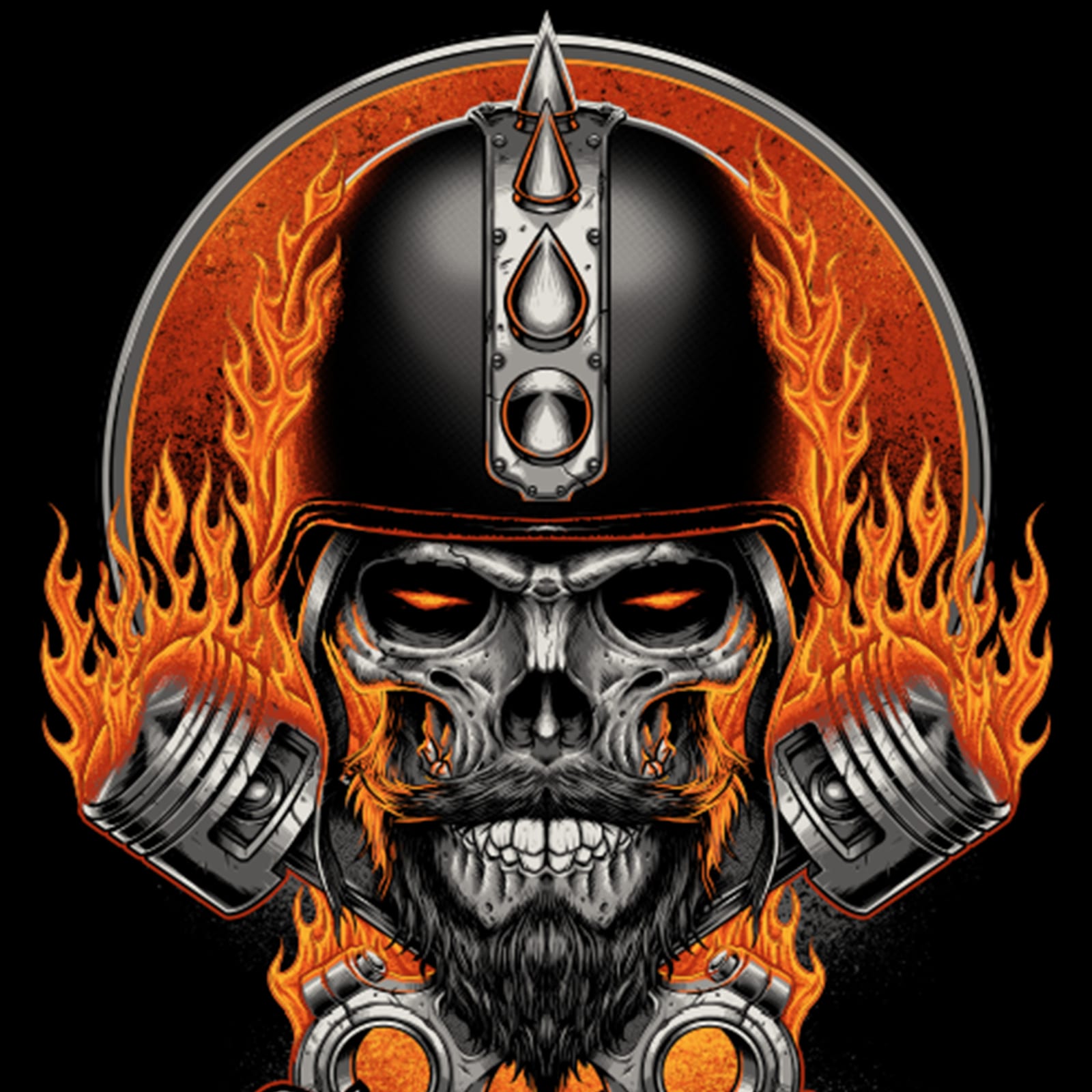
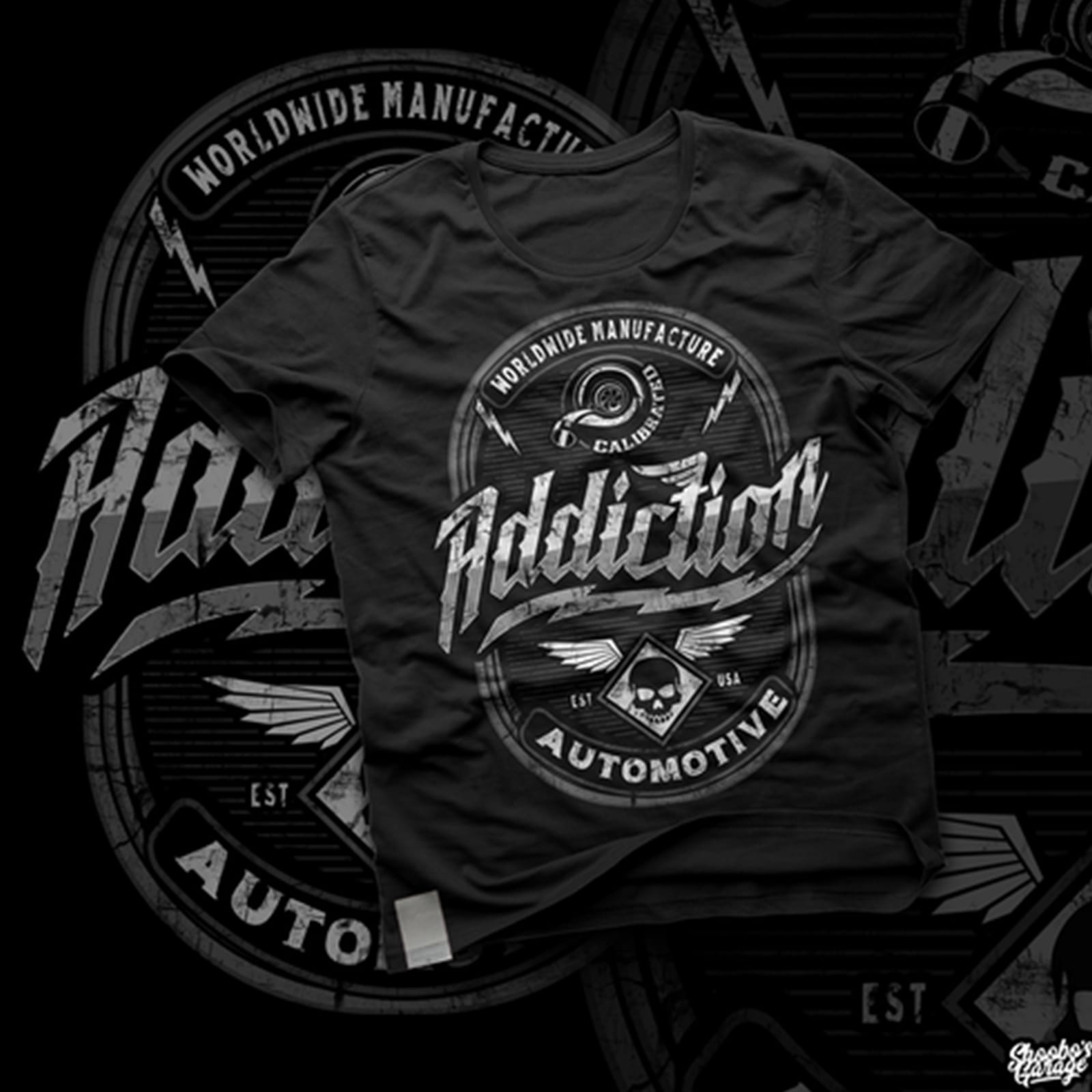
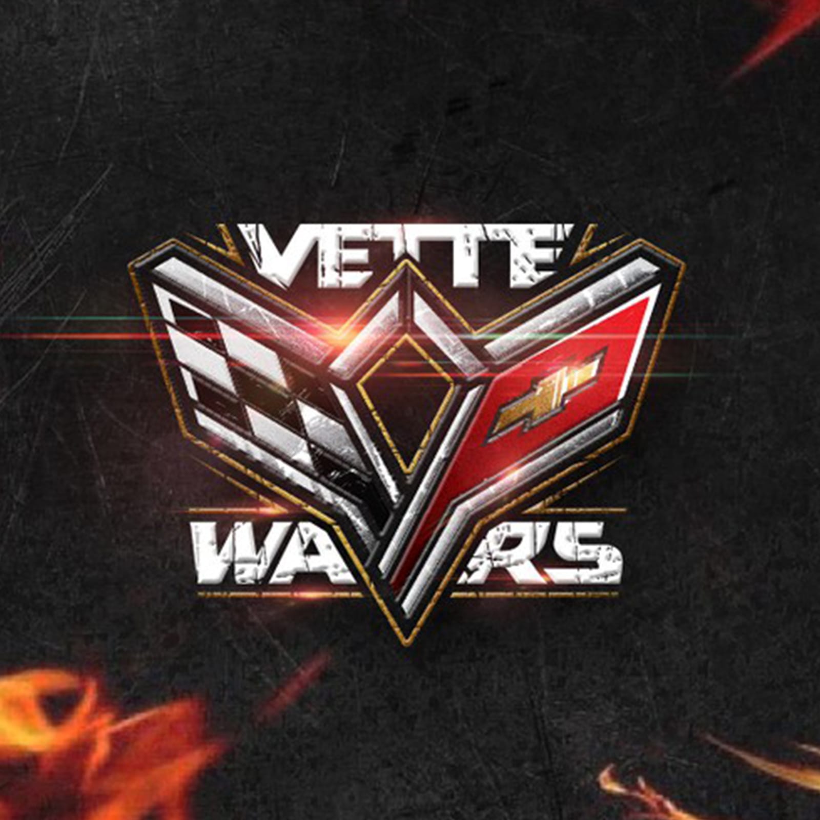
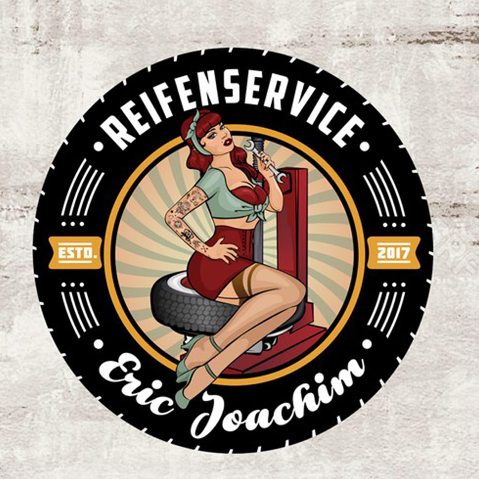
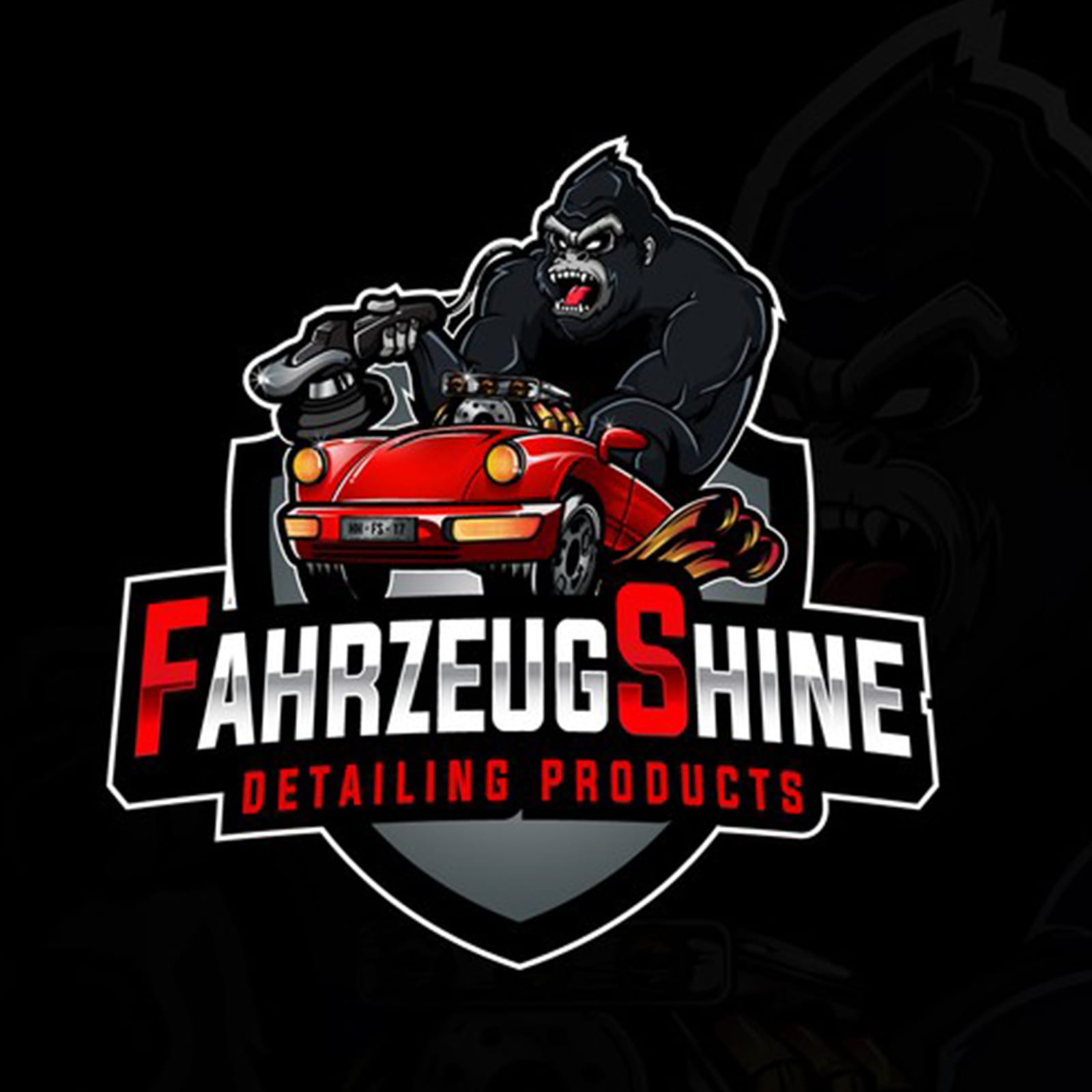
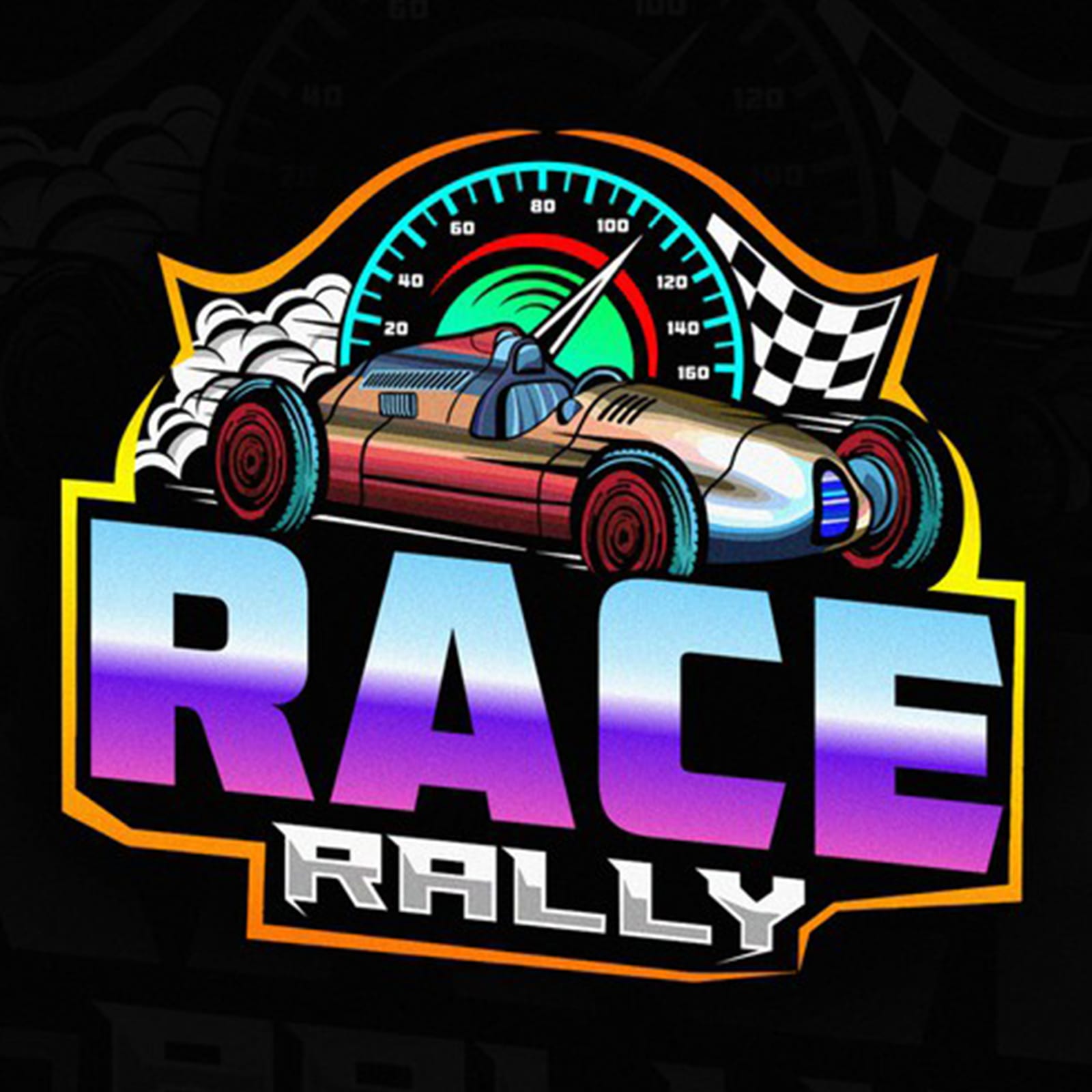
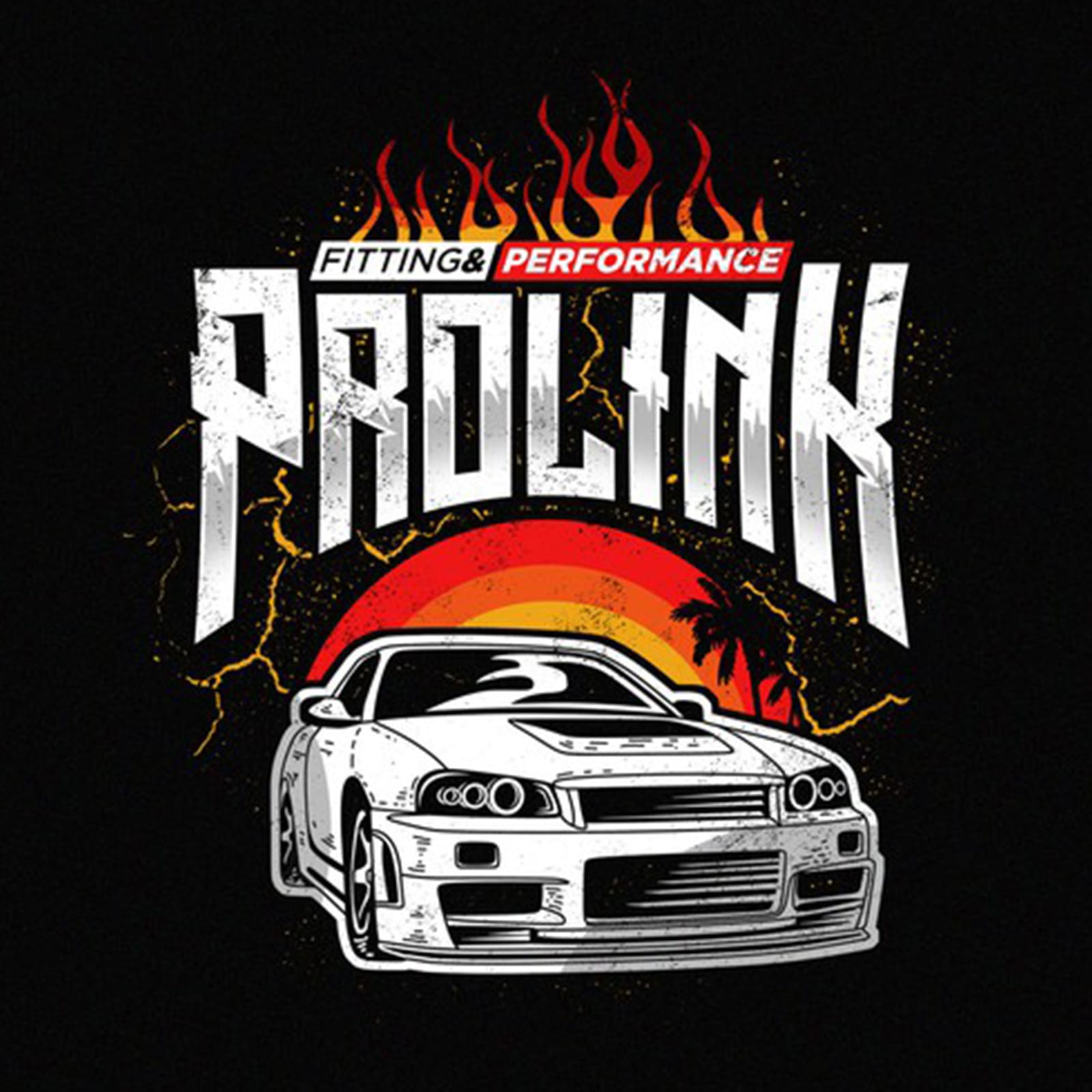
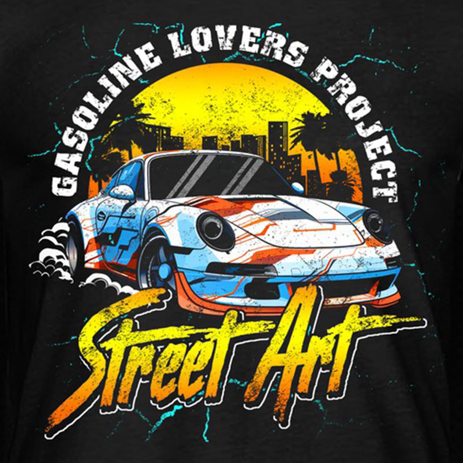
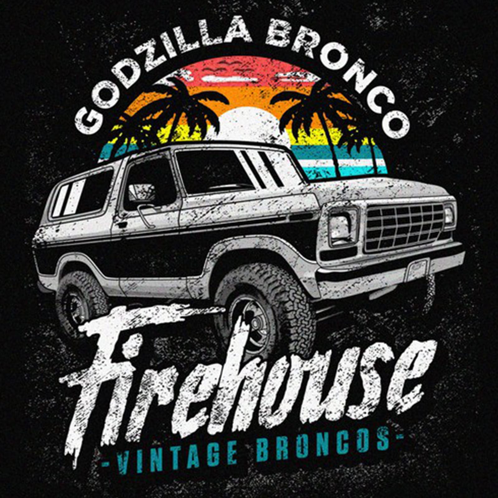
Emblems and marks for the motor trade, drawn to survive a badge, a wrap and a workshop sign — heavy enough to hold at speed, fine enough to hold on paper.


Selected Clients 2021–2025
Marks for online retail, where the first appearance is a 32-pixel avatar. Each one is tested at that size before it is tested at any other.

Selected Clients 2021–2025
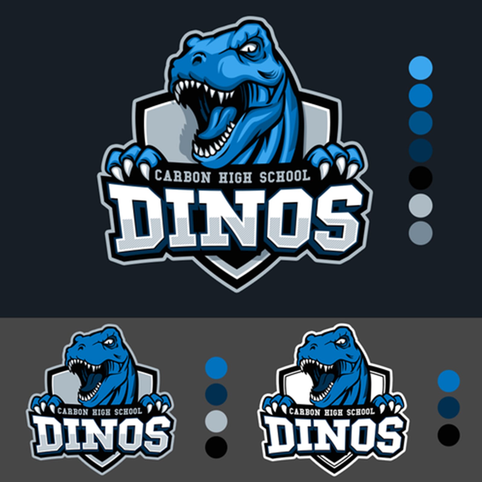
Logos for media, music and entertainment brands — expressive without becoming illustration, so they still work as a stamp on a poster or a corner bug on screen.


Selected Clients 2021–2025
Characters drawn as marks rather than as pictures: one consistent line weight, a limited palette, and a silhouette that is recognisable before any detail is.


Selected Clients 2021–2025
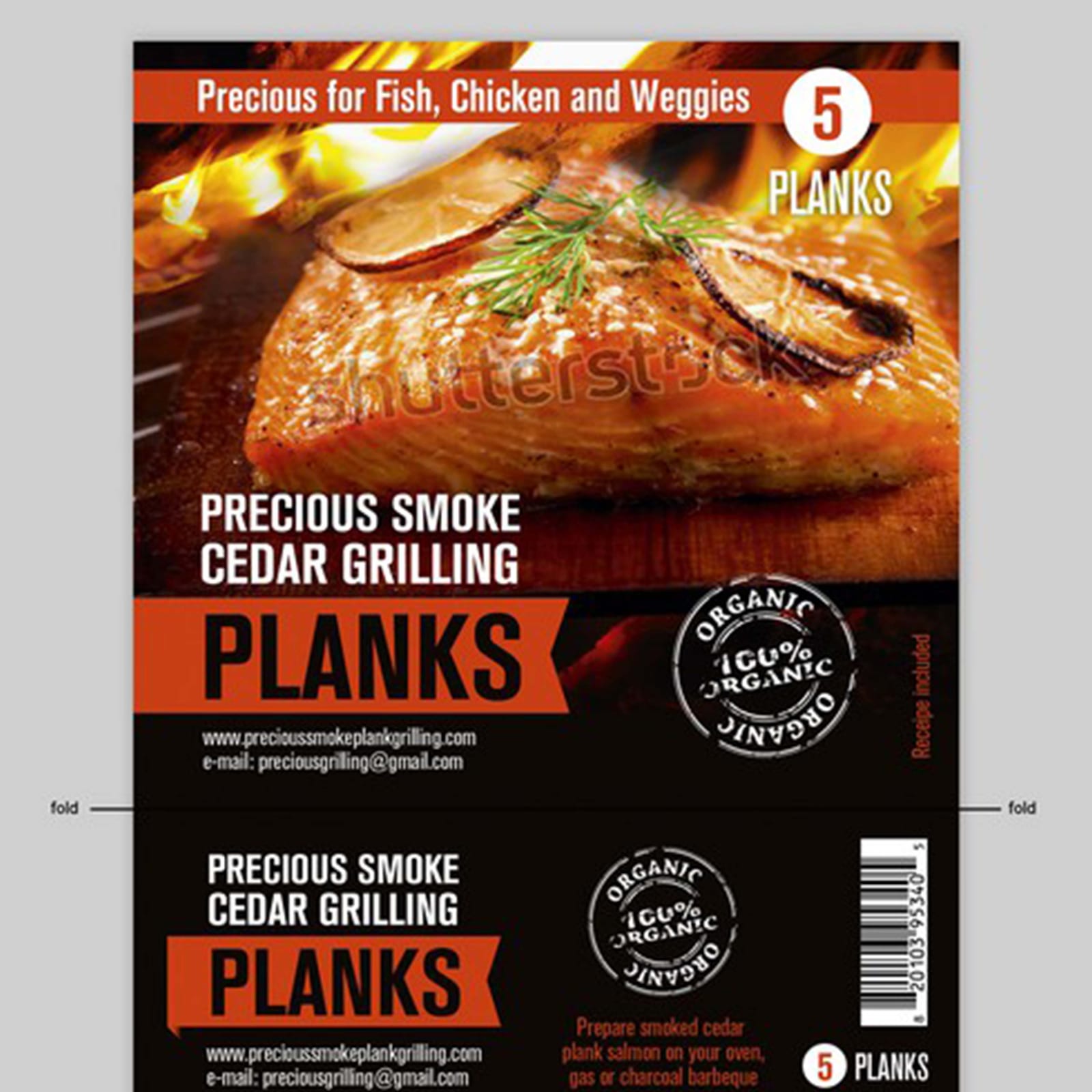
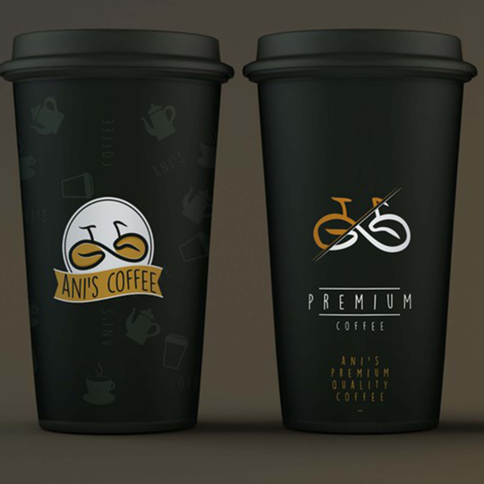
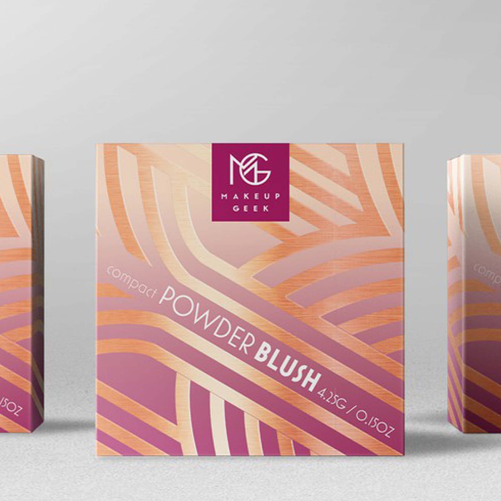
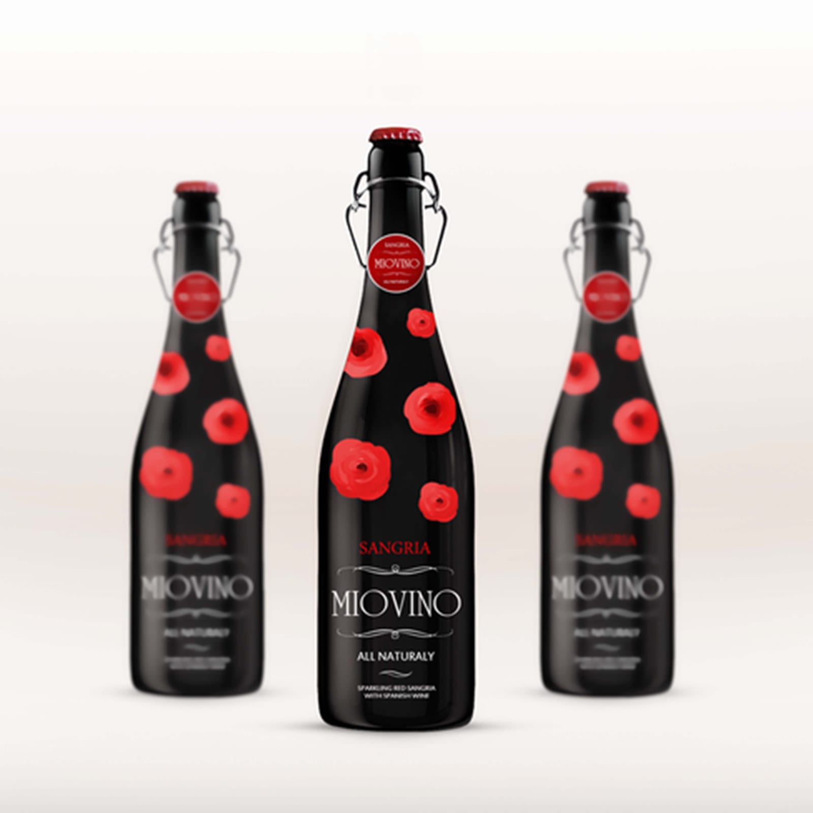
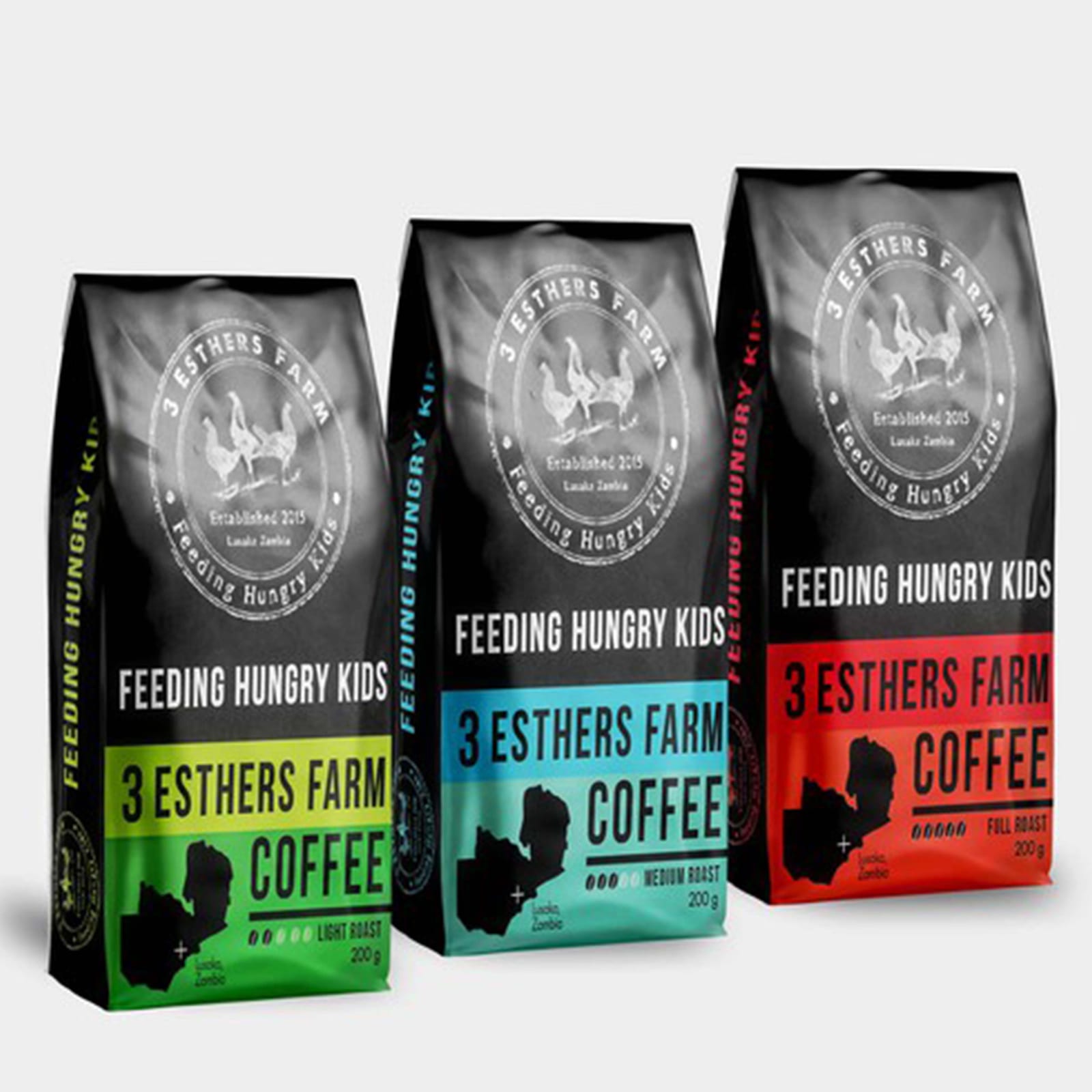
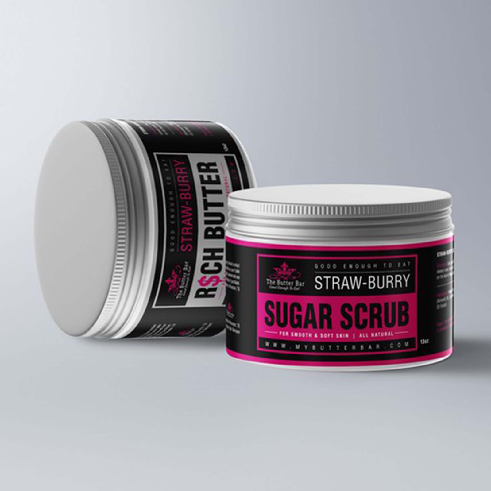
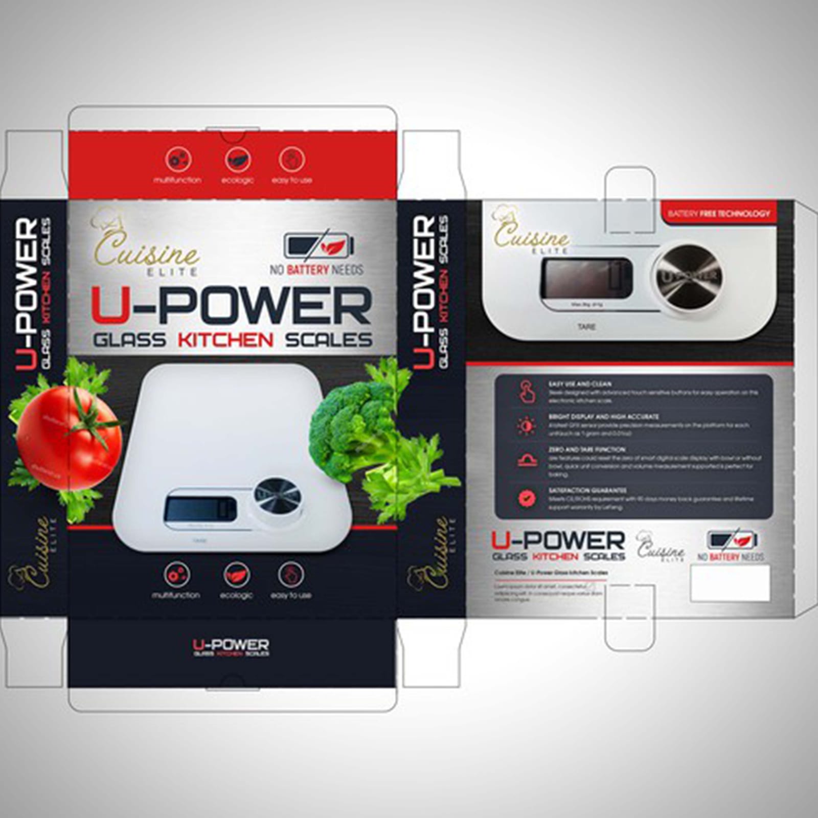
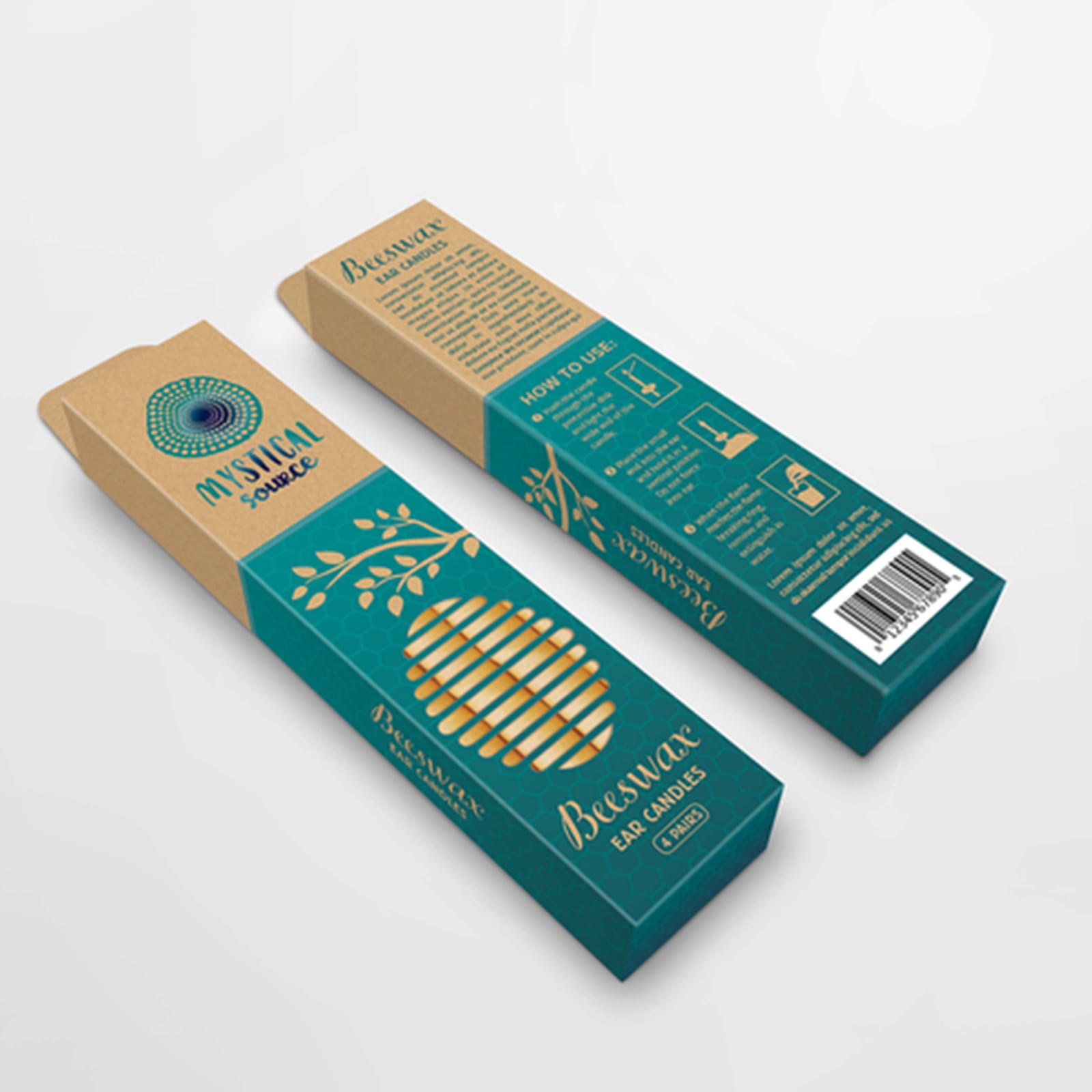
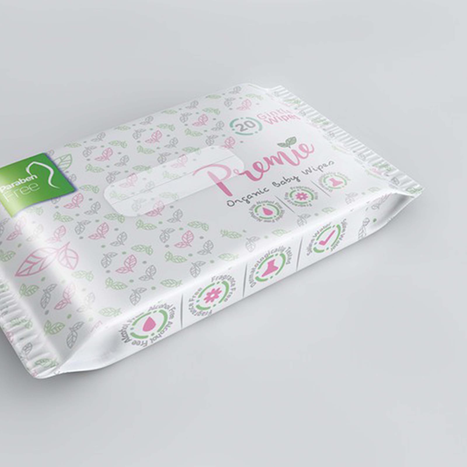
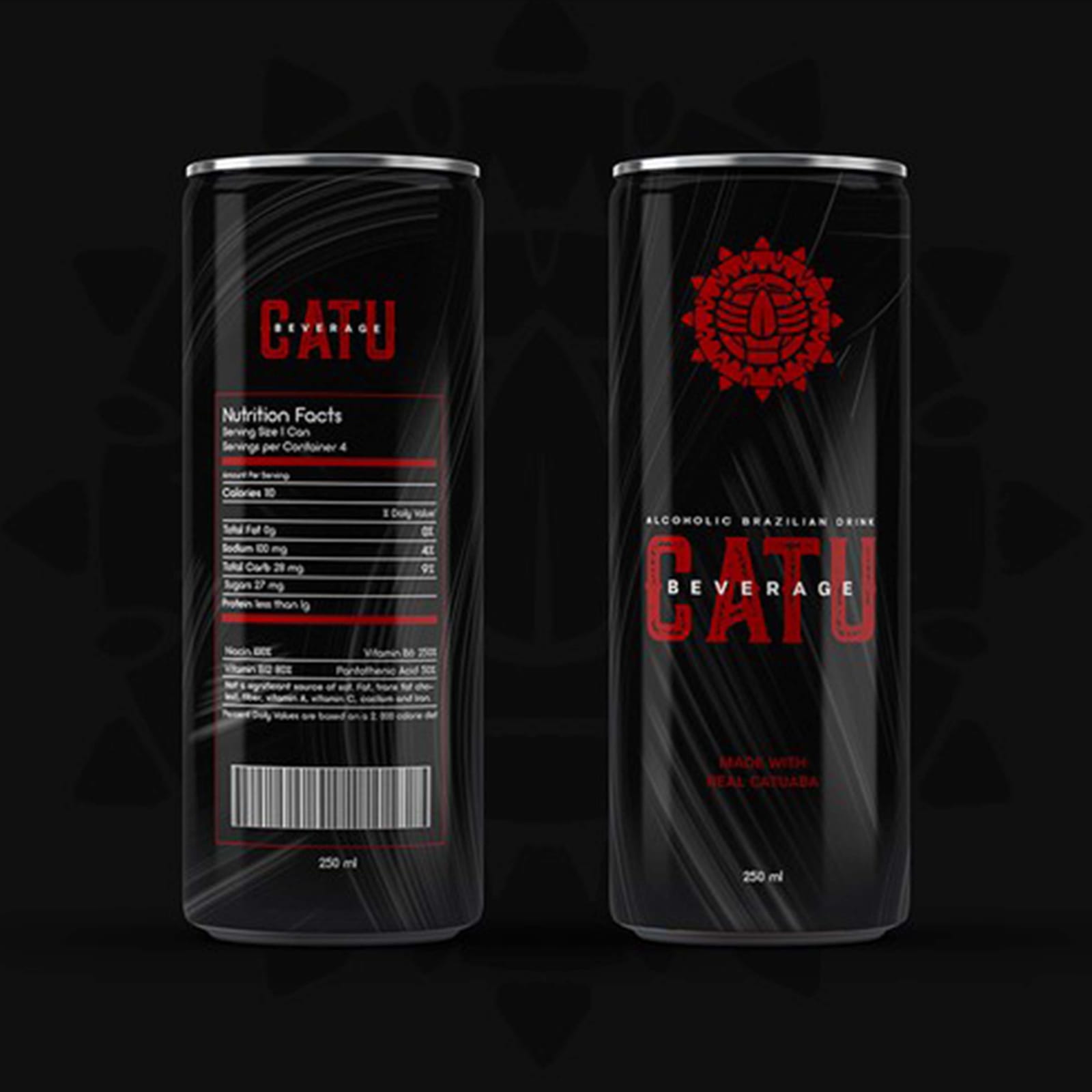
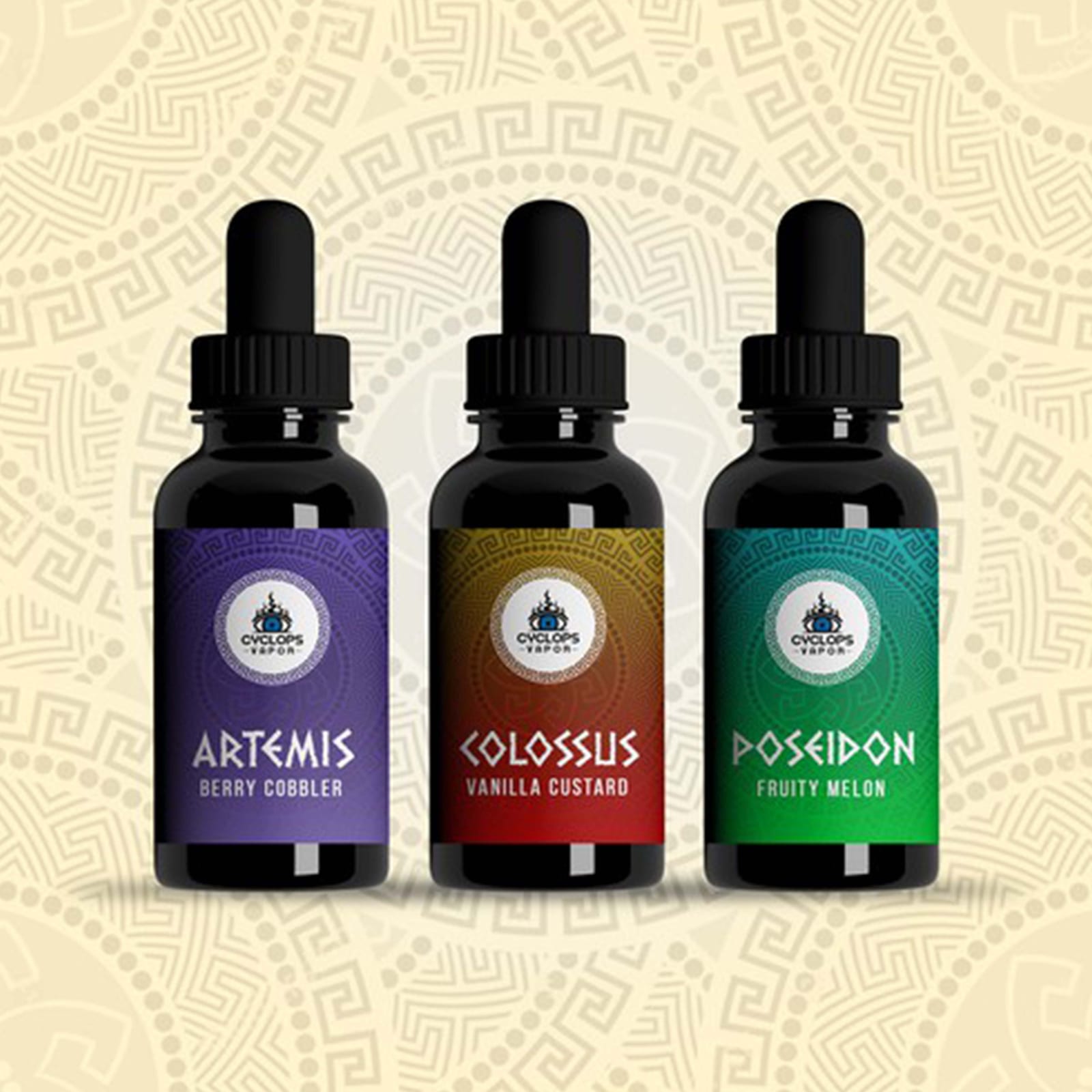
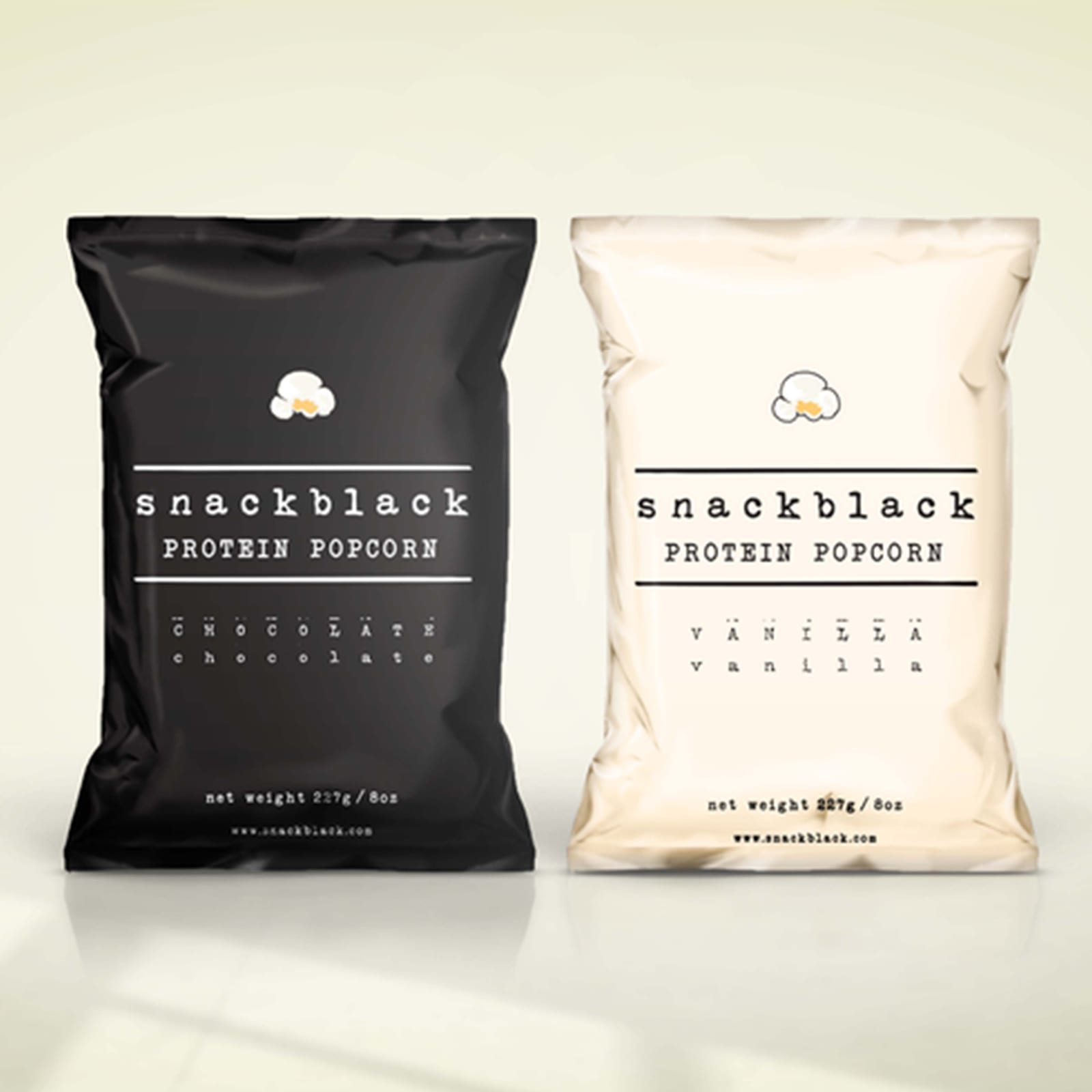
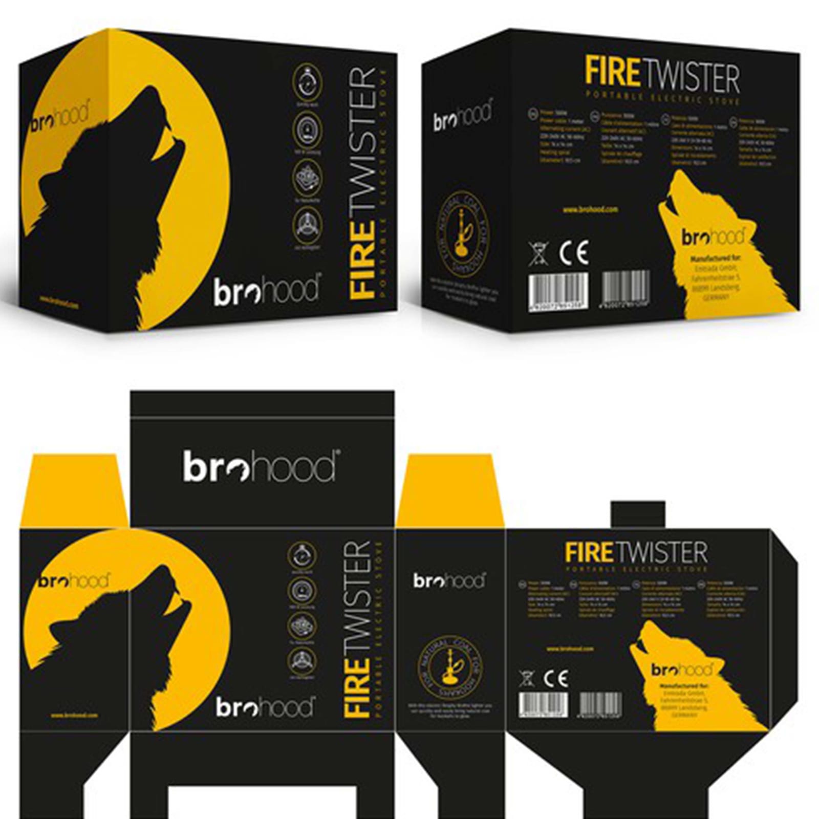
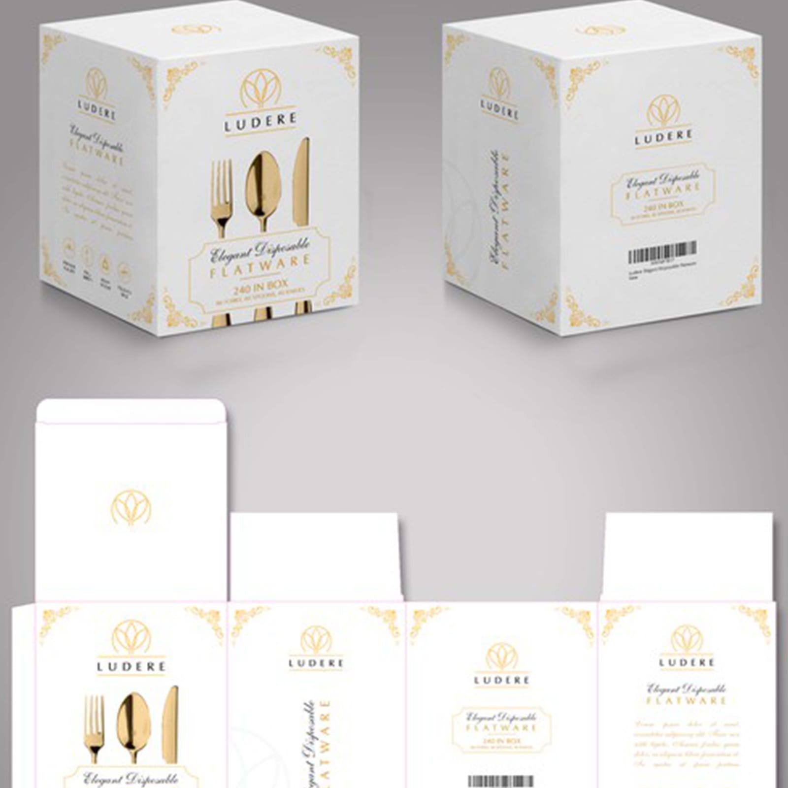
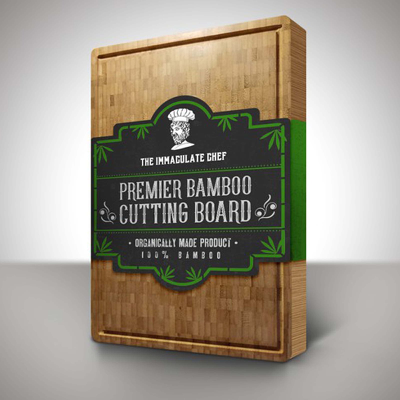
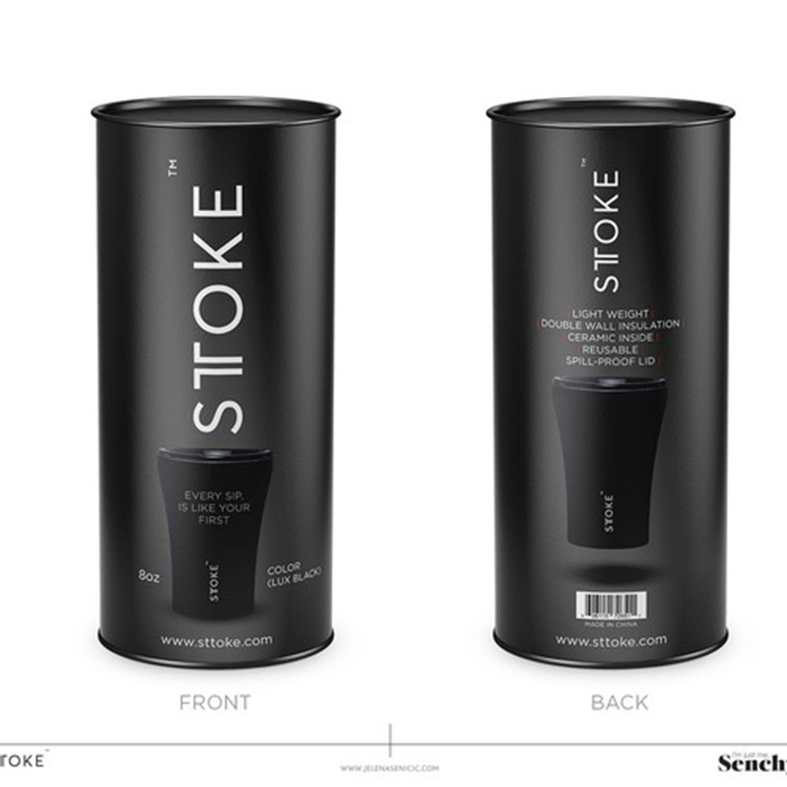
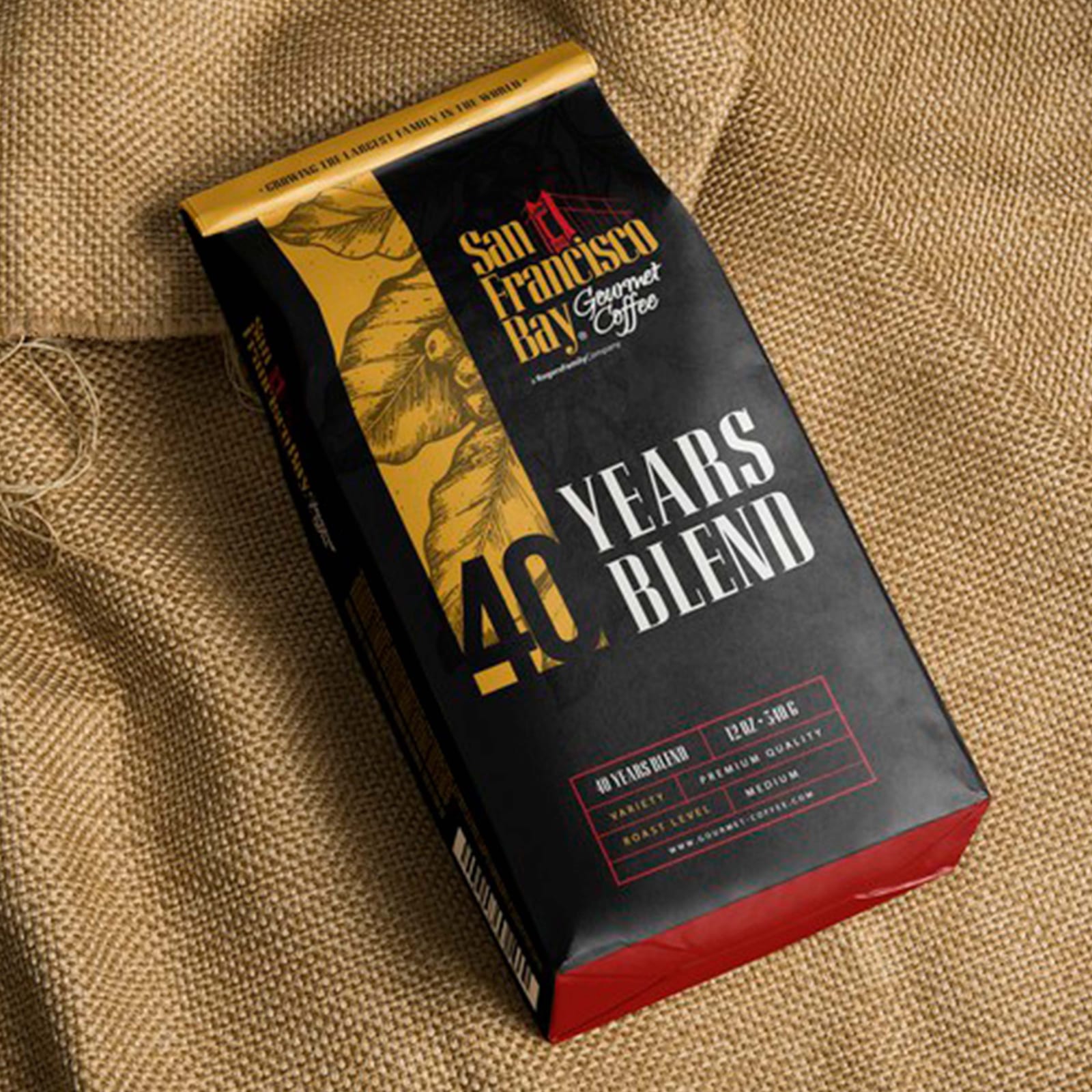
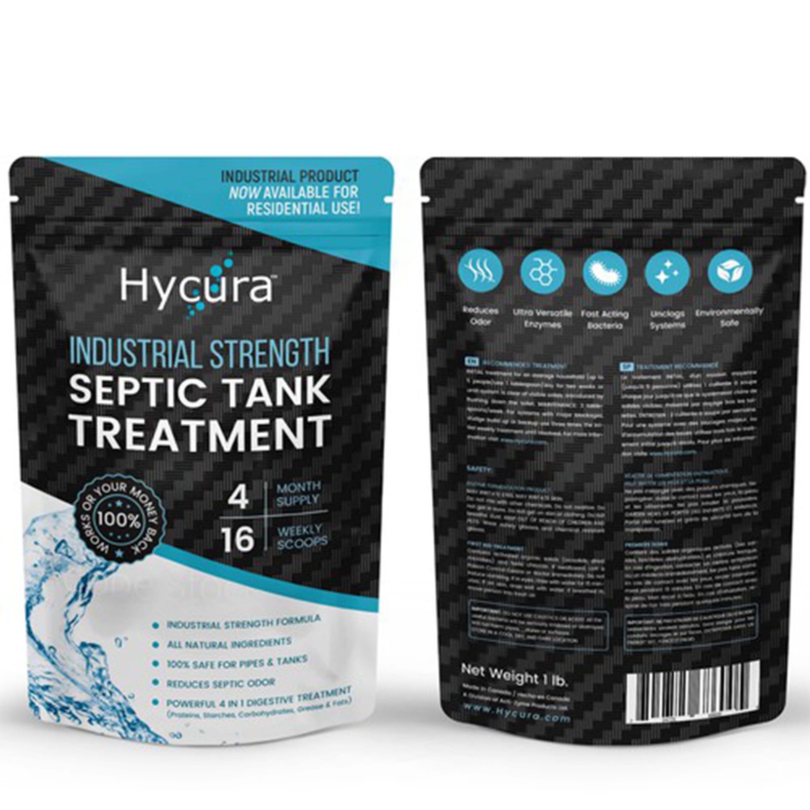
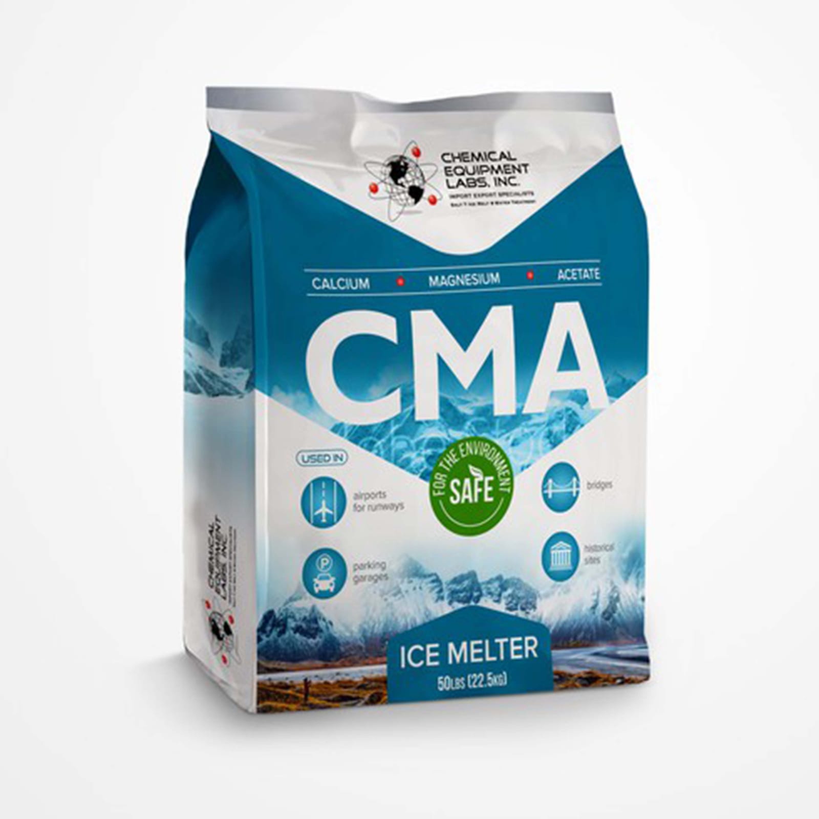
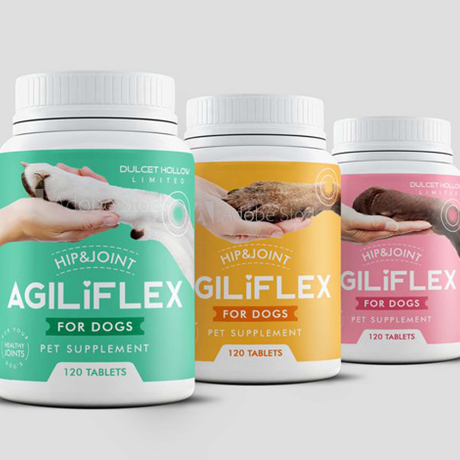
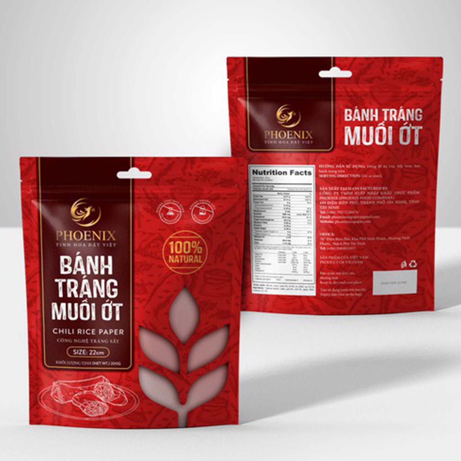
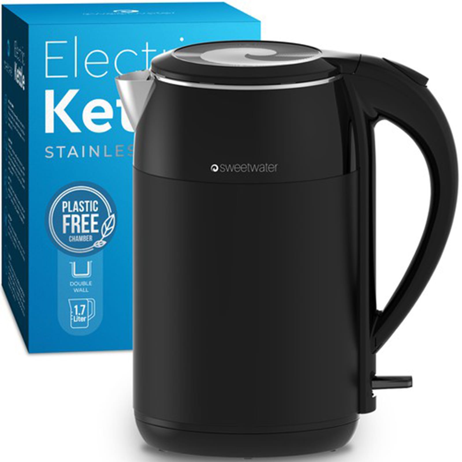
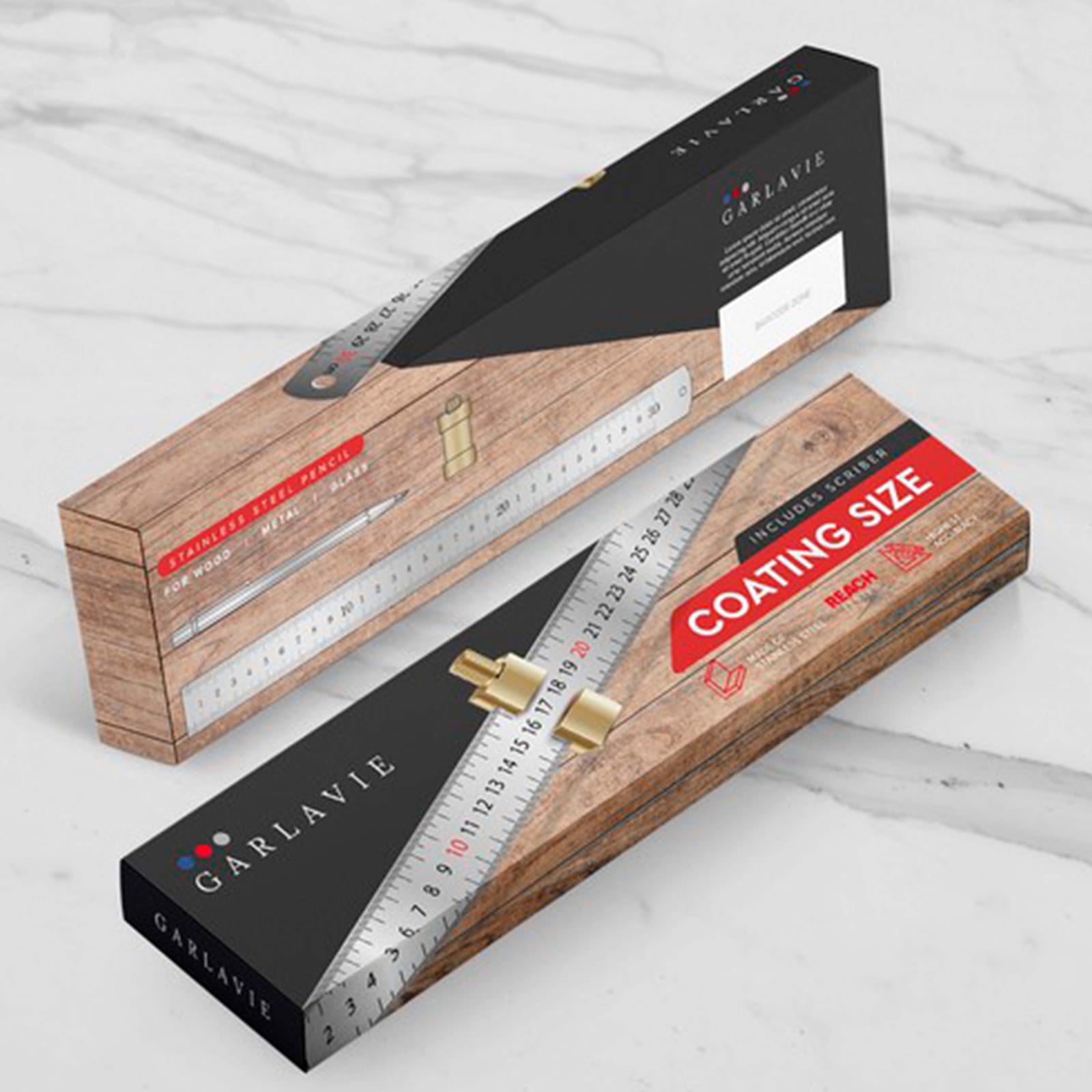
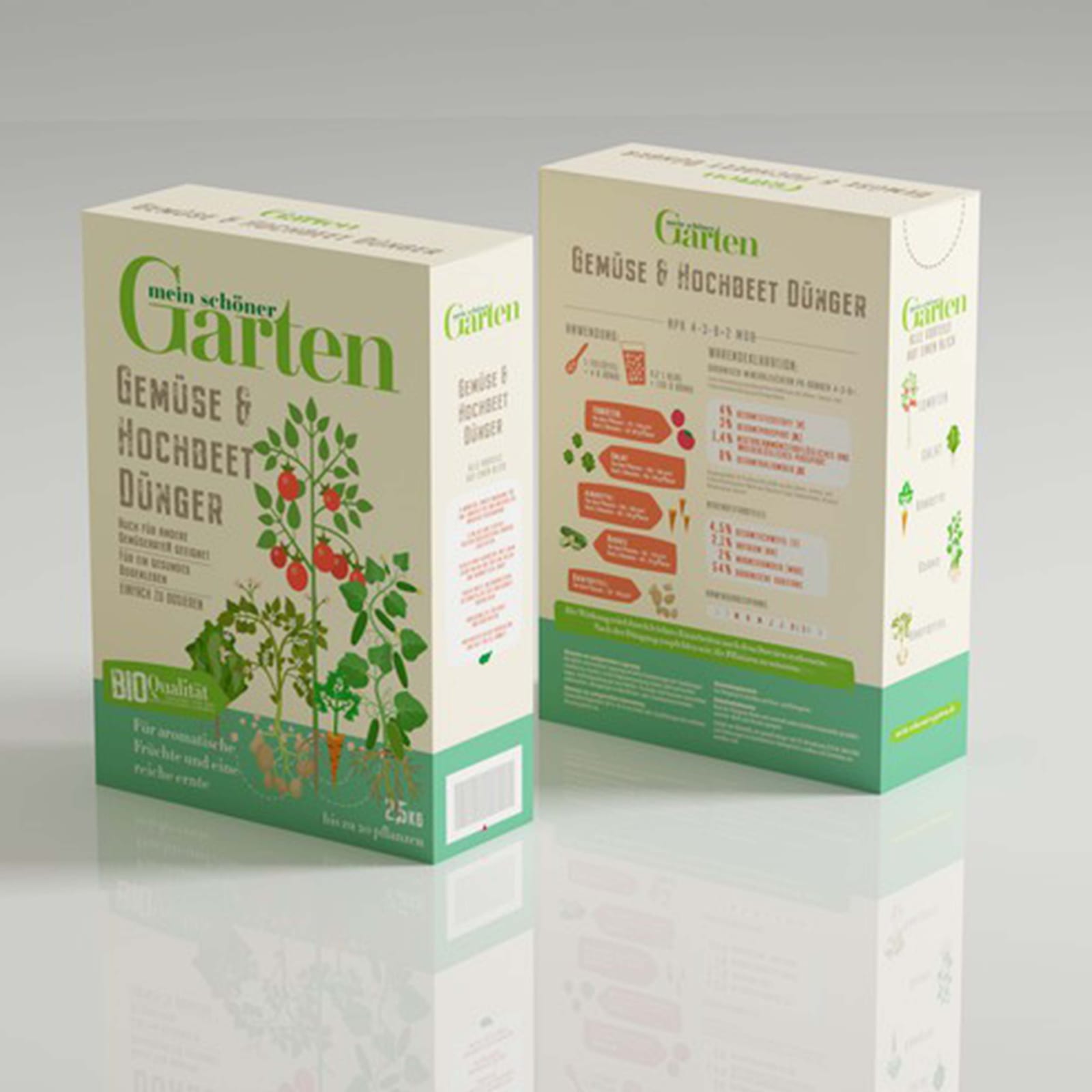
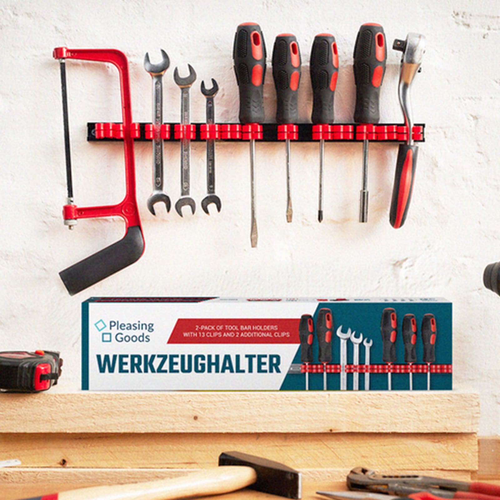
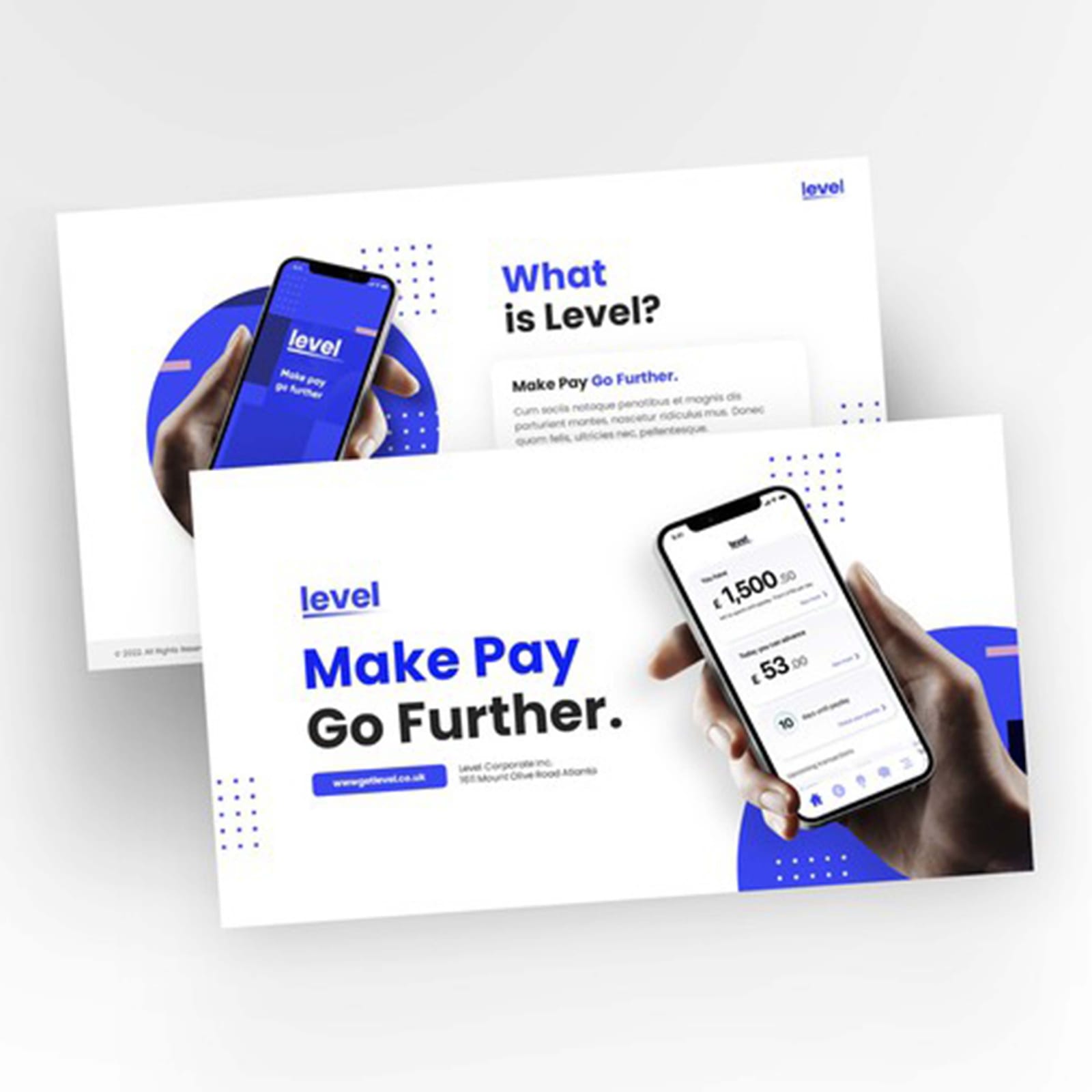
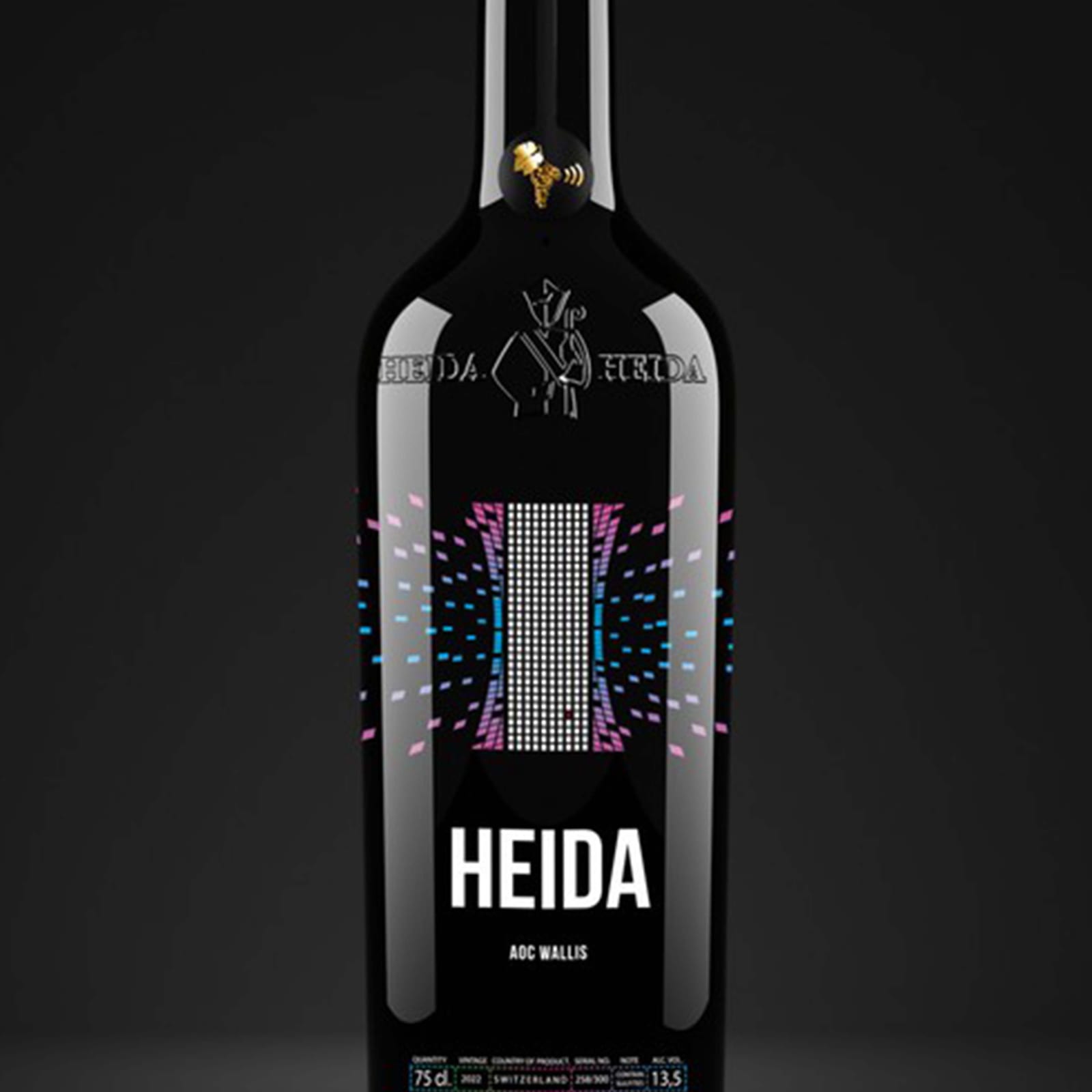
Labels and packaging built as a kit, so a new flavour or variant extends the range without a redesign — and still holds its own on a crowded shelf.

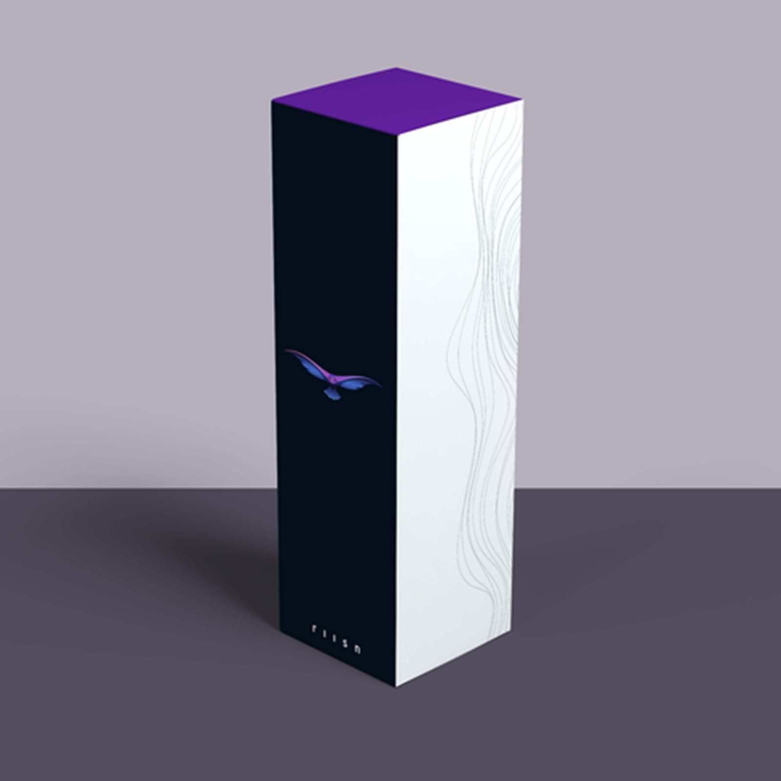


Selected Clients 2021–2025
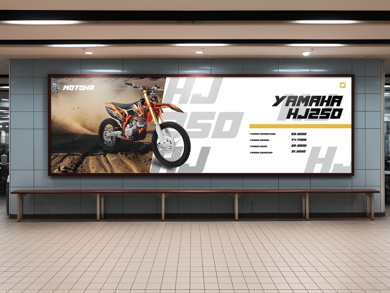
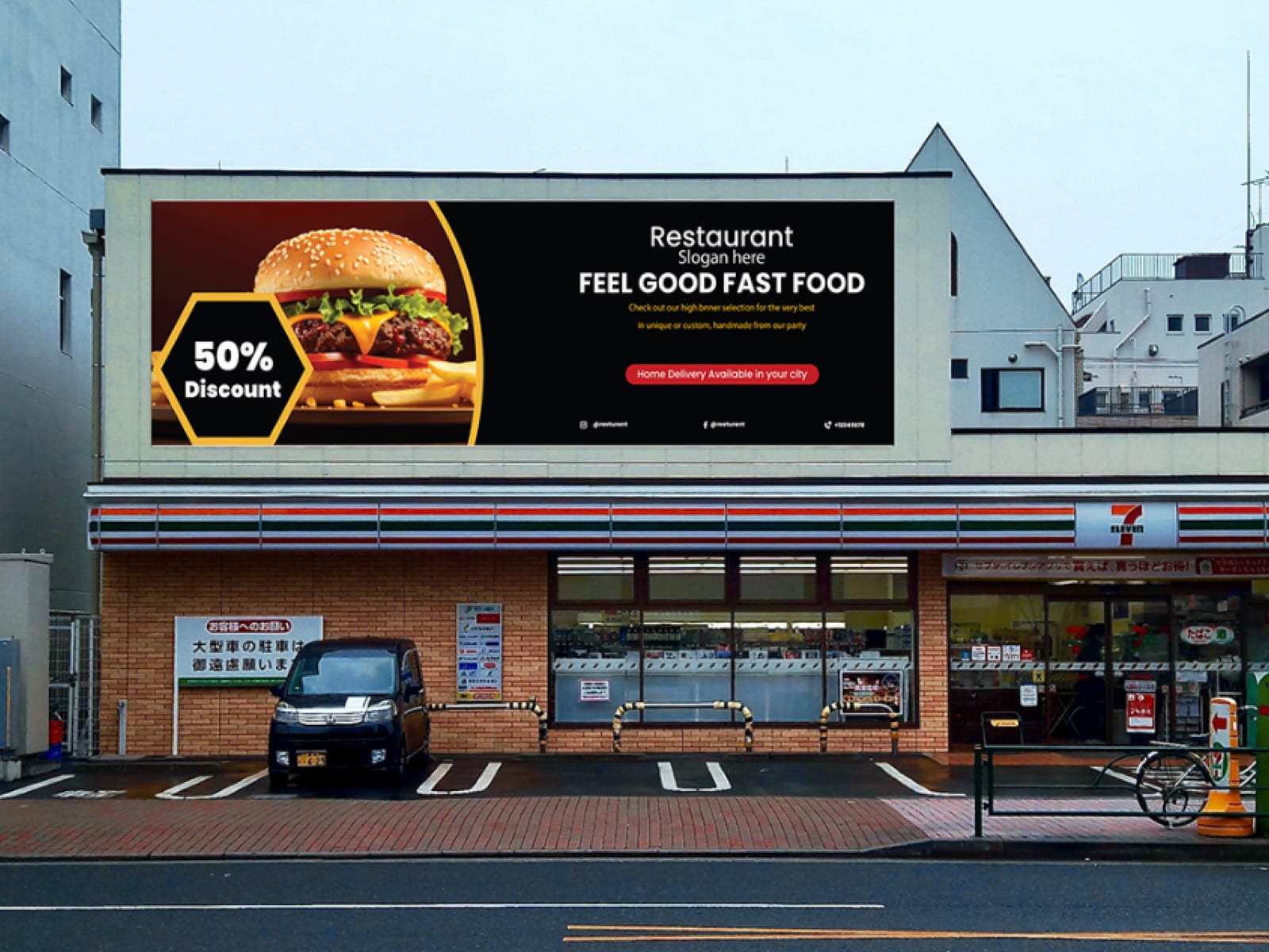
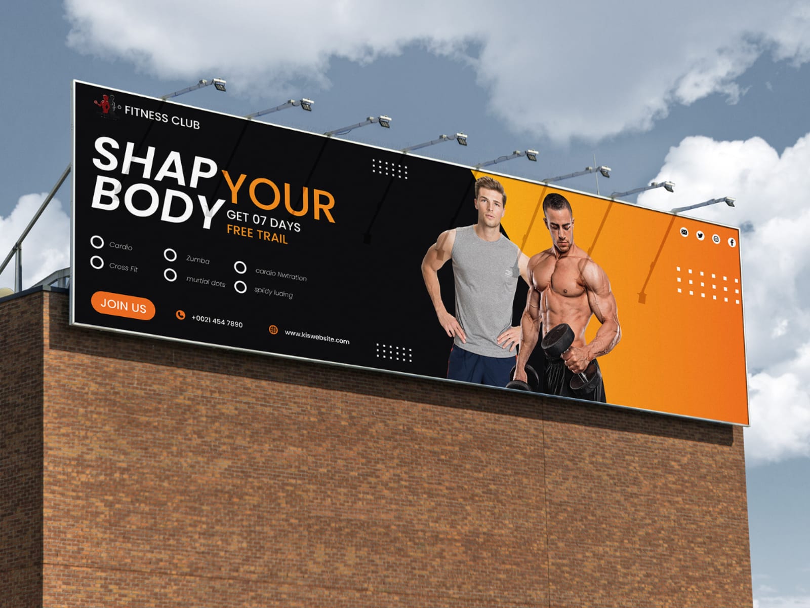
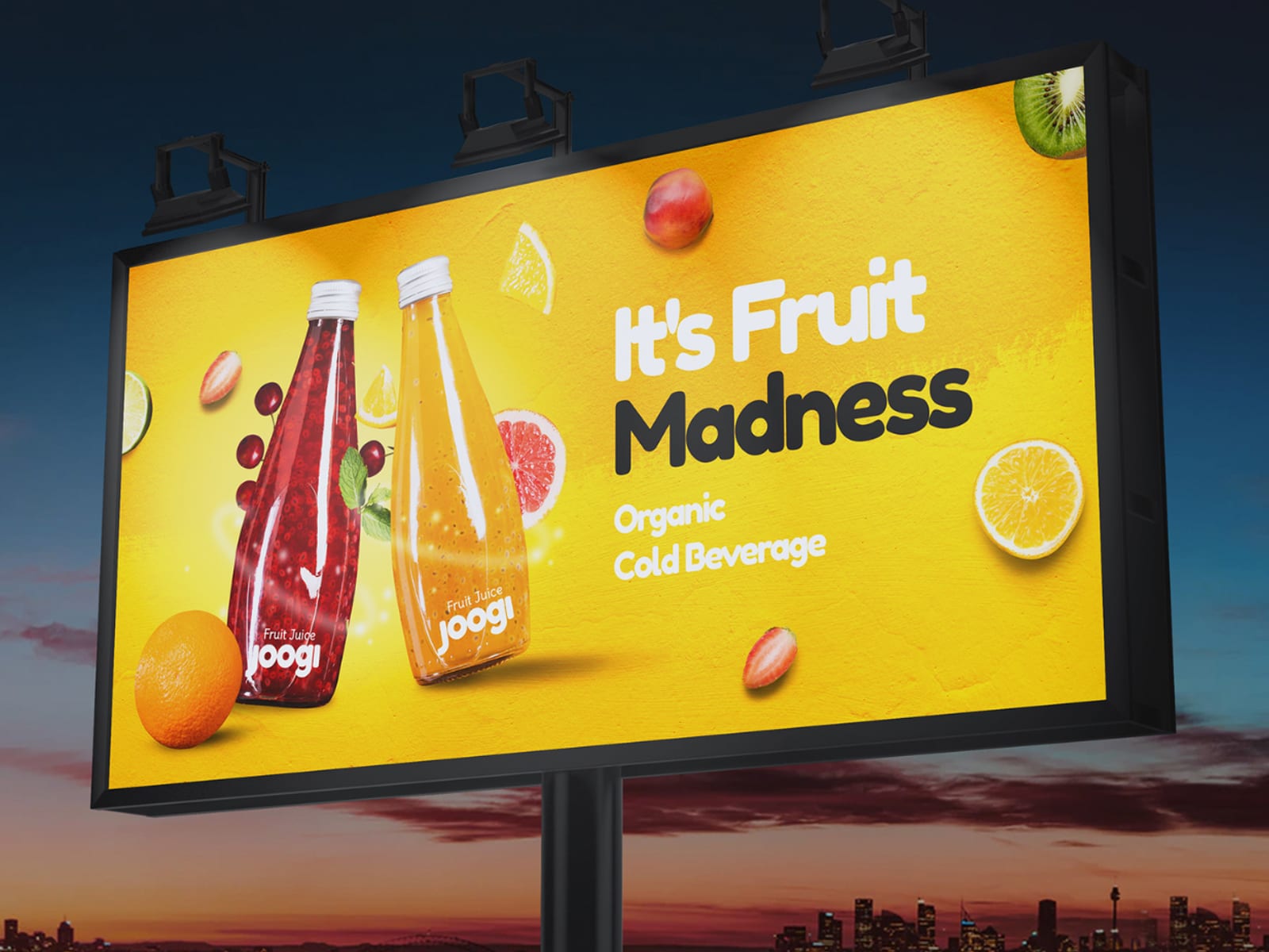
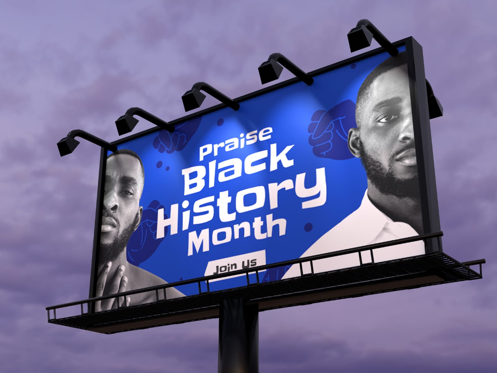
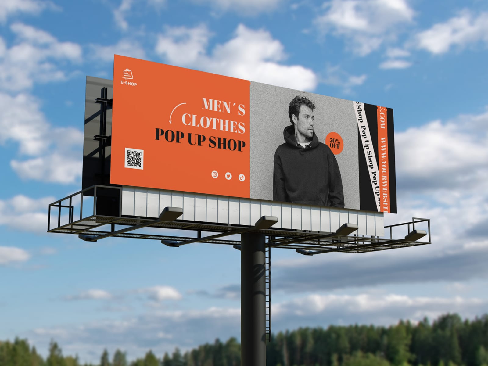
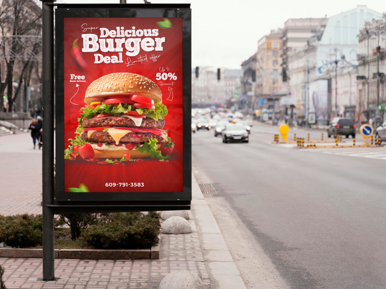
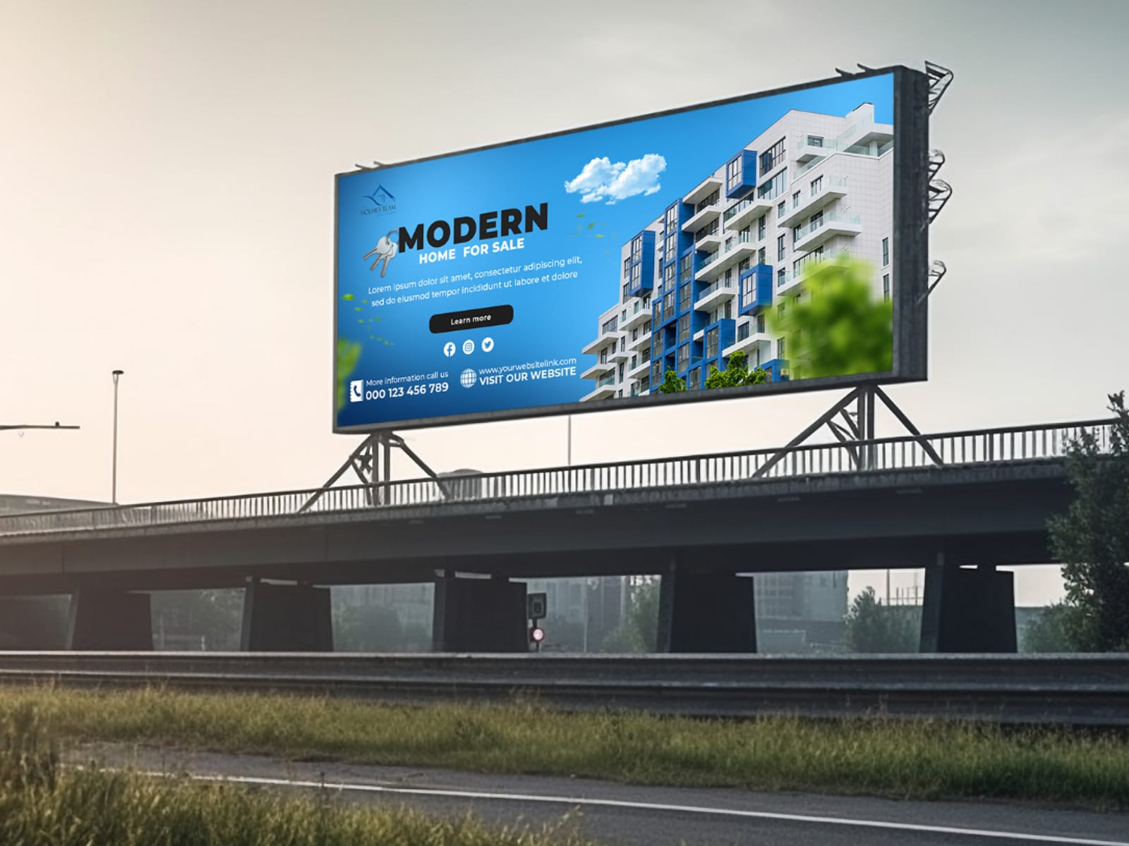
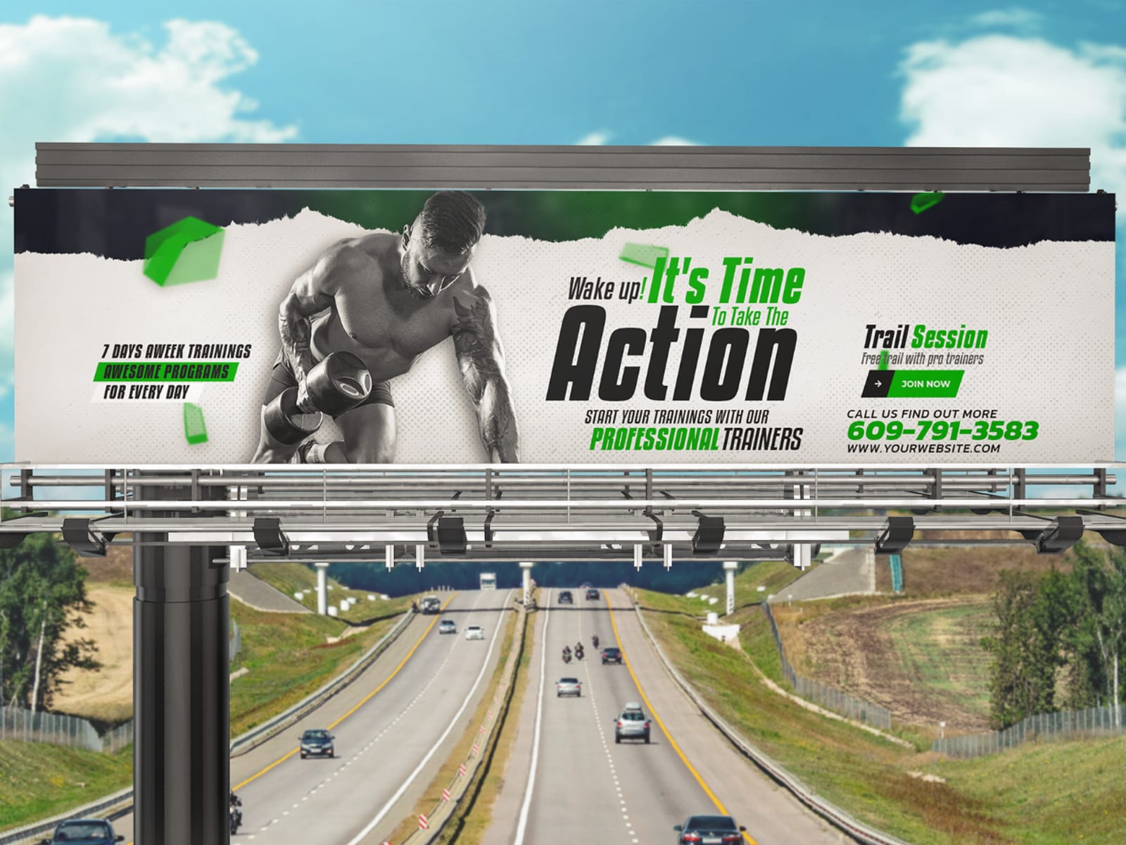
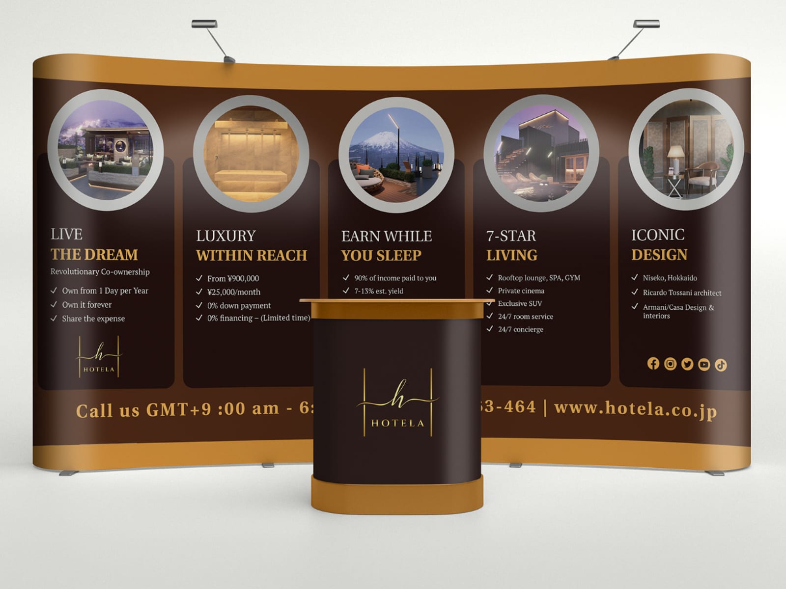
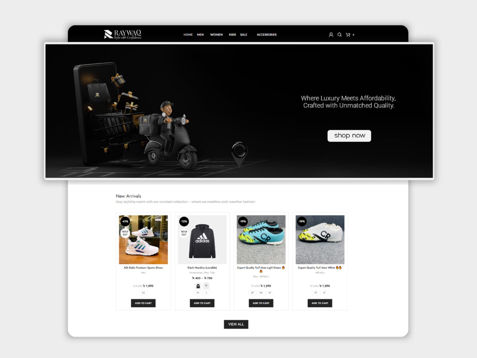
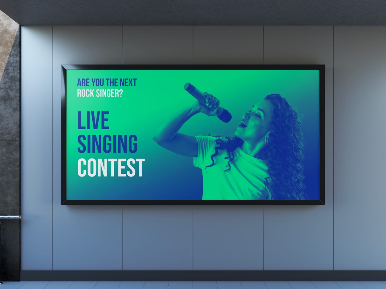
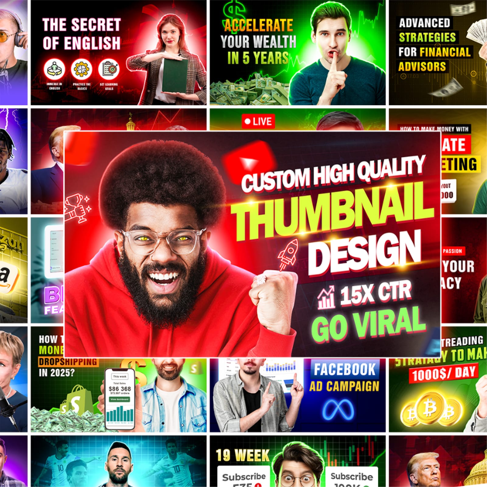
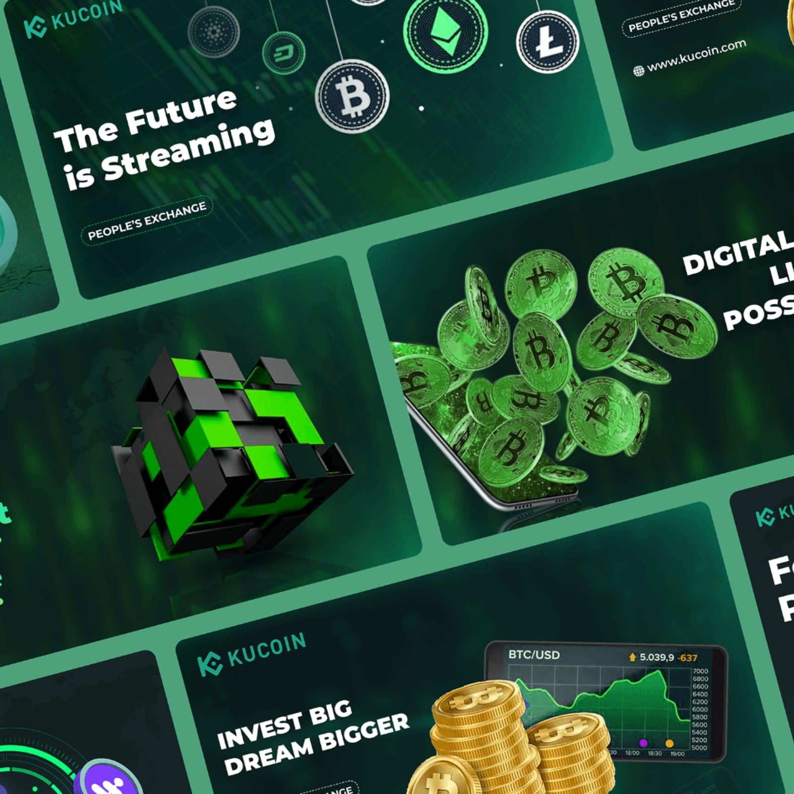
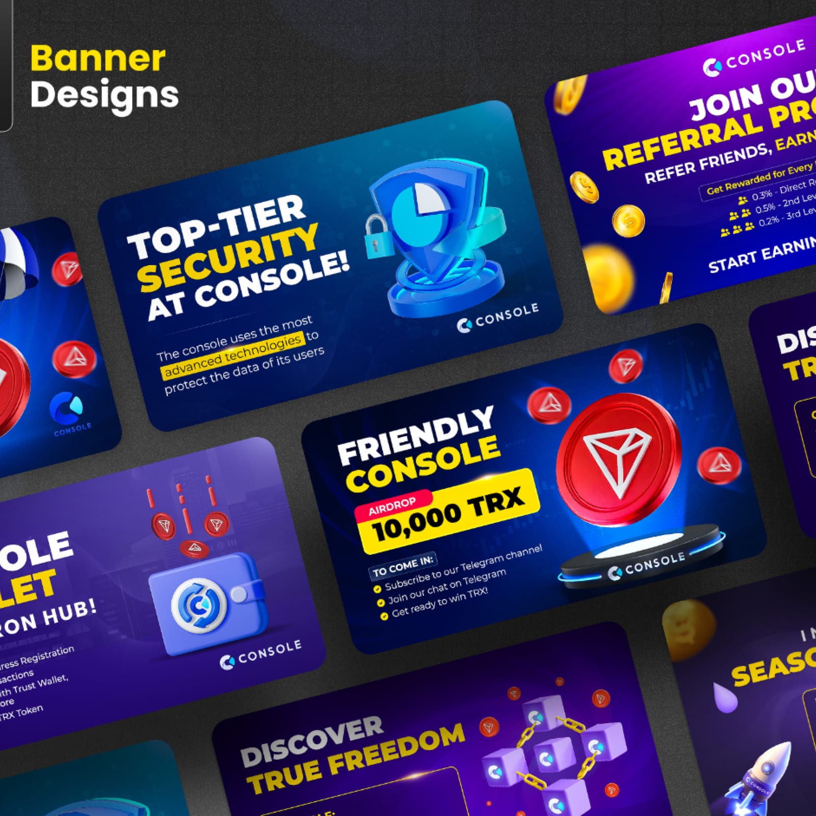
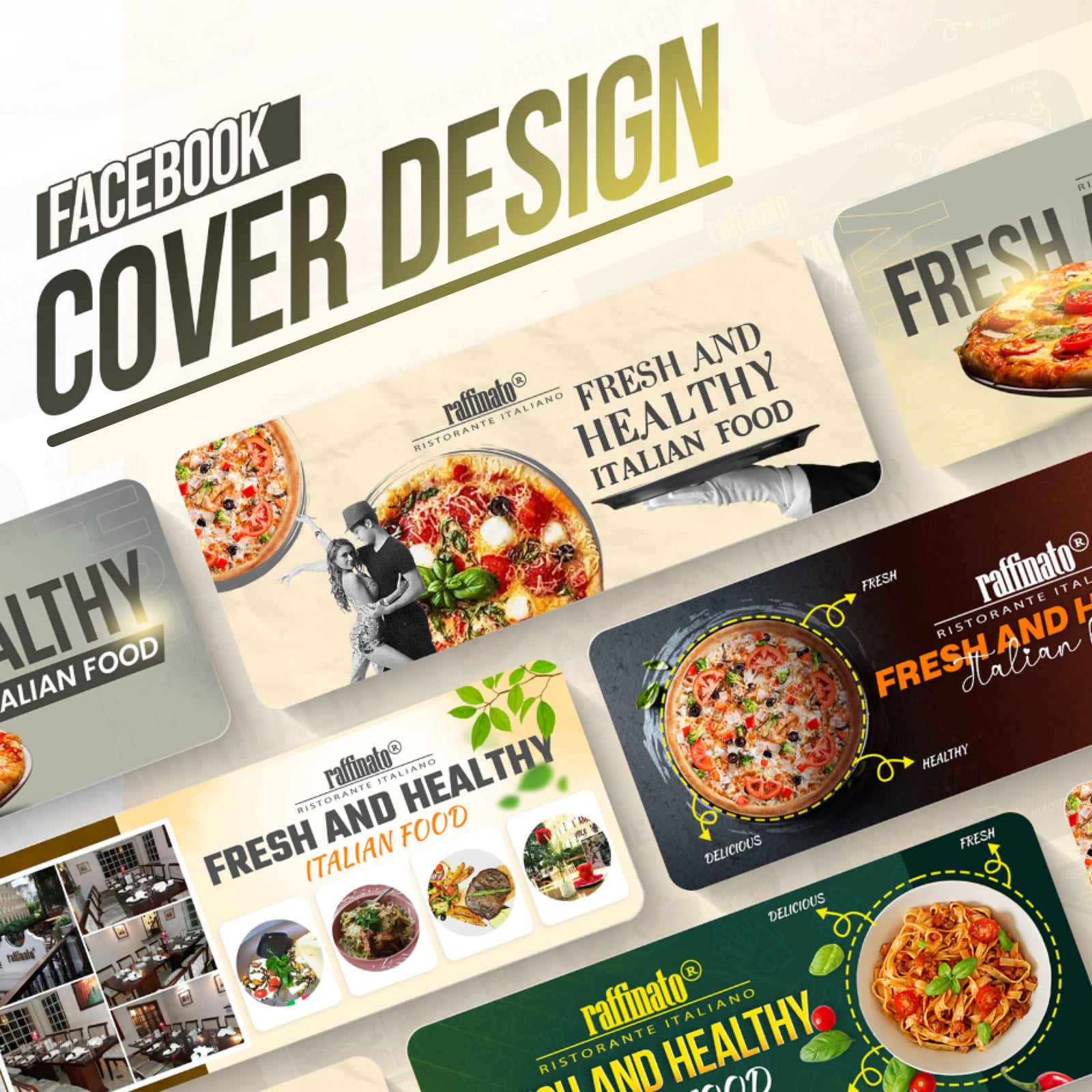
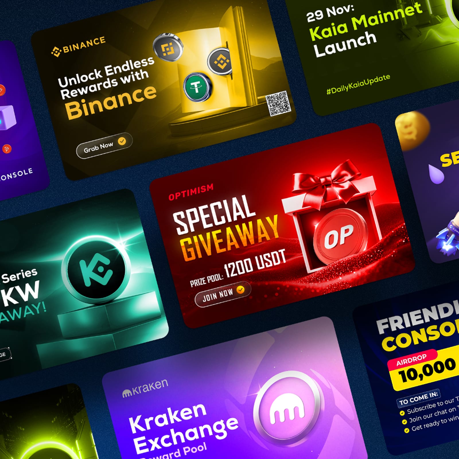
Banners and thumbnails tuned for the size they actually appear at — type weight and crop decided at the final scale, not at 100%.
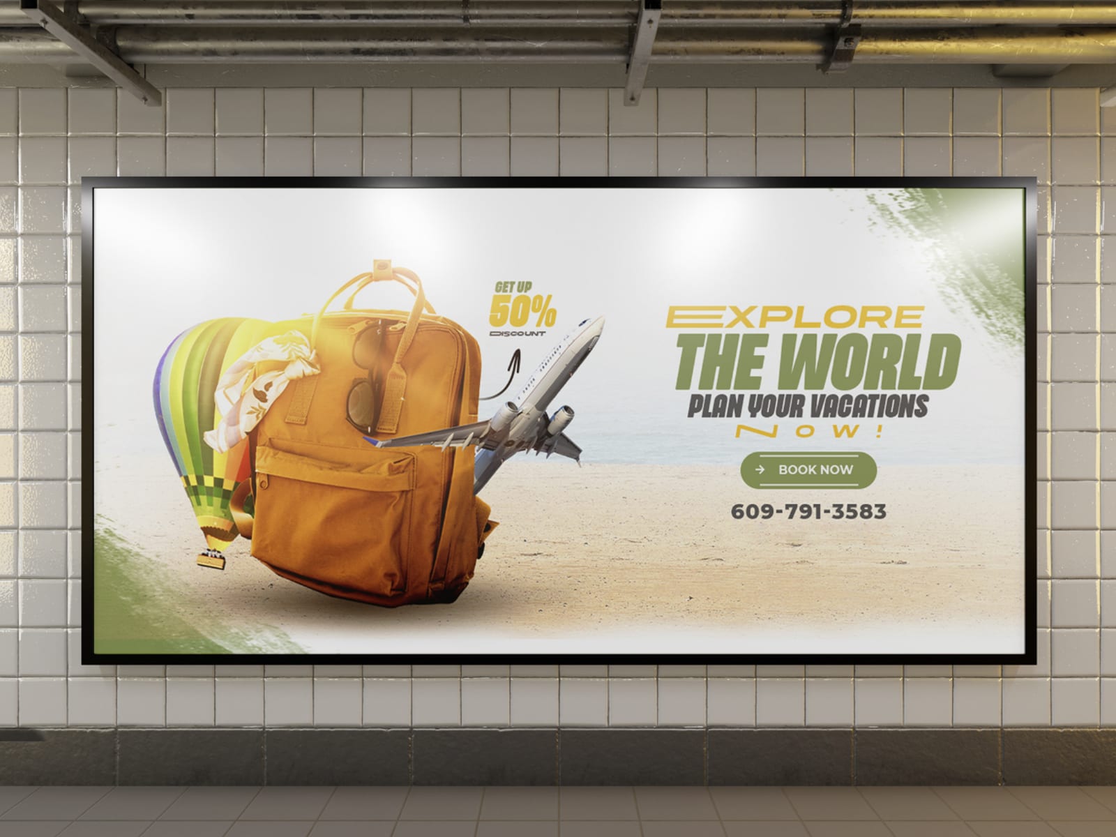
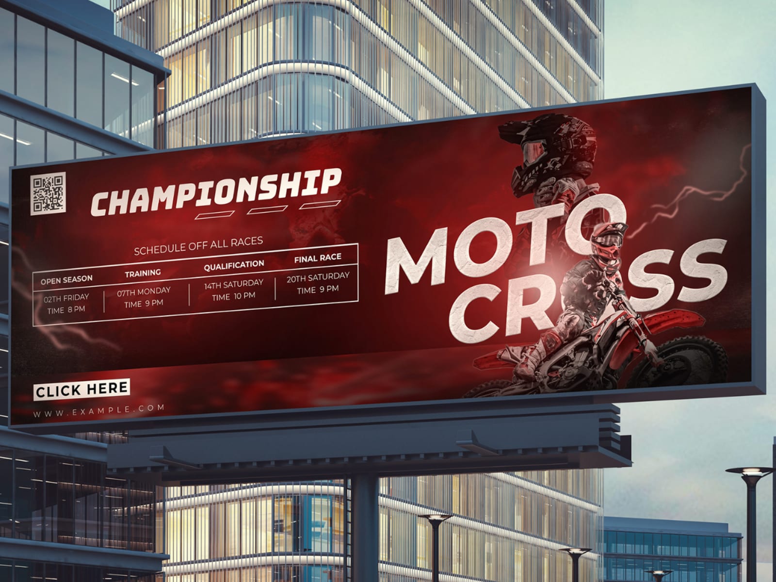
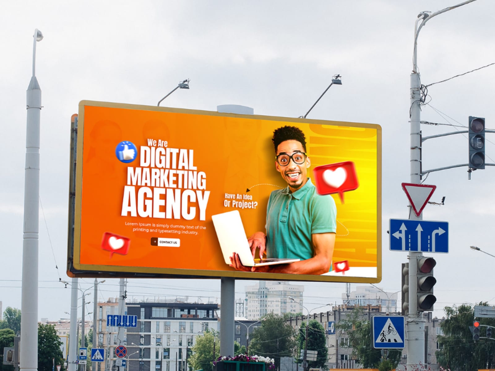
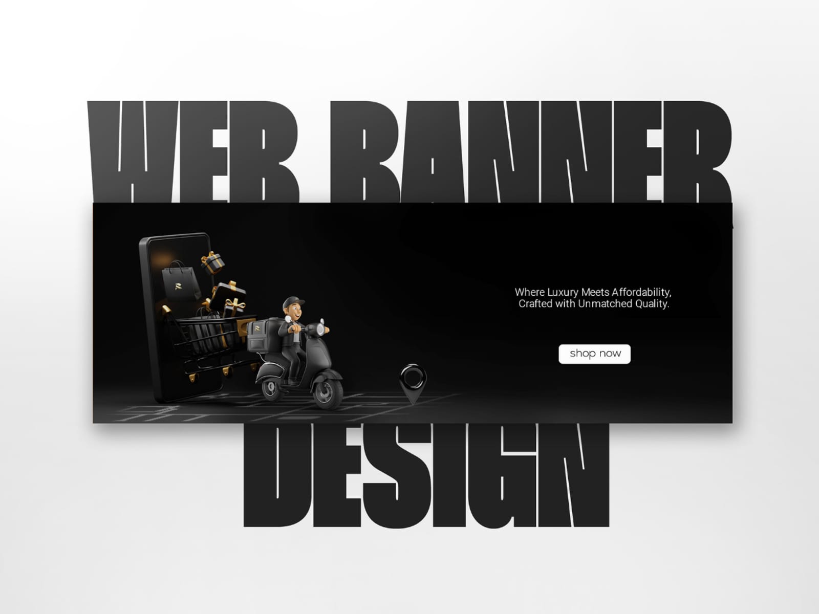

Dorsett Travels 2021–2025
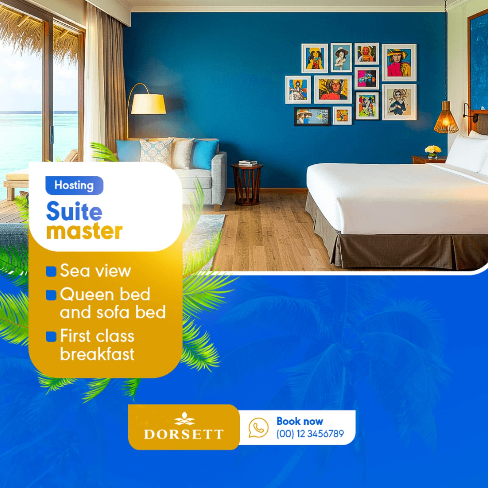
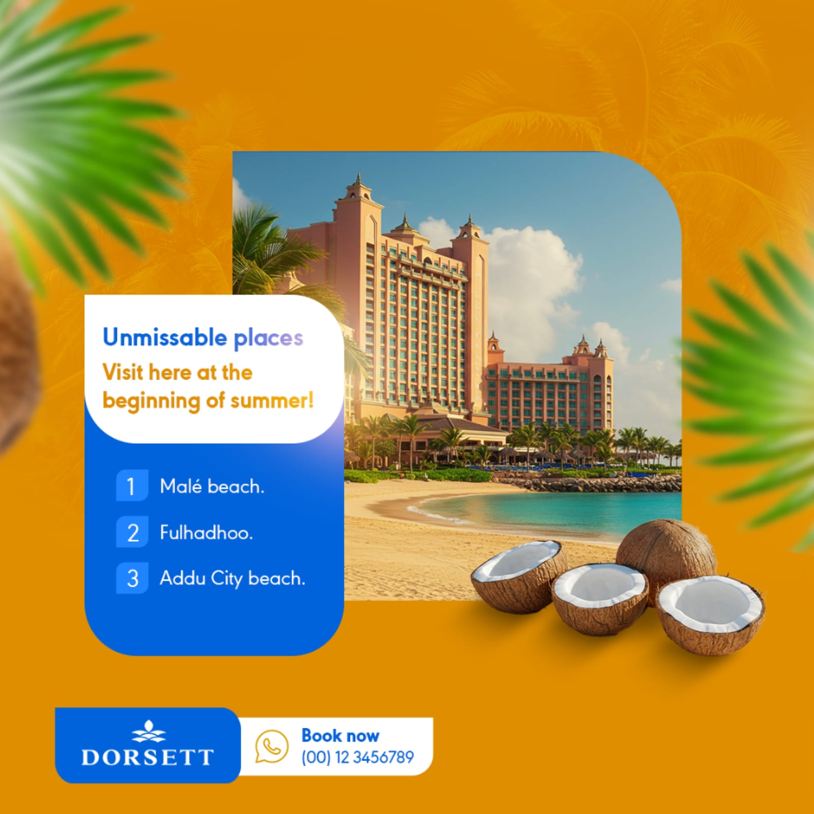
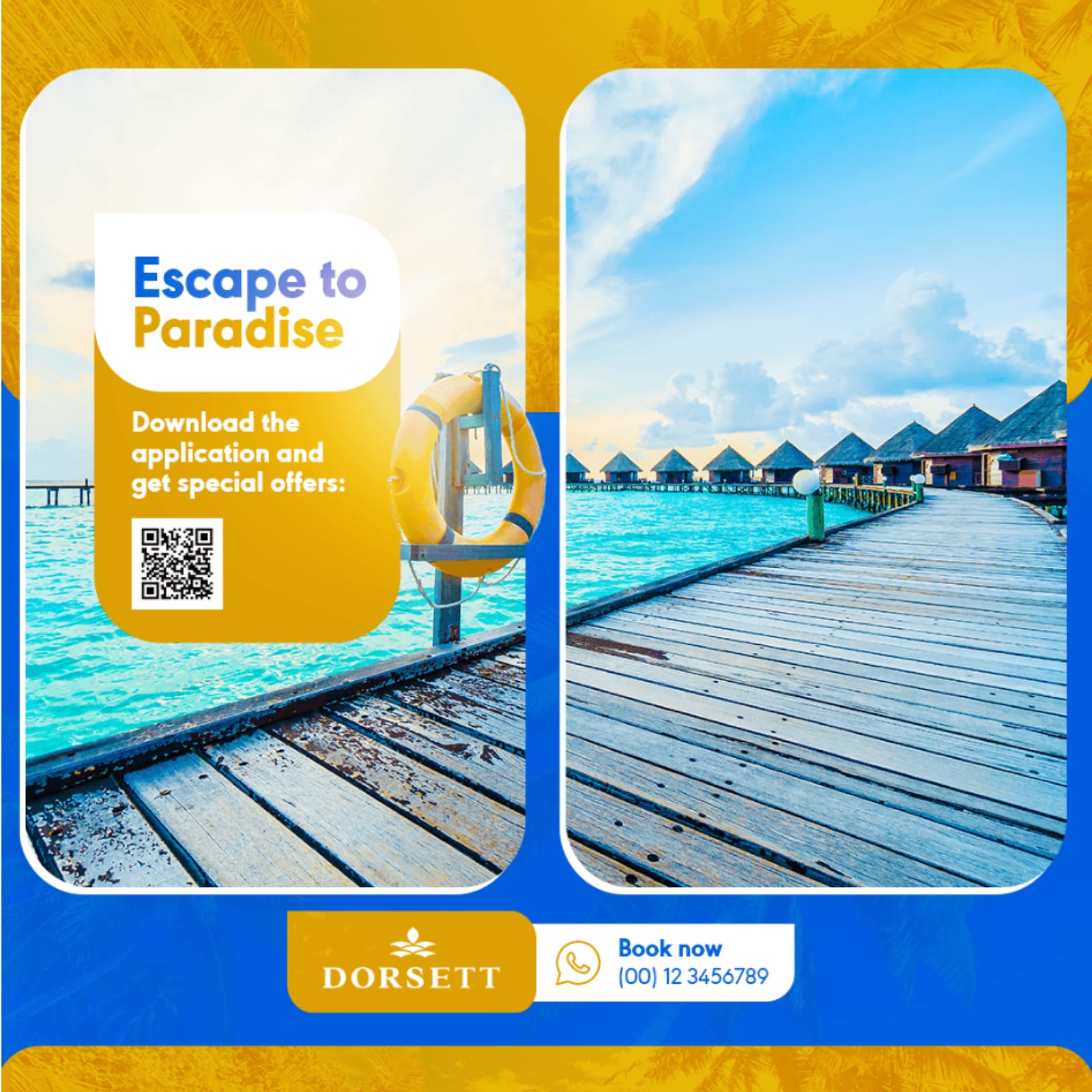
An engagement campaign for a travel brand: one grid, one type scale and a palette that lets a destination photograph carry the post without the layout competing with it.




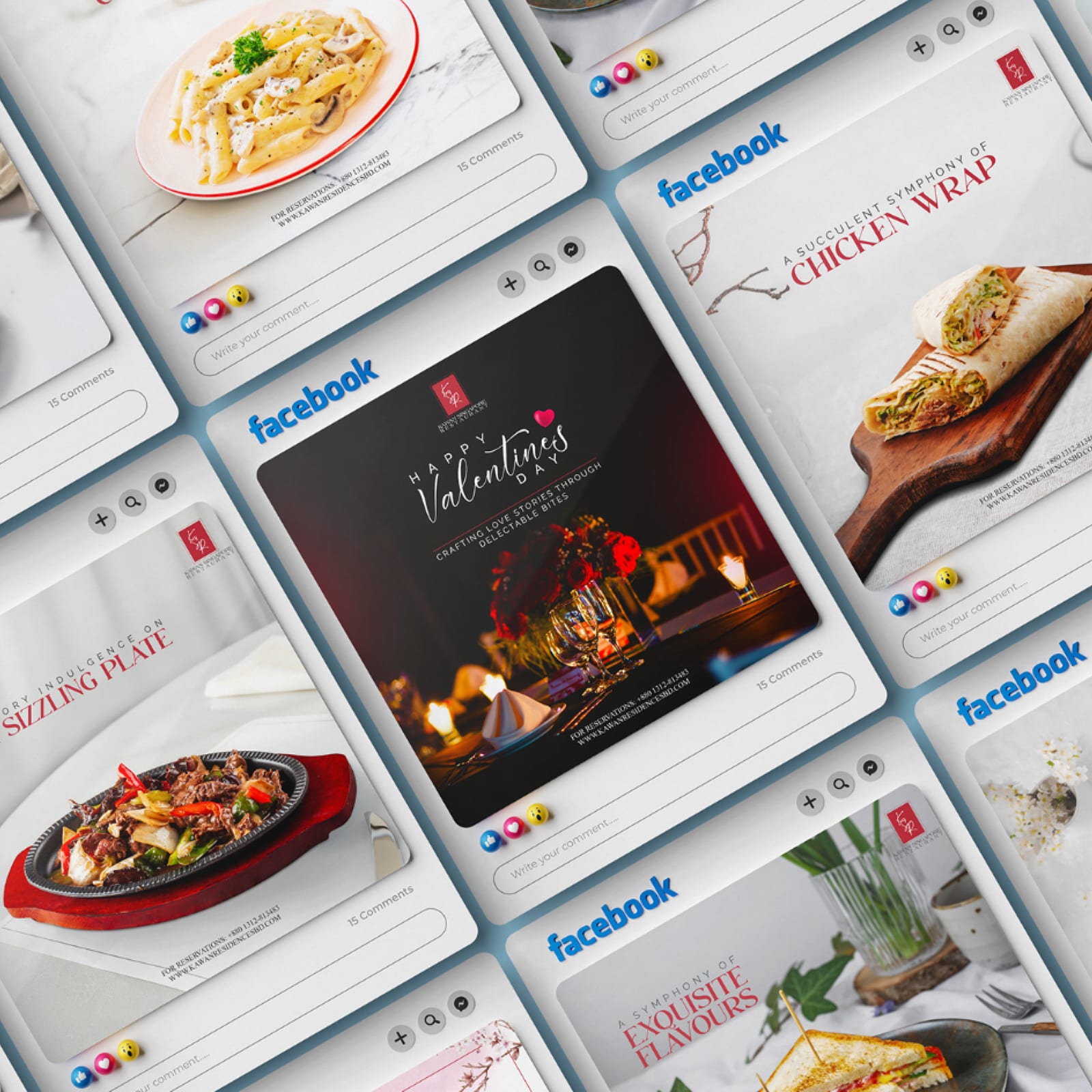
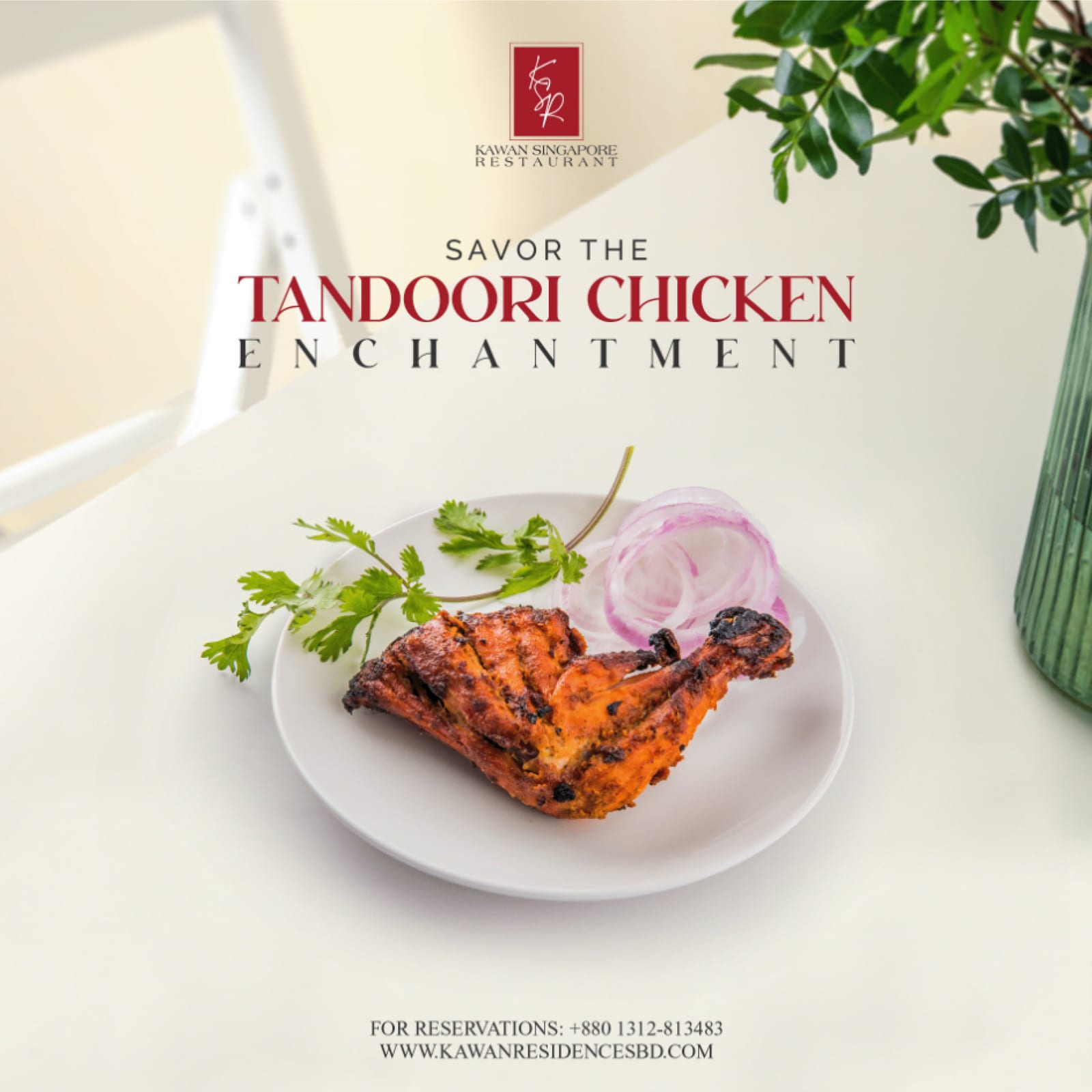
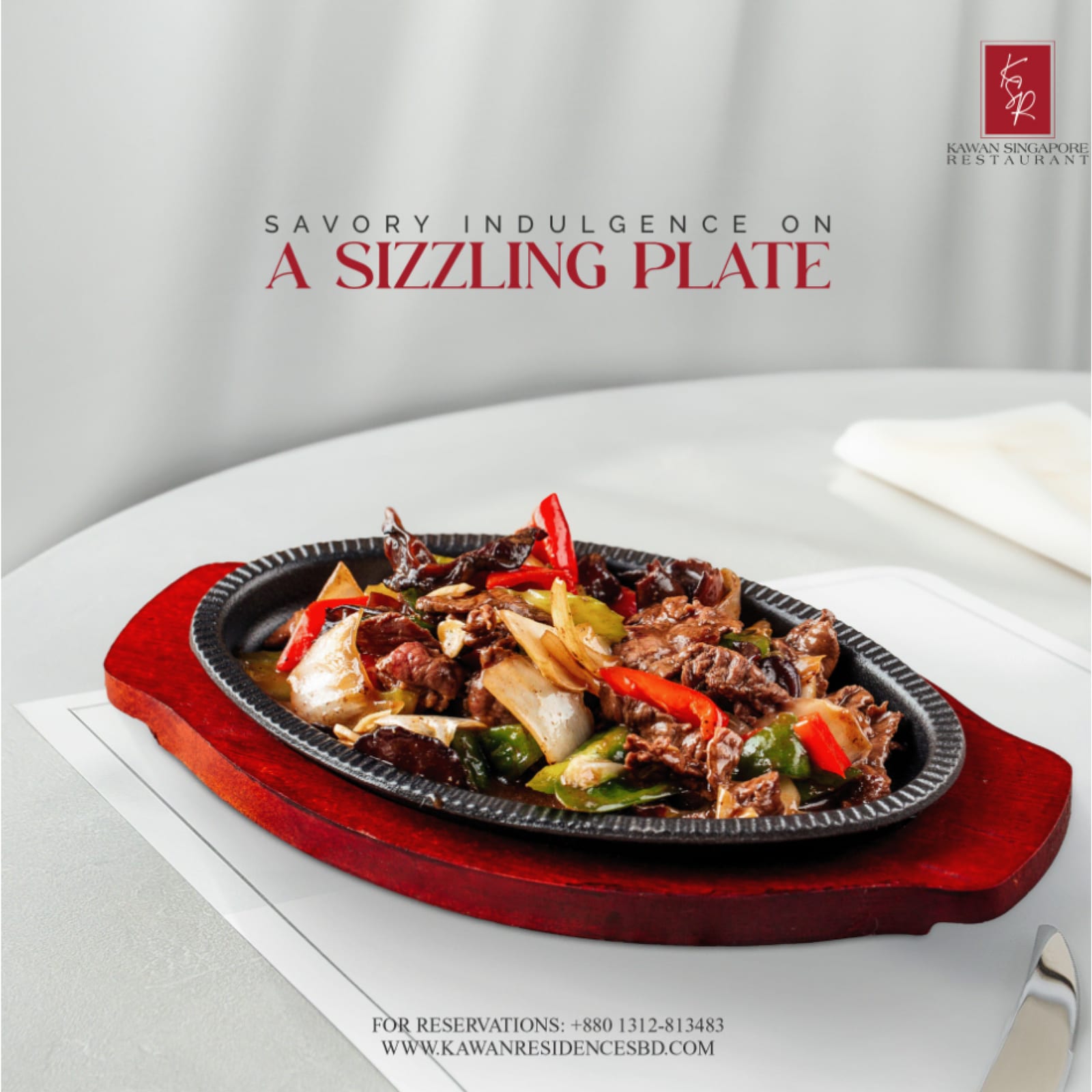
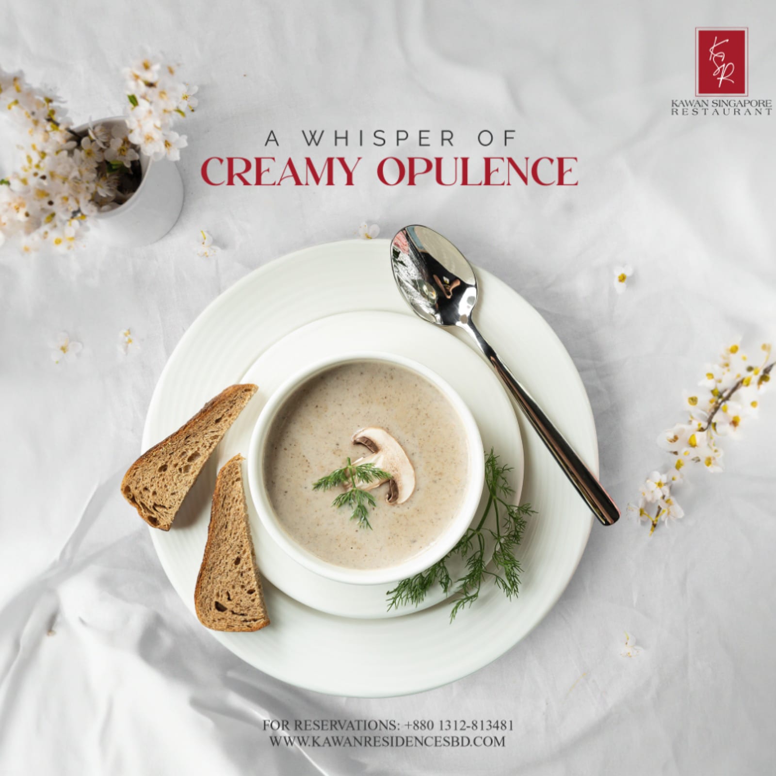
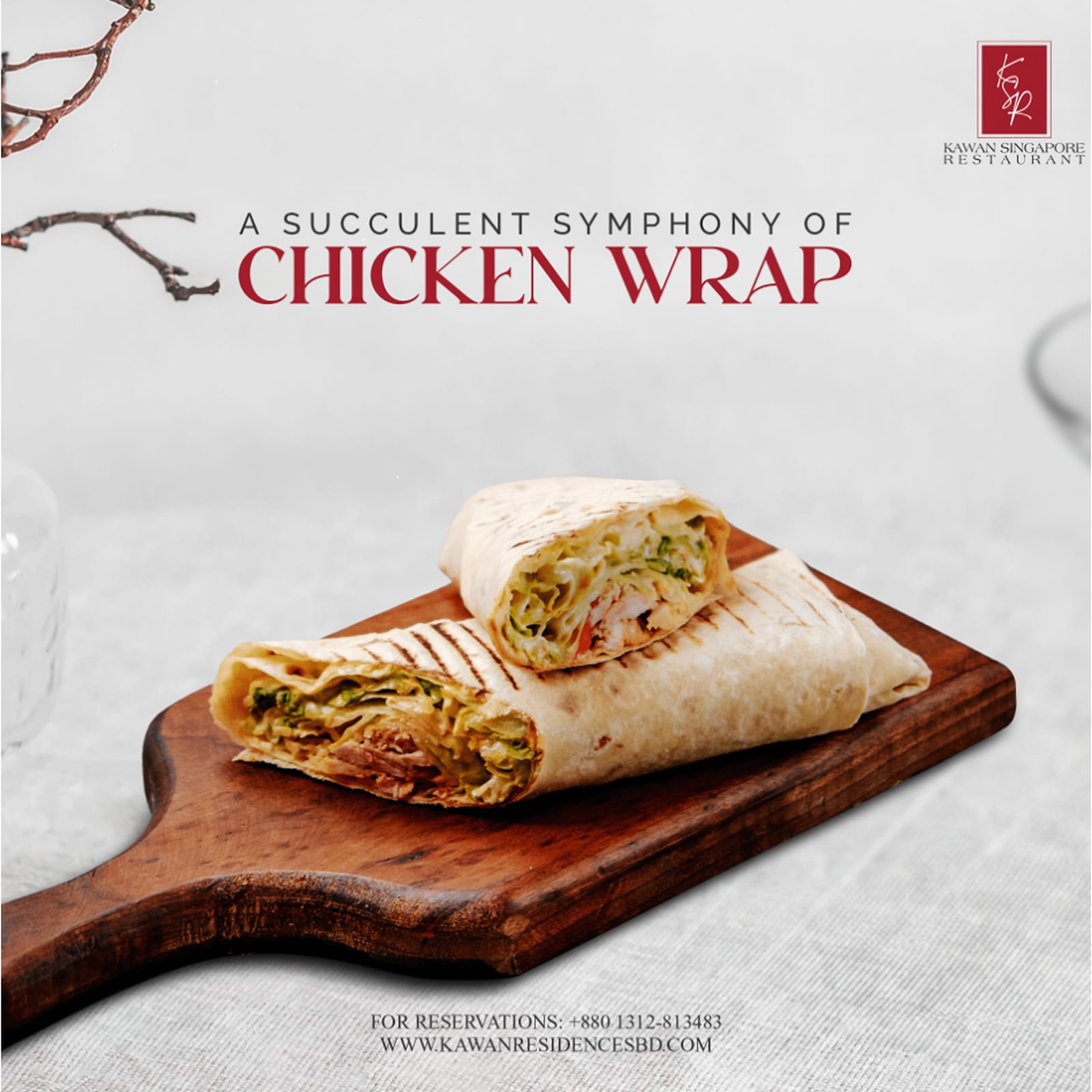
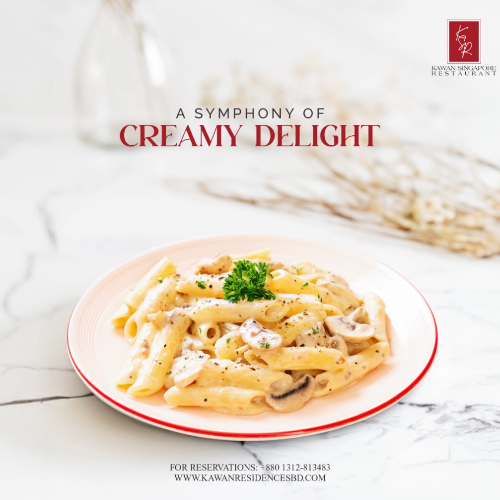
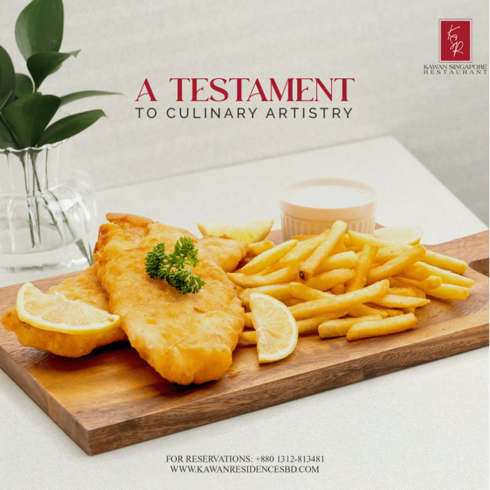
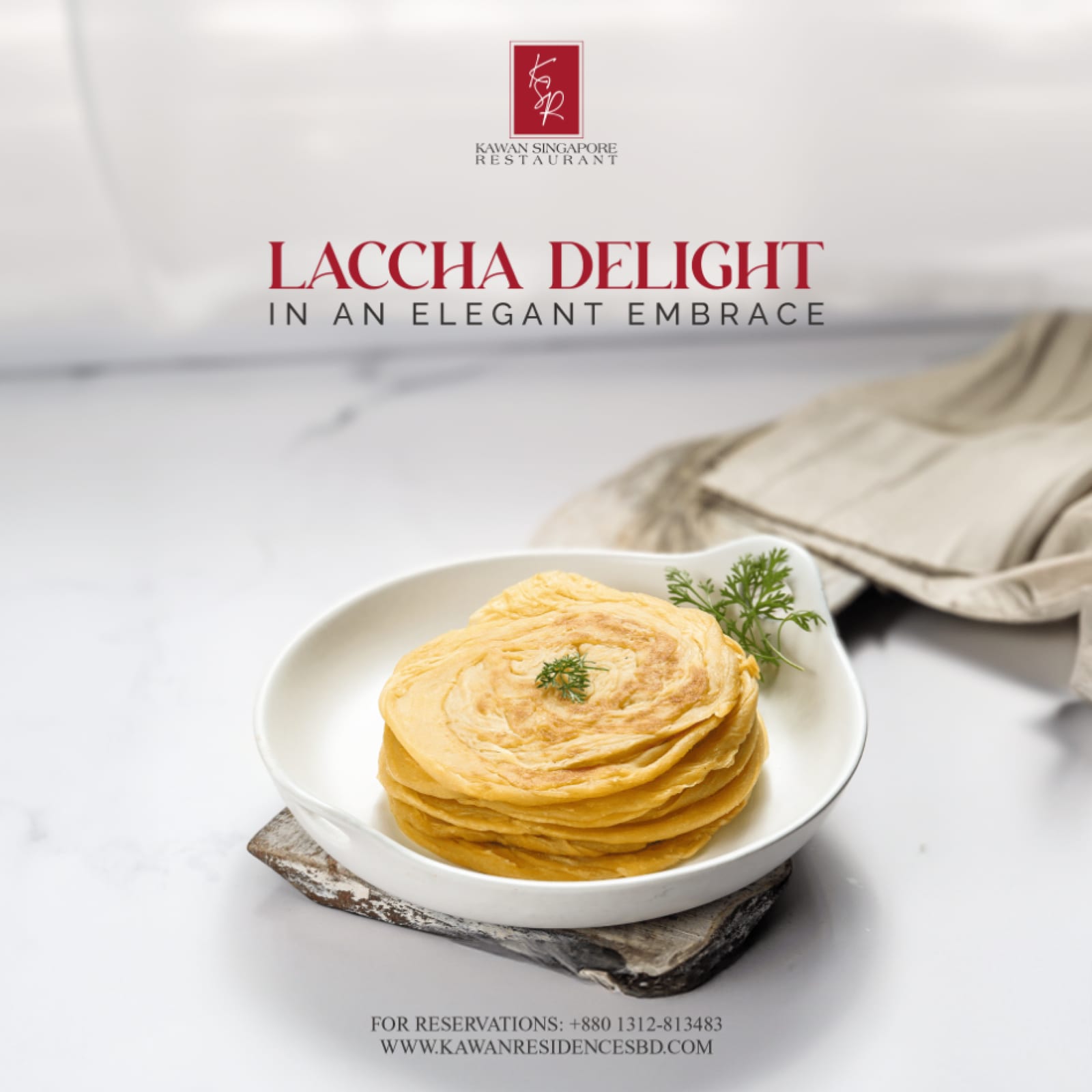
Kawan Singapore 2021–2025
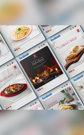
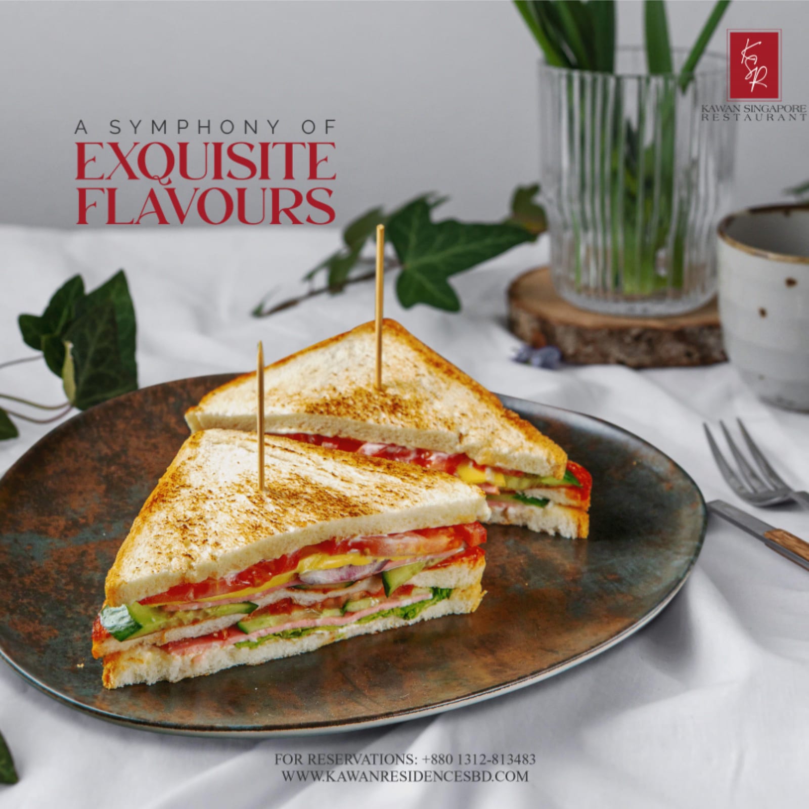
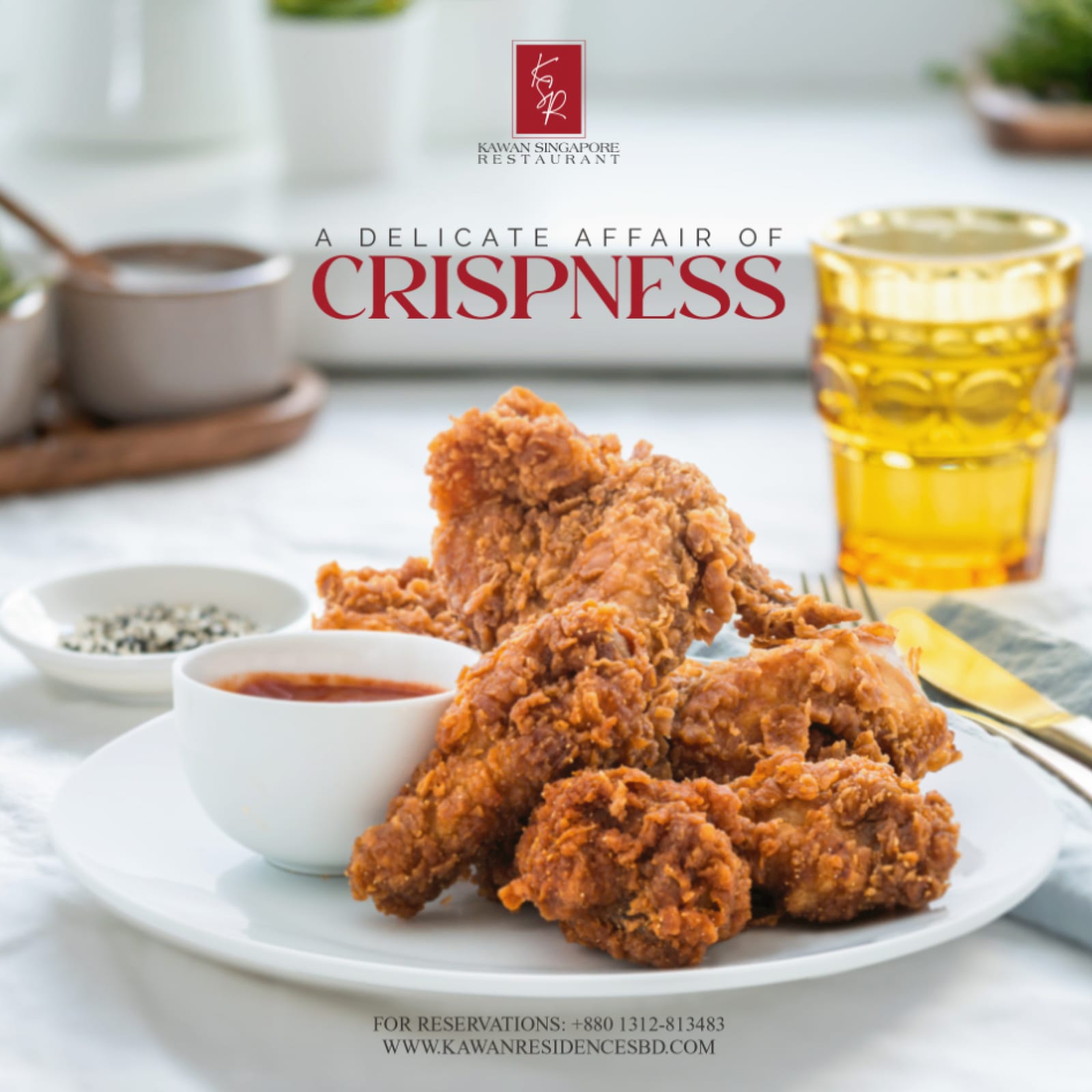
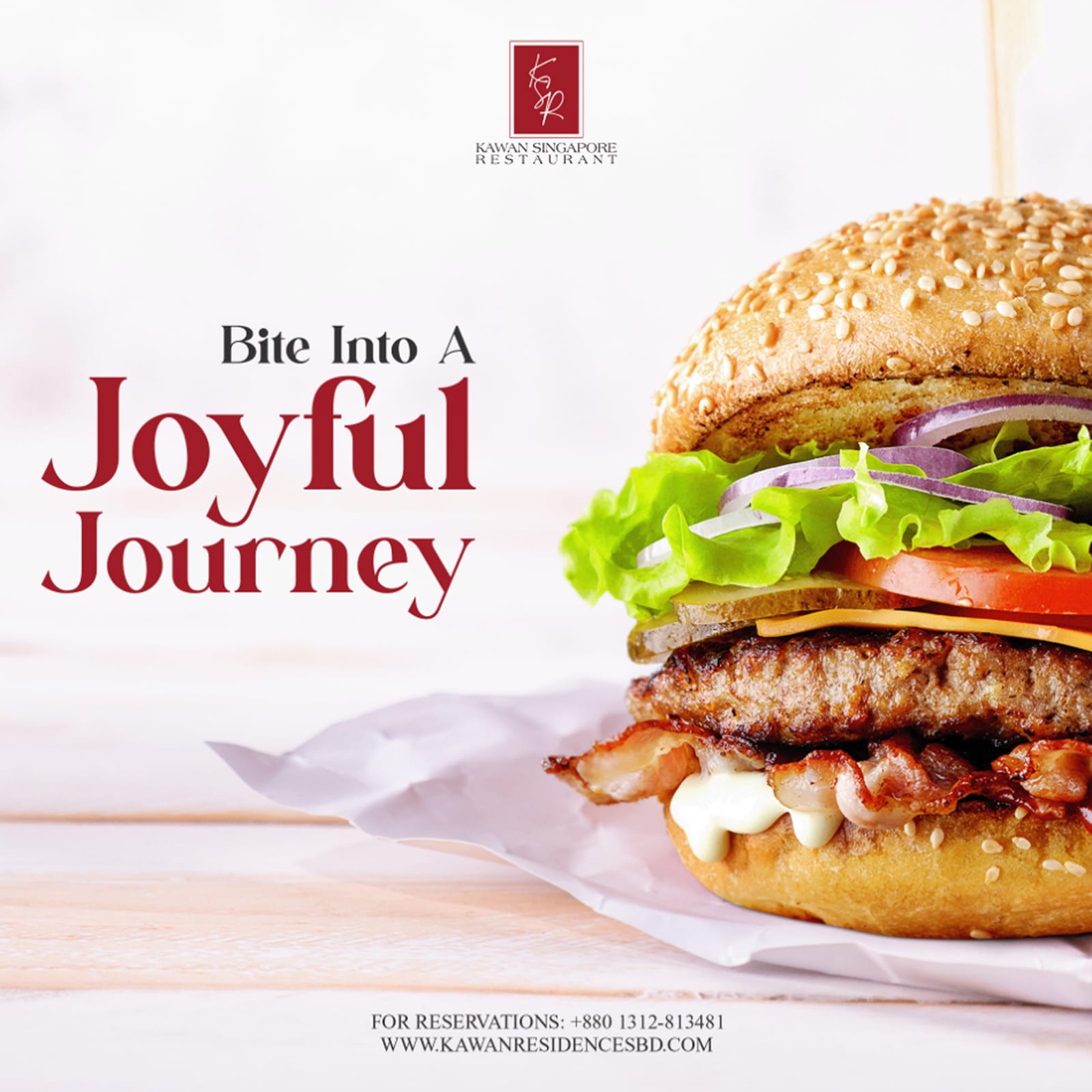
Restaurant social built as a repeatable kit, so the venue's own team can post a new dish each week and the feed still reads as one brand.
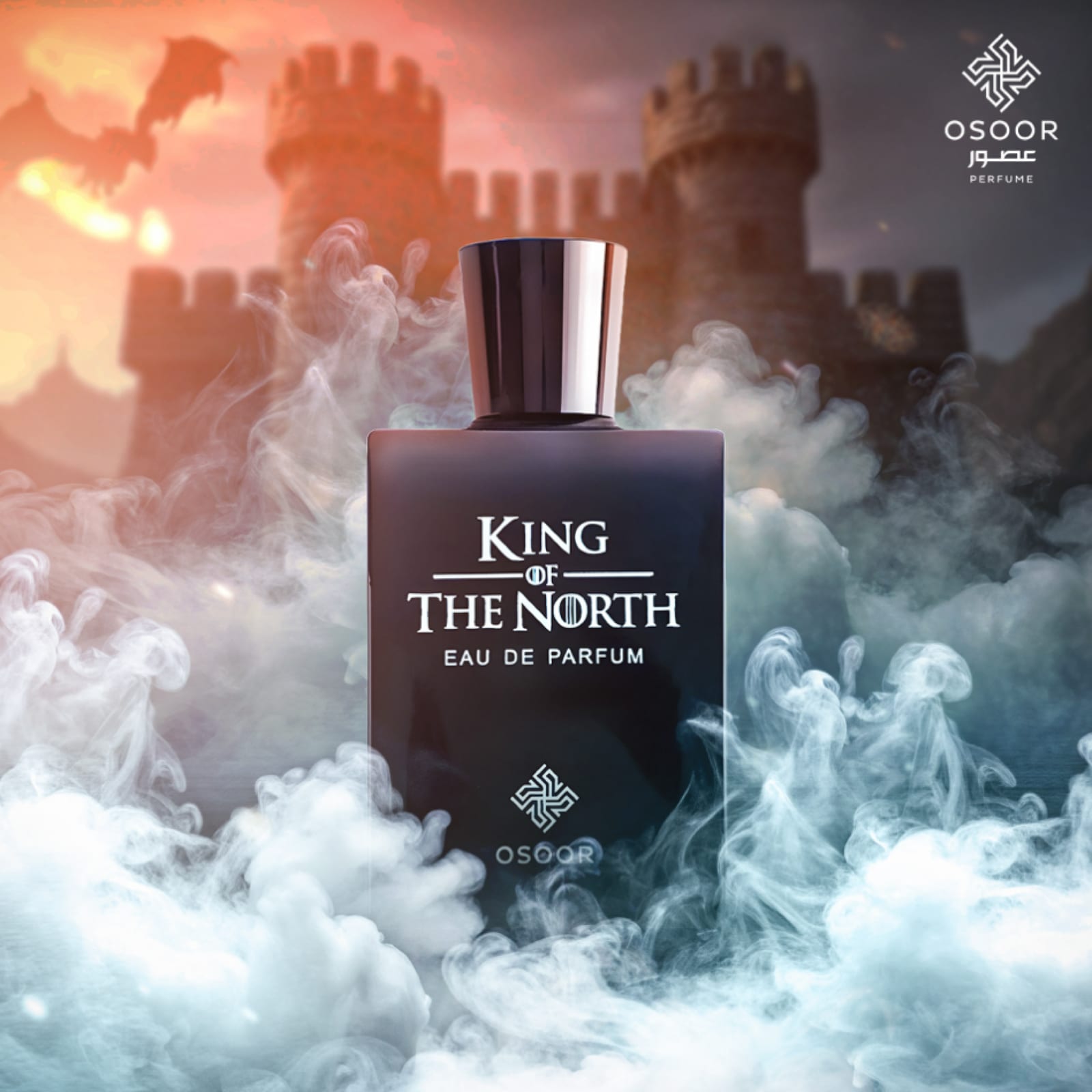
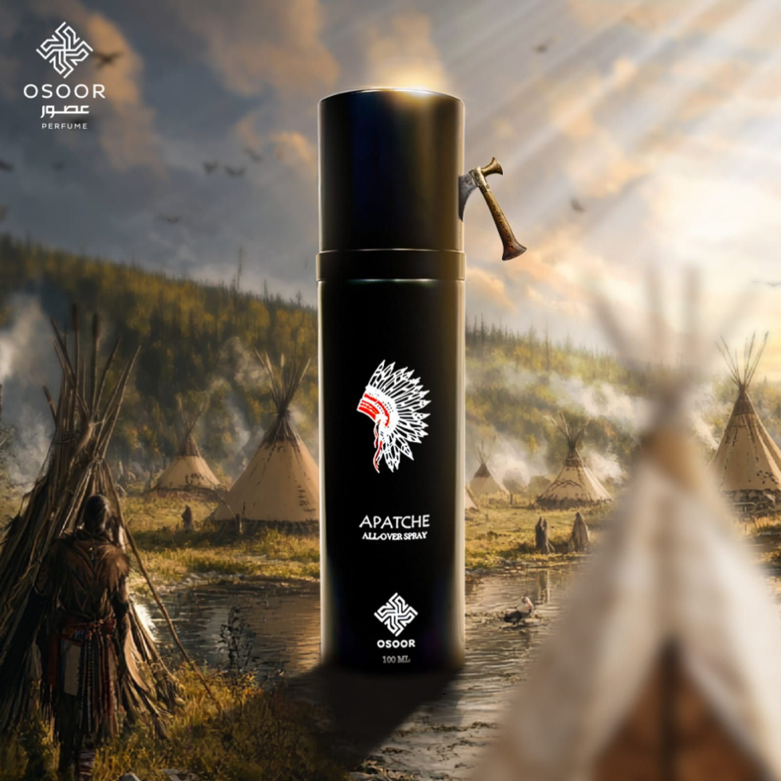
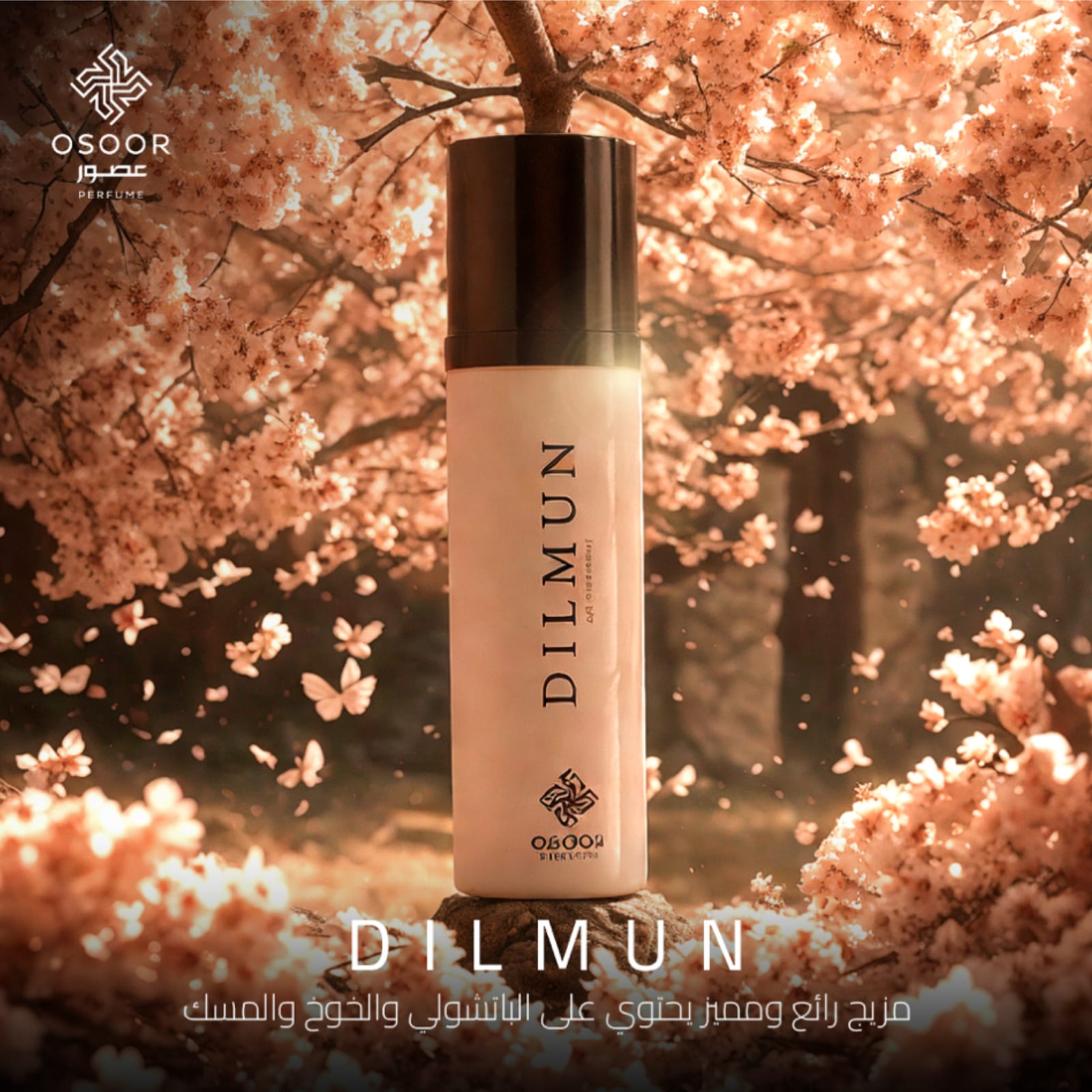
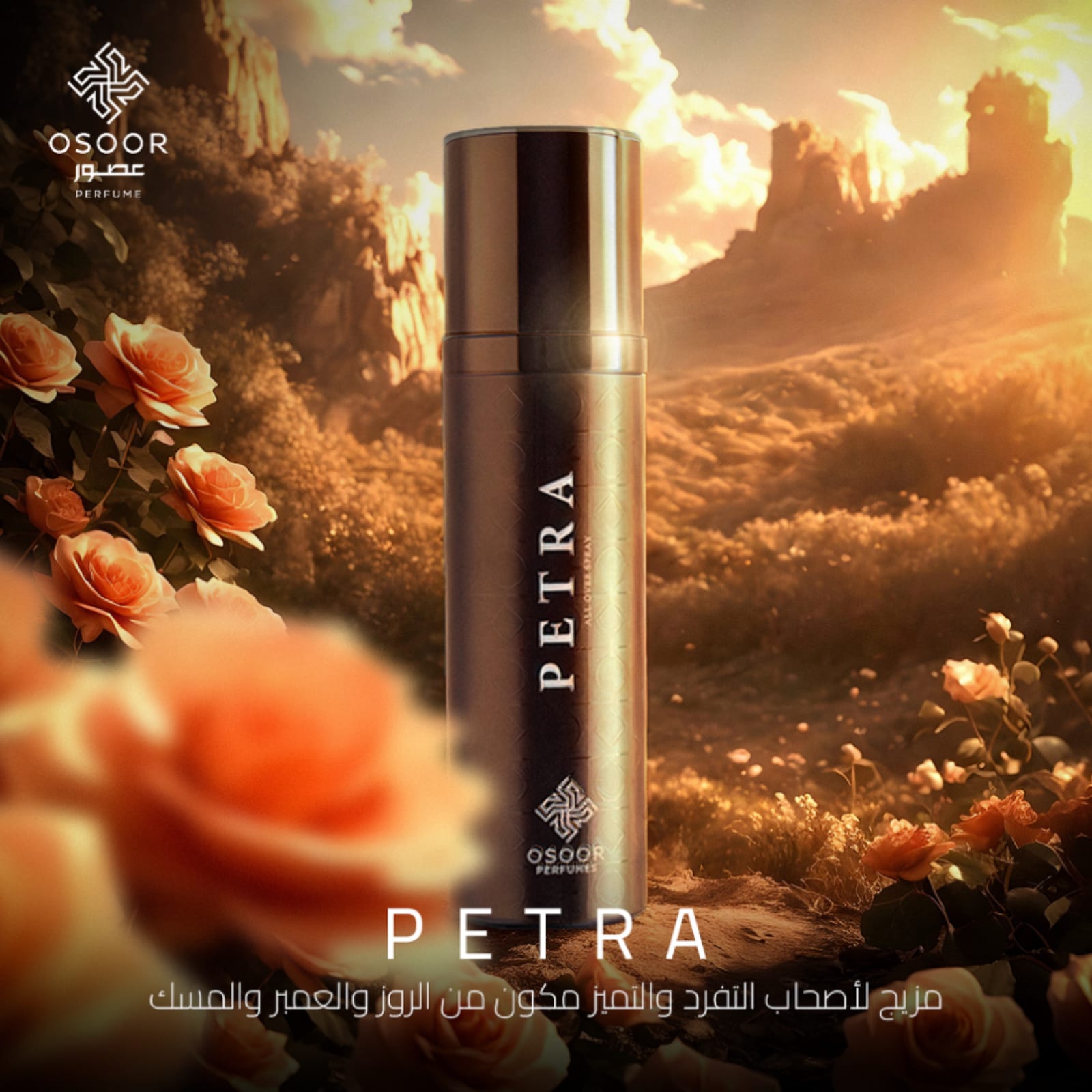
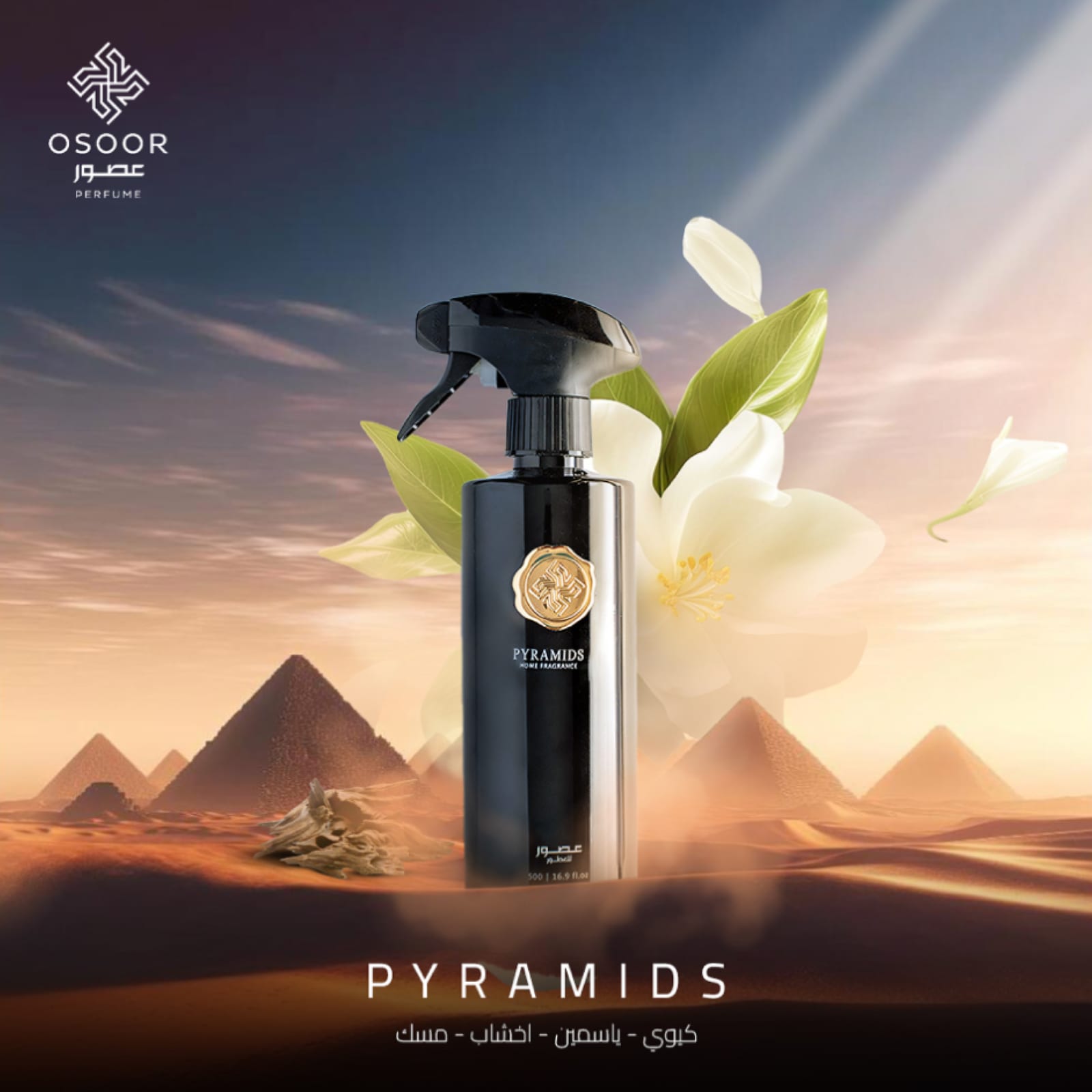
Osoor Perfumes 2021–2025
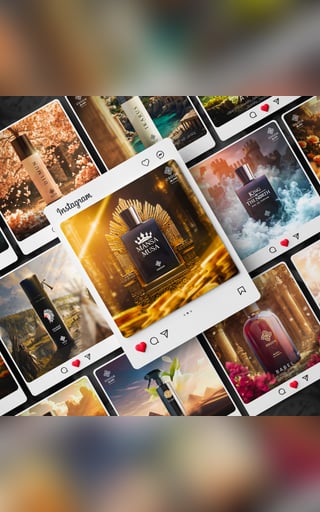
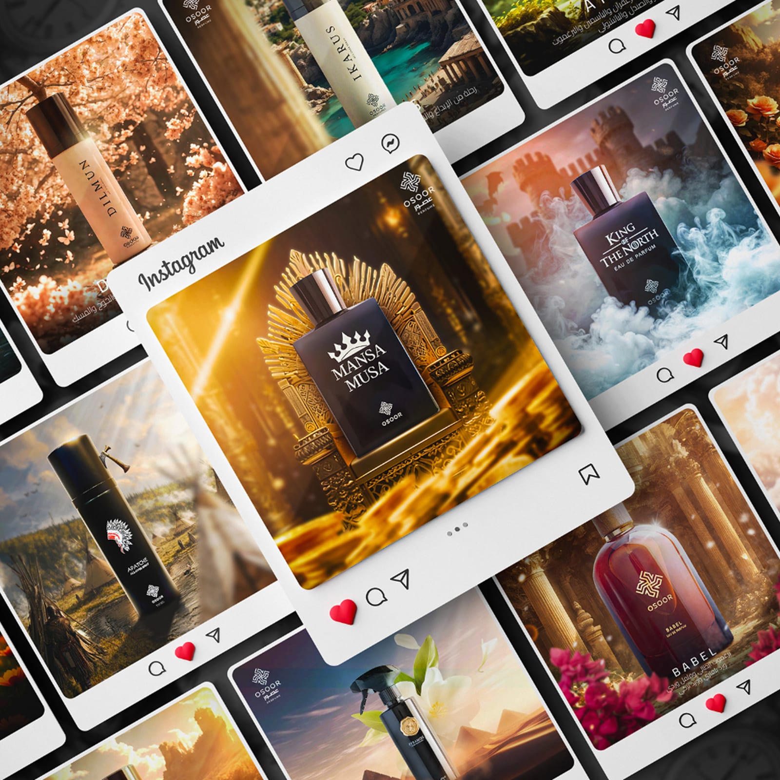
Product-led social for a fragrance house, where the bottle is the hero and the typography's job is to stay out of its way while still carrying the name.


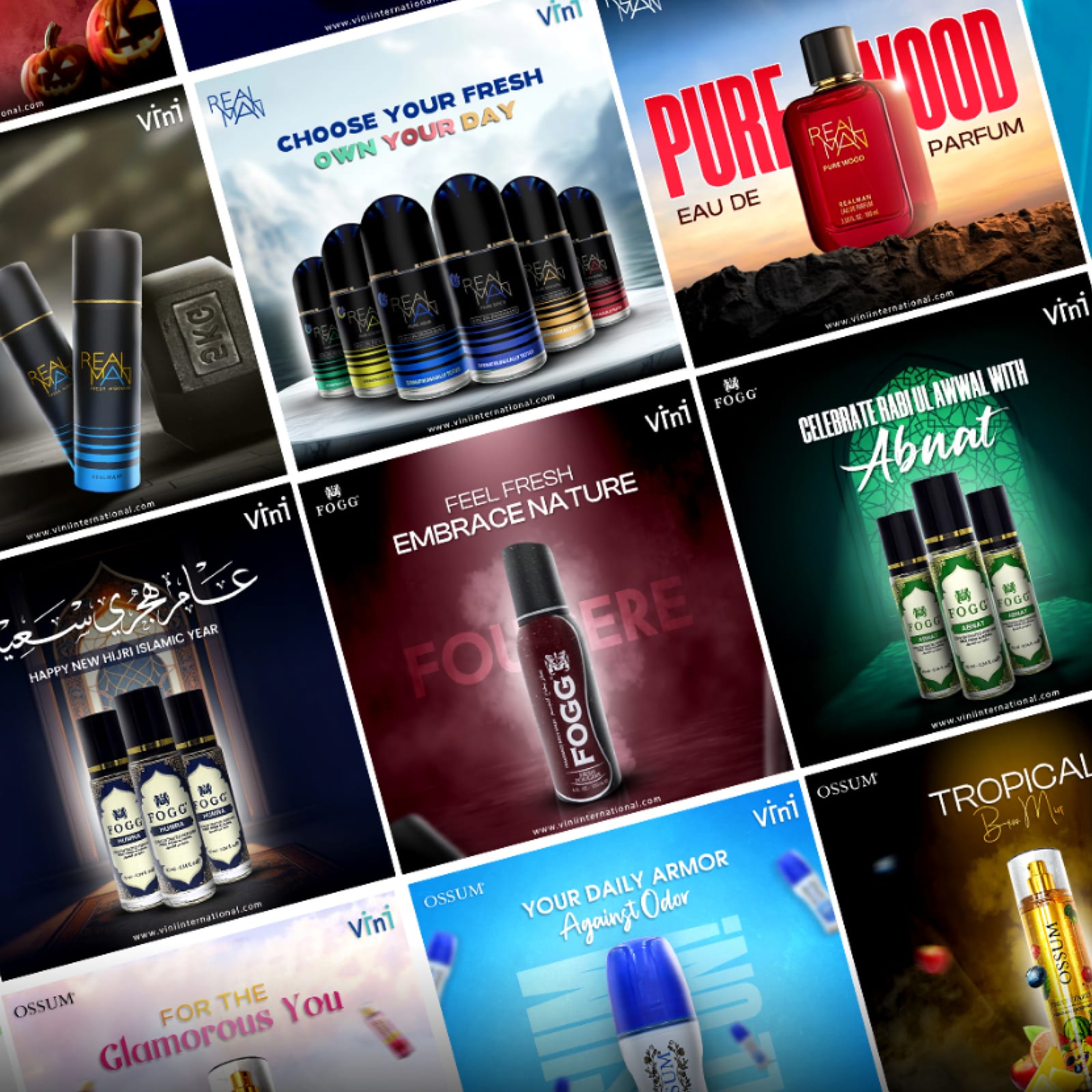
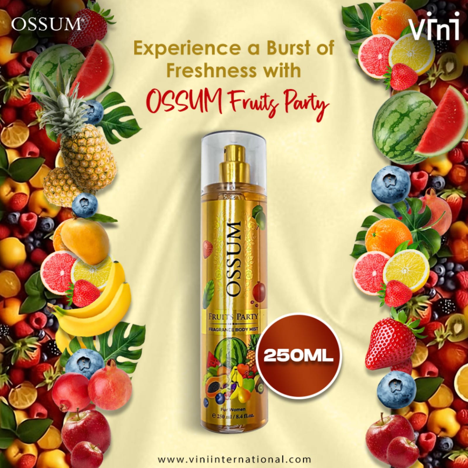
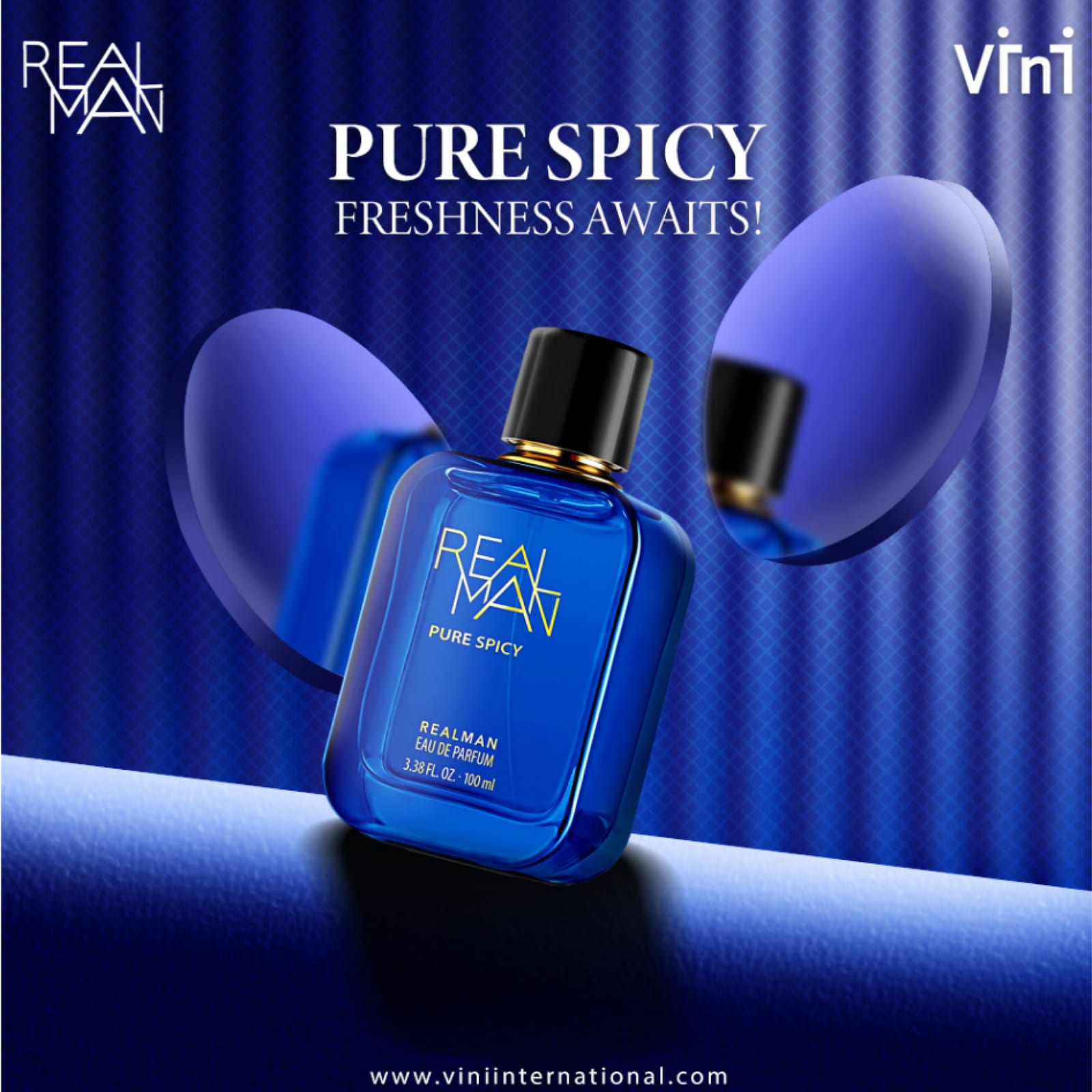
Vini Perfumes 2021–2025
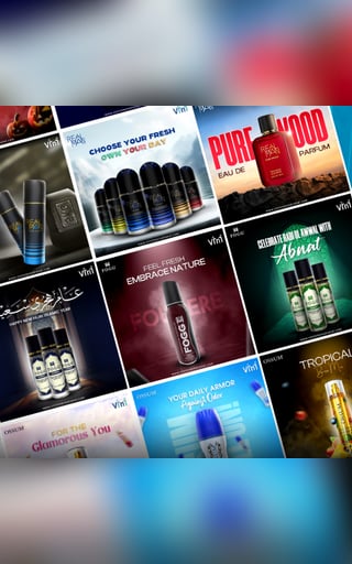
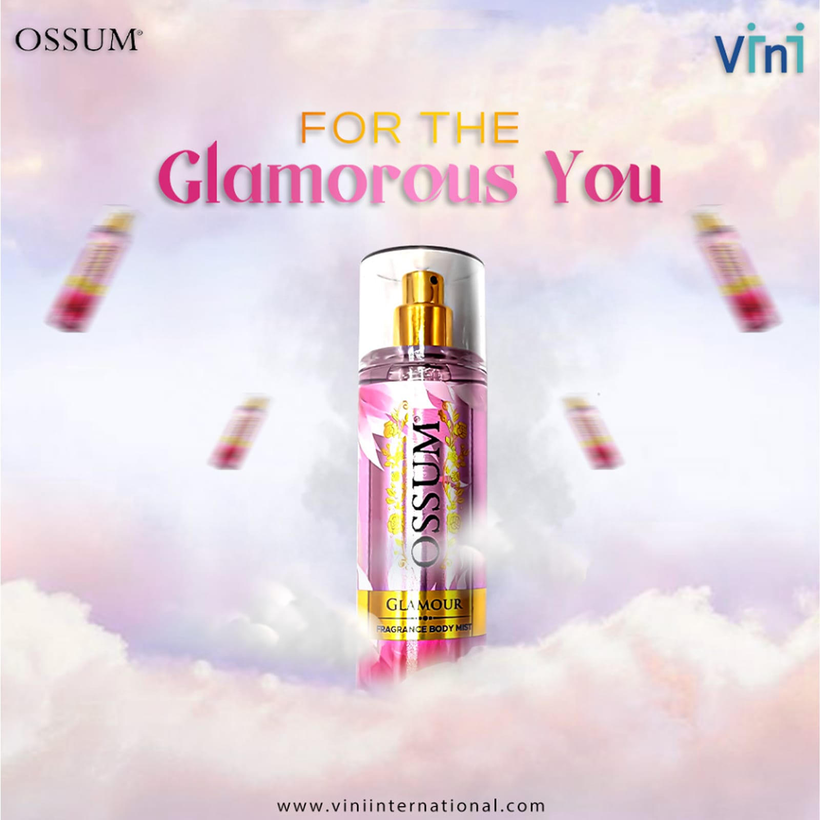
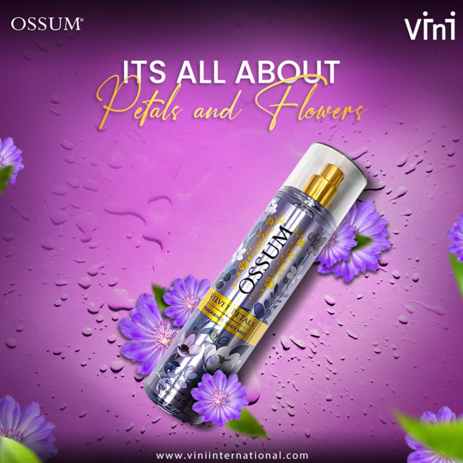
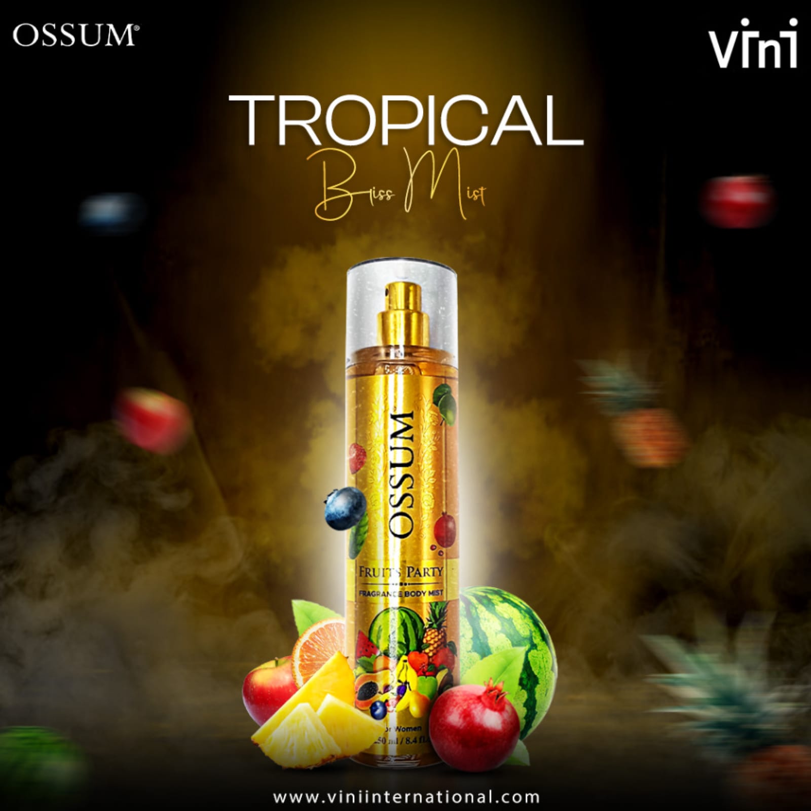
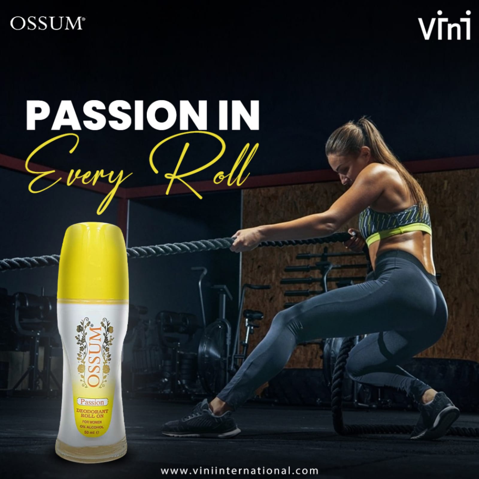
A fragrance range given a consistent social language: the same crop discipline and the same lighting treatment across every variant, so the line reads as a set.




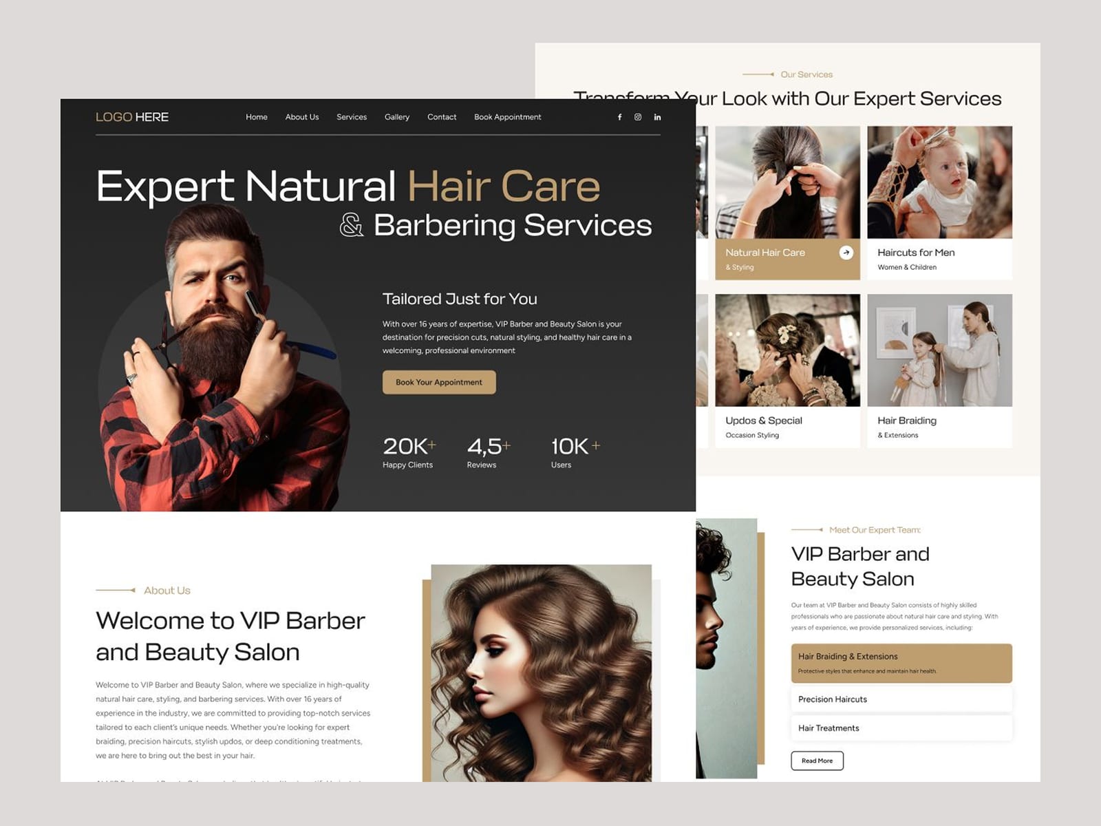
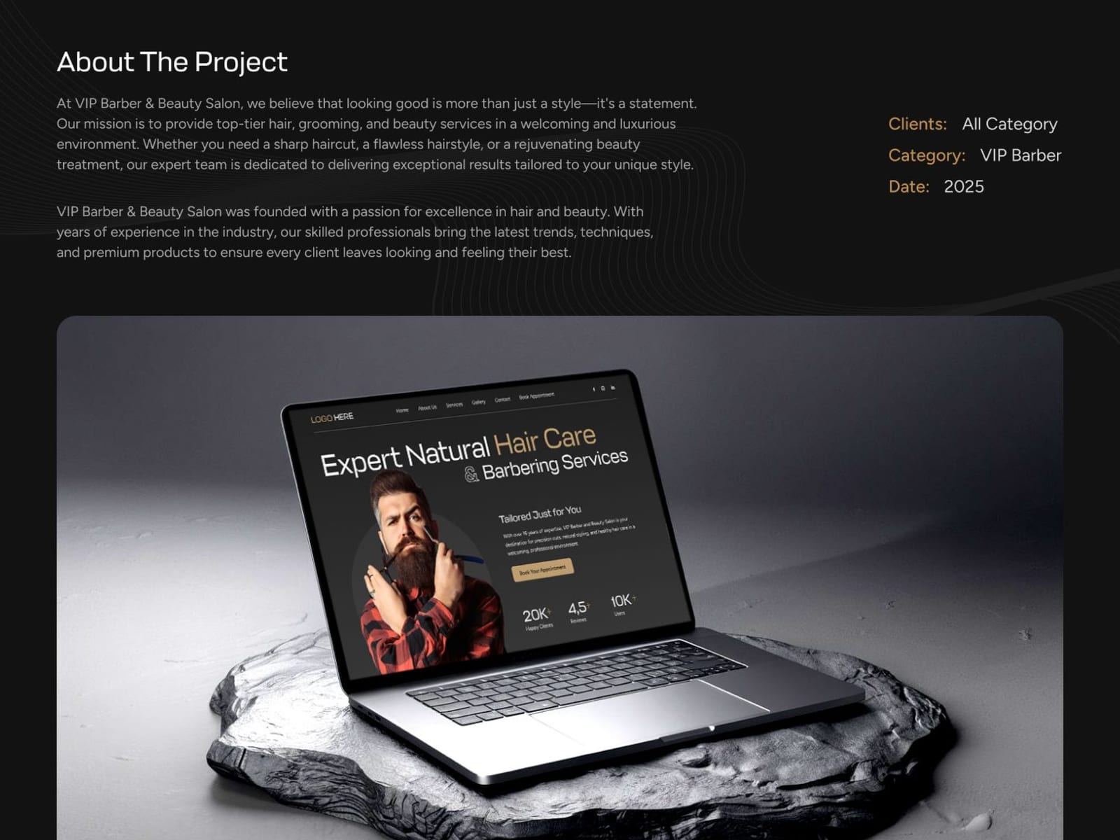
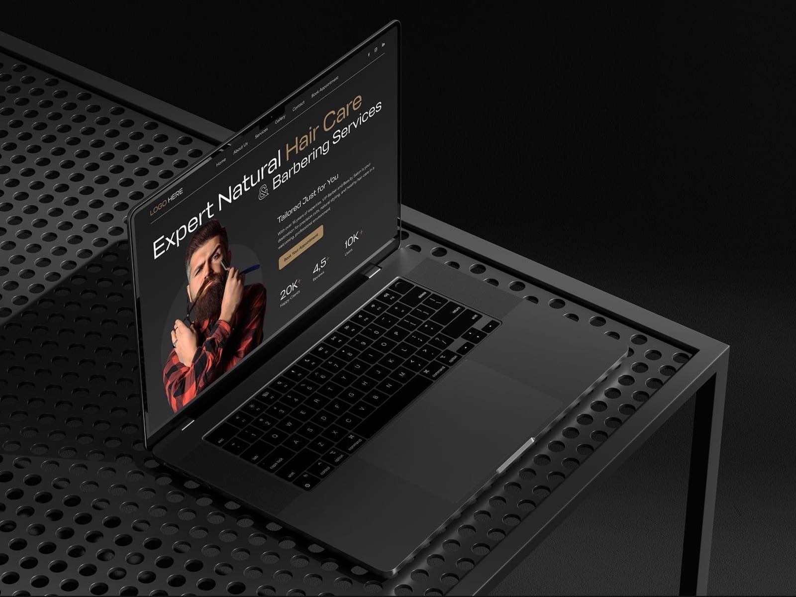
Expert Barber Shop 2021–2025
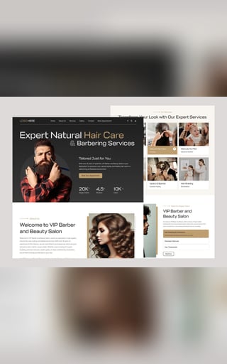
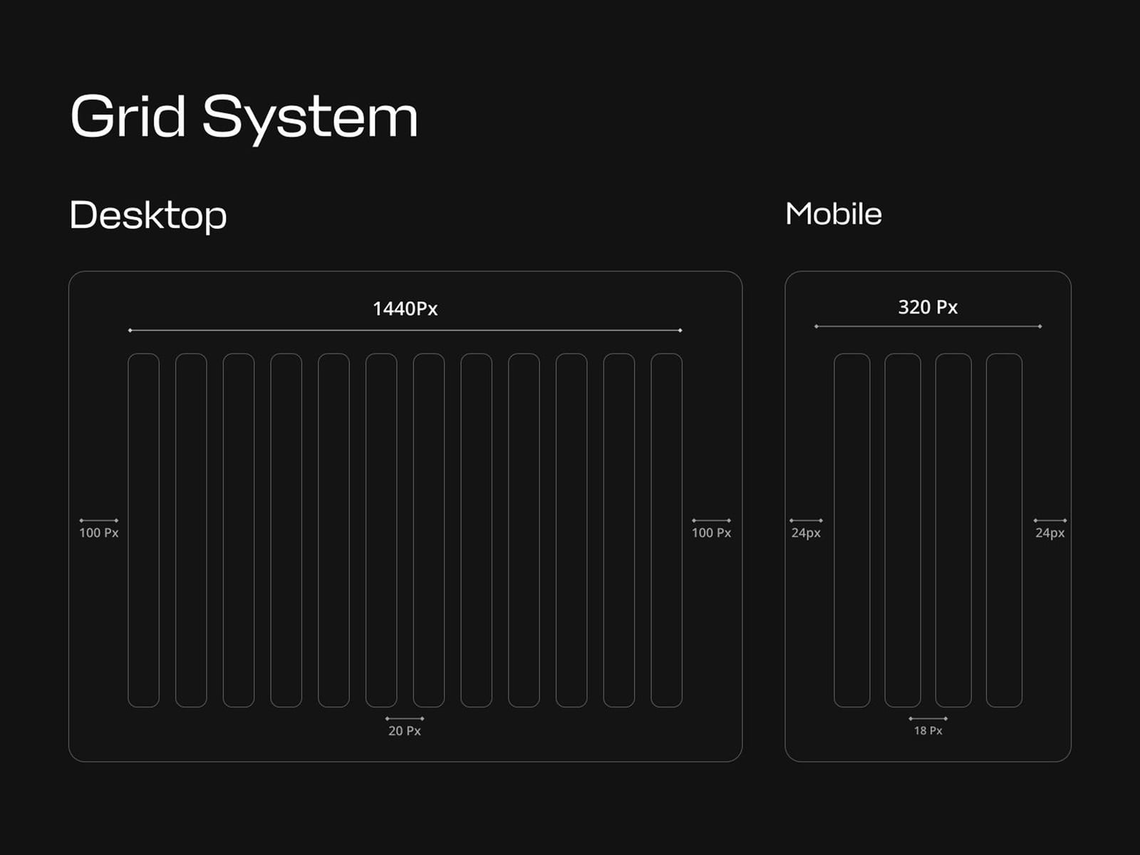
An interface built around one job — booking a chair — with everything that does not serve it moved out of the first screen.
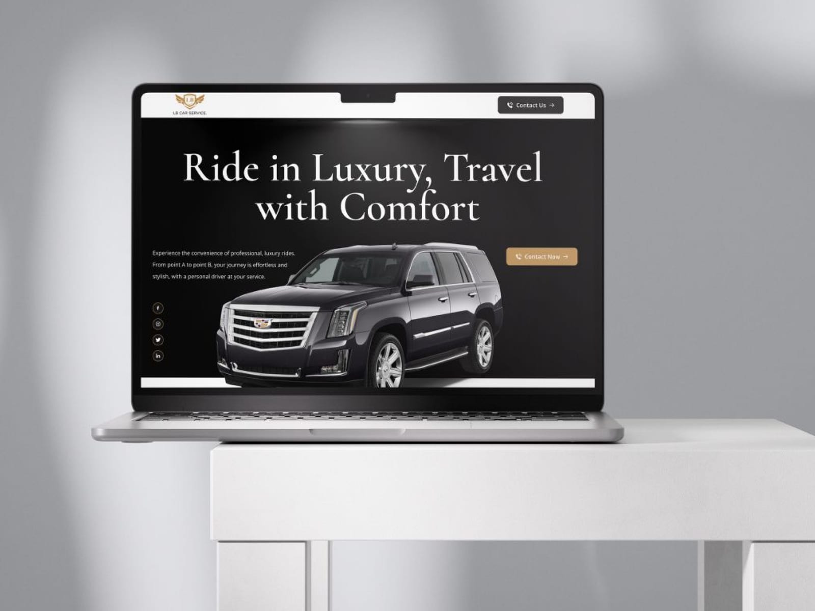
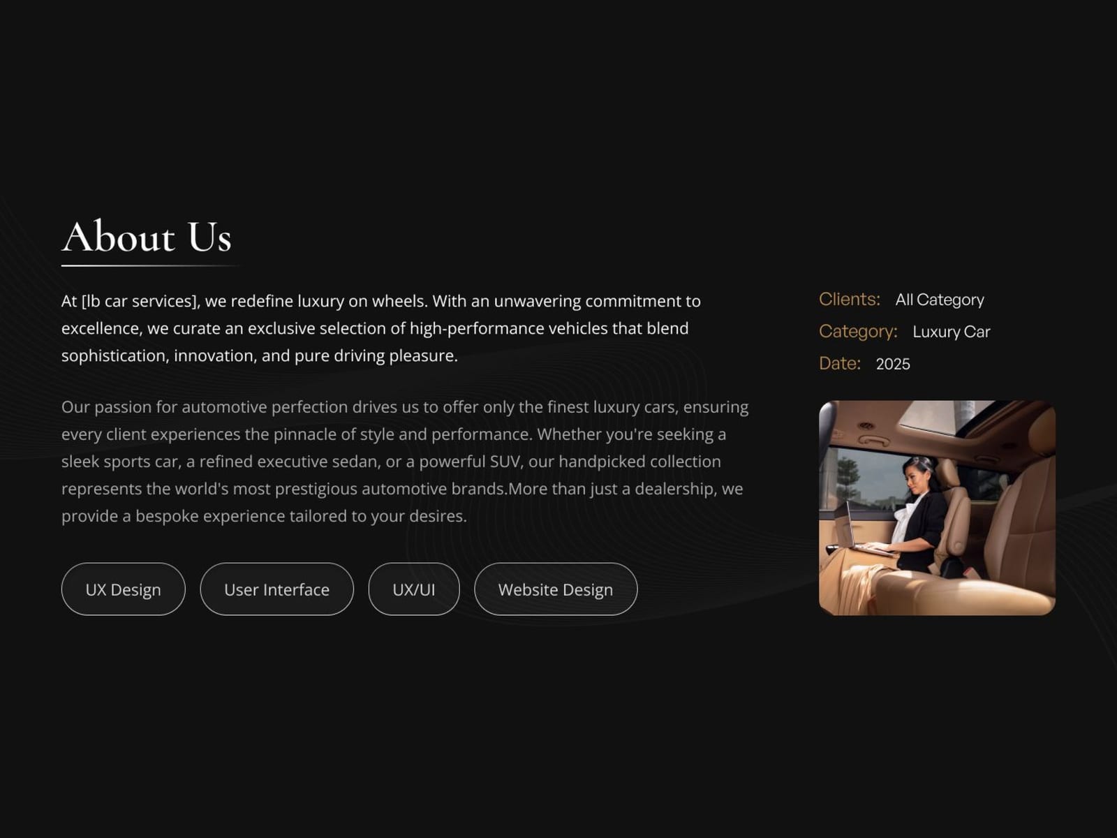
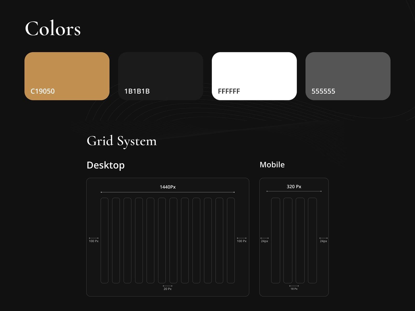
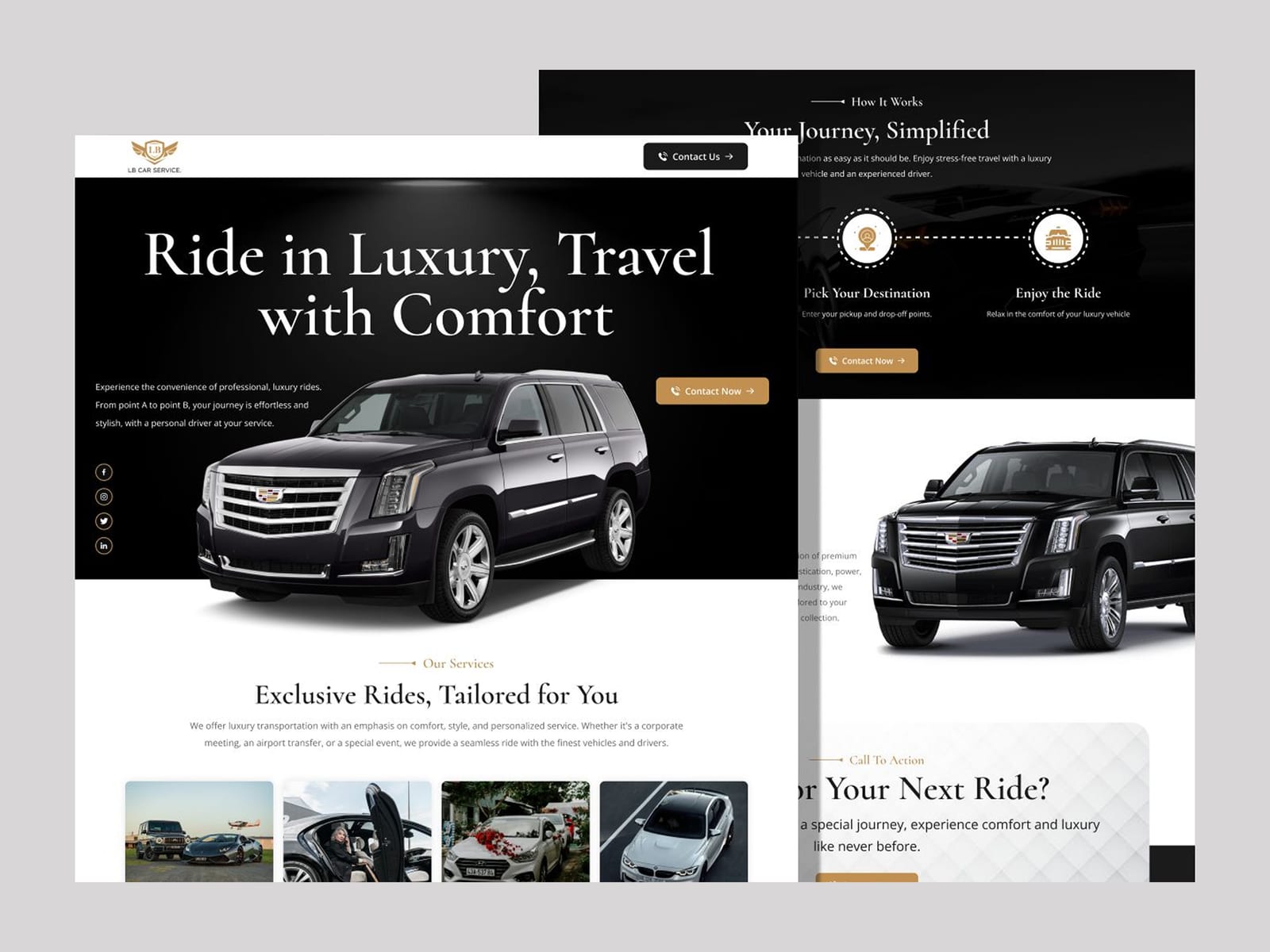
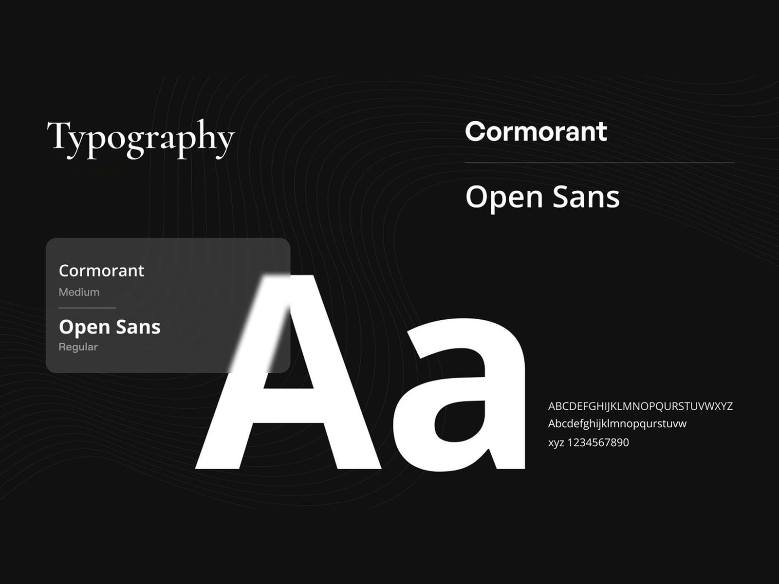
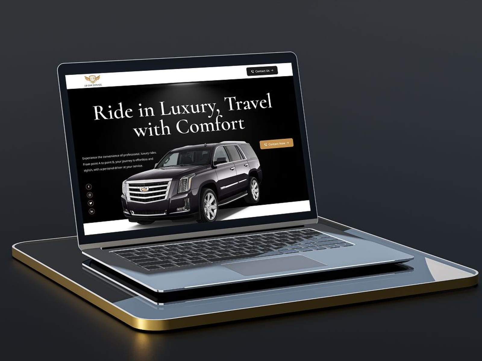
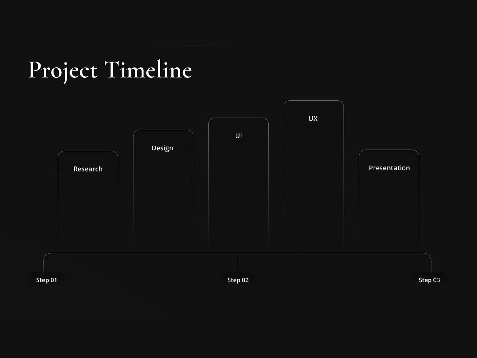
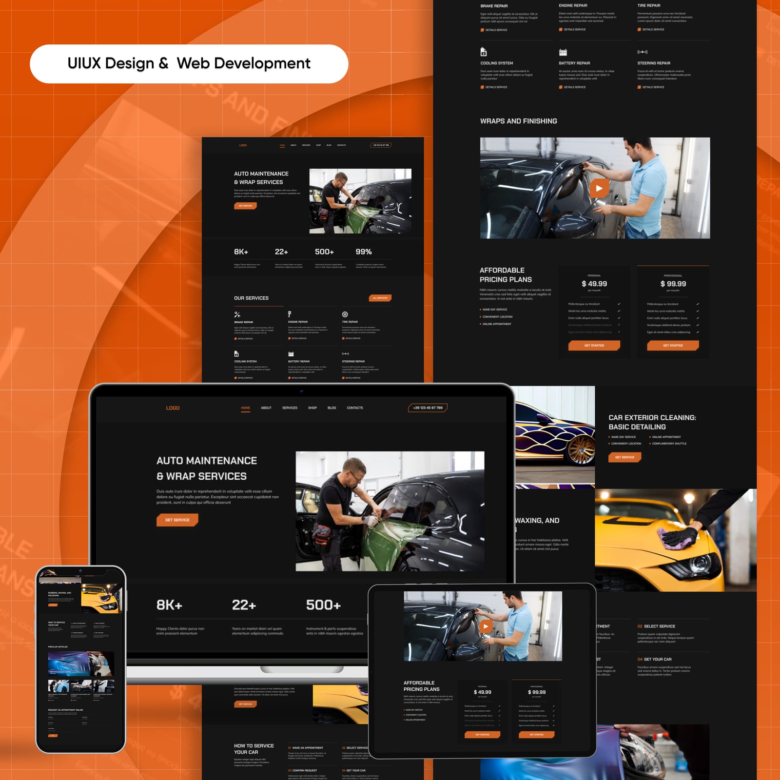
LB Car Services 2021–2025
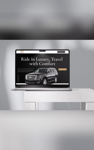
A service-booking interface for the motor trade: a flow a customer can complete on a phone in a forecourt, with the quote logic visible rather than hidden behind a call-back form.
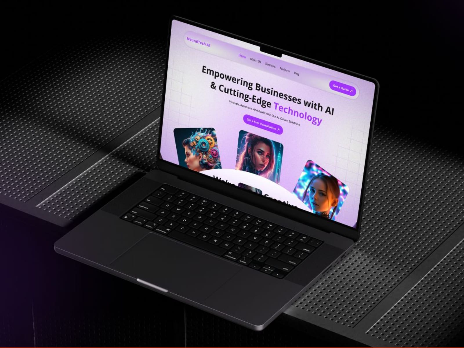
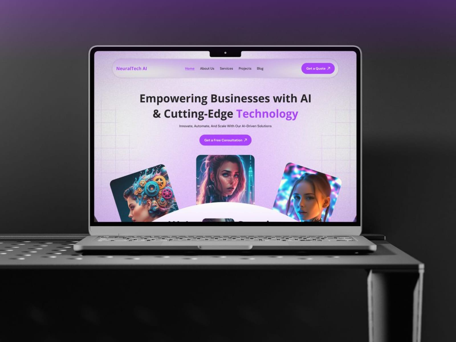
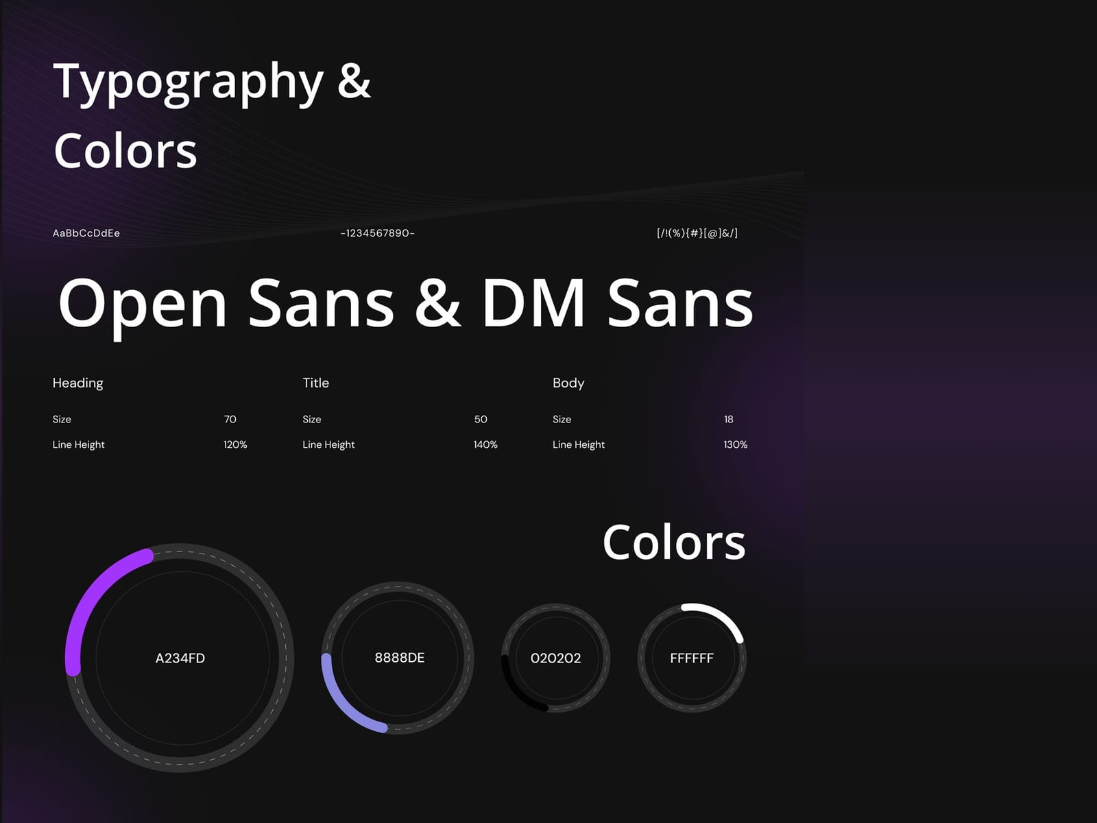
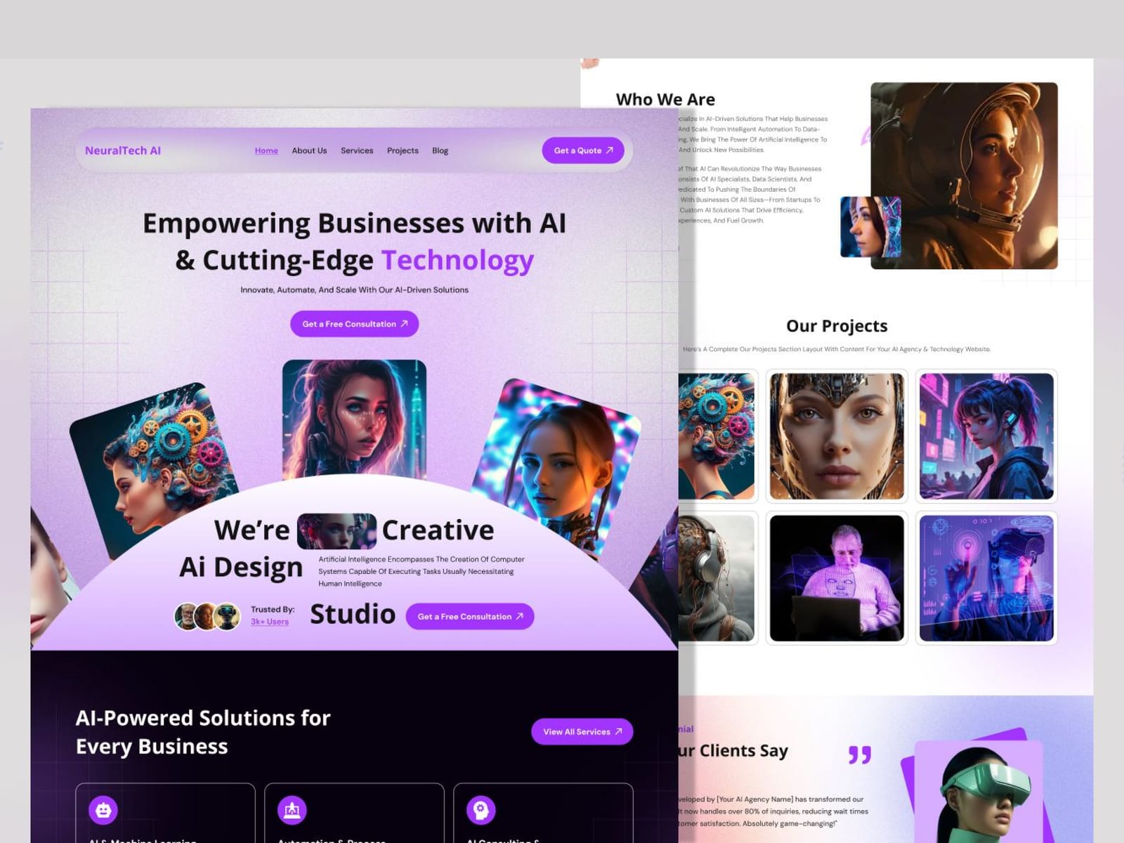
Neural Tech AI 2021–2025
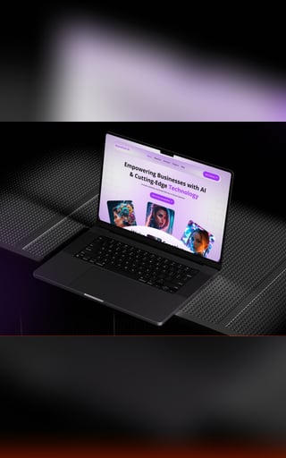
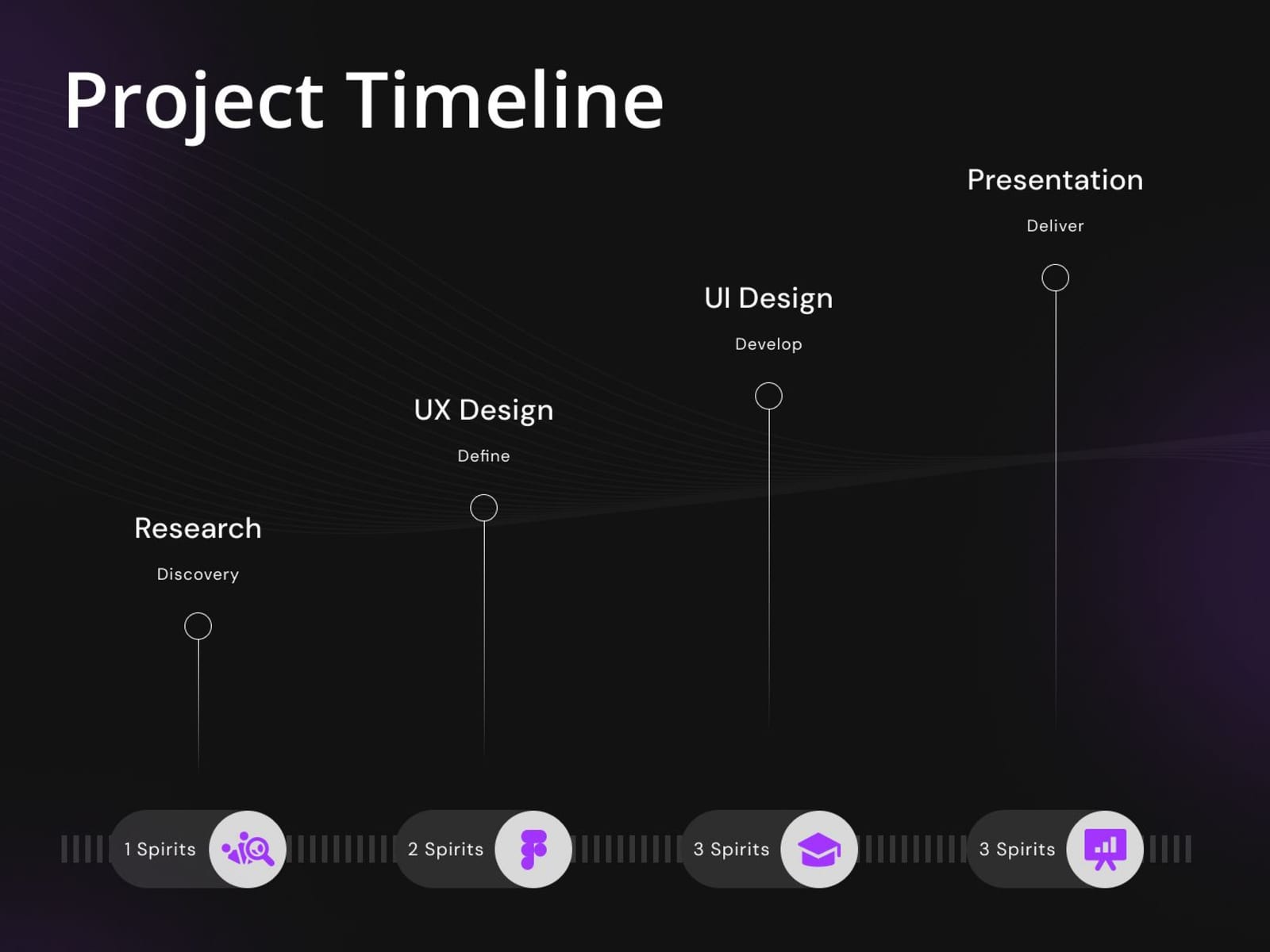
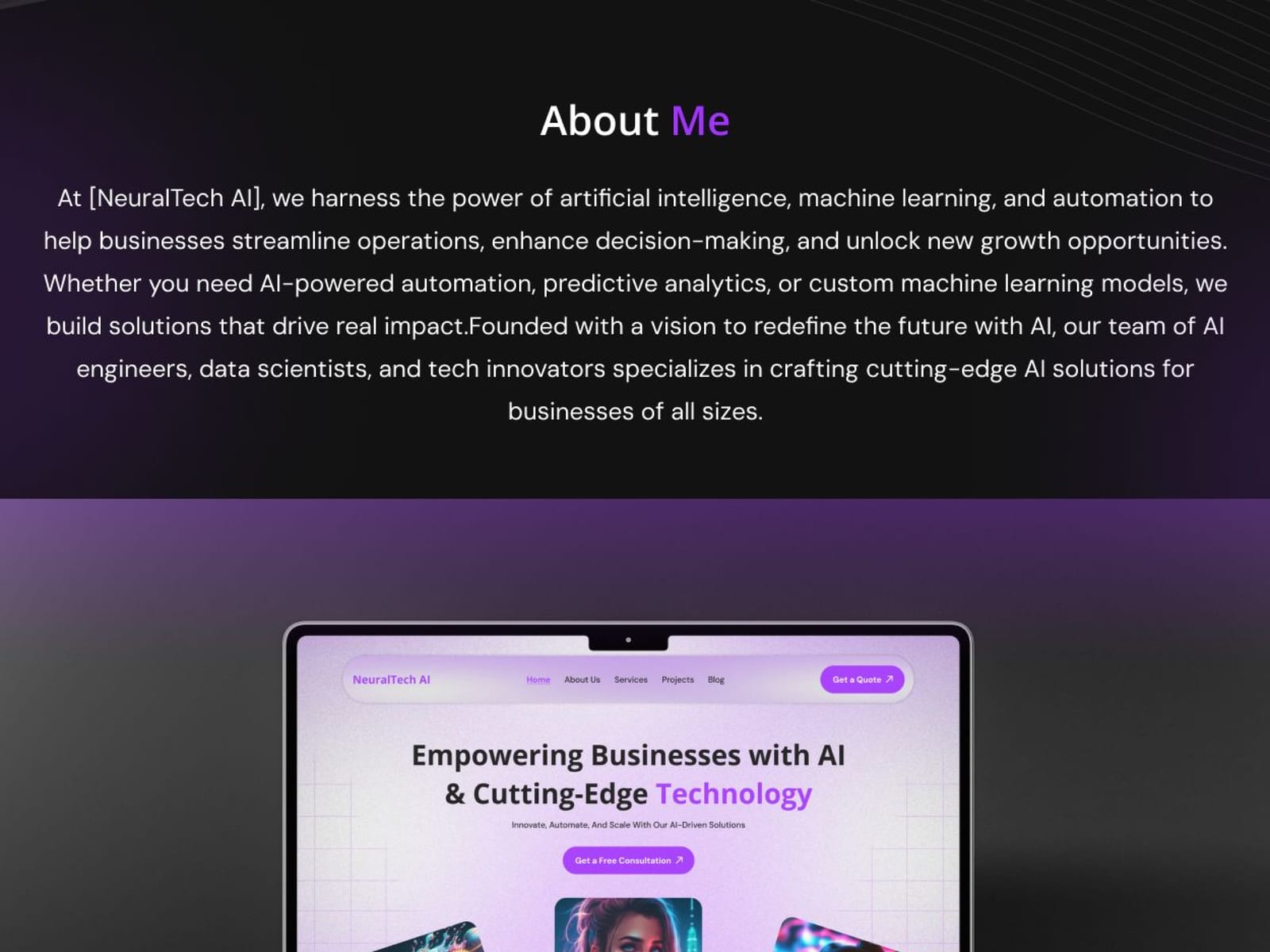
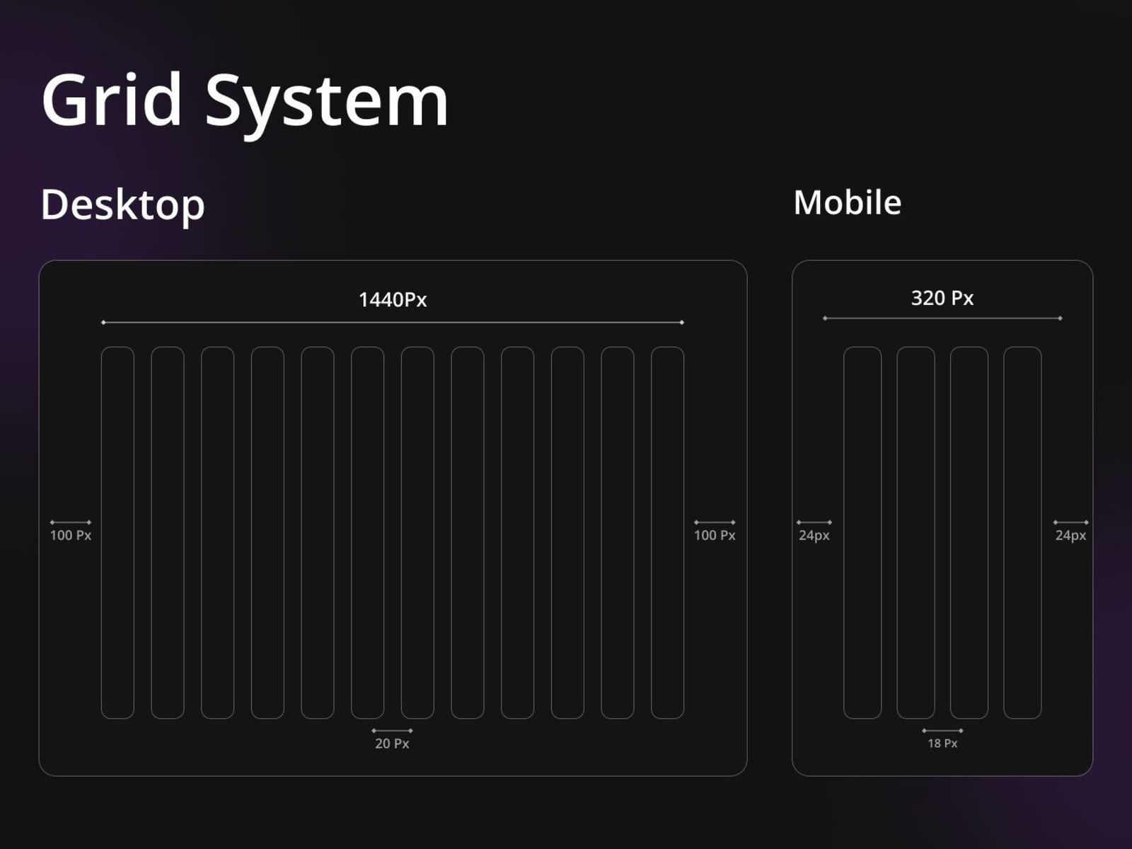
A product interface for an AI platform, designed as a system: one type scale, one spacing rhythm and one component set, so a new flow costs a layout rather than a redesign.
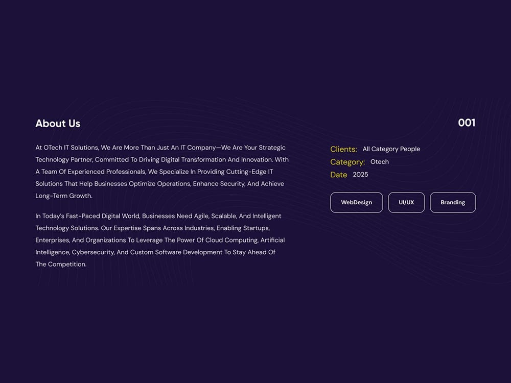
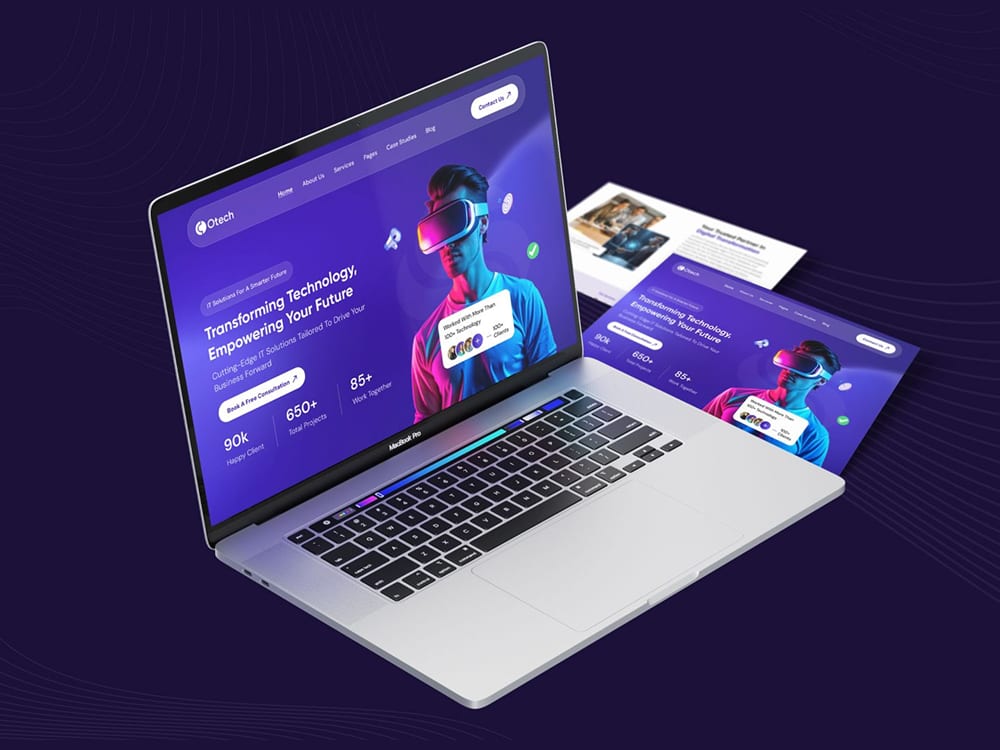
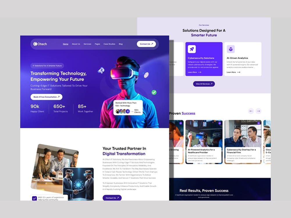
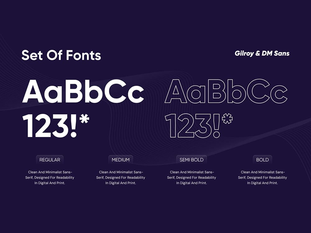
Otech Enterprises 2021–2025
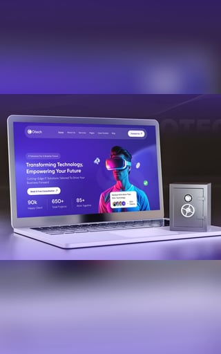
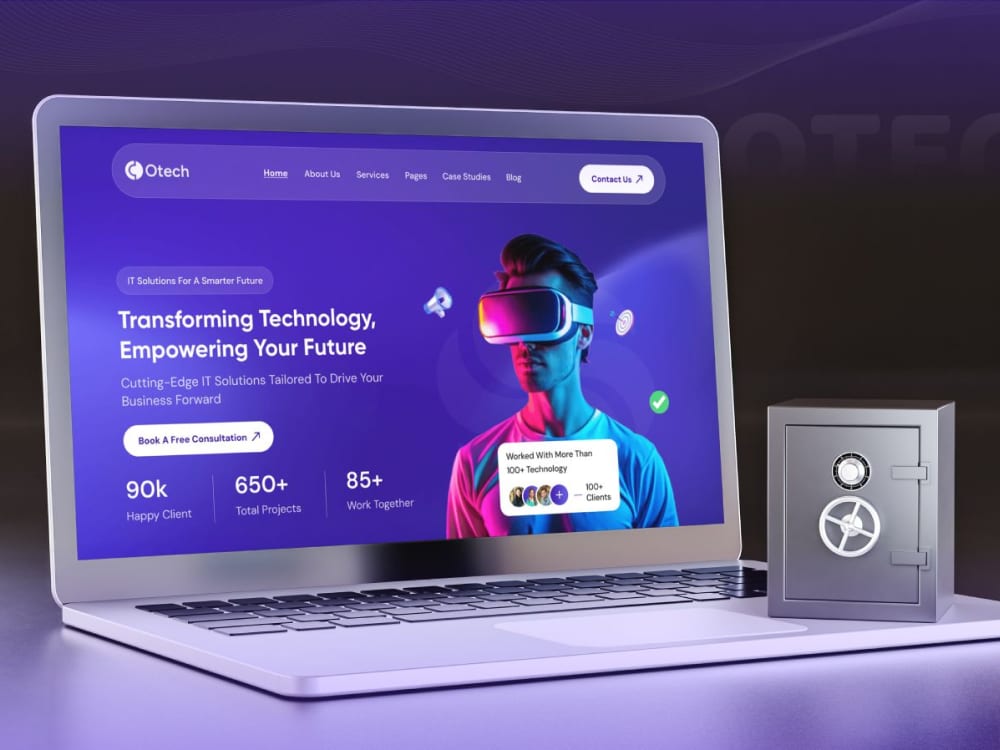
A corporate platform given a structure it can grow into — sections that stay navigable as the content trebles, and a hierarchy that survives the client's own edits.
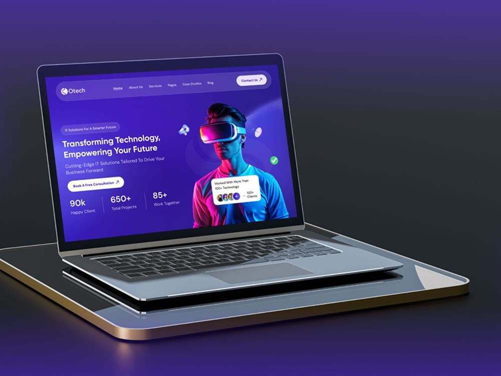
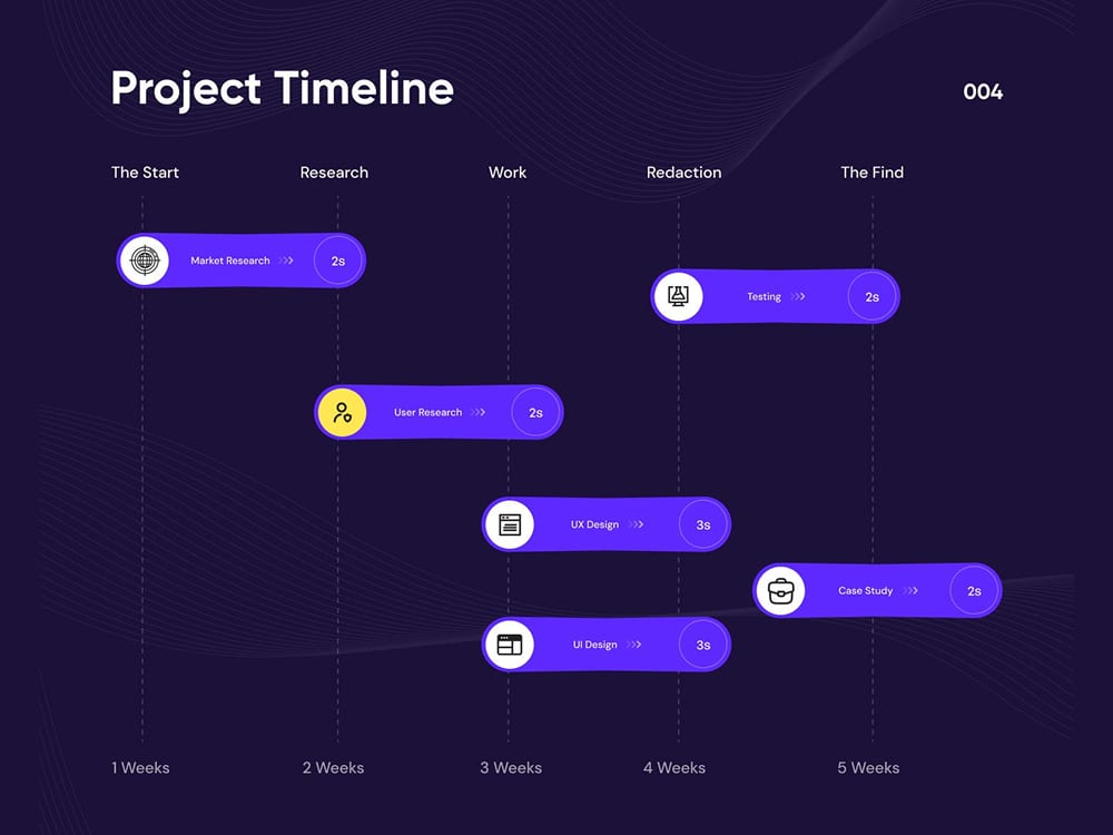
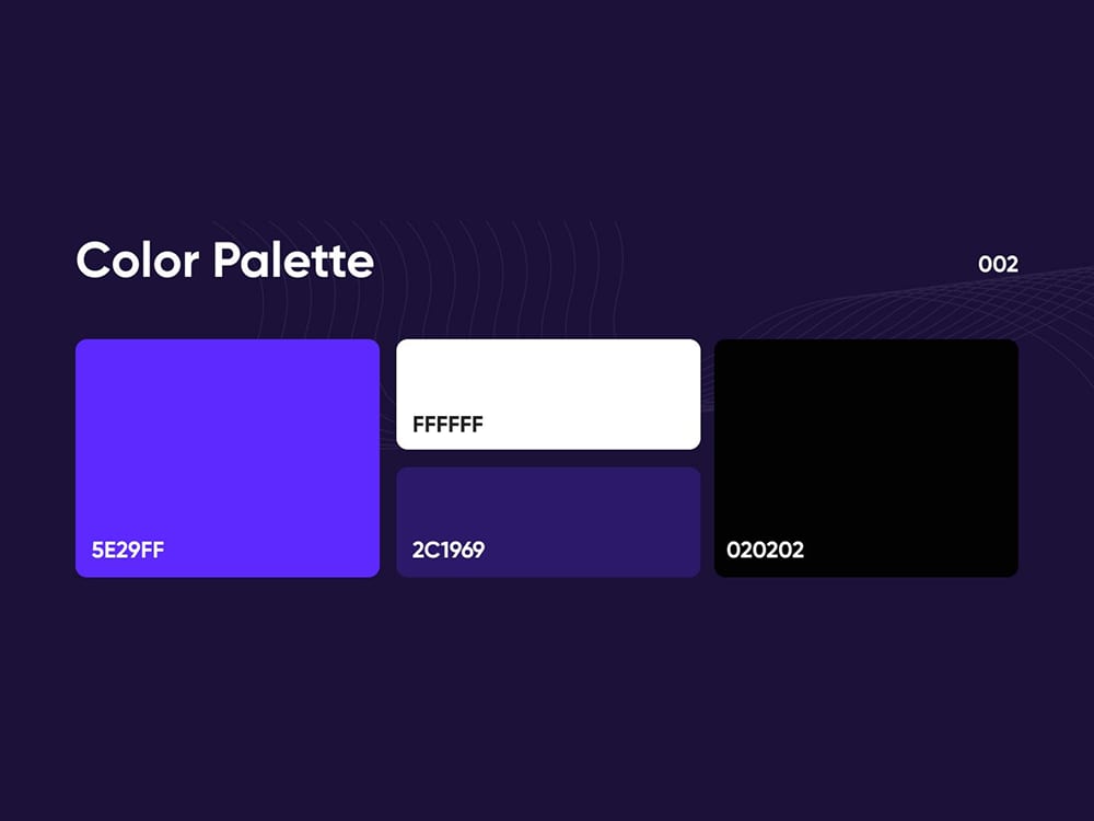
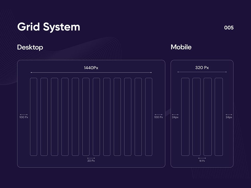
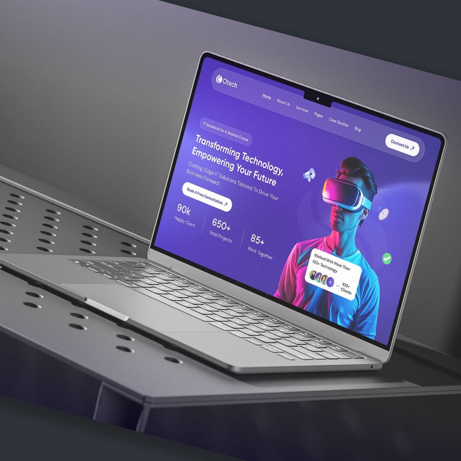
Selected Clients 2021–2025
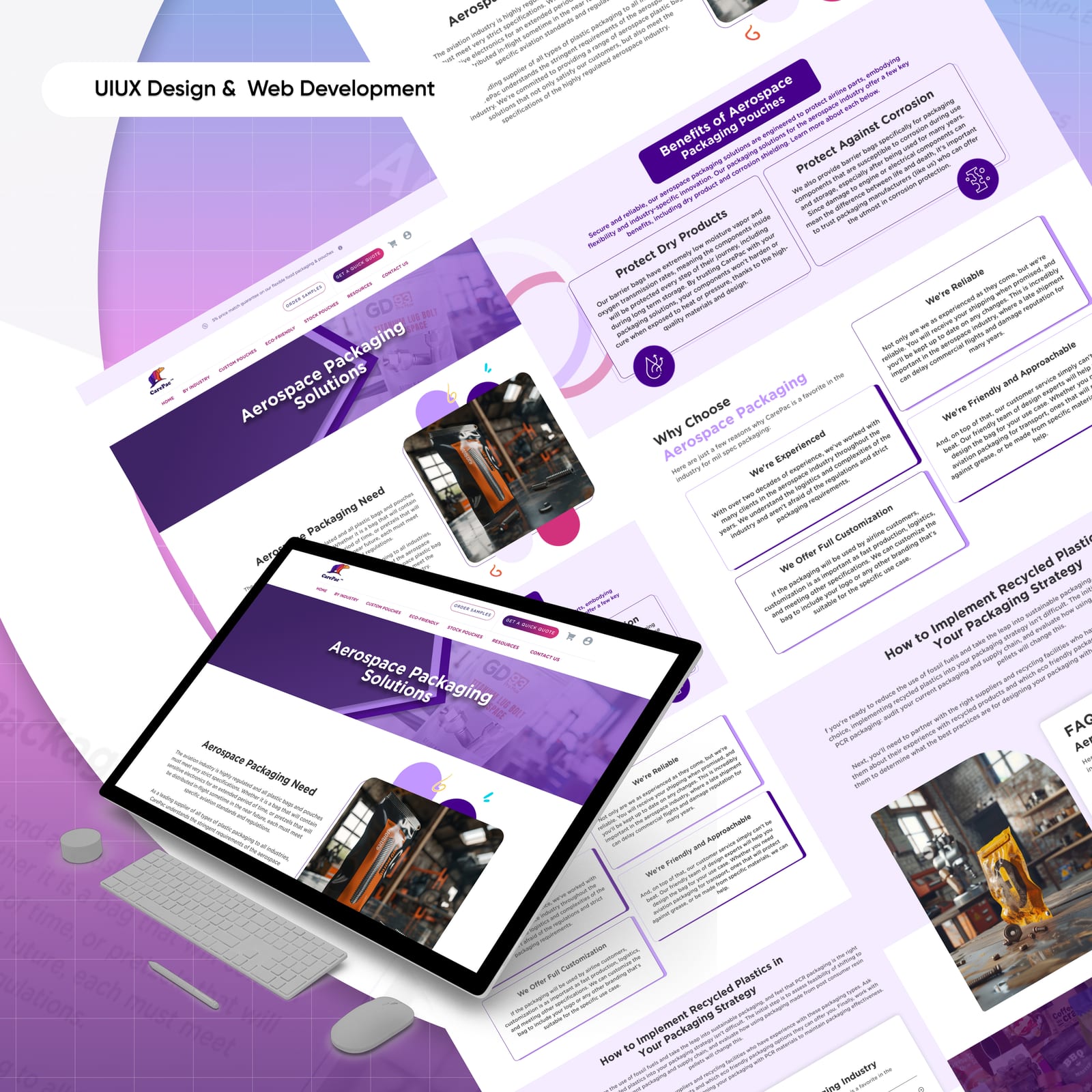
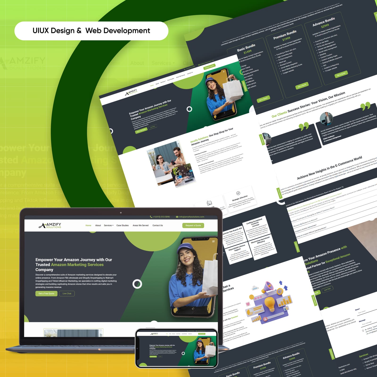
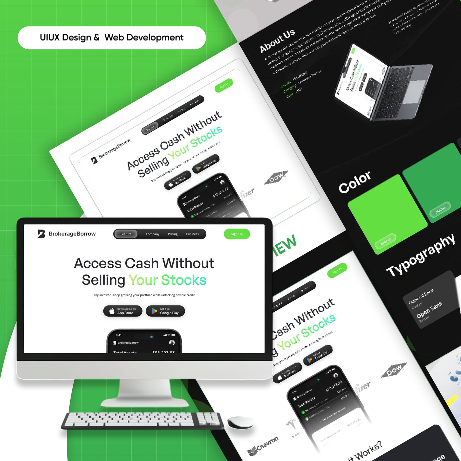
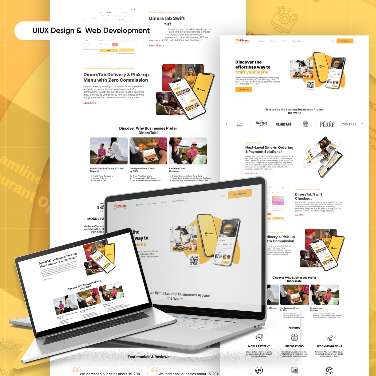
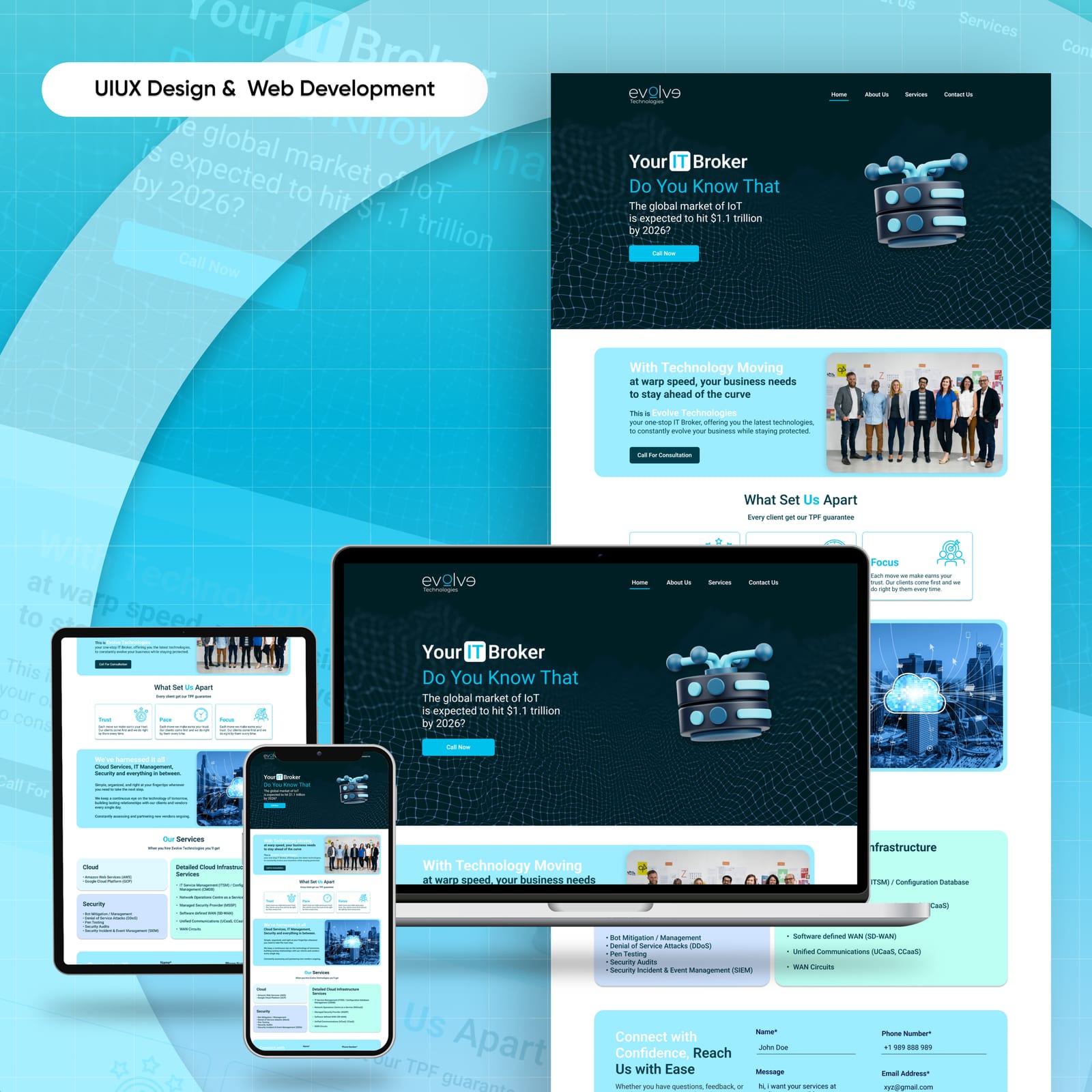
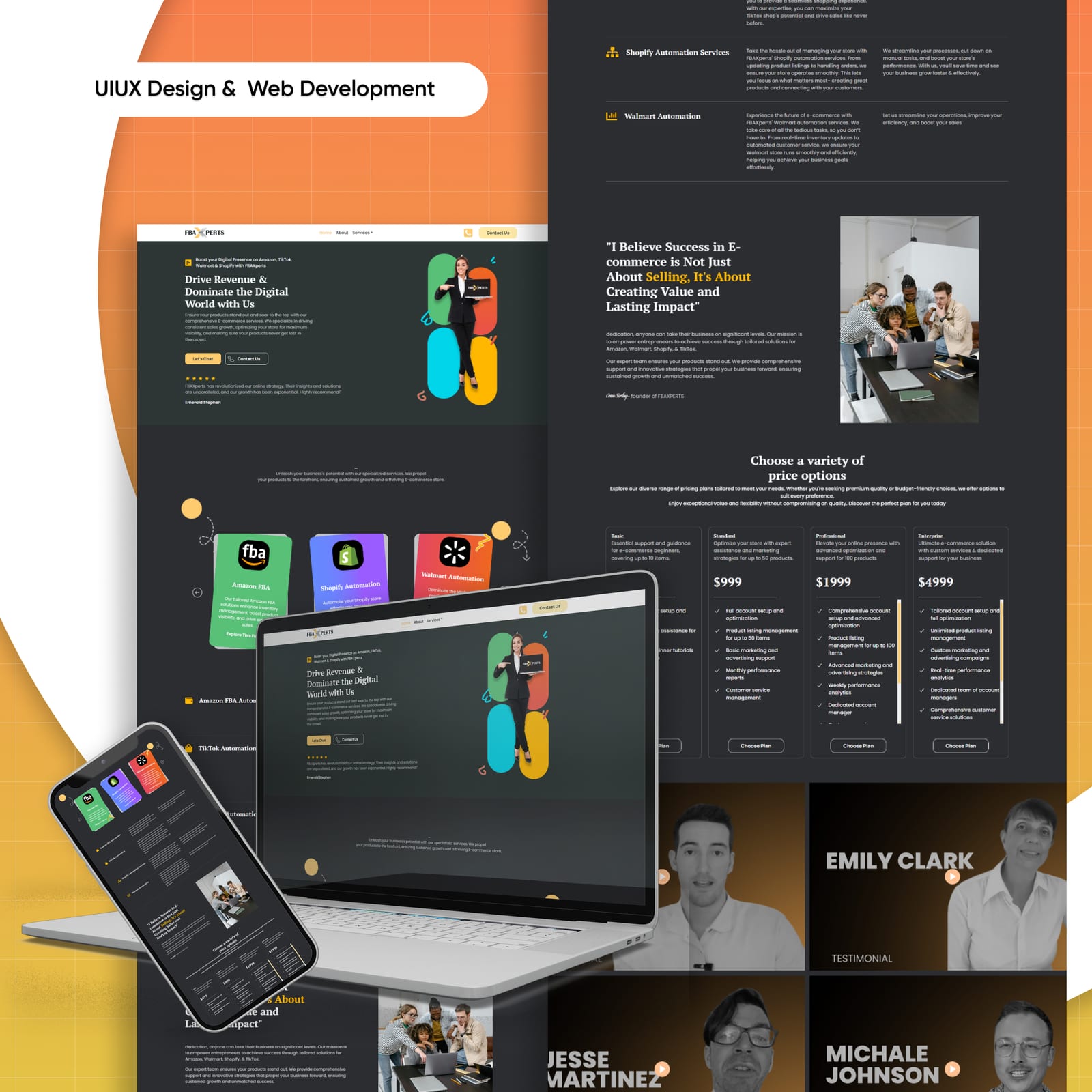
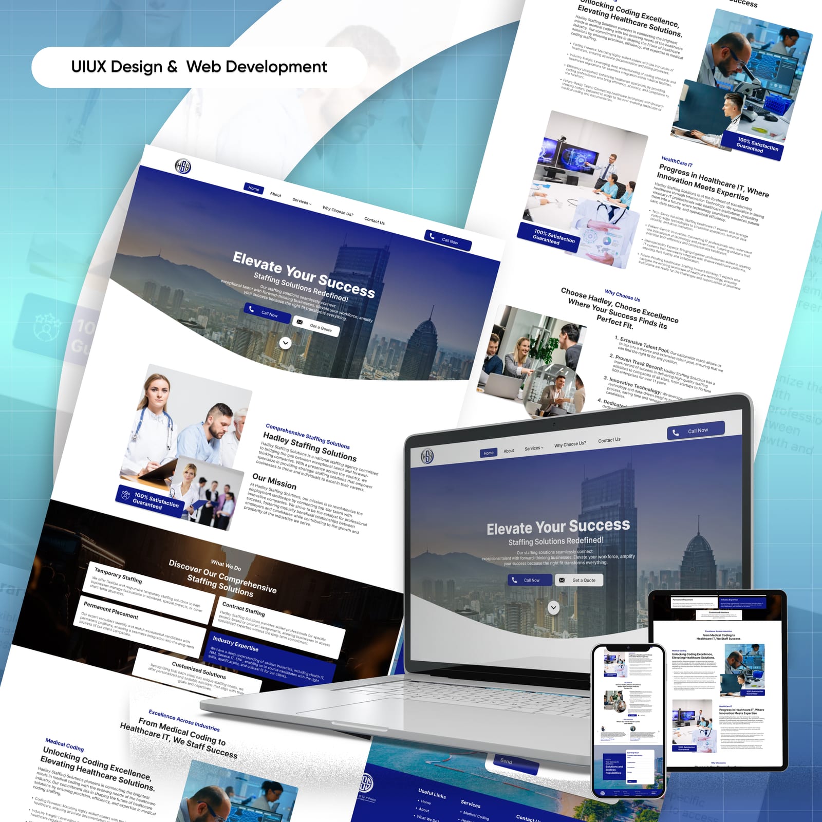
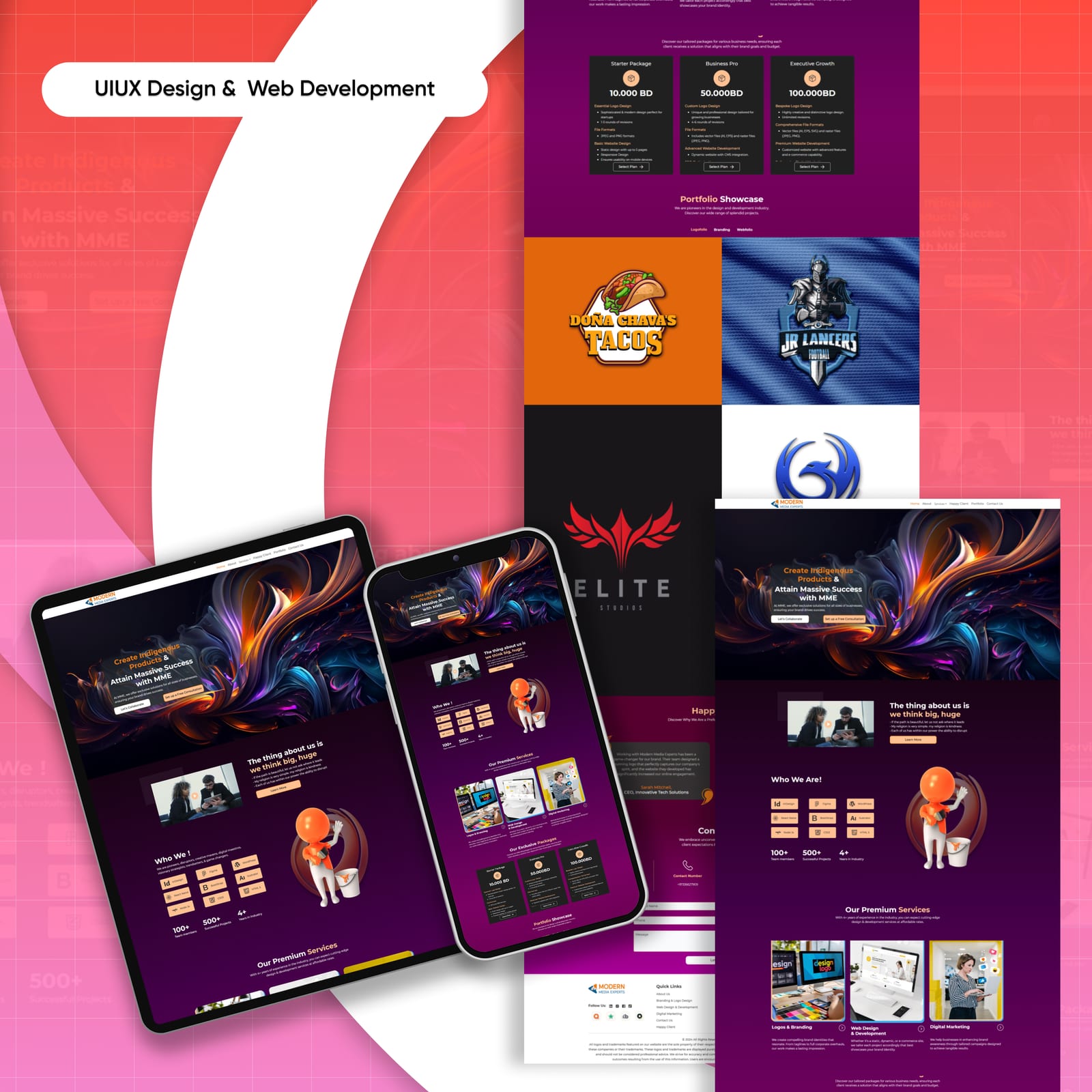
Websites designed on a grid and a component set, so what gets built matches what was designed at every breakpoint rather than only at the width it was drawn in.
Our Toolkit
Every identity, campaign and experience is built with a carefully chosen creative stack — the tools our guardians reach for every day.
Voices of Trust
Our clients’ success is our greatest achievement.
The team at Patronus Pixels is creative, reliable and incredibly professional. They built more than a website—they built our online identity.
Patronus Pixels transformed our vision into a stunning digital experience. Their attention to detail and commitment to excellence is unmatched.
Professional, creative and always on point. They understood our brand and delivered beyond expectations.